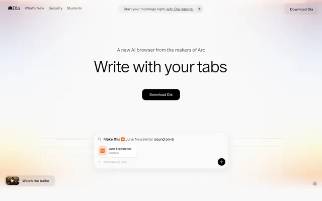
Preview image. Unlock full-res
Prism on white stationery — light refracts color from a nearly monochrome surface.
Color palette
The signature chromatic moment — ambient hero glow and decorative accent strip; this gradient IS the brand color, appearing where a logo mark would in other systems; Gradient stop — the red accent, available as --red token for error or emphasis states
Gradient stop — pink/mauve tone at the warm edge of the spectrum
Gradient stop — warm amber center of the spectrum, available as --yellow token
Gradient stop — the cool end of the spectrum, available as --blue token for links or informational highlights
Available as --pink token for highlight or playful accent contexts
Primary text, headings, nav links, borders, icon fills — the sole chromatic anchor in an otherwise gray system
Card backgrounds (at 90% opacity), base fills, overlay surfaces
Page background (--background token), the overall canvas beneath frosted cards
Header background, subtle section dividers
Filled button backgrounds ("Download Dia") — neutral gray buttons avoid competing with content; a deliberate anti-CTA that says 'ready when you are'
Body text, secondary copy, subheadings beneath display type
Tertiary text, nav labels, metadata captions
Disabled states, carousel indicator dots, icon strokes
Subtle borders, secondary body text
Typography
- Weights
- 300, 400, 500
- Sizes
- 10px, 14px, 16px, 18px, 22px, 50px, 54px, 72px
- Line height
- 1.11
- Letter spacing
- -0.04em at display sizes (50-72px), -0.02em at heading sizes (22px), normal at body (14-18px)
- Fallback
- GT Super Display (weight 300) or DM Sans (lighter weights) for structure; for closer match, Instrument Serif light or Reckless Neue light
The sole typeface across the entire system — display headlines at weight 300 (72px, 54px), body at 400 (16px, 18px), nav/buttons at 500 (14px, 16px). Weight 300 for display is the signature: most browser/SaaS sites use 600+ for headlines, but Dia goes featherweight, making large type feel like ink drying on paper rather than commands carved in stone. The tight -0.04em tracking at display sizes compresses the airy letterforms just enough to hold together at scale.
Spacing & shape
Elevation
Components
Background rgba(255,255,255,0.9) with backdrop-filter: blur(24px). Border-radius 30px. Padding 32px all sides. Box-shadow rgba(0,0,0,0.08) 0px 0px 8px 0px. No visible border. Text inside uses #000000 headings at weight 400/500 and #636363 body text.
Background #D9D9D9, text color rgba(0,0,0,0.85), border-radius 30px, font 14-16px ABC Oracle weight 500. Hover transitions to --get-dia-button-hover (#000000 background with white text). No visible border. Padding inline — content-sized.
Background transparent, text rgba(0,0,0,0.85), border-radius 9999px. Relies on text and hover state for interactivity. Used for category tabs (Write, Learning, Planning) and secondary links.
Background rgba(0,0,0,0.04), text rgba(0,0,0,0.85), border-radius 16px, horizontal padding 24px. Used for the header announcement bar ('Start your mornings right, with Dia reports').
Background #EFEFEF (--header-background) with backdrop-filter: blur(24px). Contains Dia logo left, nav links center, and Download Dia button right. Nav links at 14px weight 400 #000000. Border-radius likely 16-20px for the banner pill nested inside.
Same frosted card base (rgba(255,255,255,0.9), 30px radius, 32px padding, 8px shadow). Contains quote text at 14-16px weight 400 #000000, user avatar (circular, ~40px), name at weight 500, and role at #959595 caption weight.
Full-width section with the spectrum gradient bleeding softly behind a contained browser mockup screenshot. Screenshots have 10px border-radius. The gradient appears as a warm ambient glow at ~30% opacity beneath the screenshot frame, creating depth.
Row of oval navigation dots in #AEAEAE (inactive) and #000000 (active). Below the "Dia is for" heading. Active category text appears as heading-sm (22px) with italic emphasis. Transition uses 0.2s ease.
Circular avatar/thumbnail preview (~48px) with adjacent text label "Watch the trailer" at 14px weight 400. Positioned fixed bottom-left. No background fill — floats over content.
Columns with headers (Product, Company, etc.) at 14px weight 500 #000000. Links at 14px weight 400 #636363. Column gap ~20px, row gap ~10px. No decorative borders or dividers.
Centered layout with lock icon (black, ~24px), display heading at 50-54px weight 300 #000000 with -0.04em tracking. Body text at 16px #636363. Inline link in body uses underline with text-decoration-color transition.
Color #000000, text-decoration underline. Hover transitions text-decoration-color over 0.2s ease. No color change on hover — underline emphasis only. Used for 'Learn more about privacy in Dia' and similar.
Guidelines
- Use the spectrum gradient (pink → red → amber → lavender → blue) ONLY as ambient background glow or decorative strip — never as text color or button fill
- Keep buttons neutral gray (#D9D9D9) or transparent; the system deliberately avoids chromatic CTAs to keep focus on content
- Apply 30px border-radius consistently to cards and filled buttons; use 9999px pill radius only for ghost/tab buttons
- Use ABC Oracle weight 300 for all display text (50px+) with -0.04em letter-spacing; weight 500 only for buttons and labels ≤16px
- Apply backdrop-filter: blur(24px) with rgba(255,255,255,0.9) for any elevated surface to maintain the frosted-glass layering
- Maintain the rgba(0,0,0,0.08) 0px 0px 8px 0px shadow on all floating cards — this is the only shadow in the system
- Use #636363 for body text and #959595 for tertiary/metadata text against the #F8F8F8 canvas
- Never use saturated colors (--red, --blue, --pink, --yellow) as solid backgrounds or button fills — they exist only within the gradient and as design tokens for rare micro-accents
- Never use border-radius less than 10px on any element; the system has no sharp corners
- Never use font weights above 500 — there is no bold (600/700/800) anywhere in this system
- Never add drop shadows beyond the single 8px blur shadow; avoid layered or colored shadows
- Never place dark backgrounds behind content sections; the system is exclusively light with the gradient as the only warm/dark element
- Never use underlined links with color changes — links stay #000000 and only animate underline opacity on hover
- Never introduce a second typeface; the entire system runs on a single family at three weights
About this system
ShowHide
Feels like holding a blank sheet of premium stationery up to warm morning light — the page is almost entirely achromatic, but a hidden spectrum bleeds through in concentrated gradient bursts that feel like sunlight refracting through a prism's edge. The warmth comes from translucent card surfaces (white at 90% opacity) floating on a #F8F8F8 canvas with backdrop-blur, creating frosted-glass depth without hard shadows. ABC Oracle at weight 300 for display text (72px, 54px) is the defining typographic gesture — impossibly thin letterforms with tight -0.04em tracking create an airy authority, like text etched into glass. The single rainbow gradient (pink → red → amber → lavender → blue) appears as a chromatic accent strip and ambient background glow, making what is otherwise a monochrome system feel alive. Buttons default to #D9D9D9 — deliberately muted, never demanding attention, letting the content hierarchy stay centered on the typography.
Max-width ~1200px centered content on #F8F8F8 canvas. Hero is centered single-column: subtitle at 18px, display headline at 72px weight 300, neutral button, then a floating product UI mockup with gradient glow beneath. Sticky frosted header (~52px tall) with logo left, nav center, CTA right. Sections flow vertically with generous 80-120px gaps. Feature sections use centered stacks: heading → carousel dots → subheading → full-width screenshot showcase. Testimonial section is a horizontal scrolling card carousel (5+ cards visible, edge-bleed). Privacy section returns to simple centered text stack. Footer is a multi-column link grid. No alternating background bands — the entire page stays on the same canvas color, with depth created by frosted card surfaces and gradient glows rather than section color changes.
Product screenshots dominate — browser UI mockups (Gmail compose, Substack editor) shown at realistic scale with 10px rounded corners, floating over warm ambient gradient glows. No stock photography for hero/feature sections. The only photography is small circular avatar crops (~40px) for testimonial cards. The spectrum gradient functions as the primary decorative visual — a horizontal chromatic band (pink → red → amber → lavender → blue) that bleeds into soft ambient light behind screenshot showcases. This gradient replaces traditional hero imagery; it's atmospheric rather than illustrative. Icon style is minimal monochrome: a small lock icon for privacy, the Dia diamond logo mark. The system is text-dominant — imagery serves as proof (screenshots) or mood (gradient glow), never as decoration for its own sake.
Reminiscent of Arc Browser, Linear, Raycast, Notion, Perplexity.
# Dia Browser — Style Reference
> Prism on white stationery — light refracts color from a nearly monochrome surface.

**Theme:** light

**Site:** https://diabrowser.com

Feels like holding a blank sheet of premium stationery up to warm morning light — the page is almost entirely achromatic, but a hidden spectrum bleeds through in concentrated gradient bursts that feel like sunlight refracting through a prism's edge. The warmth comes from translucent card surfaces (white at 90% opacity) floating on a #F8F8F8 canvas with backdrop-blur, creating frosted-glass depth without hard shadows. ABC Oracle at weight 300 for display text (72px, 54px) is the defining typographic gesture — impossibly thin letterforms with tight -0.04em tracking create an airy authority, like text etched into glass. The single rainbow gradient (pink → red → amber → lavender → blue) appears as a chromatic accent strip and ambient background glow, making what is otherwise a monochrome system feel alive. Buttons default to #D9D9D9 — deliberately muted, never demanding attention, letting the content hierarchy stay centered on the typography.

## Tokens — Colors

| Name | Value | Token | Role |
|------|------|------|------|
| Spectrum Gradient | `#fa3d1d` | `--color-spectrum-gradient` | The signature chromatic moment — ambient hero glow and decorative accent strip; this gradient IS the brand color, appearing where a logo mark would in other systems; Gradient stop — the red accent, available as --red token for error or emphasis states |
| Rose Quartz | `#c679c4` | `--color-rose-quartz` | Gradient stop — pink/mauve tone at the warm edge of the spectrum |
| Marigold | `#ffb005` | `--color-marigold` | Gradient stop — warm amber center of the spectrum, available as --yellow token |
| Signal Blue | `#0358f7` | `--color-signal-blue` | Gradient stop — the cool end of the spectrum, available as --blue token for links or informational highlights |
| Hot Pink | `#fd02f5` | `--color-hot-pink` | Available as --pink token for highlight or playful accent contexts |
| Ink Black | `#000000` | `--color-ink-black` | Primary text, headings, nav links, borders, icon fills — the sole chromatic anchor in an otherwise gray system |
| Snow | `#ffffff` | `--color-snow` | Card backgrounds (at 90% opacity), base fills, overlay surfaces |
| Canvas | `#f8f8f8` | `--color-canvas` | Page background (--background token), the overall canvas beneath frosted cards |
| Fog | `#efefef` | `--color-fog` | Header background, subtle section dividers |
| Pebble | `#d9d9d9` | `--color-pebble` | Filled button backgrounds ("Download Dia") — neutral gray buttons avoid competing with content; a deliberate anti-CTA that says 'ready when you are' |
| Graphite | `#636363` | `--color-graphite` | Body text, secondary copy, subheadings beneath display type |
| Slate | `#959595` | `--color-slate` | Tertiary text, nav labels, metadata captions |
| Steel | `#aeaeae` | `--color-steel` | Disabled states, carousel indicator dots, icon strokes |
| Ash | `#7c7c7c` | `--color-ash` | Subtle borders, secondary body text |

## Tokens — Typography

### ABC Oracle
- **Substitute:** GT Super Display (weight 300) or DM Sans (lighter weights) for structure; for closer match, Instrument Serif light or Reckless Neue light
- **Weights:** 300, 400, 500
- **Sizes:** 10px, 14px, 16px, 18px, 22px, 50px, 54px, 72px
- **Line height:** 1.11
- **Letter spacing:** -0.04em at display sizes (50-72px), -0.02em at heading sizes (22px), normal at body (14-18px)
- **Role:** The sole typeface across the entire system — display headlines at weight 300 (72px, 54px), body at 400 (16px, 18px), nav/buttons at 500 (14px, 16px). Weight 300 for display is the signature: most browser/SaaS sites use 600+ for headlines, but Dia goes featherweight, making large type feel like ink drying on paper rather than commands carved in stone. The tight -0.04em tracking at display sizes compresses the airy letterforms just enough to hold together at scale.

## Tokens — Type Scale

Perfect Fourth (1.333) from 16px base.

| Role | Size | Line height | Letter spacing |
|------|------|------|------|
| caption | 10px | 1.5 | — |
| body-sm | 14px | 1.5 | — |
| body | 16px | 1.5 | — |
| subheading | 18px | 1.33 | — |
| heading-sm | 22px | 1.25 | -0.44px |
| heading | 50px | 1.18 | -2px |
| heading-lg | 54px | 1.17 | -2.16px |
| display | 72px | 1.11 | -2.88px |

## Tokens — Spacing

- **Max width:** 1200px
- **Section gap:** 80-120px
- **Card padding:** 32px
- **Element gap:** 15-20px

## Tokens — Radius

- **Buttons:** 30px
- **Cards:** 30px
- **Images:** 10px
- **containers:** 40px
- **navItems:** 16px
- **pillButtons:** 9999px

## Tokens — Elevation

- **Content Card:** `rgba(0, 0, 0, 0.08) 0px 0px 8px 0px`

## Layout

Max-width ~1200px centered content on #F8F8F8 canvas. Hero is centered single-column: subtitle at 18px, display headline at 72px weight 300, neutral button, then a floating product UI mockup with gradient glow beneath. Sticky frosted header (~52px tall) with logo left, nav center, CTA right. Sections flow vertically with generous 80-120px gaps. Feature sections use centered stacks: heading → carousel dots → subheading → full-width screenshot showcase. Testimonial section is a horizontal scrolling card carousel (5+ cards visible, edge-bleed). Privacy section returns to simple centered text stack. Footer is a multi-column link grid. No alternating background bands — the entire page stays on the same canvas color, with depth created by frosted card surfaces and gradient glows rather than section color changes.

## Imagery

Product screenshots dominate — browser UI mockups (Gmail compose, Substack editor) shown at realistic scale with 10px rounded corners, floating over warm ambient gradient glows. No stock photography for hero/feature sections. The only photography is small circular avatar crops (~40px) for testimonial cards. The spectrum gradient functions as the primary decorative visual — a horizontal chromatic band (pink → red → amber → lavender → blue) that bleeds into soft ambient light behind screenshot showcases. This gradient replaces traditional hero imagery; it's atmospheric rather than illustrative. Icon style is minimal monochrome: a small lock icon for privacy, the Dia diamond logo mark. The system is text-dominant — imagery serves as proof (screenshots) or mood (gradient glow), never as decoration for its own sake.

## Components

### Download CTA Button Group

### Testimonial Cards

### AI Prompt Search Bar

### Frosted Content Card
*Primary content container for feature descriptions, testimonials, and product showcases*

Background rgba(255,255,255,0.9) with backdrop-filter: blur(24px). Border-radius 30px. Padding 32px all sides. Box-shadow rgba(0,0,0,0.08) 0px 0px 8px 0px. No visible border. Text inside uses #000000 headings at weight 400/500 and #636363 body text.

### Neutral Filled Button
*Primary download/action button ("Download Dia")*

Background #D9D9D9, text color rgba(0,0,0,0.85), border-radius 30px, font 14-16px ABC Oracle weight 500. Hover transitions to --get-dia-button-hover (#000000 background with white text). No visible border. Padding inline — content-sized.

### Ghost Pill Button
*Secondary actions and navigation toggles*

Background transparent, text rgba(0,0,0,0.85), border-radius 9999px. Relies on text and hover state for interactivity. Used for category tabs (Write, Learning, Planning) and secondary links.

### Soft Fill Button
*Announcement banner and contextual actions*

Background rgba(0,0,0,0.04), text rgba(0,0,0,0.85), border-radius 16px, horizontal padding 24px. Used for the header announcement bar ('Start your mornings right, with Dia reports').

### Sticky Header Bar
*Fixed navigation with frosted glass effect*

Background #EFEFEF (--header-background) with backdrop-filter: blur(24px). Contains Dia logo left, nav links center, and Download Dia button right. Nav links at 14px weight 400 #000000. Border-radius likely 16-20px for the banner pill nested inside.

### Testimonial Card
*User quote display in horizontal carousel*

Same frosted card base (rgba(255,255,255,0.9), 30px radius, 32px padding, 8px shadow). Contains quote text at 14-16px weight 400 #000000, user avatar (circular, ~40px), name at weight 500, and role at #959595 caption weight.

### Product Screenshot Showcase
*Feature demonstration with ambient gradient background*

Full-width section with the spectrum gradient bleeding softly behind a contained browser mockup screenshot. Screenshots have 10px border-radius. The gradient appears as a warm ambient glow at ~30% opacity beneath the screenshot frame, creating depth.

### Category Tab Carousel
*Horizontal dot pagination and content category switcher*

Row of oval navigation dots in #AEAEAE (inactive) and #000000 (active). Below the "Dia is for" heading. Active category text appears as heading-sm (22px) with italic emphasis. Transition uses 0.2s ease.

### Video Thumbnail Button
*Watch the trailer CTA overlay*

Circular avatar/thumbnail preview (~48px) with adjacent text label "Watch the trailer" at 14px weight 400. Positioned fixed bottom-left. No background fill — floats over content.

### Footer Navigation Grid
*Multi-column link grid in footer*

Columns with headers (Product, Company, etc.) at 14px weight 500 #000000. Links at 14px weight 400 #636363. Column gap ~20px, row gap ~10px. No decorative borders or dividers.

### Privacy Section
*Trust/privacy messaging block*

Centered layout with lock icon (black, ~24px), display heading at 50-54px weight 300 #000000 with -0.04em tracking. Body text at 16px #636363. Inline link in body uses underline with text-decoration-color transition.

### Inline Text Link
*Contextual links within body copy*

Color #000000, text-decoration underline. Hover transitions text-decoration-color over 0.2s ease. No color change on hover — underline emphasis only. Used for 'Learn more about privacy in Dia' and similar.

## Guidelines

### Do

- Use the spectrum gradient (pink → red → amber → lavender → blue) ONLY as ambient background glow or decorative strip — never as text color or button fill
- Keep buttons neutral gray (#D9D9D9) or transparent; the system deliberately avoids chromatic CTAs to keep focus on content
- Apply 30px border-radius consistently to cards and filled buttons; use 9999px pill radius only for ghost/tab buttons
- Use ABC Oracle weight 300 for all display text (50px+) with -0.04em letter-spacing; weight 500 only for buttons and labels ≤16px
- Apply backdrop-filter: blur(24px) with rgba(255,255,255,0.9) for any elevated surface to maintain the frosted-glass layering
- Maintain the rgba(0,0,0,0.08) 0px 0px 8px 0px shadow on all floating cards — this is the only shadow in the system
- Use #636363 for body text and #959595 for tertiary/metadata text against the #F8F8F8 canvas

### Don't

- Never use saturated colors (--red, --blue, --pink, --yellow) as solid backgrounds or button fills — they exist only within the gradient and as design tokens for rare micro-accents
- Never use border-radius less than 10px on any element; the system has no sharp corners
- Never use font weights above 500 — there is no bold (600/700/800) anywhere in this system
- Never add drop shadows beyond the single 8px blur shadow; avoid layered or colored shadows
- Never place dark backgrounds behind content sections; the system is exclusively light with the gradient as the only warm/dark element
- Never use underlined links with color changes — links stay #000000 and only animate underline opacity on hover
- Never introduce a second typeface; the entire system runs on a single family at three weights

## Gradient System

The spectrum gradient is Dia's visual signature — it replaces a traditional brand color. CSS: linear-gradient(90deg, #c679c4 0%, #fa3d1d 25%, #ffb005 50%, #e1e1fe 75%, #0358f7 100%). It appears in three modes: (1) Full strip — a horizontal bar, often masked to reveal only a center portion. (2) Ambient glow — diffused behind product screenshots at low opacity with blur, creating warm light. (3) Chroma animation — the gradient sweeps or expands using named animations (chroma-expand-bidirectional, chroma-sweep) at ~0.85-0.9s with cubic-bezier(0.77, 0, 0.175, 1) easing. The gradient tokens also exist as individual --red, --blue, --pink, --yellow, --brown CSS variables with 50% and 10% opacity variants for potential use in badges or highlights, but the primary site uses them only within the gradient context.

## Motion Philosophy

Expressive personality: 0.2s ease is the default micro-interaction (hover states on links, buttons, icons — transitions color, background-color, border-color, fill, stroke, opacity, text-decoration-color). The gradient animations are slower and more theatrical: 0.85-0.9s with cubic-bezier(0.77, 0, 0.175, 1) for sweeps. A marquee animation (diaMarqueeL) runs at extremely long duration (~2040s) for a slow-scrolling continuous loop. No spring/bounce physics — all easing is smooth curves.

## Agent Prompt Guide

**Quick Color Reference:**
- text: #000000 (primary), #636363 (secondary body), #959595 (tertiary/meta)
- background: #F8F8F8 (canvas), rgba(255,255,255,0.9) (card surfaces)
- border: none prominent — system uses shadow + frosted surfaces instead
- accent: spectrum gradient (linear-gradient from #c679c4 → #fa3d1d → #ffb005 → #e1e1fe → #0358f7)
- primary action: no distinct CTA color — buttons use neutral #D9D9D9 fill with #000000 text

**Example Component Prompts:**

1. **Hero Section:** #F8F8F8 background. Centered subtitle at 18px ABC Oracle weight 400, #636363. Display headline at 72px weight 300, #000000, letter-spacing -2.88px, line-height 1.11. Below: neutral button #D9D9D9 background, #000000 text, 30px radius, 14px weight 500. Below button: product UI mockup with 10px radius, spectrum gradient glow (low opacity, blurred) behind it.

2. **Feature Card Grid:** 3-column grid of frosted cards — background rgba(255,255,255,0.9), backdrop-filter blur(24px), 30px radius, 32px padding, shadow rgba(0,0,0,0.08) 0px 0px 8px 0px. Card heading 22px weight 500 #000000, body 16px weight 400 #636363, 15px gap between elements.

3. **Testimonial Carousel:** Horizontal scroll of frosted cards (same card styling as above). Each card: quote text 14px weight 400 #000000, 5px margin above attribution. Avatar 40px circle, name 14px weight 500 #000000, role 14px weight 400 #959595. Cards spaced 20px apart.

4. **Sticky Navigation Bar:** Background #EFEFEF with backdrop-filter blur(24px). Height ~52px. Logo left. Nav links 14px weight 400 #000000, 20px horizontal gaps. Right side: announcement pill (rgba(0,0,0,0.04) background, 16px radius, 24px horizontal padding, 14px text), neutral Download button (#D9D9D9, 30px radius).

5. **Privacy/Trust Section:** Centered layout. Icon (lock) at 24px, black. Headline 54px weight 300 #000000, letter-spacing -2.16px. Body text 16px weight 400 #636363. Inline link: #000000 with underline, hover transitions text-decoration-color 0.2s ease.
More like this






Keep what you find
A free account saves references to boards and can send you a weekly email of picks based on what you save.
To see every result, go Pro.