Preview image. Unlock full-res
architectural blueprint on dark slate
Color palette
Accent surface for specific cards and decorative blocks — a cool, muted tone providing visual variation within the dark theme
Page backgrounds, card surfaces, primary dark canvas
Primary text, prominent headings, key UI elements, and ghost button text
Secondary text, muted helper information, and subtle borders
Muted list items, subtle decorative elements, and borders for less prominent information
Typography
- Weights
- 400, 500
- Sizes
- 13px, 16px
- Line height
- 1.6
- Fallback
- Open Sans
Primary body text, button labels, link text, list items, and general interface text. Weight 400 is standard for readability, while 500 subtly emphasizes certain content.
- Weights
- 400
- Sizes
- 24px
- Line height
- 1.2
- Letter spacing
- -0.24px at 24px
- Fallback
- Open Sans
Main headings and section titles, providing a distinct, slightly condensed look.
Spacing & shape
Components
Text in Cloud Whisper (#eeeeee) on a transparent background, with a 1px Cloud Whisper (#eeeeee) border at 10% opacity on the top edge only. Features a 999px border-radius (pill shape) and 11px vertical, 16px horizontal padding. Letter-spacing is normal.
Background in Deep Midnight (#181818), with a 12px border-radius and no internal padding. Elevation is flat (no box-shadow).
Background in Deep Sea Teal (#225757), with a 12px border-radius and no internal padding. Elevation is flat (no box-shadow).
Uses Suisse Intl, weight 400, size 24px, line-height 1.2, color Cloud Whisper (#eeeeee), with -0.24px letter-spacing.
Uses Suisse Intl Book, weight 400, size 16px, line-height 1.6, color Cloud Whisper (#eeeeee).
Uses Suisse Intl Book, weight 400, size 16px, line-height 1.6, color Steel Gaze (#696969).
Guidelines
- Prioritize Deep Midnight (#181818) for all primary background surfaces.
- Use Cloud Whisper (#eeeeee) exclusively for primary text and significant UI elements.
- Apply a 999px border-radius to all interactive buttons for a pill-like shape.
- Maintain a compact element spacing of 8px around most interactive and informational elements.
- Utilize 12px border-radius for all cards and container elements.
- Employ ghost button styling (transparent background, #eeeeee text, subtle top border) for all secondary actions.
- Use Suisse Intl Book and Suisse Intl consistently, adhering to specified weights and letter-spacing for each role.
- Avoid using heavy shadows or strong elevation effects; surfaces should remain flat.
- Do not introduce bright, saturated colors unless for a very specific, isolated accent like Deep Sea Teal (#225757).
- Do not use generic system fonts; stick to Suisse Intl variants to maintain brand consistency.
- Avoid large, prominent filled buttons; prefer ghost or text-only interactive elements.
- Do not deviate from the established spacing scale for element and component gaps.
- Avoid applying padding directly inside cards; contained elements manage their own spacing.
- Do not use highly contrasting or vibrant brand colors in the core UI; keep the palette muted and dark-centric.
About this system
ShowHide
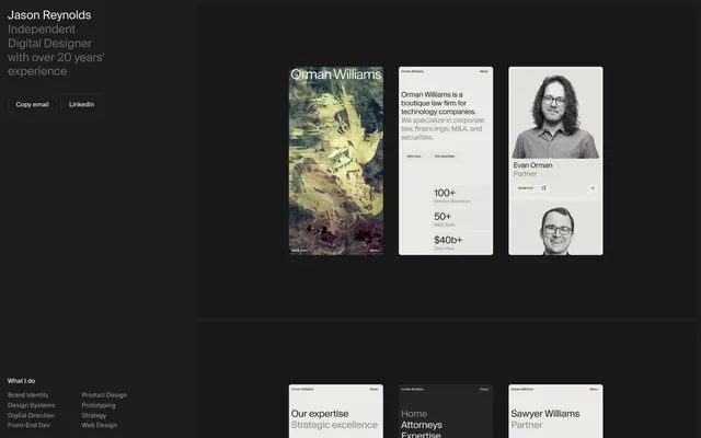
Jsnrynlds employs a sophisticated dark-mode aesthetic with a minimalist footprint. Content is presented on dark charcoal backgrounds with accents of off-white text and subtle cool-toned greens. Components are lightweight, favoring ghost styles and thin borders over heavy fills, creating a sense of understated elegance. The overall impression is one of clarity and focused information delivery.
The page uses a contained layout with a dark, full-bleed background for the main canvas. The hero section presents a two-column split with text on the left and a dense block of content cards on the right. Content sections generally follow a grid pattern, showcasing cards within a largely monochrome environment. Vertical rhythm is established through consistent 72px section gaps. Navigation is minimal, consisting of embedded links within the main content flow and a utility navigation in the footer. The layout feels compact yet breathable, making efficient use of space.
Imagery primarily consists of contained, often square or rectangular product shots and headshots, frequently presented in grayscale or with desaturated tones. There are also abstract, painterly textures used as background elements within cards. Images are typically isolated, without overlapping elements, and use a 12px border-radius on cards, and 8px for smaller interactive elements. The overall density is balanced, allowing imagery to break up text blocks without dominating the layout.
Reminiscent of Linear, Figma (dark mode), Raycast, Supabase.
# Jsnrynlds — Style Reference
> architectural blueprint on dark slate

**Theme:** dark

**Site:** https://jsnrynlds.com

Jsnrynlds employs a sophisticated dark-mode aesthetic with a minimalist footprint. Content is presented on dark charcoal backgrounds with accents of off-white text and subtle cool-toned greens.  Components are lightweight, favoring ghost styles and thin borders over heavy fills, creating a sense of understated elegance. The overall impression is one of clarity and focused information delivery.

## Tokens — Colors

| Name | Value | Token | Role |
|------|------|------|------|
| Deep Sea Teal | `#225757` | `--color-deep-sea-teal` | Accent surface for specific cards and decorative blocks — a cool, muted tone providing visual variation within the dark theme |
| Deep Midnight | `#181818` | `--color-deep-midnight` | Page backgrounds, card surfaces, primary dark canvas |
| Cloud Whisper | `#eeeeee` | `--color-cloud-whisper` | Primary text, prominent headings, key UI elements, and ghost button text |
| Steel Gaze | `#696969` | `--color-steel-gaze` | Secondary text, muted helper information, and subtle borders |
| Pale Ash | `#898989` | `--color-pale-ash` | Muted list items, subtle decorative elements, and borders for less prominent information |

## Tokens — Typography

### Suisse Intl Book
- **Substitute:** Open Sans
- **Weights:** 400, 500
- **Sizes:** 13px, 16px
- **Line height:** 1.6
- **Role:** Primary body text, button labels, link text, list items, and general interface text. Weight 400 is standard for readability, while 500 subtly emphasizes certain content.

### Suisse Intl
- **Substitute:** Open Sans
- **Weights:** 400
- **Sizes:** 24px
- **Line height:** 1.2
- **Letter spacing:** -0.24px at 24px
- **Role:** Main headings and section titles, providing a distinct, slightly condensed look.

## Tokens — Spacing

- **Section gap:** 72px
- **Card padding:** 0px
- **Element gap:** 8px

## Tokens — Radius

- **Buttons:** 999px
- **Cards:** 12px
- **links:** 8px
- **other:** 12px

## Layout

The page uses a contained layout with a dark, full-bleed background for the main canvas. The hero section presents a two-column split with text on the left and a dense block of content cards on the right. Content sections generally follow a grid pattern, showcasing cards within a largely monochrome environment. Vertical rhythm is established through consistent 72px section gaps. Navigation is minimal, consisting of embedded links within the main content flow and a utility navigation in the footer. The layout feels compact yet breathable, making efficient use of space.

## Imagery

Imagery primarily consists of contained, often square or rectangular product shots and headshots, frequently presented in grayscale or with desaturated tones. There are also abstract, painterly textures used as background elements within cards. Images are typically isolated, without overlapping elements, and use a 12px border-radius on cards, and 8px for smaller interactive elements. The overall density is balanced, allowing imagery to break up text blocks without dominating the layout.

## Components

### Ghost Button
*Interactive elements for secondary actions.*

Text in Cloud Whisper (#eeeeee) on a transparent background, with a 1px Cloud Whisper (#eeeeee) border at 10% opacity on the top edge only. Features a 999px border-radius (pill shape) and 11px vertical, 16px horizontal padding. Letter-spacing is normal.

### Dark Surface Card
*Container for content, particularly portfolio items.*

Background in Deep Midnight (#181818), with a 12px border-radius and no internal padding. Elevation is flat (no box-shadow).

### Accent Surface Card
*Highlighted content container or thematic grouping.*

Background in Deep Sea Teal (#225757), with a 12px border-radius and no internal padding. Elevation is flat (no box-shadow).

### Main Heading
*Primary labels for sections and key information.*

Uses Suisse Intl, weight 400, size 24px, line-height 1.2, color Cloud Whisper (#eeeeee), with -0.24px letter-spacing.

### Body Text
*Standard textual content.*

Uses Suisse Intl Book, weight 400, size 16px, line-height 1.6, color Cloud Whisper (#eeeeee).

### Muted Body Text
*Secondary and less prominent textual content.*

Uses Suisse Intl Book, weight 400, size 16px, line-height 1.6, color Steel Gaze (#696969).

## Guidelines

### Do

- Prioritize Deep Midnight (#181818) for all primary background surfaces.
- Use Cloud Whisper (#eeeeee) exclusively for primary text and significant UI elements.
- Apply a 999px border-radius to all interactive buttons for a pill-like shape.
- Maintain a compact element spacing of 8px around most interactive and informational elements.
- Utilize 12px border-radius for all cards and container elements.
- Employ ghost button styling (transparent background, #eeeeee text, subtle top border) for all secondary actions.
- Use Suisse Intl Book and Suisse Intl consistently, adhering to specified weights and letter-spacing for each role.

### Don't

- Avoid using heavy shadows or strong elevation effects; surfaces should remain flat.
- Do not introduce bright, saturated colors unless for a very specific, isolated accent like Deep Sea Teal (#225757).
- Do not use generic system fonts; stick to Suisse Intl variants to maintain brand consistency.
- Avoid large, prominent filled buttons; prefer ghost or text-only interactive elements.
- Do not deviate from the established spacing scale for element and component gaps.
- Avoid applying padding directly inside cards; contained elements manage their own spacing.
- Do not use highly contrasting or vibrant brand colors in the core UI; keep the palette muted and dark-centric.

## Agent Prompt Guide

Quick Color Reference:
- text: #eeeeee
- background: #181818
- border: #eeeeee (10% opacity for ghost buttons)
- accent: #225757
- primary action: no distinct CTA color

Example Component Prompts:
- Create a section divider using Deep Midnight background (#181818), an 8px rowGap, and a horizontal rule that is 1px high, full width, and uses Steel Gaze (#696969).
- Design a Ghost Button: Suisse Intl Book 400, 16px, line-height 1.6, Cloud Whisper text (#eeeeee). Transparent background. 1px Cloud Whisper border (#eeeeee) at 10% opacity, only on the top edge. 999px border-radius. Padding 11px vertical, 16px horizontal.
- Build a Dark Surface Card: background Deep Midnight (#181818), 12px border-radius. No internal padding. Place a Muted Body Text (Suisse Intl Book 400, 16px, line-height 1.6, Pale Ash #898989) inside it, with 8px margin from the card's edge.
- Create a Heading using Suisse Intl 400, 24px, line-height 1.2, Cloud Whisper text (#eeeeee), with -0.24px letter-spacing (for 'Jason Reynolds').
More like this





Keep what you find
A free account saves references to boards and can send you a weekly email of picks based on what you save.
To see every result, go Pro.