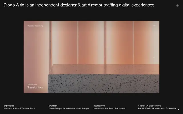
Preview image. Unlock full-res
Shadowbox gallery display
Color palette
Page backgrounds, large container fills, the primary canvas for all content
Subtle background for UI elements or secondary content blocks, providing a slight elevation from the Pitch Black canvas
Accent surface that offers a rich, cool-toned break from the dominant neutrals, used sparingly for depth
Hairline borders, dividers, input outlines, and card edges on light surfaces. Do not promote it to the primary CTA color
Typography
- Weights
- 400
- Sizes
- 16px, 34px
- Line height
- 1.2, 1.4
- Letter spacing
- -0.009, 0.02
- Fallback
- Helvetica Neue
The sole typeface, used for all textual content from headings to body text. Its neutral yet precise character supports the minimalist aesthetic. A subtle negative letter-spacing for larger sizes enhances visual density for headings, while a slightly positive one for smaller text improves legibility.
Spacing & shape
Components
Ghost button with a 1px Canvas White border, no background, and Canvas White text. Uses Helvetica Neue LT Pro Roman at 16px, line height 1.4, with 0.02em letter spacing. Padding creates ample interactive area.
Full-bleed image container with text overlaid. Text uses Helvetica Neue LT Pro Roman, 16px for category and 34px for title, all in Canvas White. Cards have no explicit border or shadow, relying on the image for definition against the Pitch Black background. Padding is minimal internal to the card.
List items separated by 1px Canvas White borders, 128px long. Each item contains Helvetica Neue LT Pro Roman text in Canvas White at 16px, line height 1.4, with 0.02em letter spacing. Items are arranged in columns with a 20px gap.
Guidelines
- Prioritize Pitch Black, Slate Canvas, and Canvas White as the core color palette; avoid introducing additional saturated colors.
- Use Helvetica Neue LT Pro Roman at 16px (line height 1.4, letter spacing 0.02em) for all body text and small UI elements.
- Apply Pitch Black as the default background for all primary sections to maintain a consistent dark theme.
- Utilize 30px for vertical gaps between major sections to ensure generous content separation.
- Define interactive elements with Canvas White text and a 1px Canvas White border or outline against dark backgrounds.
- Employ consistent 0px border-radius across all UI elements for a sharp, rectilinear aesthetic.
- Maintain an element gap of 19px for consistent horizontal and vertical spacing between most UI components.
- Do not introduce complex shadows or gradients; rely on color contrast and spatial arrangement for visual hierarchy.
- Avoid using multiple font families or excessive font weights; Helvetica Neue LT Pro Roman 400 is the only typeface.
- Do not use small, dense text blocks; leverage 16px as the minimum text size and ample line-height for readability.
- Refrain from adding decorative iconography or illustrations that deviate from the stark, functional aesthetic.
- Do not break the dark theme with large, light-colored sections; maintain the dominant Pitch Black canvas.
- Avoid inconsistent spacing, as precise and generous spacing is critical to the system's minimalist identity.
- Do not use rounded corners on any UI elements; all shapes should be rectilinear and sharp.
About this system
ShowHide
Diogo Akio's design system evokes a minimalist gallery experience. It operates on a dark canvas, providing a stark backdrop for high-contrast white typography and isolated portfolio pieces. The aesthetic prioritizes clarity and directness through generous spacing and a strong typographic focus, with minimal use of color or elaborate components. The system is designed to showcase content without visual distraction, relying on subtle interactions and precise spatial relationships.
The page employs a full-bleed layout for its main content, with a centered max-width constraint for text elements like the header and footer. The hero section is characterized by a prominent centered headline over a dark background. Content areas for portfolio pieces are presented as large, often full-width image blocks. The overall rhythm is established by consistent vertical spacing (30px section gaps) and horizontal consistency in text elements. Navigation is minimal, limited to text links and a ghost 'menu' indicator in the top right. The layout is spacious, giving visual elements ample room to breathe against the dark canvas.
The site's imagery consists of high-quality product design visuals and atmospheric architectural photography. These images are large, often full-bleed within their respective containers, and act as primary visual anchors. They are rendered with realistic textures and lighting, presenting content as a focal point. There is no consistent icon style revealed, but the '+' icon in the header suggests a minimal, outlined approach for functional iconography. Imagery serves to showcase portfolio work and establish visual atmosphere rather than being purely decorative.
Reminiscent of B&B Studio, Basic (Design Agency), Minimalissimo, ACNE Production.
# Diogo Akio — Style Reference
> Shadowbox gallery display

**Theme:** dark

**Site:** https://www.diogoakio.com.br

Diogo Akio's design system evokes a minimalist gallery experience. It operates on a dark canvas, providing a stark backdrop for high-contrast white typography and isolated portfolio pieces. The aesthetic prioritizes clarity and directness through generous spacing and a strong typographic focus, with minimal use of color or elaborate components. The system is designed to showcase content without visual distraction, relying on subtle interactions and precise spatial relationships.

## Tokens — Colors

| Name | Value | Token | Role |
|------|------|------|------|
| Pitch Black | `#000000` | `--color-pitch-black` | Page backgrounds, large container fills, the primary canvas for all content |
| Slate Canvas | `#151515` | `--color-slate-canvas` | Subtle background for UI elements or secondary content blocks, providing a slight elevation from the Pitch Black canvas |
| Deep Plum | `#1c2763` | `--color-deep-plum` | Accent surface that offers a rich, cool-toned break from the dominant neutrals, used sparingly for depth |
| Canvas White | `#ffffff` | `--color-canvas-white` | Hairline borders, dividers, input outlines, and card edges on light surfaces. Do not promote it to the primary CTA color |

## Tokens — Typography

### Helvetica Neue LT Pro
- **Substitute:** Helvetica Neue
- **Weights:** 400
- **Sizes:** 16px, 34px
- **Line height:** 1.2, 1.4
- **Letter spacing:** -0.009, 0.02
- **Role:** The sole typeface, used for all textual content from headings to body text. Its neutral yet precise character supports the minimalist aesthetic. A subtle negative letter-spacing for larger sizes enhances visual density for headings, while a slightly positive one for smaller text improves legibility.

## Tokens — Type Scale

| Role | Size | Line height | Letter spacing |
|------|------|------|------|
| body | 16px | 1.4 | 0.32px |
| heading | 34px | 1.2 | -0.31px |

## Tokens — Spacing

- **Section gap:** 30px
- **Card padding:** 20px
- **Element gap:** 19px

## Tokens — Radius

- **Default:** 0px

## Layout

The page employs a full-bleed layout for its main content, with a centered max-width constraint for text elements like the header and footer. The hero section is characterized by a prominent centered headline over a dark background. Content areas for portfolio pieces are presented as large, often full-width image blocks. The overall rhythm is established by consistent vertical spacing (30px section gaps) and horizontal consistency in text elements. Navigation is minimal, limited to text links and a ghost 'menu' indicator in the top right. The layout is spacious, giving visual elements ample room to breathe against the dark canvas.

## Imagery

The site's imagery consists of high-quality product design visuals and atmospheric architectural photography. These images are large, often full-bleed within their respective containers, and act as primary visual anchors. They are rendered with realistic textures and lighting, presenting content as a focal point. There is no consistent icon style revealed, but the '+' icon in the header suggests a minimal, outlined approach for functional iconography. Imagery serves to showcase portfolio work and establish visual atmosphere rather than being purely decorative.

## Components

### Ghost Header CTA Button
*Primary call to action in the header.*

Ghost button with a 1px Canvas White border, no background, and Canvas White text. Uses Helvetica Neue LT Pro Roman at 16px, line height 1.4, with 0.02em letter spacing. Padding creates ample interactive area.

### Project Card
*Showcases individual portfolio projects.*

Full-bleed image container with text overlaid. Text uses Helvetica Neue LT Pro Roman, 16px for category and 34px for title, all in Canvas White. Cards have no explicit border or shadow, relying on the image for definition against the Pitch Black background. Padding is minimal internal to the card.

### Footer Detail List
*Provides secondary navigation and information at the page bottom.*

List items separated by 1px Canvas White borders, 128px long. Each item contains Helvetica Neue LT Pro Roman text in Canvas White at 16px, line height 1.4, with 0.02em letter spacing. Items are arranged in columns with a 20px gap.

## Guidelines

### Do

- Prioritize Pitch Black, Slate Canvas, and Canvas White as the core color palette; avoid introducing additional saturated colors.
- Use Helvetica Neue LT Pro Roman at 16px (line height 1.4, letter spacing 0.02em) for all body text and small UI elements.
- Apply Pitch Black as the default background for all primary sections to maintain a consistent dark theme.
- Utilize 30px for vertical gaps between major sections to ensure generous content separation.
- Define interactive elements with Canvas White text and a 1px Canvas White border or outline against dark backgrounds.
- Employ consistent 0px border-radius across all UI elements for a sharp, rectilinear aesthetic.
- Maintain an element gap of 19px for consistent horizontal and vertical spacing between most UI components.

### Don't

- Do not introduce complex shadows or gradients; rely on color contrast and spatial arrangement for visual hierarchy.
- Avoid using multiple font families or excessive font weights; Helvetica Neue LT Pro Roman 400 is the only typeface.
- Do not use small, dense text blocks; leverage 16px as the minimum text size and ample line-height for readability.
- Refrain from adding decorative iconography or illustrations that deviate from the stark, functional aesthetic.
- Do not break the dark theme with large, light-colored sections; maintain the dominant Pitch Black canvas.
- Avoid inconsistent spacing, as precise and generous spacing is critical to the system's minimalist identity.
- Do not use rounded corners on any UI elements; all shapes should be rectilinear and sharp.

## Agent Prompt Guide

Quick Color Reference:
text: #ffffff
background: #000000
border: #ffffff
accent: no distinct accent color
primary action: no distinct CTA color

Example Component Prompts:
1. Create a Header section: Pitch Black background. Centered text 'Diogo Akio is an independent designer & art director crafting digital experiences' in Canvas White, Helvetica Neue LT Pro Roman, 34px, 1.2 line height, -0.009em letter spacing. Right-aligned '+' icon in Canvas White, 16px, with a 1px Canvas White border.
2. Design a Project showcase block: Image placeholder covering 100% width. Overlay 'Edificio Rosa' in Canvas White, Helvetica Neue LT Pro Roman, 16px, 1.4 line height, 0.02em letter spacing, and 'Translucidez' in Canvas White, Helvetica Neue LT Pro Roman, 34px, 1.2 line height, -0.009em letter spacing, both anchored to the bottom left of the image.
3. Build a Footer detail list: Pitch Black background. Four columns with 20px column gap. Each column contains a list of Canvas White text links, Helvetica Neue LT Pro Roman, 16px, 1.4 line height, 0.02em letter spacing. List items are separated by a 1px Canvas White solid line, 128px wide. Each list item has a 30px marginBottom.
More like this





Keep what you find
A free account saves references to boards and can send you a weekly email of picks based on what you save.
To see every result, go Pro.