Preview image. Unlock full-res
Gallery Grid on Obsidian
Color palette
Accent surface background for cards, highlighting specific projects
Page backgrounds, card backgrounds for dark themes, primary text in lighter contexts
Neutral form states, badge text, and quiet UI feedback where color should stay understated. Do not promote it to the primary CTA color
Secondary surface background for cards, often paired with dark text
Typography
- Weights
- 600
- Sizes
- 12px, 14px
- Line height
- 1.4
- Fallback
- Inter
All text elements including body copy, links, navigation, and badges, favoring a uniform, confident presence.
Spacing & shape
Components
backgroundColor: Obsidian (#000000), borderRadius: 5px, no padding or shadows, designed for full-bleed image content.
backgroundColor: Pale Stone (#c2c1bf), borderRadius: 5px, no padding or shadows. Acts as a visual break within a grid.
backgroundColor: Deep Violet (#00174f), borderRadius: 5px, no padding or shadows. Used to draw attention.
Font: Suisse Intl, Weight: 600, Color: Ghost White (#ffffff), Size: 12-14px, Line Height: 1.4, borderBottom: 1px solid transparent (implied hover/active state).
backgroundColor: transparent, color: Ghost White (#ffffff), borderRadius: 0px, no padding. Uses Suisse Intl 600, 12-14px.
Guidelines
- Prioritize Obsidian (#000000) as the primary background for most sections to maintain a high-contrast dark aesthetic.
- Use Ghost White (#ffffff) for all primary text elements, including body, links, and headings, ensuring maximum legibility against dark backgrounds.
- Apply Suisse Intl, weight 600, across all text, varying only in size (12px, 14px) and line height (1.4) to establish a consistent, confident typographic voice.
- Maintain a uniform border-radius of 5px for all card-like components and images to promote a soft, cohesive visual language.
- Utilize Pale Stone (#c2c1bf) and Deep Violet (#00174f) as distinct background colors for cards to create visual variety and emphasize certain content without introducing complex patterns or shadows.
- Ensure generous element spacing, particularly 14px for internal link groups, to preserve readability and prevent visual clutter.
- Employ direct, minimal text links without background fills for interactive elements, relying on Ghost White (#ffffff) text and subtle underlines for interaction states.
- Avoid using drop shadows or complex gradients on components. The design relies on flat surfaces and color contrast for visual hierarchy.
- Do not introduce additional saturated colors beyond Deep Violet (#00174f); restrict accent usage to this specific hue to maintain visual restraint.
- Refrain from using thin font weights; the system's character is built on the robust weight 600 of Suisse Intl.
- Avoid decorative borders or heavy strokes around components; rely on background color changes for distinction.
- Do not break the dark theme with large, light-colored sections unless justified by specific content, as the system thrives on its high-contrast dark mode.
- Do not use generic system fonts; Suisse Intl is integral to the brand's unique typographic identity.
- Avoid dense packing of elements; maintain a comfortable density with ample negative space around components, especially with an element gap of 14px.
About this system
ShowHide
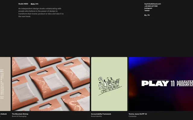
Studio HEED employs a high-contrast dark aesthetic that feels like a refined digital gallery. Dominant dark backdrops are punctuated by crisp white typography and subtle gray surfaces, creating a strong sense of depth and focus on visual content. The system uses a singular, distinct violet accent for functional elements and occasionally as a card background, offering a cool, modern counterpoint to the monochromatic base. Components are minimalistic, with soft, rounded corners and no heavy shadows or borders, maintaining the clean, unobtrusive feel.
The page structure adopts a full-bleed layout which dynamically scales, though individual content sections and text blocks appear to be subtly contained. The hero area is implicit, showcasing the studio name and description. The primary visual pattern is a responsive grid of project cards, typically displaying images and minimal text labels below. The vertical rhythm is comfortable, with significant white space between the header and the main content grid. Navigation is minimal and positioned at the top left, while contact information and language selectors are at the top right, creating a balanced and easily digestible header experience.
The visual language predominantly features high-quality product photography and bespoke illustrations, presented within project cards. Photography is often tightly cropped and product-focused, showcasing details without much contextual environment. Illustrations are simple, linear, and occasionally monochromatic. The imagery serves to showcase the studio's portfolio, presented in a gallery-like grid. Images are contained within defined card boundaries with a subtle 5px border-radius, maintaining a clean perimeter. There's an overall impression of visual clarity and directness, with a strong emphasis on the work itself.
Reminiscent of Awwwards, Kikk Festival, Fieldwork, Human Deluxe.
# Studio HEED — Style Reference
> Gallery Grid on Obsidian

**Theme:** dark

**Site:** https://www.studioheed.com

Studio HEED employs a high-contrast dark aesthetic that feels like a refined digital gallery. Dominant dark backdrops are punctuated by crisp white typography and subtle gray surfaces, creating a strong sense of depth and focus on visual content. The system uses a singular, distinct violet accent for functional elements and occasionally as a card background, offering a cool, modern counterpoint to the monochromatic base. Components are minimalistic, with soft, rounded corners and no heavy shadows or borders, maintaining the clean, unobtrusive feel.

## Tokens — Colors

| Name | Value | Token | Role |
|------|------|------|------|
| Deep Violet | `#00174f` | `--color-deep-violet` | Accent surface background for cards, highlighting specific projects |
| Obsidian | `#000000` | `--color-obsidian` | Page backgrounds, card backgrounds for dark themes, primary text in lighter contexts |
| Ghost White | `#ffffff` | `--color-ghost-white` | Neutral form states, badge text, and quiet UI feedback where color should stay understated. Do not promote it to the primary CTA color |
| Pale Stone | `#c2c1bf` | `--color-pale-stone` | Secondary surface background for cards, often paired with dark text |

## Tokens — Typography

### Suisse Intl
- **Substitute:** Inter
- **Weights:** 600
- **Sizes:** 12px, 14px
- **Line height:** 1.4
- **Role:** All text elements including body copy, links, navigation, and badges, favoring a uniform, confident presence.

## Tokens — Type Scale

| Role | Size | Line height | Letter spacing |
|------|------|------|------|
| caption | 12px | 1.4 | — |
| body | 14px | 1.4 | — |

## Tokens — Spacing

- **Section gap:** 48px
- **Card padding:** 0px
- **Element gap:** 14px

## Tokens — Radius

- **Cards:** 5px
- **Images:** 5px

## Layout

The page structure adopts a full-bleed layout which dynamically scales, though individual content sections and text blocks appear to be subtly contained. The hero area is implicit, showcasing the studio name and description. The primary visual pattern is a responsive grid of project cards, typically displaying images and minimal text labels below. The vertical rhythm is comfortable, with significant white space between the header and the main content grid. Navigation is minimal and positioned at the top left, while contact information and language selectors are at the top right, creating a balanced and easily digestible header experience.

## Imagery

The visual language predominantly features high-quality product photography and bespoke illustrations, presented within project cards. Photography is often tightly cropped and product-focused, showcasing details without much contextual environment. Illustrations are simple, linear, and occasionally monochromatic. The imagery serves to showcase the studio's portfolio, presented in a gallery-like grid. Images are contained within defined card boundaries with a subtle 5px border-radius, maintaining a clean perimeter. There's an overall impression of visual clarity and directness, with a strong emphasis on the work itself.

## Components

### Image Project Card (Dark)
*Case study thumbnail in a grid*

backgroundColor: Obsidian (#000000), borderRadius: 5px, no padding or shadows, designed for full-bleed image content.

### Image Project Card (Light)
*Case study thumbnail in a grid*

backgroundColor: Pale Stone (#c2c1bf), borderRadius: 5px, no padding or shadows. Acts as a visual break within a grid.

### Image Project Card (Violet Accent)
*Case study thumbnail in a grid, highlighting a project*

backgroundColor: Deep Violet (#00174f), borderRadius: 5px, no padding or shadows. Used to draw attention.

### Text Link (Header/Nav)
*Primary navigation and prominent header links*

Font: Suisse Intl, Weight: 600, Color: Ghost White (#ffffff), Size: 12-14px, Line Height: 1.4, borderBottom: 1px solid transparent (implied hover/active state).

### Badge (Text Tag)
*Categorization tag for project cards*

backgroundColor: transparent, color: Ghost White (#ffffff), borderRadius: 0px, no padding. Uses Suisse Intl 600, 12-14px.

## Guidelines

### Do

- Prioritize Obsidian (#000000) as the primary background for most sections to maintain a high-contrast dark aesthetic.
- Use Ghost White (#ffffff) for all primary text elements, including body, links, and headings, ensuring maximum legibility against dark backgrounds.
- Apply Suisse Intl, weight 600, across all text, varying only in size (12px, 14px) and line height (1.4) to establish a consistent, confident typographic voice.
- Maintain a uniform border-radius of 5px for all card-like components and images to promote a soft, cohesive visual language.
- Utilize Pale Stone (#c2c1bf) and Deep Violet (#00174f) as distinct background colors for cards to create visual variety and emphasize certain content without introducing complex patterns or shadows.
- Ensure generous element spacing, particularly 14px for internal link groups, to preserve readability and prevent visual clutter.
- Employ direct, minimal text links without background fills for interactive elements, relying on Ghost White (#ffffff) text and subtle underlines for interaction states.

### Don't

- Avoid using drop shadows or complex gradients on components. The design relies on flat surfaces and color contrast for visual hierarchy.
- Do not introduce additional saturated colors beyond Deep Violet (#00174f); restrict accent usage to this specific hue to maintain visual restraint.
- Refrain from using thin font weights; the system's character is built on the robust weight 600 of Suisse Intl.
- Avoid decorative borders or heavy strokes around components; rely on background color changes for distinction.
- Do not break the dark theme with large, light-colored sections unless justified by specific content, as the system thrives on its high-contrast dark mode.
- Do not use generic system fonts; Suisse Intl is integral to the brand's unique typographic identity.
- Avoid dense packing of elements; maintain a comfortable density with ample negative space around components, especially with an element gap of 14px.

## Agent Prompt Guide

Quick Color Reference:
text: #ffffff
background: #000000
border: #ffffff
accent: #00174f
primary action: no distinct CTA color

Example Component Prompts:
Create a header: background Obsidian (#000000), text Ghost White (#ffffff), with 'Studio HEED' and 'Work, Info' in Suisse Intl 600, 14px, lineHeight 1.4. On the right, 'hey@studioheed.com', '+43 660 2279181', 'Instagram', 'Twitter', 'En. De' in Suisse Intl 600, 12px, lineHeight 1.4.
Create an image project card: background Obsidian (#000000), borderRadius 5px. Below the image, text 'The Mountain Shrimp' in Suisse Intl 600, 14px, Ghost White (#ffffff), and 'Brand & Packaging' in Suisse Intl 600, 12px, Ghost White (#ffffff).
Create a text-only project card: backgroundColor Pale Stone (#c2c1bf), borderRadius 5px. Text 'Accountability Framework' in Suisse Intl 600, 14px, Obsidian (#000000), and 'Brand Identity' in Suisse Intl 600, 12px, Obsidian (#000000).
Create a project card with a violet background: backgroundColor Deep Violet (#00174f), borderRadius 5px. Text 'Tommy Jeans SU/PF '22' in Suisse Intl 600, 14px, Ghost White (#ffffff), and 'Campaign' in Suisse Intl 600, 12px, Ghost White (#ffffff).
More like this





Keep what you find
A free account saves references to boards and can send you a weekly email of picks based on what you save.
To see every result, go Pro.