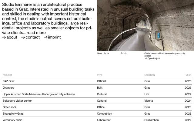
Preview image. Unlock full-res
Architectural Blueprint, Night Mode
Color palette
Dark borders and separators for elevated surfaces and inverted UI. Do not promote it to the primary CTA color
Muted text for secondary information like table headers or metadata. Provides a subtle visual separation from primary text
Color used for text that appears over preview images, ensuring readability against varied photographic backgrounds
Typography
- Weights
- 400
- Sizes
- 15px, 16px, 20px, 30px
- Line height
- 0.9, 1.16
- Letter spacing
- -0.165, -0.16, -0.16, -0.15
- Fallback
- Helvetica Neue
The sole typeface for all text content, from body to headlines and interactive elements. Its consistent weight and precise tracking maintain a disciplined, uniform voice across the interface.
Spacing & shape
Components
Uses NHaasGrotesk, 16px, 400 weight, Pitch Black text. On hover, the Pitch Black text remains, the underline appears. No background or padding. The spacing between nav items is 30px.
Uses NHaasGrotesk, 16px, 400 weight, Pitch Black text, with a Pitch Black border-bottom. No padding.
Text uses NHaasGrotesk, 16px, 400 weight, Pitch Black. The row has a bottom border of 1px solid Pitch Black. Padding of 12px top/bottom and 4px left/right. The labels like 'PROJECT', 'TYPE', 'LOCATION', 'YEAR' use Steel Gray text.
Displaying 'PAZ Graz Official Graz 2025' like a block link, using 'NHaasGrotesk', 16px, 400 weight, Pitch Black text, with a 1px solid Pitch Black border underneath the entire listing. The `Open Project` text within uses the same styling but with an arrow icon.
Guidelines
- Always use 'NHaasGrotesk' as the primary typeface for all text elements.
- Maintain a high-contrast dark theme using Pitch Black (#000000) for backgrounds and primary text.
- Implement borders using 1px solid Pitch Black (#000000) to delineate sections and interactive elements.
- Utilize 0px border-radius for all elements, maintaining sharp, angular forms.
- Apply Steel Gray (#999999) for secondary text such as table headers or metadata.
- Ensure consistent spacing with a base unit derived from 5px for element gaps and 32px for section gaps.
- Use Preview White (#ffffff) for any text appearing directly over photographic or illustrative content.
- Do not introduce any background colors other than Pitch Black (#000000) for primary surfaces.
- Avoid using shadows or elevation effects; elements should remain flat against the dark background.
- Do not deviate from the 'NHaasGrotesk' typeface or introduce additional font families.
- Refrain from using any color accents; the palette is strictly achromatic with specific allowances for text over media.
- Do not use rounded corners or any non-zero border-radius on any UI elements.
- Avoid decorative gradients; surfaces should be solid colors.
- Do not introduce unnecessary padding or margin, adhere to the established spacing units.
About this system
ShowHide
Studio Emmerer employs a minimalist, almost stark aesthetic, prioritizing content through a high-contrast dark theme. Visual hierarchy is achieved primarily through typography and subtle spacing. Surfaces are uniformly dark, with distinction created by thin hairline borders rather than depth or shadows. The overall impression is one of restrained precision, reminiscent of architectural blueprints presented on a night-mode screen.
The page primarily uses a full-bleed layout, particularly for hero sections and image showcases. Content sections alternate between full-width black backgrounds and a max-width centered container for text-heavy content or tabular data. Vertical rhythm is maintained by consistent section gaps. Navigation is minimalist, typically a horizontal inline list. The overall arrangement is straightforward and linear, prioritizing content presentation with a clear, functional aesthetic.
This site features product/architectural photography exclusively. Images are full-bleed within their sections, presenting stark, uncropped views of built environments. There are no illustrations, icons are minimal and functional (arrows), and there's no lifestyle photography. The imagery serves as direct project showcase rather than decorative atmosphere, often occupying significant visual space.
Reminiscent of Norm Architects, OMA, Bjarke Ingels Group (BIG), PANGAIA.
# Studio Emmerer — Style Reference
> Architectural Blueprint, Night Mode

**Theme:** dark

**Site:** https://emmerer.com

Studio Emmerer employs a minimalist, almost stark aesthetic, prioritizing content through a high-contrast dark theme. Visual hierarchy is achieved primarily through typography and subtle spacing. Surfaces are uniformly dark, with distinction created by thin hairline borders rather than depth or shadows. The overall impression is one of restrained precision, reminiscent of architectural blueprints presented on a night-mode screen.

## Tokens — Colors

| Name | Value | Token | Role |
|------|------|------|------|
| Pitch Black | `#000000` | `--color-pitch-black` | Dark borders and separators for elevated surfaces and inverted UI. Do not promote it to the primary CTA color |
| Steel Gray | `#999999` | `--color-steel-gray` | Muted text for secondary information like table headers or metadata. Provides a subtle visual separation from primary text |
| Preview White | `#ffffff` | `--color-preview-white` | Color used for text that appears over preview images, ensuring readability against varied photographic backgrounds |

## Tokens — Typography

### NHaasGrotesk
- **Substitute:** Helvetica Neue
- **Weights:** 400
- **Sizes:** 15px, 16px, 20px, 30px
- **Line height:** 0.9, 1.16
- **Letter spacing:** -0.165, -0.16, -0.16, -0.15
- **Role:** The sole typeface for all text content, from body to headlines and interactive elements. Its consistent weight and precise tracking maintain a disciplined, uniform voice across the interface.

## Tokens — Type Scale

Augmented Fourth (1.414) from 15px base.

| Role | Size | Line height | Letter spacing |
|------|------|------|------|
| body-sm | 15px | 1.16 | -0.165px |
| subheading | 20px | 0.9 | -0.16px |
| heading | 30px | 0.9 | -0.15px |

## Tokens — Spacing

- **Section gap:** 32px
- **Card padding:** 12px
- **Element gap:** 5px

## Tokens — Radius

- **none:** 0px

## Layout

The page primarily uses a full-bleed layout, particularly for hero sections and image showcases. Content sections alternate between full-width black backgrounds and a max-width centered container for text-heavy content or tabular data. Vertical rhythm is maintained by consistent section gaps. Navigation is minimalist, typically a horizontal inline list. The overall arrangement is straightforward and linear, prioritizing content presentation with a clear, functional aesthetic.

## Imagery

This site features product/architectural photography exclusively. Images are full-bleed within their sections, presenting stark, uncropped views of built environments. There are no illustrations, icons are minimal and functional (arrows), and there's no lifestyle photography. The imagery serves as direct project showcase rather than decorative atmosphere, often occupying significant visual space.

## Components

### Navigation Link
*Interactive text link for site navigation.*

Uses NHaasGrotesk, 16px, 400 weight, Pitch Black text. On hover, the Pitch Black text remains, the underline appears. No background or padding. The spacing between nav items is 30px.

### Read More Link
*Text link for expanding content.*

Uses NHaasGrotesk, 16px, 400 weight, Pitch Black text, with a Pitch Black border-bottom. No padding.

### Project Table Row
*A single row within the tabular project listing.*

Text uses NHaasGrotesk, 16px, 400 weight, Pitch Black. The row has a bottom border of 1px solid Pitch Black. Padding of 12px top/bottom and 4px left/right. The labels like 'PROJECT', 'TYPE', 'LOCATION', 'YEAR' use Steel Gray text.

### Project List Item
*A single project entry in the main list. Behaves like a link.*

Displaying 'PAZ Graz Official Graz 2025' like a block link, using 'NHaasGrotesk', 16px, 400 weight, Pitch Black text, with a 1px solid Pitch Black border underneath the entire listing. The `Open Project` text within uses the same styling but with an arrow icon.

## Guidelines

### Do

- Always use 'NHaasGrotesk' as the primary typeface for all text elements.
- Maintain a high-contrast dark theme using Pitch Black (#000000) for backgrounds and primary text.
- Implement borders using 1px solid Pitch Black (#000000) to delineate sections and interactive elements.
- Utilize 0px border-radius for all elements, maintaining sharp, angular forms.
- Apply Steel Gray (#999999) for secondary text such as table headers or metadata.
- Ensure consistent spacing with a base unit derived from 5px for element gaps and 32px for section gaps.
- Use Preview White (#ffffff) for any text appearing directly over photographic or illustrative content.

### Don't

- Do not introduce any background colors other than Pitch Black (#000000) for primary surfaces.
- Avoid using shadows or elevation effects; elements should remain flat against the dark background.
- Do not deviate from the 'NHaasGrotesk' typeface or introduce additional font families.
- Refrain from using any color accents; the palette is strictly achromatic with specific allowances for text over media.
- Do not use rounded corners or any non-zero border-radius on any UI elements.
- Avoid decorative gradients; surfaces should be solid colors.
- Do not introduce unnecessary padding or margin, adhere to the established spacing units.

## Agent Prompt Guide

Quick Color Reference: text: #000000, background: #000000, border: #000000, accent: no distinct accent color, primary action: no distinct CTA color

Example Component Prompts:
Create a primary navigation link titled 'about': NHaasGrotesk, 16px, 400 weight, Pitch Black text (#000000). No background, no padding, 0px border-radius.
Create a 'read more' text link: NHaasGrotesk, 16px, 400 weight, Pitch Black text (#000000) with a 1px solid Pitch Black (#000000) bottom border.
Create a project table row for 'PAZ Graz Official Graz 2025': NHaasGrotesk, 16px, 400 weight, Pitch Black text (#000000). 12px vertical padding, 4px horizontal padding. A 1px solid Pitch Black (#000000) border-bottom.
More like this





Keep what you find
A free account saves references to boards and can send you a weekly email of picks based on what you save.
To see every result, go Pro.