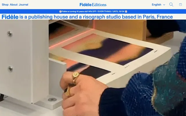
Preview image. Unlock full-res
Risographic print workshop: layers of paper and ink, tactile and vibrant.
Color palette
Primary brand accent, link text, active states, decorative borders around text, and outlined action highlights — a vivid, almost electric blue that cuts through the warm neutrals
Link text within product grids, secondary icon tinting — a slightly softer variant of the brand blue, used for less prominent interactive elements
Specific link colors, typically within text blocks, providing a slightly darker, more traditional blue for internal navigation
Page background, input fields, subtle card surfaces — a warm, creamy off-white that creates a paper-like canvas
High-contrast neutral action fill for primary buttons on light surfaces.
Divider lines, subtle backgrounds for content grouping — a light, cool gray that provides minimal visual separation
Text on dark backgrounds, selected border accents, icon colors — used sparingly for contrast against Ink Black or Printmaker Blue
Typography
- Weights
- 400
- Sizes
- 14px, 16px, 20px, 22px, 24px, 26px, 28px, 32px, 37px, 38px, 41px, 62px
- Line height
- 0.92, 0.96, 1, 1.2, 1.3, 1.5, 1.8
- Letter spacing
- -0.0490em, -0.0200em, -0.0160em, 0.0250em, 0.0430em, 0.0630em, 0.0670em
- Fallback
- Inter
General text, navigation, product titles — this semi-condensed grotesque forms the backbone of the site’s voice through its wide range of sizes and line heights. The negative letter-spacing for larger sizes gives it a compact, intentional feel.
- Weights
- 400
- Sizes
- 14px, 17px, 19px, 32px, 62px
- Line height
- 0.92, 1, 1.5
- Letter spacing
- -0.0160em, 0.0230em
- Fallback
- Inter
Secondary headings, smaller labels, and image captions — offering a slightly more open form compared to 'Book' for readability at varied sizes.
- Weights
- 400
- Sizes
- 13px
- Line height
- 1.2
- Letter spacing
- normal
- Fallback
- Helvetica Neue
Utility text, small buttons, and system-level messages — a highly legible sans-serif for functional elements where clarity is paramount.
- Weights
- 400, 700
- Sizes
- 22px, 32px
- Line height
- 0.92, 1
- Letter spacing
- normal
- Fallback
- Inter
High-impact statements and critical body text emphasis — used sparingly to draw attention without shouting. Note that its 'bold' variant defaults to 400 weight visually.
- Weights
- 400
- Sizes
- 62px
- Line height
- 0.92
- Letter spacing
- -0.0160em
- Fallback
- Playfair Display
Unique display font for hero headlines and key promotional elements — its distinctive character adds a sophisticated, almost artistic touch to focal points.
- Weights
- 400
- Sizes
- 14px
- Line height
- 1.5
- Letter spacing
- normal
- Fallback
- Space Mono
Specialized small-text contexts, possibly for metadata or fine print — a robust monospace-esque font for structured data presentation.
- Weights
- 400
- Sizes
- 26px
- Line height
- 1.5
- Letter spacing
- 0.0250em
- Fallback
- Inter
Input field text with slightly elevated letter spacing to maintain readability in interactive contexts.
Spacing & shape
Components
Text is 'Printmaker Blue' (#1664eb), font 'BaselGrotesk Book', with a 'Printmaker Blue' (#1664eb) underline on hover/active. No border radius.
Background is transparent, text is 'Ink Black' (#121212), font 'Arial' 13px weight 400. Padding varies significantly but can be simulated using 48px horizontal for large and 0px for small. No border radius.
Background is 'Ink Black' (#121212), text is 'Pure White' (#ffffff), font 'Arial' 13px weight 400. Padding: 0px vertical, 48px horizontal. No border radius.
Background is 'Faded Paper' (#f8f7ef), text color is 'Printmaker Blue' (#1664eb) or 'Ink Black' (#121212) for input value. Border is 'Printmaker Blue' (#1664eb) at the bottom. Padding: 24px vertical, 24px horizontal. No border radius.
Text is 'Printmaker Blue' (#1664eb), font 'BaselGrotesk Book' 14px weight 400. On hover, a border appears, colored 'Printmaker Blue' (#1664eb).
Background is transparent, text for title and price is 'Ink Black' (#121212) using 'BaselGrotesk Book'. Image is central. No explicit border or shadow, relying on spacing and clear areas for definition.
Guidelines
- Use 'Faded Paper' (#f8f7ef) as the primary page background to maintain the consistent paper-like canvas.
- Apply 'Printmaker Blue' (#1664eb) selectively for interactive text, primary links, and accent borders to ensure it remains a potent visual highlight.
- For headlines, prioritize 'OTMagisterUnlicensedTrial Regular' at 62px, 'BaselGrotesk Book' or 'BaselGrotesk Regular' at larger sizes (32px, 41px), employing negative letter-spacing for impact.
- Structure content using defined element gaps: 5px for close internal elements, 19px for card padding, and 42px for distinct section breaks.
- Maintain zero border radius across all UI elements (buttons, inputs, cards) to preserve the sharp, print-inspired aesthetic.
- When displaying product imagery, ensure it is unmasked and contained, allowing the product itself to be the central visual focus.
- Avoid using gradients or drop shadows as primary visual cues; the design relies on flat colors and distinct typography.
- Do not introduce additional saturated colors; restrict the palette to primary brand blue, neutrals, and incidental chromatic link colors to maintain focus.
- Refrain from using 'Arial' for prominent headings or marketing copy; reserve it for utility text or smaller functional elements.
- Do not set border-radius on any component; the site's aesthetic is characterized by sharp, defined edges.
- Avoid heavy borders or solid backgrounds on informational cards or product listings; maintain an open, airy feel with minimal visual clutter.
About this system
ShowHide
Fidèle Editions presents an analog craft workshop aesthetic: a warm off-white canvas, sturdy typography, and a single vibrant blue brand accent. Product surfaces are subtle, often borderless, letting the rich product imagery dominate. Typography combines playful, condensed headlines with robust body text, creating a tactile, hand-printed feel across the interface.
Reminiscent of It's Nice That, Printed Matter, Doane Paper.
# Fidèle Editions — Style Reference
> Risographic print workshop: layers of paper and ink, tactile and vibrant.

**Theme:** light

**Site:** https://fidele-editions.com

Fidèle Editions presents an analog craft workshop aesthetic: a warm off-white canvas, sturdy typography, and a single vibrant blue brand accent. Product surfaces are subtle, often borderless, letting the rich product imagery dominate. Typography combines playful, condensed headlines with robust body text, creating a tactile, hand-printed feel across the interface.

## Tokens — Colors

| Name | Value | Token | Role |
|------|------|------|------|
| Printmaker Blue | `#1664eb` | `--color-printmaker-blue` | Primary brand accent, link text, active states, decorative borders around text, and outlined action highlights — a vivid, almost electric blue that cuts through the warm neutrals |
| Shop Grid Blue | `#4f89ec` | `--color-shop-grid-blue` | Link text within product grids, secondary icon tinting — a slightly softer variant of the brand blue, used for less prominent interactive elements |
| Link Blue | `#006ce5` | `--color-link-blue` | Specific link colors, typically within text blocks, providing a slightly darker, more traditional blue for internal navigation |
| Faded Paper | `#f8f7ef` | `--color-faded-paper` | Page background, input fields, subtle card surfaces — a warm, creamy off-white that creates a paper-like canvas |
| Ink Black | `#121212` | `--color-ink-black` | High-contrast neutral action fill for primary buttons on light surfaces. |
| Dusty Gray | `#e2e2df` | `--color-dusty-gray` | Divider lines, subtle backgrounds for content grouping — a light, cool gray that provides minimal visual separation |
| Pure White | `#ffffff` | `--color-pure-white` | Text on dark backgrounds, selected border accents, icon colors — used sparingly for contrast against Ink Black or Printmaker Blue |

## Tokens — Typography

### BaselGrotesk Book
- **Substitute:** Inter
- **Weights:** 400
- **Sizes:** 14px, 16px, 20px, 22px, 24px, 26px, 28px, 32px, 37px, 38px, 41px, 62px
- **Line height:** 0.92, 0.96, 1, 1.2, 1.3, 1.5, 1.8
- **Letter spacing:** -0.0490em, -0.0200em, -0.0160em, 0.0250em, 0.0430em, 0.0630em, 0.0670em
- **Role:** General text, navigation, product titles — this semi-condensed grotesque forms the backbone of the site’s voice through its wide range of sizes and line heights. The negative letter-spacing for larger sizes gives it a compact, intentional feel.

### BaselGrotesk Regular
- **Substitute:** Inter
- **Weights:** 400
- **Sizes:** 14px, 17px, 19px, 32px, 62px
- **Line height:** 0.92, 1, 1.5
- **Letter spacing:** -0.0160em, 0.0230em
- **Role:** Secondary headings, smaller labels, and image captions — offering a slightly more open form compared to 'Book' for readability at varied sizes.

### Arial
- **Substitute:** Helvetica Neue
- **Weights:** 400
- **Sizes:** 13px
- **Line height:** 1.2
- **Letter spacing:** normal
- **Role:** Utility text, small buttons, and system-level messages — a highly legible sans-serif for functional elements where clarity is paramount.

### BaselGrotesk Bold
- **Substitute:** Inter
- **Weights:** 400, 700
- **Sizes:** 22px, 32px
- **Line height:** 0.92, 1
- **Letter spacing:** normal
- **Role:** High-impact statements and critical body text emphasis — used sparingly to draw attention without shouting. Note that its 'bold' variant defaults to 400 weight visually.

### OTMagisterUnlicensedTrial Regular
- **Substitute:** Playfair Display
- **Weights:** 400
- **Sizes:** 62px
- **Line height:** 0.92
- **Letter spacing:** -0.0160em
- **Role:** Unique display font for hero headlines and key promotional elements — its distinctive character adds a sophisticated, almost artistic touch to focal points.

### GTStandard-M
- **Substitute:** Space Mono
- **Weights:** 400
- **Sizes:** 14px
- **Line height:** 1.5
- **Letter spacing:** normal
- **Role:** Specialized small-text contexts, possibly for metadata or fine print — a robust monospace-esque font for structured data presentation.

### Assistant
- **Substitute:** Inter
- **Weights:** 400
- **Sizes:** 26px
- **Line height:** 1.5
- **Letter spacing:** 0.0250em
- **Role:** Input field text with slightly elevated letter spacing to maintain readability in interactive contexts.

## Tokens — Type Scale

Perfect Fifth (1.5) from 16px base.

| Role | Size | Line height | Letter spacing |
|------|------|------|------|
| caption | 13px | 1.2 | — |
| body | 16px | 1.5 | -0.16px |
| subheading | 22px | 0.92 | — |
| heading | 32px | 1 | -0.64px |
| display | 62px | 0.92 | -0.99px |

## Tokens — Spacing

- **Section gap:** 42px
- **Card padding:** 19px
- **Element gap:** 5px

## Tokens — Radius

- **Default:** 0px

## Components

### Outlined Brand Link
*Hypertext link or navigation item with an underline.*

Text is 'Printmaker Blue' (#1664eb), font 'BaselGrotesk Book', with a 'Printmaker Blue' (#1664eb) underline on hover/active. No border radius.

### Ghost Command Button
*A utility button designed for low hierarchy actions or page navigation (e.g. 'Skip to content').*

Background is transparent, text is 'Ink Black' (#121212), font 'Arial' 13px weight 400. Padding varies significantly but can be simulated using 48px horizontal for large and 0px for small. No border radius.

### Filled Footer Button
*A solid background button for secondary actions usually against dark backgrounds (e.g. newsletter subscribe).*

Background is 'Ink Black' (#121212), text is 'Pure White' (#ffffff), font 'Arial' 13px weight 400. Padding: 0px vertical, 48px horizontal. No border radius.

### Product Input Field
*Input fields for forms (e.g. search, email).*

Background is 'Faded Paper' (#f8f7ef), text color is 'Printmaker Blue' (#1664eb) or 'Ink Black' (#121212) for input value. Border is 'Printmaker Blue' (#1664eb) at the bottom. Padding: 24px vertical, 24px horizontal. No border radius.

### Header Nav Link
*Primary navigation items in the header.*

Text is 'Printmaker Blue' (#1664eb), font 'BaselGrotesk Book' 14px weight 400. On hover, a border appears, colored 'Printmaker Blue' (#1664eb).

### Product Listing Card
*Container for individual product items in a grid.*

Background is transparent, text for title and price is 'Ink Black' (#121212) using 'BaselGrotesk Book'. Image is central. No explicit border or shadow, relying on spacing and clear areas for definition.

## Guidelines

### Do

- Use 'Faded Paper' (#f8f7ef) as the primary page background to maintain the consistent paper-like canvas.
- Apply 'Printmaker Blue' (#1664eb) selectively for interactive text, primary links, and accent borders to ensure it remains a potent visual highlight.
- For headlines, prioritize 'OTMagisterUnlicensedTrial Regular' at 62px, 'BaselGrotesk Book' or 'BaselGrotesk Regular' at larger sizes (32px, 41px), employing negative letter-spacing for impact.
- Structure content using defined element gaps: 5px for close internal elements, 19px for card padding, and 42px for distinct section breaks.
- Maintain zero border radius across all UI elements (buttons, inputs, cards) to preserve the sharp, print-inspired aesthetic.
- When displaying product imagery, ensure it is unmasked and contained, allowing the product itself to be the central visual focus.

### Don't

- Avoid using gradients or drop shadows as primary visual cues; the design relies on flat colors and distinct typography.
- Do not introduce additional saturated colors; restrict the palette to primary brand blue, neutrals, and incidental chromatic link colors to maintain focus.
- Refrain from using 'Arial' for prominent headings or marketing copy; reserve it for utility text or smaller functional elements.
- Do not set border-radius on any component; the site's aesthetic is characterized by sharp, defined edges.
- Avoid heavy borders or solid backgrounds on informational cards or product listings; maintain an open, airy feel with minimal visual clutter.

## Agent Prompt Guide

Quick Color Reference:
text: #121212
background: #f8f7ef
border: #1664eb
accent: #1664eb
primary action: #1664eb (outlined action border)

Example Component Prompts:
1. Create a product hero section: 'Faded Paper' (#f8f7ef) background. Headline 'What's on: Latest' uses 'OTMagisterUnlicensedTrial Regular' 62px, 'Ink Black' (#121212), letter-spacing -0.99px. Body text below uses 'BaselGrotesk Book' 16px, 'Ink Black' (#121212).
2. Design a product listing card: transparent background. Image at top. Product title 'Rainbow' uses 'BaselGrotesk Book' 14px, 'Ink Black' (#121212). Price '€27,00' uses 'BaselGrotesk Book' 14px, 'Ink Black' (#121212).
3. Develop a navigation link: 'Shop' uses 'BaselGrotesk Book' 14px 400 weight, 'Printmaker Blue' (#1664eb). Set border-bottom to 1px solid 'Printmaker Blue' (#1664eb) on hover.
4. Create a footer utility button: 'Skip to content' uses 'Arial' 13px 400 weight, 'Ink Black' (#121212) text on transparent background. Left padding 19.2px, right padding 43.2px, 0px vertical. No border radius.
5. Generate an input field for email signup: 'Faded Paper' (#f8f7ef) background, 'Printmaker Blue' (#1664eb) text, 'BaselGrotesk Book' 26px 400 weight, letter-spacing +0.65px. Border-bottom is 2px solid 'Printmaker Blue' (#1664eb). Add 24px padding on all sides.
More like this






Keep what you find
A free account saves references to boards and can send you a weekly email of picks based on what you save.
To see every result, go Pro.