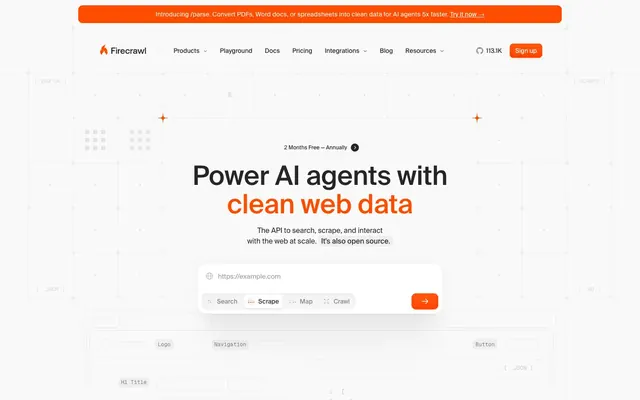
Preview image. Unlock full-res
Whiteboard blueprints, with a single neon 'active' indicator.
Color palette
Orange action color for filled buttons, selected navigation states, and focused conversion moments
Code snippet syntax highlighting and informational text, offering a distinct visual cue for technical content
Dominant background for the page, setting a light, open tone. Also used for neutral borders, ensuring divisions are subtle
Secondary body text, navigation labels, and subdued headings. Do not promote it to the primary CTA color
Card surfaces and elevated elements, creating a subtle lift from the main canvas without harsh contrast
Secondary text, disabled states, and subtle icon detailing, providing a softer visual presence than primary text
Muted link text and less prominent body copy, contributing to visual hierarchy
Helper text, placeholders, and subtle strokes in icons, receding into the background for less critical information
Decorative lines, very faint borders, and subtle separating elements
Gray supporting accent for decorative details and low-frequency emphasis. Do not promote it to the primary CTA color
Accent in subtle shadow layers, providing a soft, almost imperceptible warmth
Typography
- Weights
- 400, 450, 500
- Sizes
- 10px, 12px, 13px, 14px, 15px, 16px, 20px, 24px, 40px, 52px, 60px
- Line height
- 1, 1.07, 1.08, 1.1, 1.2, 1.33, 1.4, 1.43, 1.5, 1.54, 1.6, 1.67
- Letter spacing
- -0.0100em at 60px, -0.0050em at 52px, 0.0100em at 10-15px, 0.0200em at 14px
- Fallback
- Inter
The primary typeface for all interface text, from headings to body copy, offering a clean and structured appearance. Its range of weights and optical adjustments for larger sizes ensure flexibility and impact.
- Weights
- 400, 500
- Sizes
- 12px, 13px, 14px
- Line height
- 1.33, 1.54, 1.57
- Letter spacing
- normal
- Fallback
- SF Mono
Used for code snippets and technical examples, providing a clear, fixed-width presentation that distinguishes it from other interface text.
Spacing & shape
Elevation
Components
Filled with Fire Orange (#ff4d00), white text, fully rounded (999px radius), with padding varied by context but commonly 12px vertical, 24px horizontal.
Transparent background, Ink Black (#262626) text, 999px radius, 12px vertical, 24px horizontal padding, with a subtle Cloud Canvas (#e5e7eb) border upon interaction or focus.
Transparent background, Ink Black (#262626) text at rgba(0, 0, 0, 0.56) for inactive, 0px radius, 6px padding.
Paper White (#f9f9f9) background, 16px border-radius, with a subtle multi-layer shadow effect for elevation: rgba(0, 0, 0, 0.02) 0px 40px 48px -20px, rgba(0, 0, 0, 0.03) 0px 32px 32px -20px, rgba(0, 0, 0, 0.03) 0px 16px 24px -12px, rgba(0, 0, 0, 0.03) 0px 0px 0px 1px.
Transparent background, Ink Black (#262626) text, Cloud Canvas (#e5e7eb) border, no explicit border-radius (default 0px is observed), but contained within a larger card that provides overall curvature.
Paper White (#f9f9f9) background, 20px border-radius, with a comprehensive multi-layer shadow stack (including a 10px rgb(249, 249, 249) inner shadow) for significant elevation and visual separation.
Guidelines
- Always use Fire Orange (#ff4d00) for primary interactive elements and key brand callouts.
- Maintain a clear visual hierarchy using Ink Black (#262626) for primary text and Slate Gray (#727272) or Stone Gray (#616161) for secondary text.
- Apply Cloud Canvas (#e5e7eb) as the page background and Paper White (#f9f9f9) for elevated card surfaces.
- Use Suisse typeface for all UI text, selecting weights 400 for body, 450 for subheadings, and 500 for main headings.
- Round all buttons and tags with a 999px border-radius for distinct pill-shaped components.
- Utilize a 1px Cloud Canvas (#e5e7eb) border for subtle visual separation of elements and boundaries.
- Implement the multi-layer shadow for Feature Cards to create a feeling of subtle elevation and depth.
- Avoid introducing additional saturated colors; maintain the Fire Orange (#ff4d00) as the sole vibrant accent for consistency.
- Do not use heavy, opaque backgrounds for cards or panels; leverage transparency and subtle shadows for layering.
- Never compromise text contrast; ensure all text meets AAA accessibility standards against its background.
- Do not use generic square buttons; all actionable buttons should have a 999px border radius.
- Avoid excessively ornate or pictorial imagery; prefer simple icons, product mockups, or abstract data visualizations.
- Do not use arbitrary spacing; adhere to the 4px base unit and established element, card, and section gaps.
- Avoid bolding or italicizing large blocks of text; rely on font weight and size hierarchy with the Suisse typeface.
About this system
ShowHide
Firecrawl employs a crisp, data-centric interface with a strong emphasis on clean surfaces and a single vibrant accent color. Typography is confident and precise, prioritizing legibility and structure over decorative flair. Components are lightweight and interaction focused, using subtle borders and shadows to define hierarchy rather than heavy fills. The overall impression is one of efficiency and directness, designed for developers engaging with AI tools.
The page maintains a centered, max-width layout, approximately 1200px wide, with generous horizontal padding. The hero section features a centered headline and a large input with call-to-action, set against the Cloud Canvas background. Sections are separated by consistent vertical spacing, often 164px, with subtle borders or faint background shifts. Content is arranged in alternating single-column stacks and two-to-three column card grids for features and examples. The navigation is a sticky top bar with clearly defined links and a prominent Fire Orange primary action button.
The visual language focuses on minimalist product-centric graphics. Photography is absent. Illustrations are stylized, flat, and often abstract, emphasizing geometric forms and subtle outlines. Icons are outlined, conveying functionality without visual weight. Product screenshots or code blocks are presented within clean card elements. Imagery serves to explain content or showcase product interfaces rather than for decorative atmosphere. The overall density is text-dominant, with graphics used sparingly and purposefully.
Reminiscent of Vercel, Stripe, Linear, Supabase.
# Firecrawl — Style Reference
> Whiteboard blueprints, with a single neon 'active' indicator.

**Theme:** light

**Site:** https://www.firecrawl.dev

Firecrawl employs a crisp, data-centric interface with a strong emphasis on clean surfaces and a single vibrant accent color. Typography is confident and precise, prioritizing legibility and structure over decorative flair. Components are lightweight and interaction focused, using subtle borders and shadows to define hierarchy rather than heavy fills. The overall impression is one of efficiency and directness, designed for developers engaging with AI tools.

## Tokens — Colors

| Name | Value | Token | Role |
|------|------|------|------|
| Fire Orange | `#ff4d00` | `--color-fire-orange` | Orange action color for filled buttons, selected navigation states, and focused conversion moments |
| Code Blue | `#006fff` | `--color-code-blue` | Code snippet syntax highlighting and informational text, offering a distinct visual cue for technical content |
| Cloud Canvas | `#e5e7eb` | `--color-cloud-canvas` | Dominant background for the page, setting a light, open tone. Also used for neutral borders, ensuring divisions are subtle |
| Ink Black | `#262626` | `--color-ink-black` | Secondary body text, navigation labels, and subdued headings. Do not promote it to the primary CTA color |
| Paper White | `#f9f9f9` | `--color-paper-white` | Card surfaces and elevated elements, creating a subtle lift from the main canvas without harsh contrast |
| Slate Gray | `#727272` | `--color-slate-gray` | Secondary text, disabled states, and subtle icon detailing, providing a softer visual presence than primary text |
| Stone Gray | `#616161` | `--color-stone-gray` | Muted link text and less prominent body copy, contributing to visual hierarchy |
| Silver Mist | `#949494` | `--color-silver-mist` | Helper text, placeholders, and subtle strokes in icons, receding into the background for less critical information |
| Frost Gray | `#c7c7c7` | `--color-frost-gray` | Decorative lines, very faint borders, and subtle separating elements |
| Pale Sienna | `#fcddcc` | `--color-pale-sienna` | Gray supporting accent for decorative details and low-frequency emphasis. Do not promote it to the primary CTA color |
| Powder Pink | `#febec2` | `--color-powder-pink` | Accent in subtle shadow layers, providing a soft, almost imperceptible warmth |

## Tokens — Typography

### suisse
- **Substitute:** Inter
- **Weights:** 400, 450, 500
- **Sizes:** 10px, 12px, 13px, 14px, 15px, 16px, 20px, 24px, 40px, 52px, 60px
- **Line height:** 1, 1.07, 1.08, 1.1, 1.2, 1.33, 1.4, 1.43, 1.5, 1.54, 1.6, 1.67
- **Letter spacing:** -0.0100em at 60px, -0.0050em at 52px, 0.0100em at 10-15px, 0.0200em at 14px
- **Role:** The primary typeface for all interface text, from headings to body copy, offering a clean and structured appearance. Its range of weights and optical adjustments for larger sizes ensure flexibility and impact.

### GeistMono
- **Substitute:** SF Mono
- **Weights:** 400, 500
- **Sizes:** 12px, 13px, 14px
- **Line height:** 1.33, 1.54, 1.57
- **Letter spacing:** normal
- **Role:** Used for code snippets and technical examples, providing a clear, fixed-width presentation that distinguishes it from other interface text.

## Tokens — Type Scale

| Role | Size | Line height | Letter spacing |
|------|------|------|------|
| caption | 10px | 1.4 | 0.1px |
| body | 14px | 1.54 | — |
| body-lg | 16px | 1.6 | — |
| subheading | 20px | 1.43 | — |
| heading | 24px | 1.33 | — |
| heading-lg | 40px | 1.1 | — |
| display | 52px | 1.07 | -0.52px |
| display-lg | 60px | 1 | -0.6px |

## Tokens — Spacing

- **Max width:** 1200px
- **Section gap:** 164px
- **Card padding:** 16px
- **Element gap:** 12px

## Tokens — Radius

- **Buttons:** 999px
- **Inputs:** 8px
- **Cards:** 16px
- **menuItems:** 8px
- **tags:** 999px

## Tokens — Elevation

- **Feature Card:** `rgba(0, 0, 0, 0.02) 0px 40px 48px -20px, rgba(0, 0, 0, 0.03) 0px 32px 32px -20px, rgba(0, 0, 0, 0.03) 0px 16px 24px -12px, rgba(0, 0, 0, 0.03) 0px 0px 0px 1px`
- **Code Block Card:** `rgba(0, 0, 0, 0.02) 0px 0px 44px 0px, rgba(0, 0, 0, 0.03) 0px 88px 56px -20px, rgba(0, 0, 0, 0.02) 0px 56px 56px -20px, rgba(0, 0, 0, 0.03) 0px 32px 32px -20px, rgba(0, 0, 0, 0.03) 0px 16px 24px -12px, rgba(0, 0, 0, 0.05) 0px 0px 0px 1px, rgb(249, 249, 249) 0px 0px 0px 10px`

## Layout

The page maintains a centered, max-width layout, approximately 1200px wide, with generous horizontal padding. The hero section features a centered headline and a large input with call-to-action, set against the Cloud Canvas background. Sections are separated by consistent vertical spacing, often 164px, with subtle borders or faint background shifts. Content is arranged in alternating single-column stacks and two-to-three column card grids for features and examples. The navigation is a sticky top bar with clearly defined links and a prominent Fire Orange primary action button.

## Imagery

The visual language focuses on minimalist product-centric graphics. Photography is absent. Illustrations are stylized, flat, and often abstract, emphasizing geometric forms and subtle outlines. Icons are outlined, conveying functionality without visual weight. Product screenshots or code blocks are presented within clean card elements. Imagery serves to explain content or showcase product interfaces rather than for decorative atmosphere. The overall density is text-dominant, with graphics used sparingly and purposefully.

## Components

### Primary Action Button
*Calls to action, signup, and key interactive elements.*

Filled with Fire Orange (#ff4d00), white text, fully rounded (999px radius), with padding varied by context but commonly 12px vertical, 24px horizontal.

### Ghost Button
*Secondary actions that need less emphasis, often next to a primary button.*

Transparent background, Ink Black (#262626) text, 999px radius, 12px vertical, 24px horizontal padding, with a subtle Cloud Canvas (#e5e7eb) border upon interaction or focus.

### Navigation Link Button
*Navigation items in headers and footers.*

Transparent background, Ink Black (#262626) text at rgba(0, 0, 0, 0.56) for inactive, 0px radius, 6px padding.

### Feature Card
*Showcasing product features or benefits.*

Paper White (#f9f9f9) background, 16px border-radius, with a subtle multi-layer shadow effect for elevation: rgba(0, 0, 0, 0.02) 0px 40px 48px -20px, rgba(0, 0, 0, 0.03) 0px 32px 32px -20px, rgba(0, 0, 0, 0.03) 0px 16px 24px -12px, rgba(0, 0, 0, 0.03) 0px 0px 0px 1px.

### Hero Input Field
*Main input for search/URL, prominent on hero section.*

Transparent background, Ink Black (#262626) text, Cloud Canvas (#e5e7eb) border, no explicit border-radius (default 0px is observed), but contained within a larger card that provides overall curvature.

### Code Block Card
*Displaying code examples, with syntax highlighting.*

Paper White (#f9f9f9) background, 20px border-radius, with a comprehensive multi-layer shadow stack (including a 10px rgb(249, 249, 249) inner shadow) for significant elevation and visual separation.

## Guidelines

### Do

- Always use Fire Orange (#ff4d00) for primary interactive elements and key brand callouts.
- Maintain a clear visual hierarchy using Ink Black (#262626) for primary text and Slate Gray (#727272) or Stone Gray (#616161) for secondary text.
- Apply Cloud Canvas (#e5e7eb) as the page background and Paper White (#f9f9f9) for elevated card surfaces.
- Use Suisse typeface for all UI text, selecting weights 400 for body, 450 for subheadings, and 500 for main headings.
- Round all buttons and tags with a 999px border-radius for distinct pill-shaped components.
- Utilize a 1px Cloud Canvas (#e5e7eb) border for subtle visual separation of elements and boundaries.
- Implement the multi-layer shadow for Feature Cards to create a feeling of subtle elevation and depth.

### Don't

- Avoid introducing additional saturated colors; maintain the Fire Orange (#ff4d00) as the sole vibrant accent for consistency.
- Do not use heavy, opaque backgrounds for cards or panels; leverage transparency and subtle shadows for layering.
- Never compromise text contrast; ensure all text meets AAA accessibility standards against its background.
- Do not use generic square buttons; all actionable buttons should have a 999px border radius.
- Avoid excessively ornate or pictorial imagery; prefer simple icons, product mockups, or abstract data visualizations.
- Do not use arbitrary spacing; adhere to the 4px base unit and established element, card, and section gaps.
- Avoid bolding or italicizing large blocks of text; rely on font weight and size hierarchy with the Suisse typeface.

## Agent Prompt Guide

Quick Color Reference:
text: #262626
background: #e5e7eb
border: #e5e7eb
accent: #ff4d00
primary action: #ff4d00 (filled action)

Example Component Prompts:
1. Create a Primary Action Button labeled 'Sign up': Fire Orange (#ff4d00) background, white text, suisse weight 450 at 16px, 999px radius, padding 12px vertical, 24px horizontal.
2. Design a Feature Card with title 'Search': Paper White (#f9f9f9) background, 16px radius, Ink Black (#262626) title in suisse weight 500 at 20px, Slate Gray (#727272) body text in suisse weight 400 at 14px, and the multi-layer shadow effect.
3. Build a Ghost Button labeled 'Playground': Transparent background, Ink Black (#262626) text in suisse weight 450 at 16px, 999px radius, 12px vertical, 24px horizontal padding, with a 1px Cloud Canvas (#e5e7eb) border.
4. Construct a Code Block Card: Paper White (#f9f9f9) background, 20px radius, GeistMono weight 400 at 14px for code text, with a Code Blue (#006fff) syntax highlight, and the full multi-layer shadow stack including the rgb(249, 249, 249) 0px 0px 0px 10px inner shadow.
More like this






Keep what you find
A free account saves references to boards and can send you a weekly email of picks based on what you save.
To see every result, go Pro.