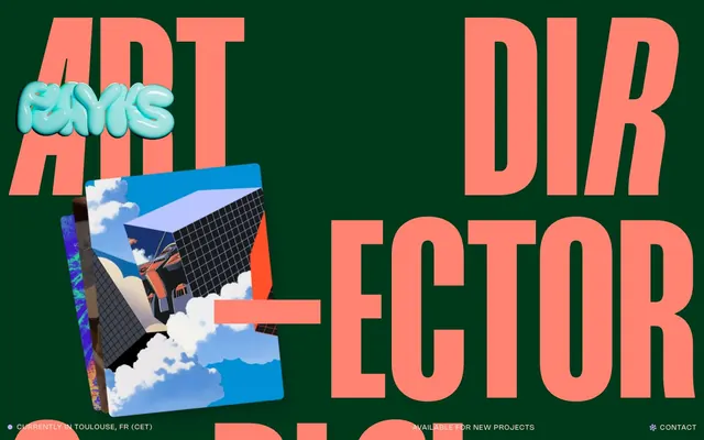
Preview image. Unlock full-res
Overlapping typographic playground
Color palette
Primary background for text elements and sometimes body sections, providing a rich, dark base
Dominant accent for large headlines, links, and decorative elements, injecting high energy and prominence
Secondary accent for navigation items, subheadings, and interactive elements, adding a vibrant yet softer highlight
Gray accent for outlined action borders, linked labels, and lightweight interactive emphasis. Do not promote it to the primary CTA color
Accent card backgrounds, providing subtle color variation within content blocks
Deep, vivid background for specific card elements, adding a strong color punch
Decorative accent for icons and special elements, a vibrant, cool contrast to other brand colors
Deepest canvas background, primary text, and neutral button borders, foundational for high contrast
Secondary surface background, contributing to the dark theme while offering slight differentiation from pure black
Card backgrounds and elevated surfaces, providing a slightly lighter dark tone for layered content
Muted background color for specific body sections or decorative blocks, a softer iteration of the green theme
Subtler text color and borders for lower-prominence elements, a very light near-gray
Typography
- Weights
- 400, 600
- Sizes
- 14px, 18px
- Line height
- 0.85, 1.1, 1.2, 1.35
- Letter spacing
- 0.1em
- Fallback
- Montserrat
Primary body text, navigation elements, and captions. Its tight tracking and varied line heights contribute to the compact, dense feel where even small text has strong presence.
- Weights
- 500, 700
- Sizes
- 32px, 40px, 48px, 88px, 94px, 97px, 144px, 256px, 518px
- Line height
- 0.8, 0.85, 1, 1.2
- Letter spacing
- 0.015em at 32px, 0.025em at 518px
- Fallback
- Anton
Primary display headlines and section titles. Its extreme scale and slightly exaggerated letter-spacing create an impactful, editorial presence that is a core part of the brand's visual identity.
- Weights
- 400
- Sizes
- 13px
- Line height
- 1.2
- Fallback
- Inter
Used for utility text, small buttons, and iconic labels where legibility and functional clarity are paramount.
Spacing & shape
Elevation
Components
Transparent background, text color typically #000000 or #ffe0ce, with no explicit padding or border radius. Interactivity is conveyed through hover states or implicit context.
Transparent background, border color #ffe0ce, text color #ffe0ce, 900px border radius (pill shape). No explicit padding given the data focuses on minimal buttons.
Background color #2c2f34, 6px border radius, no box shadow by default. Features 16px horizontal padding and 12px vertical padding.
Background color #2c2f34, 10px border radius, with a compound shadow: rgba(0, 0, 0, 0.01) 21px 44px 20px 0px, rgba(0, 0, 0, 0.05) 12px 25px 17px 0px, rgba(0, 0, 0, 0.09) 5px 11px 12px 0px, rgba(0, 0, 0, 0.1) 1px 3px 7px 0px. No explicit padding.
Background color from a range of #2d0458, #1e1779, #977eac, #002a3b. 10px border radius. No shadows.
Guidelines
- Prioritize legibility for all text over pure aesthetic, especially with overlapping graphic elements.
- Use Mango Grotesque for all display-level headings (32px-518px), varying weight and size to create visual hierarchy and impact.
- Employ Deep Forest (#00381c) as a foundational dark background for sections that need maximum brand presence.
- Utilize Coral Punch (#ff8370) and Lavender Haze (#d1adff) as primary and secondary accents for headings and interactive elements.
- Implement the 900px border radius for all interactive buttons and tags to maintain the distinct pill-shape.
- Maintain a clear distinction between the Charcoal Grey (#272221) secondary background and Slate Surface (#2c2f34) card backgrounds to establish subtle layering.
- Ensure the Vanilla Beam (#ffe0ce) outlined button is used for primary actions to provide a consistent interactive cue.
- Avoid using light backgrounds. The system is fundamentally dark-themed.
- Do not introduce new typefaces. Limit typography to Nohemi, Mango Grotesque, and Arial.
- Do not deviate from the defined color palette; new colors will disrupt the high-contrast aesthetic.
- Avoid generic rectangular buttons; all buttons should have a 900px border radius for visual identity.
- Do not over-use box shadows; reserve them for specific elevated card variants to maintain their impact.
- Do not apply large, standard padding to components. The system favors compact and sometimes edge-to-edge content.
- Avoid excessive spacing between elements; the design emphasizes density and overlapping visuals.
About this system
ShowHide
Flayks employs a dark, high-contrast, and playfully chaotic visual system. Bold, oversized typography in vivid colors dominates the layout, creating a dense, almost overwhelming textual landscape. Surfaces are predominantly dark, acting as a backdrop for energetic text and accent elements. The system feels dynamic and experimental, with elements often overlapping or being partially obscured, emphasizing a sense of motion and irreverence.
The page uses a maximum width of 1800px, but elements frequently break out of this constraint for visual impact, especially large typographic elements. The hero section is full-bleed, dominated by oversized, dynamically positioned text, creating a strong editorial and art-director aesthetic. Section rhythm is less about alternating bands and more about distinct content blocks that sometimes overlap or appear dynamically placed. Content arrangement is often asymmetrical, balancing large text blocks with project cards or abstract visuals. There's a preference for dynamic visual composition over strict grid alignment, although project showcases might adopt a looser card grid. The overall density is high, with visual elements competing for attention, contributing to a maximalist feel. Navigation is minimal, often relegated to small contextual links or a sticky header.
Imagery on Flayks is primarily abstract and graphical, often incorporating digital art, geometric shapes, and stylized 3D renders. Photography, when present, is usually high contrast or desaturated, integrated into these graphic compositions rather than standalone. Images are frequently overlapped, masked, or have raw edges, contributing to the chaotic and energetic feel. Icons are typically outlined and monochromatic but can adopt brand accent colors like Ocean Dream, with a medium stroke weight. The imagery serves a decorative atmospheric purpose, enhancing the artistic and experimental brand identity.
Reminiscent of Huge Inc., Active Theory, Readymag, Locomotive Agency.
# Flayks — Style Reference
> Overlapping typographic playground

**Theme:** dark

**Site:** https://flayks.com

Flayks employs a dark, high-contrast, and playfully chaotic visual system. Bold, oversized typography in vivid colors dominates the layout, creating a dense, almost overwhelming textual landscape. Surfaces are predominantly dark, acting as a backdrop for energetic text and accent elements. The system feels dynamic and experimental, with elements often overlapping or being partially obscured, emphasizing a sense of motion and irreverence.

## Tokens — Colors

| Name | Value | Token | Role |
|------|------|------|------|
| Deep Forest | `#00381c` | `--color-deep-forest` | Primary background for text elements and sometimes body sections, providing a rich, dark base |
| Coral Punch | `#ff8370` | `--color-coral-punch` | Dominant accent for large headlines, links, and decorative elements, injecting high energy and prominence |
| Lavender Haze | `#d1adff` | `--color-lavender-haze` | Secondary accent for navigation items, subheadings, and interactive elements, adding a vibrant yet softer highlight |
| Vanilla Beam | `#ffe0ce` | `--color-vanilla-beam` | Gray accent for outlined action borders, linked labels, and lightweight interactive emphasis. Do not promote it to the primary CTA color |
| Ink Blue | `#002a3b` | `--color-ink-blue` | Accent card backgrounds, providing subtle color variation within content blocks |
| Indigo Abyss | `#2d0458` | `--color-indigo-abyss` | Deep, vivid background for specific card elements, adding a strong color punch |
| Ocean Dream | `#55f9ff` | `--color-ocean-dream` | Decorative accent for icons and special elements, a vibrant, cool contrast to other brand colors |
| Void Black | `#000000` | `--color-void-black` | Deepest canvas background, primary text, and neutral button borders, foundational for high contrast |
| Charcoal Grey | `#272221` | `--color-charcoal-grey` | Secondary surface background, contributing to the dark theme while offering slight differentiation from pure black |
| Slate Surface | `#2c2f34` | `--color-slate-surface` | Card backgrounds and elevated surfaces, providing a slightly lighter dark tone for layered content |
| Soft Spruce | `#546f57` | `--color-soft-spruce` | Muted background color for specific body sections or decorative blocks, a softer iteration of the green theme |
| Whisper White | `#f6e9d9` | `--color-whisper-white` | Subtler text color and borders for lower-prominence elements, a very light near-gray |

## Tokens — Typography

### Nohemi
- **Substitute:** Montserrat
- **Weights:** 400, 600
- **Sizes:** 14px, 18px
- **Line height:** 0.85, 1.1, 1.2, 1.35
- **Letter spacing:** 0.1em
- **Role:** Primary body text, navigation elements, and captions. Its tight tracking and varied line heights contribute to the compact, dense feel where even small text has strong presence.

### Mango Grotesque
- **Substitute:** Anton
- **Weights:** 500, 700
- **Sizes:** 32px, 40px, 48px, 88px, 94px, 97px, 144px, 256px, 518px
- **Line height:** 0.8, 0.85, 1, 1.2
- **Letter spacing:** 0.015em at 32px, 0.025em at 518px
- **Role:** Primary display headlines and section titles. Its extreme scale and slightly exaggerated letter-spacing create an impactful, editorial presence that is a core part of the brand's visual identity.

### Arial
- **Substitute:** Inter
- **Weights:** 400
- **Sizes:** 13px
- **Line height:** 1.2
- **Role:** Used for utility text, small buttons, and iconic labels where legibility and functional clarity are paramount.

## Tokens — Type Scale

| Role | Size | Line height | Letter spacing |
|------|------|------|------|
| caption | 13px | 1.2 | — |
| body-lg | 18px | 1.2 | 1.8px |
| heading-sm | 32px | 1 | 4.8px |
| heading | 40px | 0.85 | 8px |
| heading-lg | 48px | 0.85 | 12px |
| display | 518px | 0.8 | 129.5px |

## Tokens — Spacing

- **Max width:** 1800px
- **Section gap:** 29px
- **Card padding:** 16px
- **Element gap:** 4px

## Tokens — Radius

- **General:** 6px
- **Buttons:** 900px
- **Cards:** 6px
- **largeElements:** 10px

## Tokens — Elevation

- **Card:** `rgba(0, 0, 0, 0.01) 21px 44px 20px 0px, rgba(0, 0, 0, 0.05) 12px 25px 17px 0px, rgba(0, 0, 0, 0.09) 5px 11px 12px 0px, rgba(0, 0, 0, 0.1) 1px 3px 7px 0px`
- **Deep Elevated Card:** `rgba(0, 0, 0, 0.01) 0px 62px 25px 0px, rgba(0, 0, 0, 0.05) 0px 35px 21px 0px, rgba(0, 0, 0, 0.09) 0px 16px 16px 0px, rgba(0, 0, 0, 0.1) 0px 4px 9px 0px`
- **Max Elevated Card:** `rgba(0, 0, 0, 0.01) 0px 262px 105px 0px, rgba(0, 0, 0, 0.05) 0px 148px 89px 0px, rgba(0, 0, 0, 0.09) 0px 66px 66px 0px, rgba(0, 0, 0, 0.1) 0px 16px 36px 0px`

## Layout

The page uses a maximum width of 1800px, but elements frequently break out of this constraint for visual impact, especially large typographic elements. The hero section is full-bleed, dominated by oversized, dynamically positioned text, creating a strong editorial and art-director aesthetic. Section rhythm is less about alternating bands and more about distinct content blocks that sometimes overlap or appear dynamically placed. Content arrangement is often asymmetrical, balancing large text blocks with project cards or abstract visuals. There's a preference for dynamic visual composition over strict grid alignment, although project showcases might adopt a looser card grid. The overall density is high, with visual elements competing for attention, contributing to a maximalist feel. Navigation is minimal, often relegated to small contextual links or a sticky header.

## Imagery

Imagery on Flayks is primarily abstract and graphical, often incorporating digital art, geometric shapes, and stylized 3D renders. Photography, when present, is usually high contrast or desaturated, integrated into these graphic compositions rather than standalone. Images are frequently overlapped, masked, or have raw edges, contributing to the chaotic and energetic feel. Icons are typically outlined and monochromatic but can adopt brand accent colors like Ocean Dream, with a medium stroke weight. The imagery serves a decorative atmospheric purpose, enhancing the artistic and experimental brand identity.

## Components

### Ghost Text Button
*Interactive element for navigation and actions within content.*

Transparent background, text color typically #000000 or #ffe0ce, with no explicit padding or border radius. Interactivity is conveyed through hover states or implicit context.

### Outlined Accent Button
*Secondary action or navigational links where visual hierarchy needs to be present but not dominant.*

Transparent background, border color #ffe0ce, text color #ffe0ce, 900px border radius (pill shape). No explicit padding given the data focuses on minimal buttons.

### Standard Card
*Group related content, such as project entries or information blocks.*

Background color #2c2f34, 6px border radius, no box shadow by default. Features 16px horizontal padding and 12px vertical padding.

### Elevated Card
*Highlight key content or projects with a subtle sense of depth.*

Background color #2c2f34, 10px border radius, with a compound shadow: rgba(0, 0, 0, 0.01) 21px 44px 20px 0px, rgba(0, 0, 0, 0.05) 12px 25px 17px 0px, rgba(0, 0, 0, 0.09) 5px 11px 12px 0px, rgba(0, 0, 0, 0.1) 1px 3px 7px 0px. No explicit padding.

### Dark Accent Card
*Visually distinct content blocks, often used for project showcases with specific visual themes.*

Background color from a range of #2d0458, #1e1779, #977eac, #002a3b. 10px border radius. No shadows.

## Guidelines

### Do

- Prioritize legibility for all text over pure aesthetic, especially with overlapping graphic elements.
- Use Mango Grotesque for all display-level headings (32px-518px), varying weight and size to create visual hierarchy and impact.
- Employ Deep Forest (#00381c) as a foundational dark background for sections that need maximum brand presence.
- Utilize Coral Punch (#ff8370) and Lavender Haze (#d1adff) as primary and secondary accents for headings and interactive elements.
- Implement the 900px border radius for all interactive buttons and tags to maintain the distinct pill-shape.
- Maintain a clear distinction between the Charcoal Grey (#272221) secondary background and Slate Surface (#2c2f34) card backgrounds to establish subtle layering.
- Ensure the Vanilla Beam (#ffe0ce) outlined button is used for primary actions to provide a consistent interactive cue.

### Don't

- Avoid using light backgrounds. The system is fundamentally dark-themed.
- Do not introduce new typefaces. Limit typography to Nohemi, Mango Grotesque, and Arial.
- Do not deviate from the defined color palette; new colors will disrupt the high-contrast aesthetic.
- Avoid generic rectangular buttons; all buttons should have a 900px border radius for visual identity.
- Do not over-use box shadows; reserve them for specific elevated card variants to maintain their impact.
- Do not apply large, standard padding to components. The system favors compact and sometimes edge-to-edge content.
- Avoid excessive spacing between elements; the design emphasizes density and overlapping visuals.

## Agent Prompt Guide

### Quick Color Reference
text: #000000
background: #000000
border: #ffe0ce
accent: #ff8370
primary action: #ffe0ce (outlined action border)

### 3-5 Example Component Prompts
1. Create a primary headline: 'Digital Designer' using Mango Grotesque weight 700 at 518px, color #ff8370, letter-spacing 129.5px, line-height 0.8.
2. Create a ghost navigation link: 'Contact' using Nohemi weight 400 at 14px, color #ffe0ce, letter-spacing 1.4px, on a #000000 background.
3. Create an outlined pill button: 'View Project' with a 900px border radius, border color #ffe0ce, text color #ffe0ce, using Nohemi weight 400 at 14px. Background is transparent.
4. Create a Standard Card: background #2c2f34, 6px border radius, 16px horizontal padding and 12px vertical padding. Inside, place a title using Nohemi weight 600 at 18px, color #ffe0ce.
5. Create an Elevated Card: background #2c2f34, 10px border radius, box-shadow rgba(0, 0, 0, 0.01) 21px 44px 20px 0px, rgba(0, 0, 0, 0.05) 12px 25px 17px 0px, rgba(0, 0, 0, 0.09) 5px 11px 12px 0px, rgba(0, 0, 0, 0.1) 1px 3px 7px 0px.
More like this





Keep what you find
A free account saves references to boards and can send you a weekly email of picks based on what you save.
To see every result, go Pro.