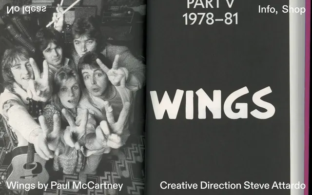
Preview image. Unlock full-res
High-contrast editorial publication
Color palette
Page backgrounds, prominent text (on dark), borders, ghost button outlines
Primary surface background, main body text, navigation elements, footer text
General body text for readability, subtle borders
Typography
- Weights
- 400, 500
- Sizes
- 36px, 48px, 331px
- Line height
- 1.05, 1.1, 1.52
- Letter spacing
- -0.052em at 36px/48px, -0.010em at 331px
- Fallback
- Inter
Primary display font for headings and prominent editorial text. Its distinct letterforms and tight tracking at larger sizes create a bold, modern, almost logotype-like feel.
- Weights
- 400
- Sizes
- 16px
- Line height
- 1.5
- Letter spacing
- normal
- Fallback
- Segoe UI, Apple System
Body text and functional UI elements where high readability and system-level consistency are preferred.
Spacing & shape
Components
Text in Ink Black (#000000) or Canvas White (#ffffff) using ABC Diatype 400 at appropriate sizes for navigation, with no background or specific padding, relying on surrounding whitespace for interaction cues.
Utilizes ABC Diatype at large sizes (48px or 331px), typically in Canvas White (#ffffff) against Ink Black (#000000) or vice-versa, with tight letter spacing for visual impact. Has a distinct vertical rhythm of 202px below it.
Images are presented with a 15px border-radius, giving a subtle softness to photographic elements within the otherwise sharp design. Text associated with images (e.g., captions) would typically use Canvas White #ffffff or Text Gray #212529.
Ink Black (#000000) background with Canvas White (#ffffff) text, structured with internal padding of 19px top/bottom and 29px left/right. Contains multiple interactive text links.
Guidelines
- Prioritize Canvas White (#ffffff) and Ink Black (#000000) for all primary backgrounds and text, maintaining high contrast.
- Use ABC Diatype for all headings and prominent textual elements, applying the specified letter-spacing for each size.
- Maintain generous spacing around sections, specifically a 202px bottom margin after primary content blocks.
- Apply a 15px border-radius consistently to all images for a subtle softening effect.
- Ensure UI elements for navigation and information are simple text links, without pronounced button styling, using either Canvas White (#ffffff) or Ink Black (#000000).
- Employ `system-ui` for all body text and secondary informational content at 16px weight 400 with normal letter-spacing and 1.5 line height.
- Avoid introducing additional chromatic colors; the system relies on a strictly monochromatic palette.
- Do not use box-shadows or complex gradients; the design aesthetic is intentionally flat.
- Do not vary from the specified line heights and letter spacing for ABC Diatype; these are critical to the typographic identity.
- Do not add heavy borders or background fills to interactive elements; they should remain text-based or 'ghost' styled.
- Avoid dense informational blocks; embrace spacious layouts to create visual breathing room.
- Do not use decorative imagery that detracts from the stark, editorial focus; images should be integral to the content.
About this system
ShowHide
No Ideas employs a stark, editorial aesthetic, reminiscent of a printed publication. The design is monochromatic, relying almost entirely on black and white to establish a clear hierarchy and dramatic contrast, with emphasis on robust typography. Layouts are clean and spacious, emphasizing content over decorative elements, creating a focused and impactful visual experience. The system avoids shadows and complex gradients, prioritizing a flat, graphic quality.
The page embraces a full-bleed content model where sections can stretch across the viewport width. The hero section, as seen with the 'WINGS' title, features a full-bleed Ink Black background with large, centered Canvas White text. The section rhythm is defined by large vertical gaps (202px) between content blocks and a clear contrast shift between dark and light backgrounds. Content is often presented in a simple, stacked or implied two-column arrangement, focusing on strong typographic statements. Navigation is minimal, consisting of a top bar for core links and a detailed footer. The overall density is spacious, allowing elements significant room to breathe.
The site uses photography as its primary imagery. These are integrated as large, full-bleed backgrounds or large, contained elements, often in black and white or highly desaturated states. The treatment is direct, with images sometimes having a 15px border-radius for a refined edge. There are no illustrations or abstract graphics. The imagery serves to set a mood or showcase work within an overarching editorial publication style, rather than providing explicit product functionality or step-by-step guides. The density is image-heavy in sections, defining visual chapters.
Reminiscent of AIGA Journal, The New York Times (digital), Actual Source, Pentagram.
# No Ideas — Style Reference
> High-contrast editorial publication

**Theme:** dark

**Site:** https://noideas.website

No Ideas employs a stark, editorial aesthetic, reminiscent of a printed publication. The design is monochromatic, relying almost entirely on black and white to establish a clear hierarchy and dramatic contrast, with emphasis on robust typography. Layouts are clean and spacious, emphasizing content over decorative elements, creating a focused and impactful visual experience. The system avoids shadows and complex gradients, prioritizing a flat, graphic quality.

## Tokens — Colors

| Name | Value | Token | Role |
|------|------|------|------|
| Canvas White | `#ffffff` | `--color-canvas-white` | Page backgrounds, prominent text (on dark), borders, ghost button outlines |
| Ink Black | `#000000` | `--color-ink-black` | Primary surface background, main body text, navigation elements, footer text |
| Text Gray | `#212529` | `--color-text-gray` | General body text for readability, subtle borders |

## Tokens — Typography

### ABC Diatype
- **Substitute:** Inter
- **Weights:** 400, 500
- **Sizes:** 36px, 48px, 331px
- **Line height:** 1.05, 1.1, 1.52
- **Letter spacing:** -0.052em at 36px/48px, -0.010em at 331px
- **Role:** Primary display font for headings and prominent editorial text. Its distinct letterforms and tight tracking at larger sizes create a bold, modern, almost logotype-like feel.

### system-ui
- **Substitute:** Segoe UI, Apple System
- **Weights:** 400
- **Sizes:** 16px
- **Line height:** 1.5
- **Letter spacing:** normal
- **Role:** Body text and functional UI elements where high readability and system-level consistency are preferred.

## Tokens — Type Scale

| Role | Size | Line height | Letter spacing |
|------|------|------|------|
| body | 16px | 1.5 | — |
| heading | 36px | 1.05 | -0.74px |
| heading-lg | 48px | 1.1 | -0.96px |
| display | 331px | 1.52 | -3.31px |

## Tokens — Spacing

- **Element gap:** 29px

## Tokens — Radius

- **image:** 15px

## Layout

The page embraces a full-bleed content model where sections can stretch across the viewport width. The hero section, as seen with the 'WINGS' title, features a full-bleed Ink Black background with large, centered Canvas White text. The section rhythm is defined by large vertical gaps (202px) between content blocks and a clear contrast shift between dark and light backgrounds. Content is often presented in a simple, stacked or implied two-column arrangement, focusing on strong typographic statements. Navigation is minimal, consisting of a top bar for core links and a detailed footer. The overall density is spacious, allowing elements significant room to breathe.

## Imagery

The site uses photography as its primary imagery. These are integrated as large, full-bleed backgrounds or large, contained elements, often in black and white or highly desaturated states. The treatment is direct, with images sometimes having a 15px border-radius for a refined edge. There are no illustrations or abstract graphics. The imagery serves to set a mood or showcase work within an overarching editorial publication style, rather than providing explicit product functionality or step-by-step guides. The density is image-heavy in sections, defining visual chapters.

## Components

### Ghost Navigation Link
*Interactive text link within headers and footers.*

Text in Ink Black (#000000) or Canvas White (#ffffff) using ABC Diatype 400 at appropriate sizes for navigation, with no background or specific padding, relying on surrounding whitespace for interaction cues.

### Editorial Header
*Primary heading for sections or pages.*

Utilizes ABC Diatype at large sizes (48px or 331px), typically in Canvas White (#ffffff) against Ink Black (#000000) or vice-versa, with tight letter spacing for visual impact. Has a distinct vertical rhythm of 202px below it.

### Image Card
*Container for visual content.*

Images are presented with a 15px border-radius, giving a subtle softness to photographic elements within the otherwise sharp design. Text associated with images (e.g., captions) would typically use Canvas White #ffffff or Text Gray #212529.

### Editorial Footer Section
*Bottom navigation and additional information block.*

Ink Black (#000000) background with Canvas White (#ffffff) text, structured with internal padding of 19px top/bottom and 29px left/right. Contains multiple interactive text links.

## Guidelines

### Do

- Prioritize Canvas White (#ffffff) and Ink Black (#000000) for all primary backgrounds and text, maintaining high contrast.
- Use ABC Diatype for all headings and prominent textual elements, applying the specified letter-spacing for each size.
- Maintain generous spacing around sections, specifically a 202px bottom margin after primary content blocks.
- Apply a 15px border-radius consistently to all images for a subtle softening effect.
- Ensure UI elements for navigation and information are simple text links, without pronounced button styling, using either Canvas White (#ffffff) or Ink Black (#000000).
- Employ `system-ui` for all body text and secondary informational content at 16px weight 400 with normal letter-spacing and 1.5 line height.

### Don't

- Avoid introducing additional chromatic colors; the system relies on a strictly monochromatic palette.
- Do not use box-shadows or complex gradients; the design aesthetic is intentionally flat.
- Do not vary from the specified line heights and letter spacing for ABC Diatype; these are critical to the typographic identity.
- Do not add heavy borders or background fills to interactive elements; they should remain text-based or 'ghost' styled.
- Avoid dense informational blocks; embrace spacious layouts to create visual breathing room.
- Do not use decorative imagery that detracts from the stark, editorial focus; images should be integral to the content.

## Agent Prompt Guide

Quick Color Reference:
text: #212529
background: #000000
border: #ffffff
accent: no distinct accent color
primary action: no distinct CTA color

Example Component Prompts:
1. Create a page hero section: background Ink Black (#000000). Headline 'WINGS' using ABC Diatype at 331px, weight 400, color Canvas White (#ffffff), letter-spacing -0.010em. Subtitle 'PART V 1978–81' using ABC Diatype at 36px, weight 500, color Canvas White (#ffffff), letter-spacing -0.052em.
2. Design a minimalist footer: background Ink Black (#000000), internal padding 19px vertical, 29px horizontal. Include navigation links like 'Info' and 'Shop' with text color Canvas White (#ffffff), using ABC Diatype 36px, weight 400, letter-spacing -0.052em.
3. Implement a text block for 'Creative Direction Steve Attardo': text color Canvas White (#ffffff), using ABC Diatype 36px, weight 400, letter-spacing -0.052em, positioned over a Ink Black (#000000) background.
More like this





Keep what you find
A free account saves references to boards and can send you a weekly email of picks based on what you save.
To see every result, go Pro.