Preview image. Unlock full-res
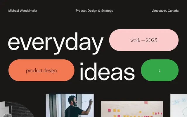
Dark canvas, bold blobs
Color palette
Primary action background, active badge, success states. Provides a vivid, high-contrast focal point
Decorative card background, visual interest element. Creates a soft, warm highlight
Decorative card background, visual interest element. Adds a strong, vibrant pop
Neutral form states, badge text, and quiet UI feedback where color should stay understated. Do not promote it to the primary CTA color
Page and section backgrounds, primary surface for content
Primary text, ghost button borders, button text on accent colors
Muted text, secondary information, divider lines
Subtle borders and dividers on dark backgrounds
Typography
- Weights
- 100
- Sizes
- 12px, 24px, 32px, 187px
- Line height
- 0.9, 1, 1.33, 2.5, 2.67
- Letter spacing
- 0.2000em
- Fallback
- system-ui
Headings and prominent display text that demand attention with a wide, almost whispering character. Its extreme lightness is a signature element.
- Weights
- 100
- Sizes
- 40px, 50px, 80px
- Line height
- 1.2, 1.3, 2.4
- Fallback
- Playfair Display
Editorial headings, creating an elegant, serif counterpoint to the sans-serif. Its light weight keeps it refined.
- Weights
- 400
- Sizes
- 16px
- Line height
- 1.2
- Fallback
- Arial
Body text and functional UI elements where clarity and neutrality are prioritized.
Spacing & shape
Components
Filled with Spring Bud (#34a847), text is Midnight Ink (#000000), 72px radius. Padding 29px vertical, 48px horizontal. Uses PolySans at 24px.
Transparent background, Cloud White (#ffffff) text and 2.5px border, 72px radius. Padding 29px vertical, 48px horizontal. Uses PolySans at 24px.
Flamingo Pink (#fbcbcb) background, extreme 10000px radius to create a 'blob' shape. No padding, acting purely as a background visual.
Sunset Orange (#f27851) background, extreme 10000px radius to create a 'blob' shape. No padding, acting purely as a background visual.
Spring Bud (#34a847) background, extreme 10000px radius to create a 'blob' shape. No padding, acting purely as a background visual.
Transparent background, Cloud White (#ffffff) text and 2.5px border, 48px radius. Padding 29px vertical, 61px horizontal. Uses PolySans at 24px.
Spring Bud (#34a847) background, Midnight Ink (#000000) text, 48px radius. Padding 29px vertical, 61px horizontal. Uses PolySans at 24px.
1px solid Deep Graphite (#302f2d) border.
Guidelines
- Use Canvas Dark (#191816) as the base background for most sections.
- Apply Cloud White (#ffffff) for all primary text elements, including headings and body copy.
- Utilize PolySans Bold (weight 100) and Canela Web (weight 100) at large sizes and Cloud White for impactful headings.
- Embed accent colors (Flamingo Pink #fbcbcb, Sunset Orange #f27851, Spring Bud #34a847) in large, irregular 10000px radius 'blob' shapes for visual interest where appropriate.
- Implement 72px radius for all interactive buttons and 48px for badges to maintain the rounded, soft aesthetic.
- Maintain a clear visual hierarchy by using Spring Bud (#34a847) only for primary actions and key highlights.
- Ensure consistent spaciousness with column/element gaps of 22px and section gaps of 96px.
- Avoid using multiple accent colors in close proximity; let one color pop per visual cluster.
- Do not use box-shadows or significant elevation; maintain a flat, graphic aesthetic.
- Refrain from tight, dense layouts; prioritize generous spacing for a breathy, premium feel.
- Do not use generic system fonts for prominent headings; PolySans and Canela Web are critical for brand identity.
- Avoid sharp corners; all interactive elements and decorative shapes should feature extreme rounding (48px, 72px, 10000px).
- Do not vary font weights for PolySans headers; the consistent weight 100 is a signature choice.
- Avoid using any other color than Cloud White (#ffffff) for primary text on dark backgrounds.
About this system
ShowHide
This design system presents a dark canvas with strong typographical elements and sporadic, vibrant accents. Large, custom typefaces create a bold, editorial feel, while custom-shaped, brightly colored interactive elements punctuate the monochrome background. The overall impression is one of confident, art-directed simplicity, eschewing typical interface conventions for a more graphic, playful approach.
The page operates on a contained max-width of 1760px, centered on the screen. The hero section features large, custom typography and vibrant 'blob' components, creating a bold, graphic introduction. Section rhythm is driven by generous vertical spacing (96px section gaps) and the alternation between text-dominant blocks and photo grids. Content often appears in a simple two-column layout for text and images, or in a multi-column grid for work showcases. Navigation is minimal and fixed at the top, integrating subtly into the dark canvas.
This system primarily uses embedded photography treated as full-bleed, unmasked rectangles set against the dark canvas for product and team shots. There's a mix of candid lifestyle and focused close-ups. Icons are minimal, subtle, and appear as outlined strokes in Cloud White. Imagery, especially the full-bleed photos, acts as content showcases rather than purely decorative elements, often integrated into larger grid layouts with generous spacing.
Reminiscent of Alinea, Blinkist, Framer, Pitch.
# Michael Wandelmaier — Style Reference
> Dark canvas, bold blobs

**Theme:** dark

**Site:** https://wandelmaier.com

This design system presents a dark canvas with strong typographical elements and sporadic, vibrant accents. Large, custom typefaces create a bold, editorial feel, while custom-shaped, brightly colored interactive elements punctuate the monochrome background. The overall impression is one of confident, art-directed simplicity, eschewing typical interface conventions for a more graphic, playful approach.

## Tokens — Colors

| Name | Value | Token | Role |
|------|------|------|------|
| Spring Bud | `#34a847` | `--color-spring-bud` | Primary action background, active badge, success states. Provides a vivid, high-contrast focal point |
| Flamingo Pink | `#fbcbcb` | `--color-flamingo-pink` | Decorative card background, visual interest element. Creates a soft, warm highlight |
| Sunset Orange | `#f27851` | `--color-sunset-orange` | Decorative card background, visual interest element. Adds a strong, vibrant pop |
| Midnight Ink | `#000000` | `--color-midnight-ink` | Neutral form states, badge text, and quiet UI feedback where color should stay understated. Do not promote it to the primary CTA color |
| Canvas Dark | `#191816` | `--color-canvas-dark` | Page and section backgrounds, primary surface for content |
| Cloud White | `#ffffff` | `--color-cloud-white` | Primary text, ghost button borders, button text on accent colors |
| Soft Gray | `#a9a9a9` | `--color-soft-gray` | Muted text, secondary information, divider lines |
| Deep Graphite | `#302f2d` | `--color-deep-graphite` | Subtle borders and dividers on dark backgrounds |

## Tokens — Typography

### PolySans
- **Substitute:** system-ui
- **Weights:** 100
- **Sizes:** 12px, 24px, 32px, 187px
- **Line height:** 0.9, 1, 1.33, 2.5, 2.67
- **Letter spacing:** 0.2000em
- **Role:** Headings and prominent display text that demand attention with a wide, almost whispering character. Its extreme lightness is a signature element.

### Canela Web
- **Substitute:** Playfair Display
- **Weights:** 100
- **Sizes:** 40px, 50px, 80px
- **Line height:** 1.2, 1.3, 2.4
- **Role:** Editorial headings, creating an elegant, serif counterpoint to the sans-serif. Its light weight keeps it refined.

### sans-serif
- **Substitute:** Arial
- **Weights:** 400
- **Sizes:** 16px
- **Line height:** 1.2
- **Role:** Body text and functional UI elements where clarity and neutrality are prioritized.

## Tokens — Type Scale

Perfect Fifth (1.5) from 16px base.

| Role | Size | Line height | Letter spacing |
|------|------|------|------|
| body | 16px | 1.2 | — |
| subheading | 24px | 1.33 | 4.8px |
| heading | 32px | 1.33 | 6.4px |
| heading-lg | 40px | 1.2 | — |
| display-sm | 50px | 1.3 | — |
| display-md | 80px | 1.2 | — |
| display-lg | 187px | 0.9 | 37.4px |

## Tokens — Spacing

- **Max width:** 1760px
- **Section gap:** 96px
- **Card padding:** 32px
- **Element gap:** 22px

## Tokens — Radius

- **Buttons:** 72px
- **Cards:** 10000px
- **badges:** 48px

## Layout

The page operates on a contained max-width of 1760px, centered on the screen. The hero section features large, custom typography and vibrant 'blob' components, creating a bold, graphic introduction. Section rhythm is driven by generous vertical spacing (96px section gaps) and the alternation between text-dominant blocks and photo grids. Content often appears in a simple two-column layout for text and images, or in a multi-column grid for work showcases. Navigation is minimal and fixed at the top, integrating subtly into the dark canvas.

## Imagery

This system primarily uses embedded photography treated as full-bleed, unmasked rectangles set against the dark canvas for product and team shots. There's a mix of candid lifestyle and focused close-ups. Icons are minimal, subtle, and appear as outlined strokes in Cloud White. Imagery, especially the full-bleed photos, acts as content showcases rather than purely decorative elements, often integrated into larger grid layouts with generous spacing.

## Components

### Primary Action Button
*Main call to action, visually distinct and interactive.*

Filled with Spring Bud (#34a847), text is Midnight Ink (#000000), 72px radius. Padding 29px vertical, 48px horizontal. Uses PolySans at 24px.

### Ghost Outline Button
*Secondary action or navigation link, subtle and integrates with the dark theme.*

Transparent background, Cloud White (#ffffff) text and 2.5px border, 72px radius. Padding 29px vertical, 48px horizontal. Uses PolySans at 24px.

### Accent Blob Card - Flamingo Pink
*Decorative background for featured items or visual breaks.*

Flamingo Pink (#fbcbcb) background, extreme 10000px radius to create a 'blob' shape. No padding, acting purely as a background visual.

### Accent Blob Card - Sunset Orange
*Decorative background for featured items or visual breaks.*

Sunset Orange (#f27851) background, extreme 10000px radius to create a 'blob' shape. No padding, acting purely as a background visual.

### Accent Blob Card - Spring Bud
*Decorative background for featured items or visual breaks.*

Spring Bud (#34a847) background, extreme 10000px radius to create a 'blob' shape. No padding, acting purely as a background visual.

### Standard Badge (Ghost)
*Categorization or tagging, visually lightweight.*

Transparent background, Cloud White (#ffffff) text and 2.5px border, 48px radius. Padding 29px vertical, 61px horizontal. Uses PolySans at 24px.

### Accent Badge (Spring Bud)
*Highlighted categorization or tag, draws attention.*

Spring Bud (#34a847) background, Midnight Ink (#000000) text, 48px radius. Padding 29px vertical, 61px horizontal. Uses PolySans at 24px.

### List Item Divider
*Separates content lines in lists, subtle presence.*

1px solid Deep Graphite (#302f2d) border.

## Guidelines

### Do

- Use Canvas Dark (#191816) as the base background for most sections.
- Apply Cloud White (#ffffff) for all primary text elements, including headings and body copy.
- Utilize PolySans Bold (weight 100) and Canela Web (weight 100) at large sizes and Cloud White for impactful headings.
- Embed accent colors (Flamingo Pink #fbcbcb, Sunset Orange #f27851, Spring Bud #34a847) in large, irregular 10000px radius 'blob' shapes for visual interest where appropriate.
- Implement 72px radius for all interactive buttons and 48px for badges to maintain the rounded, soft aesthetic.
- Maintain a clear visual hierarchy by using Spring Bud (#34a847) only for primary actions and key highlights.
- Ensure consistent spaciousness with column/element gaps of 22px and section gaps of 96px.

### Don't

- Avoid using multiple accent colors in close proximity; let one color pop per visual cluster.
- Do not use box-shadows or significant elevation; maintain a flat, graphic aesthetic.
- Refrain from tight, dense layouts; prioritize generous spacing for a breathy, premium feel.
- Do not use generic system fonts for prominent headings; PolySans and Canela Web are critical for brand identity.
- Avoid sharp corners; all interactive elements and decorative shapes should feature extreme rounding (48px, 72px, 10000px).
- Do not vary font weights for PolySans headers; the consistent weight 100 is a signature choice.
- Avoid using any other color than Cloud White (#ffffff) for primary text on dark backgrounds.

## Agent Prompt Guide

**Quick Color Reference:**
- text: #ffffff
- background: #191816
- border: #a9a9a9
- accent: #fbcbcb
- primary action: #34a847 (filled action)

**Example Component Prompts:**
- Create a ghost button for navigation: text 'Explore Projects', PolySans, weight 100, 24px, #ffffff, 2.5px #ffffff border, 72px radius, 29px vertical/48px horizontal padding.
- Build a hero headline: 'everyday ideas' using PolySans, weight 100, 187px, lineHeight 0.9, #ffffff, letter-spacing 37.4px. Pair it with a 'work - 2023' accent blob in Flamingo Pink (#fbcbcb), 10000px radius, 0 padding.
- Design a list item: left-aligned text 'Upwork' in Cloud White (#ffffff), secondary text 'METALAB • 2021' in Soft Gray (#a9a9a9), on Canvas Dark (#191816) background. Separate with a 1px Deep Graphite (#302f2d) border at the bottom.
- Create an accent badge: Text 'People & Purpose', PolySans, weight 100, 24px, #ffffff, 2.5px #ffffff border, 48px radius, 29px vertical/61px horizontal padding.
More like this





Keep what you find
A free account saves references to boards and can send you a weekly email of picks based on what you save.
To see every result, go Pro.