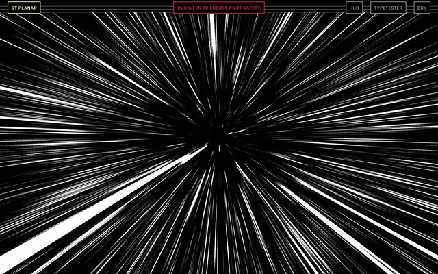
Preview image. Unlock full-res
Midnight mainframe with glowing terminals.
Color palette
Primary action button backgrounds, interactive text, button borders, active accents
Primary Call to Action button background, active state borders, and high-emphasis information. This provides a stark contrast to the violet
Secondary action button backgrounds, elevated card surfaces with a subtle tint
Green outline accent for tags, dividers, and focused UI edges
Red outline accent for tags, dividers, and focused UI edges. Use as a supporting accent, not as a status color
Orange outline accent for tags, dividers, and focused UI edges. Use as a supporting accent, not as a status color
Page background, primary text on bright surfaces, button text on electric purple fills, hairline borders
Interface text, icon strokes, active state borders, text on dark surfaces, accent shadows
Input field backgrounds, subtle elevated surface
Muted text, inactive element borders, secondary information
Fine, utilitarian borders on neutral elements
Typography
- Weights
- 300, 400, 700
- Sizes
- 11px, 14px, 16px, 17px, 20px, 24px, 25px, 32px, 37px, 58px, 86px, 115px, 146px, 187px, 230px, 274px
- Line height
- 0.8, 0.9, 0.95, 1, 1.09, 1.1, 1.14, 1.15, 1.17, 1.19, 1.2, 1.24, 1.43, 1.5, 1.63
- Letter spacing
- -0.2000em, -0.0500em, -0.0100em, -0.0050em, 0.0050em, 0.0080em, 0.0110em, 0.0150em, 0.0200em, 0.0250em, 0.0400em, 0.0460em, 0.0500em, 0.0700em, 0.7000em
- Fallback
- Space Mono, IBM Plex Mono
The sole typeface, GT Planar, defines the entire text hierarchy from micro-interactions to monumental headlines. Its variable weights emphasize precision and stark contrast, making it crucial for the 'cyberpunk utility' aesthetic. The wide range of sizes and letter-spacing values allows for hyper-controlled text density.
Spacing & shape
Elevation
Components
Filled with Electric Violet (#6100ff), black text, no border radius, 0px padding. Focus on background color for interaction.
Transparent background, Electric Violet (#6100ff) text, Electric Violet (#6100ff) 1px border. 5px padding, 0px border-radius.
Deep Space Violet (#29006c) background, Electric Violet (#6100ff) accent text, Electric Violet (#6100ff) 1px border. No border radius, 0px padding.
Fluorescent Green (#00ff85) background, Void Black (#000000) text, Fluorescent Green (#00ff85) 1px border. 25px top/bottom padding, 50px left/right padding, 0px border-radius.
Input Dark (#1a0014) background, Screen White (#ffffff) text, Screen White (#ffffff) 1px border. No border radius, 0px padding.
Transparent background, Alert Red (#ff003d) text. Defined by a 1px Alert Red (#ff003d) border instead of a fill, 10px padding, 0px border-radius.
Transparent background, Safety Yellow (#fcff76) text. Defined by a 1px Safety Yellow (#fcff76) border instead of a fill, 10px padding, 0px border-radius.
Guidelines
- Prioritize Void Black (#000000) as the dominant background color for most sections to maintain a dark, immersive theme.
- Use Electric Violet (#6100ff) only for primary interactive elements, active states, and critical information to maximize its impact.
- Employ the GT Planar typeface exclusively, varying weight and size meticulously to establish hierarchy rather than mixing font families.
- Define interactive elements with stark 1px Screen White (#ffffff) or accent-colored borders (Electric Violet #6100ff, Alert Red #ff003d, Safety Yellow #fcff76) and 0px border-radius for a precise, angular look.
- Apply negative letter-spacing for large display text and positive letter-spacing for smaller, utilitarian text to enhance the precise, engineered feel.
- Use 0px border-radius for most UI elements like buttons, inputs, and cards, reserving 9999px for small, tag-like elements.
- Construct layouts with clear, often horizontal, divisions and compact spacing to pack information densely without feeling cluttered.
- Avoid using soft shadows or gradients that suggest depth or realism, as the system relies on stark contrasts and flat surfaces.
- Do not introduce additional font families; GT Planar is the sole typographic voice.
- Refrain from using pastel or desaturated colors; all accent colors must be vivid and highly saturated.
- Never add rounded corners to primary buttons, inputs, or cards; maintain the hard-edged aesthetic except for very specific tag-like elements.
- Do not use more than two accent colors prominently in a single view to maintain focus and prevent visual noise.
- Avoid large, unbordered blocks of color unless they serve as a full-bleed hero, instead opting for precise borders around elements.
- Do not use generic spacing values; adhere to the 4px base unit and derived tokens for compact, consistent rhythm.
About this system
ShowHide
GT Planar channels 'cyberpunk utility': a deep dark canvas with vibrant, almost neon, monochromatic accents of electric violet and glowing green. Typography is hyper-controlled and precise, often uppercase, with distinct pixel-perfect white borders defining interactive elements. This creates a high-fidelity, command-line interface aesthetic where every visual element serves a clear, functional purpose in a deeply contrasted, high-tech environment.
The page model is full-bleed but features tightly controlled maximum width content areas. The hero section often utilizes a full-viewport, dynamically generated visual background with centered, stark headlines. Section rhythm is primarily seamless, with content blocks often flowing directly into one another or defined by subtle internal dividers rather than alternating background bands. Content arrangement varies from centered stacks of text to more complex, grid-based interactive elements where text and functional UI are integrated directly into the visual experience. The overall density is compact, even within the full-bleed canvas, ensuring information is readily accessible. Navigation is handled via a fixed top bar with minimal, bordered text links.
This design system uses no traditional imagery like photography or illustration. Instead, visual elements are generated dynamically, resembling wireframes or high-speed light trails, contributing to a sense of data visualization and kinetic energy. The focus is entirely on UI elements and stark typography. Icons, where present, are monochromatic outlines with sharp angles and thin strokes.
Reminiscent of The Future is Type, Hyper Island, Certain graphic design portfolios, Gandi.net.
# Gt-planar — Style Reference
> Midnight mainframe with glowing terminals.

**Theme:** dark

**Site:** https://gt-planar.com

GT Planar channels 'cyberpunk utility': a deep dark canvas with vibrant, almost neon, monochromatic accents of electric violet and glowing green. Typography is hyper-controlled and precise, often uppercase, with distinct pixel-perfect white borders defining interactive elements. This creates a high-fidelity, command-line interface aesthetic where every visual element serves a clear, functional purpose in a deeply contrasted, high-tech environment.

## Tokens — Colors

| Name | Value | Token | Role |
|------|------|------|------|
| Electric Violet | `#6100ff` | `--color-electric-violet` | Primary action button backgrounds, interactive text, button borders, active accents |
| Fluorescent Green | `#00ff85` | `--color-fluorescent-green` | Primary Call to Action button background, active state borders, and high-emphasis information. This provides a stark contrast to the violet |
| Deep Space Violet | `#29006c` | `--color-deep-space-violet` | Secondary action button backgrounds, elevated card surfaces with a subtle tint |
| Safety Yellow | `#fcff76` | `--color-safety-yellow` | Green outline accent for tags, dividers, and focused UI edges |
| Alert Red | `#ff003d` | `--color-alert-red` | Red outline accent for tags, dividers, and focused UI edges. Use as a supporting accent, not as a status color |
| Indicator Orange | `#ff8a00` | `--color-indicator-orange` | Orange outline accent for tags, dividers, and focused UI edges. Use as a supporting accent, not as a status color |
| Void Black | `#000000` | `--color-void-black` | Page background, primary text on bright surfaces, button text on electric purple fills, hairline borders |
| Screen White | `#ffffff` | `--color-screen-white` | Interface text, icon strokes, active state borders, text on dark surfaces, accent shadows |
| Input Dark | `#1a0014` | `--color-input-dark` | Input field backgrounds, subtle elevated surface |
| Subtle Gray | `#949494` | `--color-subtle-gray` | Muted text, inactive element borders, secondary information |
| Border Gray | `#606060` | `--color-border-gray` | Fine, utilitarian borders on neutral elements |

## Tokens — Typography

### GT Planar
- **Substitute:** Space Mono, IBM Plex Mono
- **Weights:** 300, 400, 700
- **Sizes:** 11px, 14px, 16px, 17px, 20px, 24px, 25px, 32px, 37px, 58px, 86px, 115px, 146px, 187px, 230px, 274px
- **Line height:** 0.8, 0.9, 0.95, 1, 1.09, 1.1, 1.14, 1.15, 1.17, 1.19, 1.2, 1.24, 1.43, 1.5, 1.63
- **Letter spacing:** -0.2000em, -0.0500em, -0.0100em, -0.0050em, 0.0050em, 0.0080em, 0.0110em, 0.0150em, 0.0200em, 0.0250em, 0.0400em, 0.0460em, 0.0500em, 0.0700em, 0.7000em
- **Role:** The sole typeface, GT Planar, defines the entire text hierarchy from micro-interactions to monumental headlines. Its variable weights emphasize precision and stark contrast, making it crucial for the 'cyberpunk utility' aesthetic. The wide range of sizes and letter-spacing values allows for hyper-controlled text density.

## Tokens — Type Scale

Golden Ratio (1.618) from 16px base.

| Role | Size | Line height | Letter spacing |
|------|------|------|------|
| caption | 11px | 1.43 | 0.05em |
| body-sm | 14px | 1.17 | 0.015em |
| body | 16px | 1.15 | 0.011em |
| subheading | 24px | 1.1 | 0.008em |
| heading | 58px | 0.95 | -0.005em |
| heading-lg | 86px | 0.9 | -0.01em |
| display-sm | 146px | 0.8 | -0.05em |
| display | 274px | 0.8 | -0.2px |

## Tokens — Spacing

- **Section gap:** 25px
- **Card padding:** 25px
- **Element gap:** 5px

## Tokens — Radius

- **Default:** 0px
- **Buttons:** 9999px
- **tags:** 9999px

## Tokens — Elevation

- **Interactive Elements:** `rgb(255, 255, 255) 1px 0px 0px 0px, rgb(255, 255, 255) 0px 1px 0px 0px, rgb(255, 255, 255) 1px 1px 0px 0px, rgb(255, 255, 255) 1px 0px 0px 0px inset, rgb(255, 255, 255) 0px 1px 0px 0px inset`

## Layout

The page model is full-bleed but features tightly controlled maximum width content areas. The hero section often utilizes a full-viewport, dynamically generated visual background with centered, stark headlines. Section rhythm is primarily seamless, with content blocks often flowing directly into one another or defined by subtle internal dividers rather than alternating background bands. Content arrangement varies from centered stacks of text to more complex, grid-based interactive elements where text and functional UI are integrated directly into the visual experience. The overall density is compact, even within the full-bleed canvas, ensuring information is readily accessible. Navigation is handled via a fixed top bar with minimal, bordered text links.

## Imagery

This design system uses no traditional imagery like photography or illustration. Instead, visual elements are generated dynamically, resembling wireframes or high-speed light trails, contributing to a sense of data visualization and kinetic energy. The focus is entirely on UI elements and stark typography. Icons, where present, are monochromatic outlines with sharp angles and thin strokes.

## Components

### Primary Action Button (Violet Fill)
*Main interactive element for actions.*

Filled with Electric Violet (#6100ff), black text, no border radius, 0px padding. Focus on background color for interaction.

### Outlined Button (Violet Border)
*Secondary action or ghost button.*

Transparent background, Electric Violet (#6100ff) text, Electric Violet (#6100ff) 1px border. 5px padding, 0px border-radius.

### Dark Elevated Button (Violet Border)
*Tertiary action or grouped controls.*

Deep Space Violet (#29006c) background, Electric Violet (#6100ff) accent text, Electric Violet (#6100ff) 1px border. No border radius, 0px padding.

### Fluorescent Action Button
*Prominent, high-contrast call to action.*

Fluorescent Green (#00ff85) background, Void Black (#000000) text, Fluorescent Green (#00ff85) 1px border. 25px top/bottom padding, 50px left/right padding, 0px border-radius.

### Text Input
*Data entry fields.*

Input Dark (#1a0014) background, Screen White (#ffffff) text, Screen White (#ffffff) 1px border. No border radius, 0px padding.

### Navigation Link Outlined (Red)
*Accentuated navigation item for warnings/promotions.*

Transparent background, Alert Red (#ff003d) text. Defined by a 1px Alert Red (#ff003d) border instead of a fill, 10px padding, 0px border-radius.

### Navigation Link Outlined (Yellow)
*Accentuated navigation item for warnings/promotions.*

Transparent background, Safety Yellow (#fcff76) text. Defined by a 1px Safety Yellow (#fcff76) border instead of a fill, 10px padding, 0px border-radius.

## Guidelines

### Do

- Prioritize Void Black (#000000) as the dominant background color for most sections to maintain a dark, immersive theme.
- Use Electric Violet (#6100ff) only for primary interactive elements, active states, and critical information to maximize its impact.
- Employ the GT Planar typeface exclusively, varying weight and size meticulously to establish hierarchy rather than mixing font families.
- Define interactive elements with stark 1px Screen White (#ffffff) or accent-colored borders (Electric Violet #6100ff, Alert Red #ff003d, Safety Yellow #fcff76) and 0px border-radius for a precise, angular look.
- Apply negative letter-spacing for large display text and positive letter-spacing for smaller, utilitarian text to enhance the precise, engineered feel.
- Use 0px border-radius for most UI elements like buttons, inputs, and cards, reserving 9999px for small, tag-like elements.
- Construct layouts with clear, often horizontal, divisions and compact spacing to pack information densely without feeling cluttered.

### Don't

- Avoid using soft shadows or gradients that suggest depth or realism, as the system relies on stark contrasts and flat surfaces.
- Do not introduce additional font families; GT Planar is the sole typographic voice.
- Refrain from using pastel or desaturated colors; all accent colors must be vivid and highly saturated.
- Never add rounded corners to primary buttons, inputs, or cards; maintain the hard-edged aesthetic except for very specific tag-like elements.
- Do not use more than two accent colors prominently in a single view to maintain focus and prevent visual noise.
- Avoid large, unbordered blocks of color unless they serve as a full-bleed hero, instead opting for precise borders around elements.
- Do not use generic spacing values; adhere to the 4px base unit and derived tokens for compact, consistent rhythm.

## Agent Prompt Guide

Quick Color Reference:
text: #ffffff
background: #000000
border: #ffffff
accent: #6100ff
primary action: #6100ff (filled action)

Example Component Prompts:
Create a primary action button: Fluorescent Action Button with text 'DOWNLOAD NOW'.
Create a navigation link: Outlined Button (Violet Border) with text 'TYPETESTER'.
Create a hero section: Void Black background. Main heading at 274px GT Planar weight 700, Screen White, letter-spacing -0.20em, with a sub-heading at 58px GT Planar weight 400, Screen White, letter-spacing -0.005em. Include a Fluorescent Action Button with text 'START YOUR JOURNEY'.
Create an input field: Text Input with placeholder text 'Enter email address' in Subtle Gray (#949494) and user input in Screen White (#ffffff).
More like this





Keep what you find
A free account saves references to boards and can send you a weekly email of picks based on what you save.
To see every result, go Pro.