Preview image. Unlock full-res
retro arcade glow
Color palette
Red wash for highlight backgrounds, decorative bands, and soft emphasis behind content. Do not promote it to the primary CTA color
Supporting palette color for small decorative accents when the core palette needs contrast. Do not promote it to the primary CTA color
Highlighting specific accent text or small decorative details, providing a sharp, almost digital glow
Supporting palette color for small decorative accents when the core palette needs contrast. Do not promote it to the primary CTA color
Supporting palette color for small decorative accents when the core palette needs contrast. Do not promote it to the primary CTA color
Abstract graphical elements, high-energy decorative accents. (derived from magenta-like shade in image)
Page background, primary canvas, neutral interface fills
Hairline borders, dividers, input outlines, and card edges on light surfaces. Do not promote it to the primary CTA color
Secondary text, subtle dividers, supporting details
Typography
- Weights
- 400, 700
- Sizes
- 100px
- Line height
- 1.2
- Letter spacing
- normal
- Fallback
- IBM Plex Mono
Bold, impactful headings and primary navigation items. Its monospace nature, in combination with heavy weights, creates a stark, unambiguous statement that anchors the UI structurally.
- Weights
- 400
- Sizes
- 100px, 108px
- Line height
- 1.2
- Letter spacing
- normal
- Fallback
- DM Serif Display
Decorative and artistic headings or prominent text snippets. The ornate, almost distressed serif style provides a vintage, 'spiced up' counterpoint to the clean monospace, injecting personality and an unexpected elegance into key areas.
Spacing & shape
Components
White text (#ffffff) using Azeret Mono, weight 700 with an underline on hover (not present in raw data, but standard behavior).
Large text using Azeret Mono, weight 700, size 100px, color Ghost White (#ffffff), on a Midnight Charcoal (#161b1b) background.
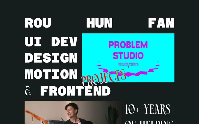
A rectangular block with an Aqua Glow (#00ffff) background, containing text in Electric Pink (#e82f5c) for main messages and Ghost White (#ffffff) for supporting text that is small and precise. Features an irregular, fragmented visual accent in Electric Pink (#e82f5c) and Violet Streak (#b333b3).
A rectangular block with a Vermilion Red (#ff0000) background, containing text in Ghost White (#ffffff) and decorated with an ornate text overlay using Ephidona font. Used for the prominent 'Problem Studio' section.
Large Ephidona text, weight 400, size 100px or 108px, color Ghost White (#ffffff). These headings are art pieces more than functional labels.
Guidelines
- Prioritize high contrast between foreground and background colors; use Ghost White (#ffffff) on Midnight Charcoal (#161b1b) and Vermilion Red (#ff0000) or Aqua Glow (#00ffff).
- Employ Azeret Mono, weight 700, for all primary headings and impactful statements at sizes 100px or larger.
- Use geometric lines and sharp corners; avoid rounded borders as the primary radius is 0px.
- Introduce elements using the Vermilion Red (#ff0000) or Aqua Glow (#00ffff) backgrounds to create distinct interactive zones or visual breaks.
- Treat Ephidona font (size 100-108px) as a decorative accent for section titles or artistic statements, not for body copy or functional text.
- Maintain a compact element spacing of 9px to keep components tightly grouped, reflecting a high-density aesthetic.
- Do not use subtle color variations for backgrounds; keep a stark contrast between Midnight Charcoal (#161b1b) and Ghost White (#ffffff) or the vibrant accent colors.
- Avoid generic line heights or letter spacing; stick to the normal letter spacing and 1.2 lineHeight for existing typefaces.
- Do not use soft shadows or gradients for elevation; the system relies on flat color blocks and visual overlap for depth.
- Do not apply subtle typography; if text isn't a headline using Azeret Mono or Ephidona, it should be a functional, small detail.
- Do not use standard button components; interactive elements are expressed through high-contrast colored blocks with unique text styles.
- Do not add extra padding or whitespace around core elements without clear design intent; the density is inherently high.
About this system
ShowHide
The Rou Hun Fan design system is a high-contrast, text-dominant interface built around a dark canvas punctuated by neon accents and an unconventional typographic play. It combines bold, blocky sans-serifs with ornate serifs, creating a distinct visual language that feels energetic and disruptive. The layout emphasizes direct and impactful messaging, using minimal interactive elements to draw attention to stark color contrasts and unique typography.
The page maintains a max-width of 1100px, centering content within the dark canvas. The hero features bold, centered headline text over a dark background. Sections are distinct, marked by large, impactful typographic elements and occasional full-width color blocks (Vermilion Red, Aqua Glow) that break the visual rhythm. Content structure leans heavily on stacked, centered elements with asymmetrical overlays of accent blocks (like the Aqua Glow box intruding on the main text area). A clear, minimal top navigation ('Rou Hun Fan' as a text-based, high-contrast link) and a concise text-based footer establish a boundary for content.
The site uses minimal photography, mainly tight, waist-up portrait crops on dark or neutral backgrounds, focusing on the subject's expression without props or complex settings. Imagery serves a direct biographical or personal branding role. Icons are implied to be text-based or minimal, outlined elements (e.g., LI, X links). There are abstract, geometric, jagged graphic accents, often in Electric Pink and Violet Streak on solid color blocks, serving as dynamic decorative flourishes.
Reminiscent of Verge, Active Theory, Superside, Read.cv.
# Freelance frontend UI developer and designer, Rou Hun Fan — Style Reference
> retro arcade glow

**Theme:** dark

**Site:** https://flowen.me

The Rou Hun Fan design system is a high-contrast, text-dominant interface built around a dark canvas punctuated by neon accents and an unconventional typographic play. It combines bold, blocky sans-serifs with ornate serifs, creating a distinct visual language that feels energetic and disruptive. The layout emphasizes direct and impactful messaging, using minimal interactive elements to draw attention to stark color contrasts and unique typography.

## Tokens — Colors

| Name | Value | Token | Role |
|------|------|------|------|
| Vermilion Red | `#ff0000` | `--color-vermilion-red` | Red wash for highlight backgrounds, decorative bands, and soft emphasis behind content. Do not promote it to the primary CTA color |
| Electric Pink | `#e82f5c` | `--color-electric-pink` | Supporting palette color for small decorative accents when the core palette needs contrast. Do not promote it to the primary CTA color |
| Neon Yellow | `#f0f26a` | `--color-neon-yellow` | Highlighting specific accent text or small decorative details, providing a sharp, almost digital glow |
| Bubblegum Pink | `#ffa8a8` | `--color-bubblegum-pink` | Supporting palette color for small decorative accents when the core palette needs contrast. Do not promote it to the primary CTA color |
| Aqua Glow | `#00ffff` | `--color-aqua-glow` | Supporting palette color for small decorative accents when the core palette needs contrast. Do not promote it to the primary CTA color |
| Violet Streak | `#b333b3` | `--color-violet-streak` | Abstract graphical elements, high-energy decorative accents. (derived from magenta-like shade in image) |
| Midnight Charcoal | `#161b1b` | `--color-midnight-charcoal` | Page background, primary canvas, neutral interface fills |
| Ghost White | `#ffffff` | `--color-ghost-white` | Hairline borders, dividers, input outlines, and card edges on light surfaces. Do not promote it to the primary CTA color |
| Muted Gray | `#b3aba4` | `--color-muted-gray` | Secondary text, subtle dividers, supporting details |

## Tokens — Typography

### Azeret Mono
- **Substitute:** IBM Plex Mono
- **Weights:** 400, 700
- **Sizes:** 100px
- **Line height:** 1.2
- **Letter spacing:** normal
- **Role:** Bold, impactful headings and primary navigation items. Its monospace nature, in combination with heavy weights, creates a stark, unambiguous statement that anchors the UI structurally.

### Ephidona
- **Substitute:** DM Serif Display
- **Weights:** 400
- **Sizes:** 100px, 108px
- **Line height:** 1.2
- **Letter spacing:** normal
- **Role:** Decorative and artistic headings or prominent text snippets. The ornate, almost distressed serif style provides a vintage, 'spiced up' counterpoint to the clean monospace, injecting personality and an unexpected elegance into key areas.

## Tokens — Type Scale

| Role | Size | Line height | Letter spacing |
|------|------|------|------|
| body-sm | 18px | 1.2 | — |
| heading | 100px | 1.2 | — |
| display | 108px | 1.2 | — |

## Tokens — Spacing

- **Max width:** 1100px
- **Section gap:** 40-80px
- **Card padding:** 24px
- **Element gap:** 9px

## Tokens — Radius

- **Default:** 0px

## Layout

The page maintains a max-width of 1100px, centering content within the dark canvas. The hero features bold, centered headline text over a dark background. Sections are distinct, marked by large, impactful typographic elements and occasional full-width color blocks (Vermilion Red, Aqua Glow) that break the visual rhythm. Content structure leans heavily on stacked, centered elements with asymmetrical overlays of accent blocks (like the Aqua Glow box intruding on the main text area). A clear, minimal top navigation ('Rou Hun Fan' as a text-based, high-contrast link) and a concise text-based footer establish a boundary for content.

## Imagery

The site uses minimal photography, mainly tight, waist-up portrait crops on dark or neutral backgrounds, focusing on the subject's expression without props or complex settings. Imagery serves a direct biographical or personal branding role. Icons are implied to be text-based or minimal, outlined elements (e.g., LI, X links). There are abstract, geometric, jagged graphic accents, often in Electric Pink and Violet Streak on solid color blocks, serving as dynamic decorative flourishes.

## Components

### Primary Navigation Link
*Top-level navigation items.*

White text (#ffffff) using Azeret Mono, weight 700 with an underline on hover (not present in raw data, but standard behavior).

### Hero Headline Block
*Main page title or section headline.*

Large text using Azeret Mono, weight 700, size 100px, color Ghost White (#ffffff), on a Midnight Charcoal (#161b1b) background.

### Accent Content Box (Aqua Glow)
*Highlighting a key message or interactive area.*

A rectangular block with an Aqua Glow (#00ffff) background, containing text in Electric Pink (#e82f5c) for main messages and Ghost White (#ffffff) for supporting text that is small and precise. Features an irregular, fragmented visual accent in Electric Pink (#e82f5c) and Violet Streak (#b333b3).

### Accent Content Box (Vermilion Red)
*Highlighting high-impact calls to action or interactive features.*

A rectangular block with a Vermilion Red (#ff0000) background, containing text in Ghost White (#ffffff) and decorated with an ornate text overlay using Ephidona font. Used for the prominent 'Problem Studio' section.

### Decorative Section Title
*Stylized section headings.*

Large Ephidona text, weight 400, size 100px or 108px, color Ghost White (#ffffff). These headings are art pieces more than functional labels.

## Guidelines

### Do

- Prioritize high contrast between foreground and background colors; use Ghost White (#ffffff) on Midnight Charcoal (#161b1b) and Vermilion Red (#ff0000) or Aqua Glow (#00ffff).
- Employ Azeret Mono, weight 700, for all primary headings and impactful statements at sizes 100px or larger.
- Use geometric lines and sharp corners; avoid rounded borders as the primary radius is 0px.
- Introduce elements using the Vermilion Red (#ff0000) or Aqua Glow (#00ffff) backgrounds to create distinct interactive zones or visual breaks.
- Treat Ephidona font (size 100-108px) as a decorative accent for section titles or artistic statements, not for body copy or functional text.
- Maintain a compact element spacing of 9px to keep components tightly grouped, reflecting a high-density aesthetic.

### Don't

- Do not use subtle color variations for backgrounds; keep a stark contrast between Midnight Charcoal (#161b1b) and Ghost White (#ffffff) or the vibrant accent colors.
- Avoid generic line heights or letter spacing; stick to the normal letter spacing and 1.2 lineHeight for existing typefaces.
- Do not use soft shadows or gradients for elevation; the system relies on flat color blocks and visual overlap for depth.
- Do not apply subtle typography; if text isn't a headline using Azeret Mono or Ephidona, it should be a functional, small detail.
- Do not use standard button components; interactive elements are expressed through high-contrast colored blocks with unique text styles.
- Do not add extra padding or whitespace around core elements without clear design intent; the density is inherently high.

## Agent Prompt Guide

Quick Color Reference:
text: #ffffff
background: #161b1b
border: #ffffff
accent: #e82f5c
primary action: no distinct CTA color

Example Component Prompts:
1. Create a header navigation: background Midnight Charcoal (#161b1b). Links use Azeret Mono, weight 700, size 100px, Ghost White (#ffffff).
2. Create a main headline section: background Midnight Charcoal (#161b1b). Headline text 'UI DEV DESIGN' uses Azeret Mono, weight 700, size 100px, Ghost White (#ffffff), stacked vertically with 9px element gap.
3. Create an accent feature block: background Aqua Glow (#00ffff). Headline 'PROBLEM STUDIO' uses Electric Pink (#e82f5c) with Azeret Mono, weight 700, size 100px. Subtext is small, Ghost White (#ffffff).
4. Create a decorative section title: use Ephidona, weight 400, size 108px, Ghost White (#ffffff) on a Midnight Charcoal (#161b1b) background.
5. Create a footer section: background Midnight Charcoal (#161b1b). '10+ Years of Helping Biz Grow' uses Ephidona, weight 400, size 100px, Ghost White (#ffffff).
More like this





Keep what you find
A free account saves references to boards and can send you a weekly email of picks based on what you save.
To see every result, go Pro.