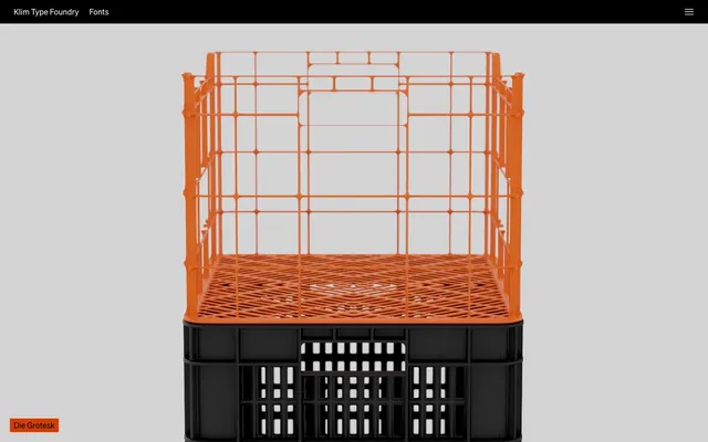
Preview image. Unlock full-res
Type specimen on black velvet
Color palette
Highlight accents for interactive elements and call-to-action backgrounds, used sparingly to draw focus
Alternative highlight accent for interactive elements and call-to-action backgrounds. Provides variety while maintaining saturation
Accent color for interactive elements, links, and highlighted content. A vibrant, warm pop against the dark theme
Link color for specific emphasized text elements
Link color for specific emphasized text elements
Link color for specific emphasized text elements
Link color for specific emphasized text elements
Primary page background, text on light surfaces, filled button backgrounds. Creates a strong, confident base for content
Subtle border colors for outlined elements and cards, secondary body text on dark backgrounds. Softer contrast for less prominent information
Background for input fields and other utility UI elements. Darker than base background to suggest interactivity
Primary text color, outlined button borders, element borders on dark backgrounds. Ensures high readability against dark surfaces
Typography
- Weights
- 400, 700
- Sizes
- 16px, 36px
- Line height
- 0.98, 1.19, 1.2, 1.33, 1.5
- Letter spacing
- normal
- Fallback
- Inter
Primary typeface for all UI elements, body text, and some headings. Its clean, geometric form provides a contemporary feel and excellent readability across various weights and sizes. Weight 700 is reserved for strong emphasis and certain navigational elements, while 400 is the workhorse.
- Weights
- 400
- Sizes
- 16px
- Line height
- 1.2, 1.33, 1.5
- Letter spacing
- normal
- Fallback
- Inter
Specialized variant of Soehne, likely for icon-like characters or specific display elements. Used minimally, maintaining character of the main typeface while allowing for specific glyphs.
Spacing & shape
Components
Background: Pitch Black (#000000), Text: Text White (#ffffff), Border Radius: 2px, Padding: 0px 8px.
Background: transparent (rgba(0,0,0,0)), Text: Text White (#ffffff), Border: 1px solid Ghost Gray (#555555), Border Radius: 2px, Padding: 0px 8px.
Text: Text White (#ffffff), Padding: 0px 8px, Border Radius: 2px.
Background: Input Dark (#1c1c1c), Text: Text White (#ffffff), Border: 1px solid Input Dark (#1c1c1c), Border Radius: 2px, Padding: 0px 8px.
Background: transparent (rgba(0,0,0,0)), Border: none, Border Radius: 0px, Padding: 0px across all sides.
Guidelines
- Prioritize high contrast between text and background, especially for readability on dark surfaces.
- Use Pitch Black (#000000) as the dominant background color for most sections to maintain the dark theme.
- Apply Text White (#ffffff) for all primary text and important UI borders against dark backgrounds.
- Reserve vibrant accent colors (Ocean Blue, Forest Green, Fire Orange) for intentional highlighting of interactive elements or key information, using them sparingly.
- Apply a consistent 2px border radius to all interactive elements (buttons, inputs) for subtle softening without losing sharpness.
- Maintain a compact element gap of 10px where precision and visual density are desired.
- Use SOEHNE, weight 700, for section headings and primary navigation items to establish strong hierarchy.
- Avoid introducing additional saturated colors beyond the defined accent palette to prevent visual chaos.
- Do not use soft, low-contrast text on dark backgrounds; ensure sufficient contrast with Text White (#ffffff).
- Do not vary border radius values across interactive elements; strictly adhere to 2px for all button-like components.
- Avoid large, soft shadows or heavy elevation treatments; the design relies on flat surfaces and clean lines.
- Do not use generic system fonts; always specify SOEHNE for all text elements.
- Refrain from excessive internal padding on cards or list items, maintaining a compact aesthetic with 0px padding on card surfaces.
- Do not mix line heights arbitrarily; follow the defined line-height ratios for SOEHNE to preserve typographic rhythm.
About this system
ShowHide
Klim Type Foundry utilizes a 'digital minimalist' approach, establishing authority through stark contrasts and precise typography on an almost entirely dark canvas. A restrained palette of bold, single-hue accents punctuates the monochromatic UI, guiding attention without visual clutter. Components prioritize clarity and function, often appearing as subtle outlines or ghost elements, reinforcing the typography's central role. The overall impression is one of meticulous craft and intentional restraint, where every visual element serves a purpose.
The page employs a full-bleed and contained layout model, alternating between completely full-width visual sections and content blocks constrained by a maximum width. Hero sections often feature full-viewport imagery or stark, text-only displays on Pitch Black. Section rhythm is driven by alternating dark and slightly lighter neutral backgrounds, creating distinct visual bands for content grouping. Content arrangement varies, from centered stacks of text on feature sections to grid-like displays for font families. There's a strong emphasis on consistent vertical padding between major sections. Navigation is a minimal top bar, with a persistent header that appears fixed, featuring the brand logo on the left and a hamburger menu on the right.
The imagery on Klim Type Foundry is highly varied and serves a decorative, artistic purpose rather than being purely functional or explanatory. It features abstract product renders (like the orange crate), highly stylized and conceptual photography (like the bacon flag), and direct product showcases (typography demonstrations). The treatment is typically full-bleed or large-format, often against a black background, allowing images to dominate the visual space. Photography is often high-key or dramatically lit, emphasizing texture and form. Illustrations are absent; the focus is on photographic or rendered realism. Icons, if present, appear to be minimal and outline-based, serving as functional UI elements rather than decorative art. Imagery is dense, often occupying entire screen real estate and driving page sections.
Reminiscent of Fonts In Use, Future Fonts, Velocity Partners, Braid.
# Klim — Style Reference
> Type specimen on black velvet

**Theme:** dark

**Site:** https://klim.co.nz

Klim Type Foundry utilizes a 'digital minimalist' approach, establishing authority through stark contrasts and precise typography on an almost entirely dark canvas. A restrained palette of bold, single-hue accents punctuates the monochromatic UI, guiding attention without visual clutter. Components prioritize clarity and function, often appearing as subtle outlines or ghost elements, reinforcing the typography's central role. The overall impression is one of meticulous craft and intentional restraint, where every visual element serves a purpose.

## Tokens — Colors

| Name | Value | Token | Role |
|------|------|------|------|
| Ocean Blue | `#24a7f2` | `--color-ocean-blue` | Highlight accents for interactive elements and call-to-action backgrounds, used sparingly to draw focus |
| Forest Green | `#3c585f` | `--color-forest-green` | Alternative highlight accent for interactive elements and call-to-action backgrounds. Provides variety while maintaining saturation |
| Fire Orange | `#d33c03` | `--color-fire-orange` | Accent color for interactive elements, links, and highlighted content. A vibrant, warm pop against the dark theme |
| Vivid Red | `#e90702` | `--color-vivid-red` | Link color for specific emphasized text elements |
| Neon Teal | `#93ffe6` | `--color-neon-teal` | Link color for specific emphasized text elements |
| Muted Peach | `#ffe6d9` | `--color-muted-peach` | Link color for specific emphasized text elements |
| Lemon Yellow | `#ffff79` | `--color-lemon-yellow` | Link color for specific emphasized text elements |
| Pitch Black | `#000000` | `--color-pitch-black` | Primary page background, text on light surfaces, filled button backgrounds. Creates a strong, confident base for content |
| Ghost Gray | `#555555` | `--color-ghost-gray` | Subtle border colors for outlined elements and cards, secondary body text on dark backgrounds. Softer contrast for less prominent information |
| Input Dark | `#1c1c1c` | `--color-input-dark` | Background for input fields and other utility UI elements. Darker than base background to suggest interactivity |
| Text White | `#ffffff` | `--color-text-white` | Primary text color, outlined button borders, element borders on dark backgrounds. Ensures high readability against dark surfaces |

## Tokens — Typography

### SOEHNE
- **Substitute:** Inter
- **Weights:** 400, 700
- **Sizes:** 16px, 36px
- **Line height:** 0.98, 1.19, 1.2, 1.33, 1.5
- **Letter spacing:** normal
- **Role:** Primary typeface for all UI elements, body text, and some headings. Its clean, geometric form provides a contemporary feel and excellent readability across various weights and sizes. Weight 700 is reserved for strong emphasis and certain navigational elements, while 400 is the workhorse.

### SOEHNE_IKON
- **Substitute:** Inter
- **Weights:** 400
- **Sizes:** 16px
- **Line height:** 1.2, 1.33, 1.5
- **Letter spacing:** normal
- **Role:** Specialized variant of Soehne, likely for icon-like characters or specific display elements. Used minimally, maintaining character of the main typeface while allowing for specific glyphs.

## Tokens — Spacing

- **Section gap:** 69px
- **Card padding:** 0px
- **Element gap:** 10px

## Tokens — Radius

- **Buttons:** 2px
- **Inputs:** 2px
- **Cards:** 0px
- **Images:** 2px
- **links:** 2px
- **navItems:** 2px

## Layout

The page employs a full-bleed and contained layout model, alternating between completely full-width visual sections and content blocks constrained by a maximum width. Hero sections often feature full-viewport imagery or stark, text-only displays on Pitch Black. Section rhythm is driven by alternating dark and slightly lighter neutral backgrounds, creating distinct visual bands for content grouping. Content arrangement varies, from centered stacks of text on feature sections to grid-like displays for font families. There's a strong emphasis on consistent vertical padding between major sections. Navigation is a minimal top bar, with a persistent header that appears fixed, featuring the brand logo on the left and a hamburger menu on the right.

## Imagery

The imagery on Klim Type Foundry is highly varied and serves a decorative, artistic purpose rather than being purely functional or explanatory. It features abstract product renders (like the orange crate), highly stylized and conceptual photography (like the bacon flag), and direct product showcases (typography demonstrations). The treatment is typically full-bleed or large-format, often against a black background, allowing images to dominate the visual space. Photography is often high-key or dramatically lit, emphasizing texture and form. Illustrations are absent; the focus is on photographic or rendered realism. Icons, if present, appear to be minimal and outline-based, serving as functional UI elements rather than decorative art. Imagery is dense, often occupying entire screen real estate and driving page sections.

## Components

### Filled Primary Button
*Call-to-action button for initiating primary actions.*

Background: Pitch Black (#000000), Text: Text White (#ffffff), Border Radius: 2px, Padding: 0px 8px.

### Outlined Secondary Button
*Secondary action button, providing a less prominent interactive element.*

Background: transparent (rgba(0,0,0,0)), Text: Text White (#ffffff), Border: 1px solid Ghost Gray (#555555), Border Radius: 2px, Padding: 0px 8px.

### Navigation Link Button
*Interactive text link within navigation areas.*

Text: Text White (#ffffff), Padding: 0px 8px, Border Radius: 2px.

### Text Input Field
*Form input for user text entry.*

Background: Input Dark (#1c1c1c), Text: Text White (#ffffff), Border: 1px solid Input Dark (#1c1c1c), Border Radius: 2px, Padding: 0px 8px.

### Transparent Card
*Content container that blends into the background, often for lists of items.*

Background: transparent (rgba(0,0,0,0)), Border: none, Border Radius: 0px, Padding: 0px across all sides.

## Guidelines

### Do

- Prioritize high contrast between text and background, especially for readability on dark surfaces.
- Use Pitch Black (#000000) as the dominant background color for most sections to maintain the dark theme.
- Apply Text White (#ffffff) for all primary text and important UI borders against dark backgrounds.
- Reserve vibrant accent colors (Ocean Blue, Forest Green, Fire Orange) for intentional highlighting of interactive elements or key information, using them sparingly.
- Apply a consistent 2px border radius to all interactive elements (buttons, inputs) for subtle softening without losing sharpness.
- Maintain a compact element gap of 10px where precision and visual density are desired.
- Use SOEHNE, weight 700, for section headings and primary navigation items to establish strong hierarchy.

### Don't

- Avoid introducing additional saturated colors beyond the defined accent palette to prevent visual chaos.
- Do not use soft, low-contrast text on dark backgrounds; ensure sufficient contrast with Text White (#ffffff).
- Do not vary border radius values across interactive elements; strictly adhere to 2px for all button-like components.
- Avoid large, soft shadows or heavy elevation treatments; the design relies on flat surfaces and clean lines.
- Do not use generic system fonts; always specify SOEHNE for all text elements.
- Refrain from excessive internal padding on cards or list items, maintaining a compact aesthetic with 0px padding on card surfaces.
- Do not mix line heights arbitrarily; follow the defined line-height ratios for SOEHNE to preserve typographic rhythm.

## Agent Prompt Guide

Quick Color Reference:
- text: #ffffff
- background: #000000
- border: #ffffff
- accent: #24a7f2
- primary action: no distinct CTA color

Example Component Prompts:
- Create a pricing section with a card: Pitch Black (#000000) background. Inside the card, display 'Founders Grotesk' as a headline (Text White #ffffff, SOEHNE 700 at 36px, lineHeight 0.98), with a 'Buy' button (Pitch Black #000000 background, Text White #ffffff text, 2px radius, 0px 8px padding).
- Design a navigation bar: Pitch Black (#000000) background, with 'Klim Type Foundry' on the left (Text White #ffffff, SOEHNE 400 at 16px, lineHeight 1.20) and a hamburger menu icon (Text White #ffffff) on the right.
- Build a feature block: Dark Panel (#101c19) background with 'Die Grotesk' as a prominent link (Fire Orange #d33c03 background, Text White #ffffff text, 2px radius, 0px 8px padding).
More like this





Keep what you find
A free account saves references to boards and can send you a weekly email of picks based on what you save.
To see every result, go Pro.