Preview image. Unlock full-res
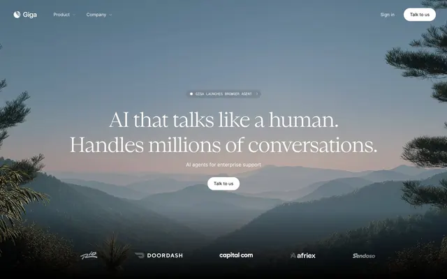
Deep night, mountain vista – a cosmic, digital calm.
Color palette
Decorative link accents, alerts — a vivid, urgent highlight
Green outline accent for tags, dividers, and focused UI edges. Use as a supporting accent, not as a status color
Decorative background gradient used in product sections
Decorative background gradient used in product sections
Decorative background gradient used in product sections
Primary text, icon outlines, dark surface background, borders
Light surface background, light text, highlights
Card backgrounds, subtle dividers
Subtle shadow tint for depth
Muted secondary text
Filled button backgrounds
Tertiary text, subtle borders
Placeholder text, low-contrast information text
Typography
- Weights
- 400
- Sizes
- 12px
- Line height
- 1.2
- Letter spacing
- normal
System fallback, minimal UI text.
- Weights
- 300, 400, 500
- Sizes
- 8px, 9px, 10px, 11px, 12px, 13px, 14px, 16px, 29px, 44px
- Line height
- 1, 1.36, 1.5, 1.54, 1.64, 1.7, 1.71, 1.75, 1.85, 1.93, 2, 2.22
- Letter spacing
- -0.0300em, 0.0070em
Primary UI text, body copy, and secondary headlines. Its variable letter-spacing for different sizes provides an adaptive, precise feel without being overtly tracked.
- Weights
- 400, 500
- Sizes
- 11px, 12px, 14px
- Line height
- 1.2, 2, 2.18
- Letter spacing
- 0.0090em
Monospaced text for data, code snippets, or subtle highlights where a technical, precise voice is needed. The positive tracking provides visual breathing room.
- Weights
- 400, 500
- Sizes
- 14px
- Line height
- 1.2
- Letter spacing
- normal
Content body text and detailed descriptive text.
- Weights
- 400
- Sizes
- 22px
- Line height
- 0.86
- Letter spacing
- normal
Small display headings, where a compact, almost stacked look is desired due to the tight line height.
- Weights
- 400, 500
- Sizes
- 16px
- Line height
- 1.5, 1.51, 2.5
- Letter spacing
- 0.0060em
Sub-headings and emphasized body text. The slight tracking enhances readability at smaller display sizes.
- Weights
- 300, 400
- Sizes
- 24px, 41px, 48px
- Line height
- 1.2, 1.3
- Letter spacing
- -0.0300em, -0.0200em
Primary headlines and hero text. The light weight and negative letter-spacing for larger sizes lend a sense of understated sophistication and calm, rather than shouting.
- Weights
- 400
- Sizes
- 30px
- Line height
- 1.33, 1.5
- Letter spacing
- normal
Medium-sized display headings.
- Weights
- 400
- Sizes
- 14px
- Line height
- 1.2
- Letter spacing
- normal
Standard body text.
Spacing & shape
Elevation
Components
Background: rgba(255, 255, 255, 0.05), Text: Obsidian, Border: Obsidian, Padding: 16px all sides, Radius: 1000px.
Background: Ghost, Text: Obsidian, Border: Obsidian, Padding: 9px vertical, 20px horizontal, Radius: 1000px.
Background: Night Sky, Text: Obsidian, Border: Obsidian, Padding: 9px vertical, 20px horizontal, Radius: 1000px.
Background: rgba(0, 0, 0, 0.1), Text: Obsidian, Border: Obsidian, Padding: 0px vertical, 8px right, 14px left, Radius: 9999px.
Background: rgba(0, 0, 0, 0.2), Border: none, Radius: 16px, Padding: 24px vertical, 24px right, 0px left.
Background: rgba(0, 0, 0, 0.02), Border: none, Radius: 8px, Padding: 2px all sides.
Background: rgba(0, 0, 0, 0.02), Border: none, Radius: 16px, Padding: 24px all sides.
Guidelines
- Use Obsidian (#000000) for primary headlines and body text to establish a strong, contrasted foundation.
- Apply Emilio Light font with negative letter-spacing for large headlines (e.g., 48px, weight 300, ls = -0.0300em) to create an elegant, restrained presence.
- Utilize Ghost Pill Button (background: rgba(255, 255, 255, 0.05), text: Obsidian, 1000px radius) for secondary actions or subtle navigational elements.
- Implement a 10px elementGap for consistent tight spacing between most inline and block elements.
- Apply a 1000px border-radius to all buttons for a distinctly pill-shaped, soft appearance.
- Employ Graphite (#cccccc) for card backgrounds and subtle dividers to introduce hierarchical breaks without harsh lines.
- Use Ember Glow (#fe2c02) sparingly as a vivid accent for critical links or calls to attention, ensuring high impact.
- Avoid using harsh, opaque borders; prefer subtle transparency or no border at all for containers.
- Do not introduce strong, colored backgrounds for full sections; rely on the subtle neutral palette for depth.
- Refrain from using heavily tracked body text; the Inter font with its specific letter-spacing adjustments should be applied as specified.
- Do not deviate from the pill-shaped radius (1000px) for buttons; it's a signature visual cue.
- Avoid standard box shadows; for elevation, use subtle, diffused shadows like rgba(0, 0, 0, 0.7) 0px 12px 32px -16px.
- Do not use highly saturated colors for large text blocks or backgrounds; reserve them for small, impactful accents.
- Resist using bold font weights for large headlines; the light weight of Emilio Light is key to the system's character.
About this system
ShowHide
Giga's design system evokes a sense of deep, expansive calm, contrasting vast dark landscapes with focused, luminous information. Typography is understated and elegant, prioritizing legibility and a sense of gravitas. Interactive elements offer subtle feedback, and surfaces vary from transparent overlays to opaque dark canvases, creating depth and dimension without heavy use of shadows. The overall aesthetic is one of quiet power and precision, mirroring complex AI capabilities with a refined visual language.
The page maintains a centered content model with an implied max-width, while hero sections can be full-bleed with panoramic imagery. The initial hero features a full-viewport, dark, landscape photograph with a centered headline stack and a prominent call-to-action. Subsequent sections often alternate between dark backgrounds (#000000) and slightly lighter, more textured dark surfaces (like rgba(0,0,0,0.2) or #cccccc). Content is typically arranged in left-aligned stacks or a two-column layout with text to the left and product visuals/cards to the right. Vertical rhythm is maintained with consistent section gaps of approximately 48px, creating a spacious but deliberate flow. Navigation is primarily a top sticky header with minimal links and a pill-shaped 'Talk to us' button.
This system primarily uses atmospheric, wide-angle photography featuring natural landscapes, often mountains or abstract patterns, with a dark, moody overlay. Imagery is used as a full-bleed background for hero sections, setting a grand, serene tone. When product interfaces are shown, they are clean, contained rectangles with sharp edges against photographic backdrops. Icons are minimal, outlined (Obsidian outline on dark backgrounds, Ghost on light), suggesting a focus on clarity rather than heavy decoration. The overall impression is image-heavy in hero sections, with imagery serving decorative atmosphere and product showcase, usually contained within a content area on darker backgrounds.
Reminiscent of Linear, Anthropic (Claude AI), Framer, Vercel.
# Giga — Style Reference
> Deep night, mountain vista – a cosmic, digital calm.

**Theme:** dark

**Site:** https://giga.ai

Giga's design system evokes a sense of deep, expansive calm, contrasting vast dark landscapes with focused, luminous information. Typography is understated and elegant, prioritizing legibility and a sense of gravitas. Interactive elements offer subtle feedback, and surfaces vary from transparent overlays to opaque dark canvases, creating depth and dimension without heavy use of shadows. The overall aesthetic is one of quiet power and precision, mirroring complex AI capabilities with a refined visual language.

## Tokens — Colors

| Name | Value | Token | Role |
|------|------|------|------|
| Ember Glow | `#fe2c02` | `--color-ember-glow` | Decorative link accents, alerts — a vivid, urgent highlight |
| Growth Green | `#49de80` | `--color-growth-green` | Green outline accent for tags, dividers, and focused UI edges. Use as a supporting accent, not as a status color |
| Subtle Violet Gradient | `#ff9aea` | `--color-subtle-violet-gradient` | Decorative background gradient used in product sections |
| Soft Mint Gradient | `#c3eaca` | `--color-soft-mint-gradient` | Decorative background gradient used in product sections |
| Sky Blue Gradient | `#88bbf5` | `--color-sky-blue-gradient` | Decorative background gradient used in product sections |
| Obsidian | `#000000` | `--color-obsidian` | Primary text, icon outlines, dark surface background, borders |
| Ghost | `#ffffff` | `--color-ghost` | Light surface background, light text, highlights |
| Graphite | `#cccccc` | `--color-graphite` | Card backgrounds, subtle dividers |
| Shadow | `#4d4d4d` | `--color-shadow` | Subtle shadow tint for depth |
| Pebble Gray | `#969696` | `--color-pebble-gray` | Muted secondary text |
| Night Sky | `#161717` | `--color-night-sky` | Filled button backgrounds |
| Steel Gray | `#808080` | `--color-steel-gray` | Tertiary text, subtle borders |
| Cosmic Dust | `#8a8f98` | `--color-cosmic-dust` | Placeholder text, low-contrast information text |

## Tokens — Typography

### sans-serif
- **Weights:** 400
- **Sizes:** 12px
- **Line height:** 1.2
- **Letter spacing:** normal
- **Role:** System fallback, minimal UI text.

### Inter
- **Weights:** 300, 400, 500
- **Sizes:** 8px, 9px, 10px, 11px, 12px, 13px, 14px, 16px, 29px, 44px
- **Line height:** 1, 1.36, 1.5, 1.54, 1.64, 1.7, 1.71, 1.75, 1.85, 1.93, 2, 2.22
- **Letter spacing:** -0.0300em, 0.0070em
- **Role:** Primary UI text, body copy, and secondary headlines. Its variable letter-spacing for different sizes provides an adaptive, precise feel without being overtly tracked.

### Geist Mono
- **Weights:** 400, 500
- **Sizes:** 11px, 12px, 14px
- **Line height:** 1.2, 2, 2.18
- **Letter spacing:** 0.0090em
- **Role:** Monospaced text for data, code snippets, or subtle highlights where a technical, precise voice is needed. The positive tracking provides visual breathing room.

### Giga Sans Text Trial 500
- **Weights:** 400, 500
- **Sizes:** 14px
- **Line height:** 1.2
- **Letter spacing:** normal
- **Role:** Content body text and detailed descriptive text.

### Giga Sans Display Trial 500
- **Weights:** 400
- **Sizes:** 22px
- **Line height:** 0.86
- **Letter spacing:** normal
- **Role:** Small display headings, where a compact, almost stacked look is desired due to the tight line height.

### Inter Display
- **Weights:** 400, 500
- **Sizes:** 16px
- **Line height:** 1.5, 1.51, 2.5
- **Letter spacing:** 0.0060em
- **Role:** Sub-headings and emphasized body text. The slight tracking enhances readability at smaller display sizes.

### Emilio Light
- **Weights:** 300, 400
- **Sizes:** 24px, 41px, 48px
- **Line height:** 1.2, 1.3
- **Letter spacing:** -0.0300em, -0.0200em
- **Role:** Primary headlines and hero text. The light weight and negative letter-spacing for larger sizes lend a sense of understated sophistication and calm, rather than shouting.

### Giga Sans Display Trial 400
- **Weights:** 400
- **Sizes:** 30px
- **Line height:** 1.33, 1.5
- **Letter spacing:** normal
- **Role:** Medium-sized display headings.

### Giga Sans Text Trial 400
- **Weights:** 400
- **Sizes:** 14px
- **Line height:** 1.2
- **Letter spacing:** normal
- **Role:** Standard body text.

## Tokens — Type Scale

Perfect Fifth (1.5) from 14px base.

| Role | Size | Line height | Letter spacing |
|------|------|------|------|
| body | 14px | 1.2 | — |
| heading | 22px | 0.86 | — |
| heading-lg | 30px | 1.33 | — |
| display | 48px | 1.2 | -1.44px |

## Tokens — Spacing

- **Section gap:** 48px
- **Card padding:** 24px
- **Element gap:** 10px

## Tokens — Radius

- **Default:** 10px
- **Buttons:** 1000px
- **Cards:** 16px
- **icons:** 9999px

## Tokens — Elevation

- **Card Shadow:** `rgba(0, 0, 0, 0.7) 0px 12px 32px -16px, rgba(0, 0, 0, 0.7) 0px 12px 60px 0px, rgba(255, 255, 255, 0.15) 0px 0px 0px 1px`

## Layout

The page maintains a centered content model with an implied max-width, while hero sections can be full-bleed with panoramic imagery. The initial hero features a full-viewport, dark, landscape photograph with a centered headline stack and a prominent call-to-action. Subsequent sections often alternate between dark backgrounds (#000000) and slightly lighter, more textured dark surfaces (like rgba(0,0,0,0.2) or #cccccc). Content is typically arranged in left-aligned stacks or a two-column layout with text to the left and product visuals/cards to the right. Vertical rhythm is maintained with consistent section gaps of approximately 48px, creating a spacious but deliberate flow. Navigation is primarily a top sticky header with minimal links and a pill-shaped 'Talk to us' button.

## Imagery

This system primarily uses atmospheric, wide-angle photography featuring natural landscapes, often mountains or abstract patterns, with a dark, moody overlay. Imagery is used as a full-bleed background for hero sections, setting a grand, serene tone. When product interfaces are shown, they are clean, contained rectangles with sharp edges against photographic backdrops. Icons are minimal, outlined (Obsidian outline on dark backgrounds, Ghost on light), suggesting a focus on clarity rather than heavy decoration. The overall impression is image-heavy in hero sections, with imagery serving decorative atmosphere and product showcase, usually contained within a content area on darker backgrounds.

## Components

### Ghost Pill Button
*Secondary action or navigation with minimal visual weight.*

Background: rgba(255, 255, 255, 0.05), Text: Obsidian, Border: Obsidian, Padding: 16px all sides, Radius: 1000px.

### Primary Filled Pill Button
*Main call to action, standing out with a solid background.*

Background: Ghost, Text: Obsidian, Border: Obsidian, Padding: 9px vertical, 20px horizontal, Radius: 1000px.

### Dark Filled Pill Button
*Call to action on lighter backgrounds, inverted version of the primary.*

Background: Night Sky, Text: Obsidian, Border: Obsidian, Padding: 9px vertical, 20px horizontal, Radius: 1000px.

### Small Decorative Pill Button
*Informational or tag-like elements with a subtle, dark background.*

Background: rgba(0, 0, 0, 0.1), Text: Obsidian, Border: Obsidian, Padding: 0px vertical, 8px right, 14px left, Radius: 9999px.

### Transparent Card
*Content container with a very subtle, almost ghost-like presence.*

Background: rgba(0, 0, 0, 0.2), Border: none, Radius: 16px, Padding: 24px vertical, 24px right, 0px left.

### Subtle Inset Card
*Small, nested content area or decorative container.*

Background: rgba(0, 0, 0, 0.02), Border: none, Radius: 8px, Padding: 2px all sides.

### Standard Card
*Primary content grouping container.*

Background: rgba(0, 0, 0, 0.02), Border: none, Radius: 16px, Padding: 24px all sides.

## Guidelines

### Do

- Use Obsidian (#000000) for primary headlines and body text to establish a strong, contrasted foundation.
- Apply Emilio Light font with negative letter-spacing for large headlines (e.g., 48px, weight 300, ls = -0.0300em) to create an elegant, restrained presence.
- Utilize Ghost Pill Button (background: rgba(255, 255, 255, 0.05), text: Obsidian, 1000px radius) for secondary actions or subtle navigational elements.
- Implement a 10px elementGap for consistent tight spacing between most inline and block elements.
- Apply a 1000px border-radius to all buttons for a distinctly pill-shaped, soft appearance.
- Employ Graphite (#cccccc) for card backgrounds and subtle dividers to introduce hierarchical breaks without harsh lines.
- Use Ember Glow (#fe2c02) sparingly as a vivid accent for critical links or calls to attention, ensuring high impact.

### Don't

- Avoid using harsh, opaque borders; prefer subtle transparency or no border at all for containers.
- Do not introduce strong, colored backgrounds for full sections; rely on the subtle neutral palette for depth.
- Refrain from using heavily tracked body text; the Inter font with its specific letter-spacing adjustments should be applied as specified.
- Do not deviate from the pill-shaped radius (1000px) for buttons; it's a signature visual cue.
- Avoid standard box shadows; for elevation, use subtle, diffused shadows like rgba(0, 0, 0, 0.7) 0px 12px 32px -16px.
- Do not use highly saturated colors for large text blocks or backgrounds; reserve them for small, impactful accents.
- Resist using bold font weights for large headlines; the light weight of Emilio Light is key to the system's character.

## Agent Prompt Guide

### Quick Color Reference
- text: #000000
- background: #000000
- border: #000000
- accent: #fe2c02
- primary action: #161717 (filled action)

### 3-5 Example Component Prompts
1. Create a Primary Action Button: #161717 background, #ffffff text, 9999px radius, compact pill padding. Use this filled treatment for the main CTA.
2. Design a feature card: use the Transparent Card with background rgba(0, 0, 0, 0.2), 16px radius, 24px vertical padding. Inside, an icon with Obsidian (#000000) fill and stroke. Below the icon, a heading 'Built to handle complexity' in Inter, weight 500, 29px size, line-height 1.5, color Ghost (#ffffff). Underneath, body text 'Explore Agent Canvas' in Giga Sans Text Trial 500, weight 400, 14px size, color Pebble Gray (#969696).
3. Generate a call-to-action banner: background Night Sky (#161717) spanning full width. Place a heading 'Join the conversation' in Inter, weight 500, 44px size, line-height 1, color Ghost (#ffffff). To its right, a Dark Filled Pill Button with text 'Learn more', background Night Sky (#161717), text Ghost (#ffffff), 9px vertical and 20px horizontal padding, 1000px radius.
More like this






Keep what you find
A free account saves references to boards and can send you a weekly email of picks based on what you save.
To see every result, go Pro.