Preview image. Unlock full-res
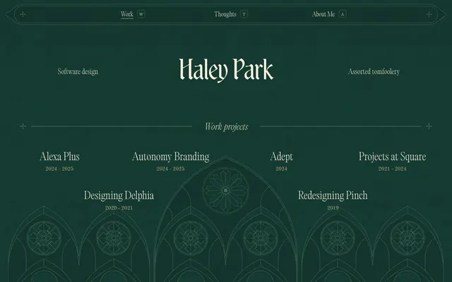
Gothic manuscript on dark parchment
Color palette
Page background, heading background fills, primary surface. Creates a deep, contemplative atmosphere
Primary text, link text, borders, decorative accents. Its slight warmth prevents a stark contrast with the dark background, maintaining the antique feel. Used for outlined ghost buttons
Subtle borders, secondary decorative elements, icon outlines. Offers just enough contrast for structural lines without disrupting the soft visual texture
Typography
- Weights
- 200
- Sizes
- 16px, 19px, 21px, 22px, 27px, 32px
- Line height
- 1.2, 1.3, 1.5
- Letter spacing
- 0.0040em, 0.0050em
- Fallback
- Lora
Primary body text, links, list items, and smaller headings. Its classic serif forms contribute to the traditional, manuscript-like character.
- Weights
- 100
- Sizes
- 96px
- Line height
- 1
- Letter spacing
- -0.96px at 96px
- Fallback
- Recursive Sans
Display headlines – extremely light weight and tight tracking create an ethereal, elegant title that feels whispered rather than shouted.
- Weights
- 200
- Sizes
- 13px, 16px
- Line height
- 1.5
- Letter spacing
- normal
- Fallback
- Old Standard TT
Auxiliary body text, helper text, and secondary information presented in a highly readable, classic serif.
- Weights
- 300
- Sizes
- 15px, 21px
- Line height
- 1.6
- Letter spacing
- 0.0040em
- Fallback
- Playfair Display
Secondary textual content, possibly for smaller annotations or details where a slightly more contemporary serif is desired.
- Weights
- 200, 300, 400
- Sizes
- 16px, 21px
- Line height
- 1.44, 1.5
- Letter spacing
- 0.0110em
- Fallback
- Decorative Dingbats or Zapf Dingbats
Decorative icons and ornamental text elements, evoking historical printing.
- Weights
- 300
- Sizes
- 27px
- Line height
- 1.1
- Letter spacing
- normal
- Fallback
- Perpetua Titling MT
A distinct heading font for specific sections, offering a unique, elegant serif character that complements the primary heading style.
- Weights
- 100, 400
- Sizes
- 16px
- Line height
- 1.5
ui-sans-serif — detected in extracted data but not described by AI
Spacing & shape
Components
Text in Parchment White (#f8f2de) on a transparent background, with a 1px bottom border in Parchment White. No padding beyond content spacing. Letter spacing matches the corresponding font style. Interactivity is subtle, focused on text and border changes rather than solid fills. Uses EditorialOld font.
Transparent background with a 1px Parchment White (#f8f2de) border. Text in Parchment White (#f8f2de). Uses body-level typography from EditorialOld. Radius is 0px, reinforcing a traditional, unembellished aesthetic.
A thin line, 1px solid Parchment White (#f8f2de), horizontally spanning the content width. Text (e.g., 'Work projects') is centered on this line using Parchment White (#f8f2de) on a Forest Canopy (#143930) background as needed to create a clear break. Spacing includes `elementGap` vertically.
Rendered as SVG fills or strokes in Moss Line (#456859). Used sparingly as visual anchors or section elaborations, drawing from the `bodoni-classic-ornaments` typeface for specific shapes. Adds to the historical, manuscript aesthetic.
Guidelines
- Prioritize Forest Canopy (#143930) for all main backgrounds to maintain the deep, dark ambiance.
- Use Parchment White (#f8f2de) exclusively for primary text, links, and borders, reserving it for elements that need to stand out from the dark background.
- Apply Moss Line (#456859) for secondary decorative strokes, subtle outlines, and subdued graphic elements to add detail without high contrast.
- Employ the 'Wispy' font (96px, 100 weight, -0.96px letter-spacing) for primary hero headlines to achieve an ethereal, elegant feel.
- Structure interactive elements like navigation and project listings with text on transparent backgrounds, using only a Parchment White (#f8f2de) border or underline for definition.
- Maintain a comfortable density with element gaps at `11px` and section gaps at `26px` to allow content to breathe without feeling sparse.
- Utilize 0px border-radius for components like project cards and buttons to reinforce a sharp, traditional print aesthetic.
- Avoid using bright, saturated colors for UI elements; stick to the muted palette provided.
- Do not introduce heavy shadows or prominent elevation; maintain a flat, layered visual approach with subtle outlines.
- Refrain from using bold or heavy font weights for headlines or primary text where lightness and elegance are key.
- Do not use large, solid background fills for interactive components; prefer ghost styles with borders or underlines.
- Avoid decorative imagery that clashes with the site's 'Gothic manuscript' aesthetic; prioritize line art, subtle textures, or classic ornaments.
- Do not deviate from the specified typefaces and their distinct letter-spacing values to preserve the unique typographic voice.
- Avoid arbitrary border radii; use 0px by default, and 4.8px very sparingly for elements that require a slight softening.
About this system
ShowHide
Haley Park employs a 'Gothic manuscript' aesthetic: a deeply saturated, muted forest green canvas provides a rich backdrop for delicate, antiqued typography, often accompanied by thin, almost calligraphic underlines or borders. Surface treatments are minimal, favoring ghostly lines and subtle background patterns over solid cards or elevation. The visual system feels quietly scholarly and meticulously crafted, with a restrained use of contrast to maintain a calm, focused atmosphere. The typography is a key expressive element, mixing classical serifs with a distinctive, almost whimsical display font.
The page uses a full-bleed layout for its background, but content is visually constrained to a central column (though `pageMaxWidth` is null, the arrangement suggests a conceptual max-width with ample horizontal padding). The hero section features a centered headline over a textured background. Sections are delineated by subtle horizontal dividers often accompanied by centered textual titles. Content is primarily arranged in multi-column grids for project listings (e.g., 2-column or 3-column), using the 'Project Card (Outlined)' component. The overall density is comfortable, with consistent vertical spacing and minimal visual clutter, emphasizing typography and subtle graphic textures. Navigation is a simple, horizontal top bar with ghost links, consistent throughout the experience.
This site features a 'graphics-only' visual language. Imagery consists primarily of highly stylized, almost architectural line art and geometric forms, reminiscent of stained glass or gothic arches, rendered in Moss Line (#456859) or as subtle grayscale patterns on the dark background. Icons are minimal, outlined, and monochromatic, often using complex, antique-inspired symbols derived from `bodoni-classic-ornaments`. Visuals serve a decorative and atmospheric role, adding texture and historical depth rather than conveying explicit content or product functionalities. They are dense in pattern but low in color, maintaining the site's quiet, scholarly mood.
Reminiscent of The New York Times (older eras), AIGA Design Archives, Medieval manuscript replicas online, Aperture Magazine.
# Haley Park — Style Reference
> Gothic manuscript on dark parchment

**Theme:** dark

**Site:** https://haleys.design

Haley Park employs a 'Gothic manuscript' aesthetic: a deeply saturated, muted forest green canvas provides a rich backdrop for delicate, antiqued typography, often accompanied by thin, almost calligraphic underlines or borders. Surface treatments are minimal, favoring ghostly lines and subtle background patterns over solid cards or elevation. The visual system feels quietly scholarly and meticulously crafted, with a restrained use of contrast to maintain a calm, focused atmosphere. The typography is a key expressive element, mixing classical serifs with a distinctive, almost whimsical display font.

## Tokens — Colors

| Name | Value | Token | Role |
|------|------|------|------|
| Forest Canopy | `#143930` | `--color-forest-canopy` | Page background, heading background fills, primary surface. Creates a deep, contemplative atmosphere |
| Parchment White | `#f8f2de` | `--color-parchment-white` | Primary text, link text, borders, decorative accents. Its slight warmth prevents a stark contrast with the dark background, maintaining the antique feel. Used for outlined ghost buttons |
| Moss Line | `#456859` | `--color-moss-line` | Subtle borders, secondary decorative elements, icon outlines. Offers just enough contrast for structural lines without disrupting the soft visual texture |

## Tokens — Typography

### EditorialOld
- **Substitute:** Lora
- **Weights:** 200
- **Sizes:** 16px, 19px, 21px, 22px, 27px, 32px
- **Line height:** 1.2, 1.3, 1.5
- **Letter spacing:** 0.0040em, 0.0050em
- **Role:** Primary body text, links, list items, and smaller headings. Its classic serif forms contribute to the traditional, manuscript-like character.

### Wispy
- **Substitute:** Recursive Sans
- **Weights:** 100
- **Sizes:** 96px
- **Line height:** 1
- **Letter spacing:** -0.96px at 96px
- **Role:** Display headlines – extremely light weight and tight tracking create an ethereal, elegant title that feels whispered rather than shouted.

### Old Standard TT
- **Substitute:** Old Standard TT
- **Weights:** 200
- **Sizes:** 13px, 16px
- **Line height:** 1.5
- **Letter spacing:** normal
- **Role:** Auxiliary body text, helper text, and secondary information presented in a highly readable, classic serif.

### GTA
- **Substitute:** Playfair Display
- **Weights:** 300
- **Sizes:** 15px, 21px
- **Line height:** 1.6
- **Letter spacing:** 0.0040em
- **Role:** Secondary textual content, possibly for smaller annotations or details where a slightly more contemporary serif is desired.

### bodoni-classic-ornaments
- **Substitute:** Decorative Dingbats or Zapf Dingbats
- **Weights:** 200, 300, 400
- **Sizes:** 16px, 21px
- **Line height:** 1.44, 1.5
- **Letter spacing:** 0.0110em
- **Role:** Decorative icons and ornamental text elements, evoking historical printing.

### altesse-std-24pt
- **Substitute:** Perpetua Titling MT
- **Weights:** 300
- **Sizes:** 27px
- **Line height:** 1.1
- **Letter spacing:** normal
- **Role:** A distinct heading font for specific sections, offering a unique, elegant serif character that complements the primary heading style.

### ui-sans-serif
- **Weights:** 100, 400
- **Sizes:** 16px
- **Line height:** 1.5
- **Role:** ui-sans-serif — detected in extracted data but not described by AI

## Tokens — Type Scale

Major Second (1.125) from 21px base.

| Role | Size | Line height | Letter spacing |
|------|------|------|------|
| caption | 16px | 1.3 | — |
| body-sm | 19px | 1.3 | — |
| body | 21px | 1.3 | — |
| body-lg | 22px | 1.3 | — |
| heading-sm | 27px | 1.3 | — |
| heading | 32px | 1.3 | — |

## Tokens — Spacing

- **Section gap:** 26px
- **Card padding:** 26px
- **Element gap:** 11px

## Tokens — Radius

- **Default:** 4.8px
- **circle:** 64px

## Layout

The page uses a full-bleed layout for its background, but content is visually constrained to a central column (though `pageMaxWidth` is null, the arrangement suggests a conceptual max-width with ample horizontal padding). The hero section features a centered headline over a textured background. Sections are delineated by subtle horizontal dividers often accompanied by centered textual titles. Content is primarily arranged in multi-column grids for project listings (e.g., 2-column or 3-column), using the 'Project Card (Outlined)' component. The overall density is comfortable, with consistent vertical spacing and minimal visual clutter, emphasizing typography and subtle graphic textures. Navigation is a simple, horizontal top bar with ghost links, consistent throughout the experience.

## Imagery

This site features a 'graphics-only' visual language. Imagery consists primarily of highly stylized, almost architectural line art and geometric forms, reminiscent of stained glass or gothic arches, rendered in Moss Line (#456859) or as subtle grayscale patterns on the dark background. Icons are minimal, outlined, and monochromatic, often using complex, antique-inspired symbols derived from `bodoni-classic-ornaments`. Visuals serve a decorative and atmospheric role, adding texture and historical depth rather than conveying explicit content or product functionalities. They are dense in pattern but low in color, maintaining the site's quiet, scholarly mood.

## Components

### Ghost Navigation Link
*Header navigation items and project links*

Text in Parchment White (#f8f2de) on a transparent background, with a 1px bottom border in Parchment White. No padding beyond content spacing. Letter spacing matches the corresponding font style. Interactivity is subtle, focused on text and border changes rather than solid fills. Uses EditorialOld font.

### Project Card (Outlined)
*Containers for project listings, often appearing in grid layouts.*

Transparent background with a 1px Parchment White (#f8f2de) border. Text in Parchment White (#f8f2de). Uses body-level typography from EditorialOld. Radius is 0px, reinforcing a traditional, unembellished aesthetic.

### Section Divider with Text
*Visual separation between content sections, enhanced with centered text*

A thin line, 1px solid Parchment White (#f8f2de), horizontally spanning the content width. Text (e.g., 'Work projects') is centered on this line using Parchment White (#f8f2de) on a Forest Canopy (#143930) background as needed to create a clear break. Spacing includes `elementGap` vertically.

### Ornamental Icon
*Decorative crosses or geometric patterns*

Rendered as SVG fills or strokes in Moss Line (#456859). Used sparingly as visual anchors or section elaborations, drawing from the `bodoni-classic-ornaments` typeface for specific shapes. Adds to the historical, manuscript aesthetic.

## Guidelines

### Do

- Prioritize Forest Canopy (#143930) for all main backgrounds to maintain the deep, dark ambiance.
- Use Parchment White (#f8f2de) exclusively for primary text, links, and borders, reserving it for elements that need to stand out from the dark background.
- Apply Moss Line (#456859) for secondary decorative strokes, subtle outlines, and subdued graphic elements to add detail without high contrast.
- Employ the 'Wispy' font (96px, 100 weight, -0.96px letter-spacing) for primary hero headlines to achieve an ethereal, elegant feel.
- Structure interactive elements like navigation and project listings with text on transparent backgrounds, using only a Parchment White (#f8f2de) border or underline for definition.
- Maintain a comfortable density with element gaps at `11px` and section gaps at `26px` to allow content to breathe without feeling sparse.
- Utilize 0px border-radius for components like project cards and buttons to reinforce a sharp, traditional print aesthetic.

### Don't

- Avoid using bright, saturated colors for UI elements; stick to the muted palette provided.
- Do not introduce heavy shadows or prominent elevation; maintain a flat, layered visual approach with subtle outlines.
- Refrain from using bold or heavy font weights for headlines or primary text where lightness and elegance are key.
- Do not use large, solid background fills for interactive components; prefer ghost styles with borders or underlines.
- Avoid decorative imagery that clashes with the site's 'Gothic manuscript' aesthetic; prioritize line art, subtle textures, or classic ornaments.
- Do not deviate from the specified typefaces and their distinct letter-spacing values to preserve the unique typographic voice.
- Avoid arbitrary border radii; use 0px by default, and 4.8px very sparingly for elements that require a slight softening.

## Agent Prompt Guide

### Quick Color Reference
text: #f8f2de
background: #143930
border: #f8f2de
accent: no distinct accent color
primary action: no distinct CTA color

### 3-5 Example Component Prompts
1. Create a primary headline for a new section: 'Latest Works' using 'Wispy' font, 96px, weight 100, letter-spacing -0.96px, color Parchment White (#f8f2de).
2. Generate a ghost navigation link for 'Contact' using 'EditorialOld' font, 19px, weight 200, color Parchment White (#f8f2de), with a 1px bottom border in Parchment White (#f8f2de).
3. Design a sub-heading: 'Productivity Tools' using 'altesse-std-24pt' font, 27px, weight 300, color Parchment White (#f8f2de), against a Forest Canopy (#143930) background.
4. Create a project card entry with the text 'AI Integration' (EditorialOld, 16px, Parchment White (#f8f2de)) and a sub-text '2023-2024' (Old Standard TT, 13px, Parchment White (#f8f2de)), inside a transparent container with a 1px Parchment White (#f8f2de) border and 0px radius.
More like this





Keep what you find
A free account saves references to boards and can send you a weekly email of picks based on what you save.
To see every result, go Pro.