Preview image. Unlock full-res
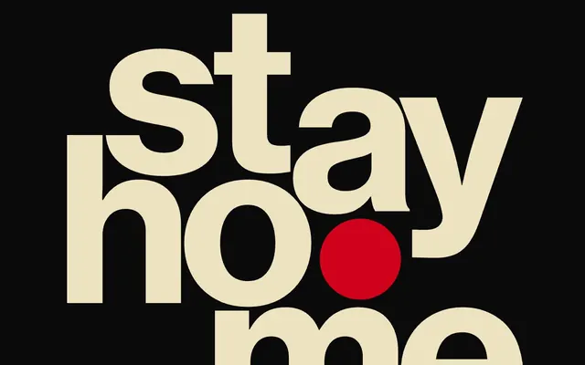
Type-forward, high-contrast, black-red-cream. A vintage subway poster come to life.
Color palette
Interactive elements, large emphatic headings, critical highlights – this vivid red introduces urgency and draws immediate attention
Page background, primary text – establishes a deep, absorbing canvas
Display text, prominent headings, key information blocks, UI borders – serves as the primary contrasting element against the dark background, evoking printed paper
Typography
- Weights
- 700
- Sizes
- 16px, 22px, 44px, 217px
- Line height
- 1
- Letter spacing
- -0.0450em
- Fallback
- System Helvetica, Arial
All primary textual content: headings, body text, links. Its heavy weight and tight tracking convey authority and impact, especially at large sizes.
- Weights
- 400
- Sizes
- 16px
- Line height
- 1.2
- Letter spacing
- normal
- Fallback
- System Helvetica, Arial
Supporting text for smaller details and descriptive content, primarily to accommodate system defaults or less emphasized content where the bold grotesque might be overbearing.
Spacing & shape
Components
Large scale text at 217px Neue Haas Grotesk Text Bd weight 700, with aggressive letter-spacing of -0.0450em. Rendered in Paper White (#eee3c1) or Alert Red (#d0021b) on an Absolute Zero (#000000) background.
Text at 16px Neue Haas Grotesk Text Bd weight 700 in Paper White (#eee3c1) with -0.0450em letter-spacing. Contained within an implied box, often with 10px vertical padding. Creates a dense, informational module.
Text in Neue Haas Grotesk Text Bd weight 700. For filled buttons, the background is Alert Red (#d0021b) with Paper White (#eee3c1) text. For outlined links, it's Paper White (#eee3c1) text with a 1px Paper White (#eee3c1) border. Minimal padding, relying on the visual weight of the text and color to define interaction.
A 1px solid line in Paper White (#eee3c1) used to visually separate content blocks, such as table rows. There are no vertical dividers evident.
Guidelines
- Prioritize text as the primary visual element; use Neue Haas Grotesk Text Bd at weight 700 for almost all content, embracing its inherent impact.
- Utilize the high-contrast pairing of Absolute Zero (#000000) and Paper White (#eee3c1) to establish bold visual rhythm and emphasize content.
- Reserve Alert Red (#d0021b) exclusively for key interactive elements, large expressive text, or critical brand highlights to maximize its impact.
- Apply a global letter-spacing of -0.0450em for all Neue Haas Grotesk Text Bd text to maintain a dense, compact typographic style.
- Use 1px solid borders in Paper White (#eee3c1) for subtle structural delineation, especially in tabular data or content blocks.
- Embrace a dense information layout, minimizing whitespace and relying on typography and strong color contrast for organization rather than ample padding.
- Adhere to the pageMaxWidth of 1184px for all main content, ensuring a consistently contained and structured layout.
- Avoid subtle color variations or gradients; the system relies on stark, flat color blocks.
- Do not introduce shadows or complex elevation; the design operates on a flat, print-like plane.
- Refrain from using lightweight fonts or open letter-spacing; the system demands a bold, condensed typographic presence.
- Do not use varied border radii; maintain sharp, angular forms via a 0px radius.
- Avoid decorative imagery or abstract graphics; content is king, presented directly.
- Do not create tertiary UI elements or secondary action styles; focus on a clear, singular interaction path.
- Refrain from deviating from the Absolute Zero (#000000) background for core content areas; it is foundational to the dark theme.
About this system
ShowHide
The hourly app design system presents an audacious, high-contrast aesthetic, built on a foundation of deep black, bold cream, and urgent red. Typography, dominated by a heavy grotesque sans-serif, takes center stage with dramatic scale and tight tracking. Information is presented densely, pushing content to the edges of a constrained layout without relying on traditional spacing cues. A distinct lack of visual hierarchy via elevation or subtle neutrals focuses attention through sheer presence and high-impact color pairing.
Reminiscent of ESPN 30 for 30 (visual identity), Bloomberg Businessweek (magazine design), Are.na, Some vintage protest posters, Telegram (dark mode).
# hourly — Style Reference
> Type-forward, high-contrast, black-red-cream. A vintage subway poster come to life.

**Theme:** dark

**Site:** https://hourly-app.com

The hourly app design system presents an audacious, high-contrast aesthetic, built on a foundation of deep black, bold cream, and urgent red. Typography, dominated by a heavy grotesque sans-serif, takes center stage with dramatic scale and tight tracking. Information is presented densely, pushing content to the edges of a constrained layout without relying on traditional spacing cues. A distinct lack of visual hierarchy via elevation or subtle neutrals focuses attention through sheer presence and high-impact color pairing.

## Tokens — Colors

| Name | Value | Token | Role |
|------|------|------|------|
| Alert Red | `#d0021b` | `--color-alert-red` | Interactive elements, large emphatic headings, critical highlights – this vivid red introduces urgency and draws immediate attention |
| Absolute Zero | `#000000` | `--color-absolute-zero` | Page background, primary text – establishes a deep, absorbing canvas |
| Paper White | `#eee3c1` | `--color-paper-white` | Display text, prominent headings, key information blocks, UI borders – serves as the primary contrasting element against the dark background, evoking printed paper |

## Tokens — Typography

### Neue Haas Grotesk Text Bd
- **Substitute:** System Helvetica, Arial
- **Weights:** 700
- **Sizes:** 16px, 22px, 44px, 217px
- **Line height:** 1
- **Letter spacing:** -0.0450em
- **Role:** All primary textual content: headings, body text, links. Its heavy weight and tight tracking convey authority and impact, especially at large sizes.

### Helvetica
- **Substitute:** System Helvetica, Arial
- **Weights:** 400
- **Sizes:** 16px
- **Line height:** 1.2
- **Letter spacing:** normal
- **Role:** Supporting text for smaller details and descriptive content, primarily to accommodate system defaults or less emphasized content where the bold grotesque might be overbearing.

## Tokens — Type Scale

| Role | Size | Line height | Letter spacing |
|------|------|------|------|
| body | 16px | 1.2 | -0.72px |
| subheading | 22px | 1 | -0.99px |
| heading | 44px | 1 | -1.98px |
| display | 217px | 1 | -9.77px |

## Tokens — Spacing

- **Max width:** 1184px
- **Section gap:** 37px
- **Card padding:** 10px
- **Element gap:** 4px

## Tokens — Radius

- **Default:** 0px

## Components

### Display Headline
*Hero headline, section titles*

Large scale text at 217px Neue Haas Grotesk Text Bd weight 700, with aggressive letter-spacing of -0.0450em. Rendered in Paper White (#eee3c1) or Alert Red (#d0021b) on an Absolute Zero (#000000) background.

### Sub-Headline Box
*Descriptive text blocks under main titles*

Text at 16px Neue Haas Grotesk Text Bd weight 700 in Paper White (#eee3c1) with -0.0450em letter-spacing. Contained within an implied box, often with 10px vertical padding. Creates a dense, informational module.

### Link Button
*Primary calls to action, navigation elements*

Text in Neue Haas Grotesk Text Bd weight 700. For filled buttons, the background is Alert Red (#d0021b) with Paper White (#eee3c1) text. For outlined links, it's Paper White (#eee3c1) text with a 1px Paper White (#eee3c1) border. Minimal padding, relying on the visual weight of the text and color to define interaction.

### Horizontal Divider
*Section break for tables or content grouping*

A 1px solid line in Paper White (#eee3c1) used to visually separate content blocks, such as table rows. There are no vertical dividers evident.

## Guidelines

### Do

- Prioritize text as the primary visual element; use Neue Haas Grotesk Text Bd at weight 700 for almost all content, embracing its inherent impact.
- Utilize the high-contrast pairing of Absolute Zero (#000000) and Paper White (#eee3c1) to establish bold visual rhythm and emphasize content.
- Reserve Alert Red (#d0021b) exclusively for key interactive elements, large expressive text, or critical brand highlights to maximize its impact.
- Apply a global letter-spacing of -0.0450em for all Neue Haas Grotesk Text Bd text to maintain a dense, compact typographic style.
- Use 1px solid borders in Paper White (#eee3c1) for subtle structural delineation, especially in tabular data or content blocks.
- Embrace a dense information layout, minimizing whitespace and relying on typography and strong color contrast for organization rather than ample padding.
- Adhere to the pageMaxWidth of 1184px for all main content, ensuring a consistently contained and structured layout.

### Don't

- Avoid subtle color variations or gradients; the system relies on stark, flat color blocks.
- Do not introduce shadows or complex elevation; the design operates on a flat, print-like plane.
- Refrain from using lightweight fonts or open letter-spacing; the system demands a bold, condensed typographic presence.
- Do not use varied border radii; maintain sharp, angular forms via a 0px radius.
- Avoid decorative imagery or abstract graphics; content is king, presented directly.
- Do not create tertiary UI elements or secondary action styles; focus on a clear, singular interaction path.
- Refrain from deviating from the Absolute Zero (#000000) background for core content areas; it is foundational to the dark theme.

## Agent Prompt Guide

Quick Color Reference:
text: #eee3c1
background: #000000
border: #eee3c1
accent: #d0021b
primary action: #d0021b (outlined action border)

Example Component Prompts:
1. Create a hero section: Absolute Zero (#000000) background. Headline 'STAY HOME' in Neue Haas Grotesk Text Bd weight 700 at 217px, letter-spacing -0.0450em, using Paper White (#eee3c1) for 'stay' and Alert Red (#d0021b) for the dot in 'home'.
2. Create a feature description block: Paper White (#eee3c1) background. Headline 'ios app for time tracking' at 44px Neue Haas Grotesk Text Bd weight 700, letter-spacing -0.0450em, in Absolute Zero (#000000). Below, a block of 16px Neue Haas Grotesk Text Bd weight 700 text in Absolute Zero (#000000), letter-spacing -0.0450em, with 10px vertical padding. Below that, a 1px Paper White (#eee3c1) rule.
3. Create an Outlined Primary Action: Transparent background, #d0021b border and text, 9999px radius, compact pill padding. Use it for the main CTA instead of a filled button.
More like this





Keep what you find
A free account saves references to boards and can send you a weekly email of picks based on what you save.
To see every result, go Pro.