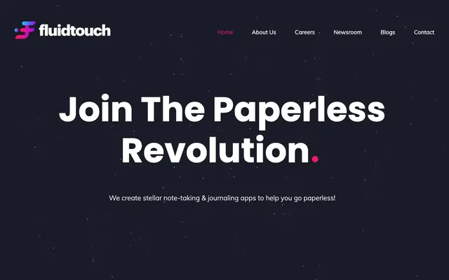
Preview image. Unlock full-res
Deep space productivity
Color palette
Primary action buttons, active navigation links, and accent elements, providing a strong visual punch and guiding user interaction
Page backgrounds and primary dark surfaces, creating a deep, immersive canvas
Muted text, subtle borders, and secondary background elements, providing contrast without being stark
Primary text for headings and body content, ensuring high readability against dark backgrounds. Also used for button text
Typography
- Weights
- 400, 700
- Sizes
- 14px, 16px, 110px
- Line height
- 1, 1.2, 1.25
- Letter spacing
- normal
- Fallback
- sans-serif
Used for all primary headings, body text, and interactive elements. Its strong, geometric forms contribute to the modern, precise feel of the brand, especially at larger sizes like 110px for hero headlines.
- Weights
- 300, 400
- Sizes
- 18px, 22px
- Line height
- 1, 1.5
- Letter spacing
- normal
- Fallback
- sans-serif
Primarily used for navigation links and some body text. Its lighter weights provide a subtle contrast to Poppins, adding a touch of understated elegance that complements the dark theme.
Spacing & shape
Components
Pill-shaped button with a solid 'Fuchsia Flare' background, 'Star Dust' text, '10px' vertical padding and '20px' horizontal padding. Features a fully rounded '100px' border radius, creating a soft, approachable pill shape against the stark background. Font is Poppins at '14px' or '16px' with weight '400'.
Text link using Muli at '18px' with weight '400'. Default color is 'Void Shadow'. Active or current page links are highlighted with 'Fuchsia Flare' for text and an underline or border when active.
Large, impactful Poppins text at '110px' with weight '700' and '1.00' line height, colored 'Star Dust'. This oversized typography creates immediate visual weight.
Poppins or Muli text at '16px' or '18px' with weight '400', colored 'Star Dust' for primary content and 'Void Shadow' for secondary or more subtle information. Line height is '1.50' for readability.
Guidelines
- Use 'Midnight Astral' (#121318) as the default background for all primary page canvases.
- Highlight primary actions, active navigation, and key accent elements with 'Fuchsia Flare' (#ed1672).
- Employ Poppins for headings and primary content, using its '700' weight for impact and '400' for general readability.
- Ensure all buttons have a '100px' border radius to achieve a consistent pill-shaped aesthetic.
- Maintain high contrast by using 'Star Dust' (#ffffff) for all primary text against dark backgrounds.
- Apply '10px' vertical and '20px' horizontal padding for all prominent buttons and calls-to-action.
- Use '15px' consistently as the 'elementGap' for tight, coherent spacing between UI elements.
- Do not introduce new primary energetic accent colors beyond 'Fuchsia Flare' (#ed1672) to maintain brand focus.
- Avoid using hard-edged or square components; prioritize '100px' border radii for buttons and similar elements.
- Do not use light backgrounds for major content sections; maintain the dark-themed 'Midnight Astral' canvas.
- Refrain from using thin weights for body text, as prominence data indicates Poppins 400 is the minimum active body weight.
- Do not deviate from the established font families (Poppins, Muli); introducing new fonts dilutes brand consistency.
- Avoid small text sizes below '14px' for interactive elements or primary content.
- Do not use generic gray buttons; always style primary actions with 'Fuchsia Flare' for background and 'Star Dust' for text.
About this system
ShowHide
Fluidtouch utilizes a deep space productivity aesthetic: a dark, starlit canvas with bold, high-contrast typography and a single vibrant fuchsia accent. This accent color serves as a focal point, drawing attention to calls to action and active states against the otherwise subdued background. Components are minimal, relying on simple shapes and strong color juxtaposition rather than elaborate styling, conveying a sense of focused, modern efficiency.
The page primarily uses a full-bleed structure. The hero section is full-width, centered text over a dark, subtly illustrated background. Subsequent sections maintain a consistent vertical rhythm with '128px' section gaps. Content is arranged in flexible full-width blocks, often with centered content stacks for headlines and subtext. Navigation is a sticky top bar with a '91px' left padding and '56px' horizontal spacing between menu items. The layout feels spacious between sections and objects, but compact within individual components.
The site uses a 'none/minimal' imagery approach, prioritizing UI and bold typography. When present, imagery appears to be product-focused or abstract illustrations rather than photography. The hero section features a subtle, abstract starfield pattern in its dark background, serving as decorative atmosphere rather than content. Icons appear to be solid, filled style, though no specific style detail is available, and their role is decorative or functional punctuation.
# Home — Style Reference
> Deep space productivity

**Theme:** dark

**Site:** https://www.fluidtouch.biz

Fluidtouch utilizes a deep space productivity aesthetic: a dark, starlit canvas with bold, high-contrast typography and a single vibrant fuchsia accent. This accent color serves as a focal point, drawing attention to calls to action and active states against the otherwise subdued background. Components are minimal, relying on simple shapes and strong color juxtaposition rather than elaborate styling, conveying a sense of focused, modern efficiency.

## Tokens — Colors

| Name | Value | Token | Role |
|------|------|------|------|
| Fuchsia Flare | `#ed1672` | `--color-fuchsia-flare` | Primary action buttons, active navigation links, and accent elements, providing a strong visual punch and guiding user interaction |
| Midnight Astral | `#121318` | `--color-midnight-astral` | Page backgrounds and primary dark surfaces, creating a deep, immersive canvas |
| Void Shadow | `#212529` | `--color-void-shadow` | Muted text, subtle borders, and secondary background elements, providing contrast without being stark |
| Star Dust | `#ffffff` | `--color-star-dust` | Primary text for headings and body content, ensuring high readability against dark backgrounds. Also used for button text |

## Tokens — Typography

### Poppins
- **Substitute:** sans-serif
- **Weights:** 400, 700
- **Sizes:** 14px, 16px, 110px
- **Line height:** 1, 1.2, 1.25
- **Letter spacing:** normal
- **Role:** Used for all primary headings, body text, and interactive elements. Its strong, geometric forms contribute to the modern, precise feel of the brand, especially at larger sizes like 110px for hero headlines.

### Muli
- **Substitute:** sans-serif
- **Weights:** 300, 400
- **Sizes:** 18px, 22px
- **Line height:** 1, 1.5
- **Letter spacing:** normal
- **Role:** Primarily used for navigation links and some body text. Its lighter weights provide a subtle contrast to Poppins, adding a touch of understated elegance that complements the dark theme.

## Tokens — Type Scale

| Role | Size | Line height | Letter spacing |
|------|------|------|------|
| caption | 14px | 1.2 | — |
| body-sm | 16px | 1.2 | — |
| body | 110px | 1.2 | — |

## Tokens — Spacing

- **Section gap:** 128px
- **Card padding:** 20px
- **Element gap:** 15px

## Tokens — Radius

- **Buttons:** 100px
- **headings:** 100px

## Layout

The page primarily uses a full-bleed structure. The hero section is full-width, centered text over a dark, subtly illustrated background. Subsequent sections maintain a consistent vertical rhythm with '128px' section gaps. Content is arranged in flexible full-width blocks, often with centered content stacks for headlines and subtext. Navigation is a sticky top bar with a '91px' left padding and '56px' horizontal spacing between menu items. The layout feels spacious between sections and objects, but compact within individual components.

## Imagery

The site uses a 'none/minimal' imagery approach, prioritizing UI and bold typography. When present, imagery appears to be product-focused or abstract illustrations rather than photography. The hero section features a subtle, abstract starfield pattern in its dark background, serving as decorative atmosphere rather than content. Icons appear to be solid, filled style, though no specific style detail is available, and their role is decorative or functional punctuation.

## Components

### Primary Action Button
*Command, navigation*

Pill-shaped button with a solid 'Fuchsia Flare' background, 'Star Dust' text, '10px' vertical padding and '20px' horizontal padding. Features a fully rounded '100px' border radius, creating a soft, approachable pill shape against the stark background. Font is Poppins at '14px' or '16px' with weight '400'.

### Navigation Link
*Site navigation*

Text link using Muli at '18px' with weight '400'. Default color is 'Void Shadow'. Active or current page links are highlighted with 'Fuchsia Flare' for text and an underline or border when active.

### Hero Headline
*Primary page title*

Large, impactful Poppins text at '110px' with weight '700' and '1.00' line height, colored 'Star Dust'. This oversized typography creates immediate visual weight.

### Body Text
*General content*

Poppins or Muli text at '16px' or '18px' with weight '400', colored 'Star Dust' for primary content and 'Void Shadow' for secondary or more subtle information. Line height is '1.50' for readability.

## Guidelines

### Do

- Use 'Midnight Astral' (#121318) as the default background for all primary page canvases.
- Highlight primary actions, active navigation, and key accent elements with 'Fuchsia Flare' (#ed1672).
- Employ Poppins for headings and primary content, using its '700' weight for impact and '400' for general readability.
- Ensure all buttons have a '100px' border radius to achieve a consistent pill-shaped aesthetic.
- Maintain high contrast by using 'Star Dust' (#ffffff) for all primary text against dark backgrounds.
- Apply '10px' vertical and '20px' horizontal padding for all prominent buttons and calls-to-action.
- Use '15px' consistently as the 'elementGap' for tight, coherent spacing between UI elements.

### Don't

- Do not introduce new primary energetic accent colors beyond 'Fuchsia Flare' (#ed1672) to maintain brand focus.
- Avoid using hard-edged or square components; prioritize '100px' border radii for buttons and similar elements.
- Do not use light backgrounds for major content sections; maintain the dark-themed 'Midnight Astral' canvas.
- Refrain from using thin weights for body text, as prominence data indicates Poppins 400 is the minimum active body weight.
- Do not deviate from the established font families (Poppins, Muli); introducing new fonts dilutes brand consistency.
- Avoid small text sizes below '14px' for interactive elements or primary content.
- Do not use generic gray buttons; always style primary actions with 'Fuchsia Flare' for background and 'Star Dust' for text.

## Agent Prompt Guide

Quick Color Reference:
text: #ffffff
background: #121318
border: #212529
accent: #ed1672
primary action: #ed1672 (filled action)

Example Component Prompts:
Create a hero section: 'Midnight Astral' background. Headline 'Join The Paperless Revolution' in Poppins 700 at 110px, 'Star Dust' color. Subtext in Poppins 400 at 18px, 'Star Dust' color. Bottom element padding 60px from the hero text block to the next element.
Create a Primary Action Button: #ed1672 background, #ffffff text, 9999px radius, compact pill padding. Use this filled treatment for the main CTA.
Create a navigation item: Muli 400 at 18px text, 'Void Shadow' as default, 'Fuchsia Flare' for active. Element gap 56px between nav items.
More like this




Keep what you find
A free account saves references to boards and can send you a weekly email of picks based on what you save.
To see every result, go Pro.