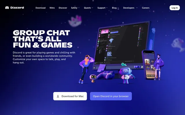
Preview image. Unlock full-res
Game world behind a chat bubble — every section is a self-contained environment with its own lighting and cast of characters.
Color palette
Primary CTA buttons, brand icon, active states — the single chromatic anchor in a near-monochrome blue-black space, creating instant recognition as the only saturated element in the layout
Hover state for primary buttons, pressed states
Button hover tint, elevated blurple interactions
Voice/video channel indicators, info states
Quest indicators, achievement highlights
Text on light surfaces, icon fills, overlay backgrounds
Primary text on dark backgrounds, button text, nav links, card backgrounds
Secondary button text and borders, dark UI surface color
App UI chrome surfaces, elevated dark panels
Tertiary text on light surfaces, image overlays
Subdued headings and body text on dark backgrounds — a lavender-tinted neutral that stays on-brand while reducing contrast
Disabled states, placeholder text, muted metadata
Input borders, dividers, secondary icon fills
Light section backgrounds, card surfaces in light contexts
Online status indicators, success states
Destructive actions, critical alerts
Typography
- Weights
- 700, 800
- Sizes
- 36px, 48px, 56px, 61px
- Line height
- 0.86
- Letter spacing
- -0.01em (approx -0.56px at 56px, -0.61px at 61px)
- Fallback
- Nunito Black, Poppins 800, or Rounded Mplus 1c 800
All display headlines and section headings. Weight 800 is the signature move — combined with all-caps styling and -0.01em tracking, headlines compress into dense rectangular blocks. No other font or weight creates this stamped-label effect. Used at 56–61px for hero, 48px for section leads, 36px for subsections.
- Weights
- 400, 500
- Sizes
- 16px, 20px
- Line height
- 1.2
- Letter spacing
- 0.013–0.016em
- Fallback
- Inter, DM Sans, or Nunito 400/500
Navigation labels, body copy, button text, UI labels. Letter-spacing at 0.013–0.016em adds subtle openness at small sizes — compensating for the condensed feel of the Nord headline font above. Weight 500 for buttons and nav emphasis, 400 for body and metadata.
- Weights
- 400
- Sizes
- 16px
- Line height
- 1.5
- Fallback
- Inter 400
Discord's proprietary UI font used inside product UI mock-ups and app interface screenshots embedded in marketing sections. Appears at 16px/1.5 exclusively — mirrors the in-product typeface to keep screenshots authentic.
- Weights
- 400
- Sizes
- 16px
- Line height
- 1.5
- Fallback
- Inter 400
Long-form paragraph body text in feature sections, link lists in footer. Functionally identical metrics to ABC Ginto Discord but a separate optical variant for extended reading.
Spacing & shape
Components
backgroundColor #5865F2, color #FFFFFF, borderRadius 12px, padding 19.5px 24px. No border visible — the blurple fill is self-contained. Hover shifts to #3442D9. The 19.5px vertical padding makes this the tallest button variant on the page — physically dominant in the CTA pair.
backgroundColor #FFFFFF, color #23272A, borderRadius 12px, padding 15px 24px. A clean white pill against the dark background — high contrast without blurple. Border is #23272A at 1px. The softer padding (vs primary) visually subordinates it as the secondary choice.
backgroundColor transparent, color #FFFFFF, border 1px solid #FFFFFF, borderRadius 12px, padding 10px 16px. Used for nav menu items with dropdown arrows. The all-white outline on dark keeps it visible without competing with blurple.
backgroundColor #FFFFFF, color #000000, border 1px solid #000000, borderRadius 16px, padding 10px 16px. Uses a larger 16px radius than other buttons — matches the pill-like header style. Appears on the light/frosted header strip, making the filled white surface legible against the nav background.
Large rounded containers with 24px+ radius, set against the page's deep blue background. Each card uses its own gradient or solid background (purple-to-magenta for 'Group Chats', green for 'Watch Together') — section identity is expressed through the card background color, not the page background. Content splits 50/50: product screenshot left, text right. Cards span full viewport width on mobile, max ~1100px on desktop.
Not interactive UI — these are 3D-rendered PNG/WebP assets positioned absolutely at section boundaries, overlapping card edges. Sizes range from ~100px to ~300px. They exit and enter sections unpredictably, creating the 'world' atmosphere. No background, no border, no radius — raw edge compositing into the page.
Screenshots of the actual Discord app rendered inside feature cards with 12-16px radius. They float slightly off-center with a subtle drop shadow. Mobile frames shown as phone outlines. Desktop frames shown as monitor bezels. The mock-ups use the real Discord dark UI (#2C2F33 surface, #23272A sidebar), grounding marketing claims in the actual product.
Fixed header spanning full viewport width. Background is semi-transparent over the hero image — appears near-white/frosted. Contains Discord wordmark left, text nav links center (16px ABC Ginto, #FFFFFF or #000000 depending on scroll state), and 'Log In' button far right. Dropdown triggers use the ghost outlined button variant. No visible shadow — floats as a flat strip.
Full-bleed dark indigo background (#0E0F2D to near-black gradient implied). Headline in ABC Ginto Nord 800 at 56-61px, color #FFFFFF, all-caps, line-height 0.86, crammed into the left 50% of the viewport. Body copy at 16px ABC Ginto 400, color #FFFFFF, max-width ~380px. CTA pair (white + blurple buttons) sits below body. Right 50% holds the product mock-up composite with 3D characters overlapping both halves.
Dark background (#23272A or #000000). Multi-column link grid with group headings in 16px ABC Ginto 500 + positive letter-spacing. Link text at 16px/1.5 weight 400, color #BABCD9 (Fog) on dark. Discord wordmark and social icons top-left. No dividers — columns separated by gap only.
Guidelines
- Use ABC Ginto Nord 800 in all-caps for all section headlines; letter-spacing must be -0.01em to maintain the compressed rectangular silhouette.
- Keep #5865F2 (Blurple) exclusively on primary CTA buttons and interactive focus states — it is the only saturated color with a guaranteed role on every page.
- Set feature section cards with their own gradient or solid background color (purple-magenta, green, etc.) to differentiate sections, since the global page background never changes.
- Pair the blurple CTA button with a white filled secondary button using padding 15px 24px and radius 12px — never use blurple for both primary and secondary in the same CTA cluster.
- Position 3D characters and mascot assets at card edges, overlapping between sections — the overlap is what creates the immersive environment, not isolated placement.
- Apply 12px border-radius to standard buttons and 16px to the Log In/header button to maintain the subtle size hierarchy between interaction contexts.
- Use the Fog color (#BABCD9) for body text in dark sections where full white (#FFFFFF) would overpower headlines — reserve pure white for headlines and critical UI labels.
- Never use a white or light-gray page background — the deep blue-black environment is non-negotiable for the brand atmosphere; even light-themed sections should be contained within cards.
- Never apply ABC Ginto Nord headlines at mixed-case — the all-caps + tight tracking combination is inseparable from the visual identity.
- Never place Blurple as a background color on large areas (sections, cards) — at scale it overwhelms the controlled accent role and collapses contrast with Blurple text.
- Never use gradient text on headlines — the weight and mass of the black-filled letterforms is the visual statement; gradients would undermine the stamped-metal quality.
- Never add drop shadows to feature cards — section identity comes from contrasting card backgrounds, not elevation shadow depth.
- Never reduce button border-radius below 12px — anything sharper breaks the rounded-corner system that softens the otherwise heavy typographic tone.
- Never use Greyple (#99AAB5) or Dim Grey (#50555F) as primary text colors — they are reserved for disabled, muted, and placeholder states only.
About this system
ShowHide
Deep cosmic blue fills every section like a starfield at 2am — not a background choice but a total environment. The hero plunges into a rich indigo-to-navy gradient populated with 3D characters, product screens, and floating mascots, making the UI feel like a game world rather than a marketing page. Blurple (#5865F2) — Discord's owned hue — appears only on primary CTAs, creating a controlled pop against the blue-black atmosphere. Typography does the heavy lifting: ABC Ginto Nord at weight 800 with tight -0.01em tracking slams headlines into all-caps blocks that feel like stamped metal, while body copy at 16px/1.5 stays conversational. The overall effect is a gaming-native space where every section is its own immersive stage, not a content column.
Full-bleed at the page level with no explicit max-width container visible — the deep blue background extends edge-to-edge. Hero is a split composition: text block flush-left with 3D product composite filling the right half, both contained within viewport height. Feature sections below the hero use large-radius cards (~24px) that span 80-90% of the viewport width, each card being a self-contained stage. Within cards, layout is 50/50 split — product screenshot left, headline + body right (or reversed). No alternating light/dark band rhythm — all sections share the same dark background; differentiation comes from card background colors. Navigation is a fixed-top full-width bar with centered link groups. Footer uses a 4-5 column link grid. The page is extremely long (7300px+), with generous inter-section gaps of 80-120px giving each feature room to breathe.
Entirely 3D illustration and product screenshots — no photography. Characters are rendered in a cartoon-realistic 3D style with soft subsurface lighting, purple-blue-tinted shadows, and saturated clothing colors (orange, lavender, pink hoodie). They're posed mid-gesture and placed off-axis against the page, creating dynamism without a static layout grid. Product screenshots are composited into device frames (monitor bezel, phone outline) rendered in the same 3D style, making the 'product demo' feel like part of the illustration world rather than a flat screen-grab. Feature cards use full-bleed gradient backgrounds (purple-to-magenta, deep green) as the canvas for these screenshot composites — the gradient IS the scene lighting. Floating 3D props (a peach, a crystal, a robot mascot in lime green) appear at section boundaries as scene accessories. Zero photography — the visual world is entirely constructed, reinforcing that Discord is a space you build rather than a place that exists.
Reminiscent of Roblox, Twitch, Epic Games Store, Spotify (gaming campaigns), Supercell.
# Discord — Style Reference
> Game world behind a chat bubble — every section is a self-contained environment with its own lighting and cast of characters.

**Theme:** dark

**Site:** https://discord.com

Deep cosmic blue fills every section like a starfield at 2am — not a background choice but a total environment. The hero plunges into a rich indigo-to-navy gradient populated with 3D characters, product screens, and floating mascots, making the UI feel like a game world rather than a marketing page. Blurple (#5865F2) — Discord's owned hue — appears only on primary CTAs, creating a controlled pop against the blue-black atmosphere. Typography does the heavy lifting: ABC Ginto Nord at weight 800 with tight -0.01em tracking slams headlines into all-caps blocks that feel like stamped metal, while body copy at 16px/1.5 stays conversational. The overall effect is a gaming-native space where every section is its own immersive stage, not a content column.

## Tokens — Colors

| Name | Value | Token | Role |
|------|------|------|------|
| Blurple | `#5865f2` | `--color-blurple` | Primary CTA buttons, brand icon, active states — the single chromatic anchor in a near-monochrome blue-black space, creating instant recognition as the only saturated element in the layout |
| Dark Blurple | `#3442d9` | `--color-dark-blurple` | Hover state for primary buttons, pressed states |
| Hover Blurple | `#8891f2` | `--color-hover-blurple` | Button hover tint, elevated blurple interactions |
| Vivid Cerulean | `#00b0f4` | `--color-vivid-cerulean` | Voice/video channel indicators, info states |
| Ember Orange | `#fda220` | `--color-ember-orange` | Quest indicators, achievement highlights |
| Void | `#000000` | `--color-void` | Text on light surfaces, icon fills, overlay backgrounds |
| Snow | `#ffffff` | `--color-snow` | Primary text on dark backgrounds, button text, nav links, card backgrounds |
| Not Quite Black | `#23272a` | `--color-not-quite-black` | Secondary button text and borders, dark UI surface color |
| Dark Charcoal | `#2c2f33` | `--color-dark-charcoal` | App UI chrome surfaces, elevated dark panels |
| Graphite | `#333333` | `--color-graphite` | Tertiary text on light surfaces, image overlays |
| Fog | `#babcd9` | `--color-fog` | Subdued headings and body text on dark backgrounds — a lavender-tinted neutral that stays on-brand while reducing contrast |
| Greyple | `#99aab5` | `--color-greyple` | Disabled states, placeholder text, muted metadata |
| Dim Grey | `#50555f` | `--color-dim-grey` | Input borders, dividers, secondary icon fills |
| Off White | `#f6f6f6` | `--color-off-white` | Light section backgrounds, card surfaces in light contexts |
| Spring Green | `#57f287` | `--color-spring-green` | Online status indicators, success states |
| Ekko Red | `#de2761` | `--color-ekko-red` | Destructive actions, critical alerts |

## Tokens — Typography

### ABC Ginto Nord Discord
- **Substitute:** Nunito Black, Poppins 800, or Rounded Mplus 1c 800
- **Weights:** 700, 800
- **Sizes:** 36px, 48px, 56px, 61px
- **Line height:** 0.86
- **Letter spacing:** -0.01em (approx -0.56px at 56px, -0.61px at 61px)
- **Role:** All display headlines and section headings. Weight 800 is the signature move — combined with all-caps styling and -0.01em tracking, headlines compress into dense rectangular blocks. No other font or weight creates this stamped-label effect. Used at 56–61px for hero, 48px for section leads, 36px for subsections.

### ABC Ginto Discord
- **Substitute:** Inter, DM Sans, or Nunito 400/500
- **Weights:** 400, 500
- **Sizes:** 16px, 20px
- **Line height:** 1.2
- **Letter spacing:** 0.013–0.016em
- **Role:** Navigation labels, body copy, button text, UI labels. Letter-spacing at 0.013–0.016em adds subtle openness at small sizes — compensating for the condensed feel of the Nord headline font above. Weight 500 for buttons and nav emphasis, 400 for body and metadata.

### GG Sans
- **Substitute:** Inter 400
- **Weights:** 400
- **Sizes:** 16px
- **Line height:** 1.5
- **Role:** Discord's proprietary UI font used inside product UI mock-ups and app interface screenshots embedded in marketing sections. Appears at 16px/1.5 exclusively — mirrors the in-product typeface to keep screenshots authentic.

### ABC Ginto Normal
- **Substitute:** Inter 400
- **Weights:** 400
- **Sizes:** 16px
- **Line height:** 1.5
- **Role:** Long-form paragraph body text in feature sections, link lists in footer. Functionally identical metrics to ABC Ginto Discord but a separate optical variant for extended reading.

## Tokens — Type Scale

Perfect Fourth (1.333) from 16px base.

| Role | Size | Line height | Letter spacing |
|------|------|------|------|
| body | 16px | 1.5 | — |
| body-lg | 20px | 1.38 | — |
| heading-sm | 36px | 1.2 | -0.36px |
| heading | 48px | 0.93 | -0.48px |
| heading-lg | 56px | 0.86 | -0.56px |
| display | 61px | 0.86 | -0.61px |

## Tokens — Spacing

- **Max width:** 1200px
- **Section gap:** 80-120px
- **Card padding:** 32-48px
- **Element gap:** 8-16px

## Tokens — Radius

- **Buttons:** 12px
- **Cards:** 16px
- **buttonsLarge:** 16px
- **featurePanels:** 24px
- **pills:** 104px

## Layout

Full-bleed at the page level with no explicit max-width container visible — the deep blue background extends edge-to-edge. Hero is a split composition: text block flush-left with 3D product composite filling the right half, both contained within viewport height. Feature sections below the hero use large-radius cards (~24px) that span 80-90% of the viewport width, each card being a self-contained stage. Within cards, layout is 50/50 split — product screenshot left, headline + body right (or reversed). No alternating light/dark band rhythm — all sections share the same dark background; differentiation comes from card background colors. Navigation is a fixed-top full-width bar with centered link groups. Footer uses a 4-5 column link grid. The page is extremely long (7300px+), with generous inter-section gaps of 80-120px giving each feature room to breathe.

## Imagery

Entirely 3D illustration and product screenshots — no photography. Characters are rendered in a cartoon-realistic 3D style with soft subsurface lighting, purple-blue-tinted shadows, and saturated clothing colors (orange, lavender, pink hoodie). They're posed mid-gesture and placed off-axis against the page, creating dynamism without a static layout grid. Product screenshots are composited into device frames (monitor bezel, phone outline) rendered in the same 3D style, making the 'product demo' feel like part of the illustration world rather than a flat screen-grab. Feature cards use full-bleed gradient backgrounds (purple-to-magenta, deep green) as the canvas for these screenshot composites — the gradient IS the scene lighting. Floating 3D props (a peach, a crystal, a robot mascot in lime green) appear at section boundaries as scene accessories. Zero photography — the visual world is entirely constructed, reinforcing that Discord is a space you build rather than a place that exists.

## Components

### CTA Button Group

### Feature Showcase Card — Make Your Group Chats More Fun

### Feature Showcase Card — Always Have Something To Do Together

### Primary CTA Button (Blurple Filled)
*Main call-to-action, e.g. 'Open Discord in your browser'*

backgroundColor #5865F2, color #FFFFFF, borderRadius 12px, padding 19.5px 24px. No border visible — the blurple fill is self-contained. Hover shifts to #3442D9. The 19.5px vertical padding makes this the tallest button variant on the page — physically dominant in the CTA pair.

### Secondary CTA Button (White Filled)
*Download prompt, paired with primary CTA*

backgroundColor #FFFFFF, color #23272A, borderRadius 12px, padding 15px 24px. A clean white pill against the dark background — high contrast without blurple. Border is #23272A at 1px. The softer padding (vs primary) visually subordinates it as the secondary choice.

### Ghost Navigation Button (Transparent Outlined)
*Nav dropdown triggers and secondary navigation actions*

backgroundColor transparent, color #FFFFFF, border 1px solid #FFFFFF, borderRadius 12px, padding 10px 16px. Used for nav menu items with dropdown arrows. The all-white outline on dark keeps it visible without competing with blurple.

### Log In Button (White Outlined)
*Top-right header authentication action*

backgroundColor #FFFFFF, color #000000, border 1px solid #000000, borderRadius 16px, padding 10px 16px. Uses a larger 16px radius than other buttons — matches the pill-like header style. Appears on the light/frosted header strip, making the filled white surface legible against the nav background.

### Feature Showcase Card
*Full-bleed section content containers holding product screenshots and feature copy*

Large rounded containers with 24px+ radius, set against the page's deep blue background. Each card uses its own gradient or solid background (purple-to-magenta for 'Group Chats', green for 'Watch Together') — section identity is expressed through the card background color, not the page background. Content splits 50/50: product screenshot left, text right. Cards span full viewport width on mobile, max ~1100px on desktop.

### 3D Character Float
*Decorative mascot and character illustrations scattered at section edges*

Not interactive UI — these are 3D-rendered PNG/WebP assets positioned absolutely at section boundaries, overlapping card edges. Sizes range from ~100px to ~300px. They exit and enter sections unpredictably, creating the 'world' atmosphere. No background, no border, no radius — raw edge compositing into the page.

### Product Screen Mock-up
*Embedded Discord UI screenshots within feature cards*

Screenshots of the actual Discord app rendered inside feature cards with 12-16px radius. They float slightly off-center with a subtle drop shadow. Mobile frames shown as phone outlines. Desktop frames shown as monitor bezels. The mock-ups use the real Discord dark UI (#2C2F33 surface, #23272A sidebar), grounding marketing claims in the actual product.

### Navigation Bar
*Global top navigation*

Fixed header spanning full viewport width. Background is semi-transparent over the hero image — appears near-white/frosted. Contains Discord wordmark left, text nav links center (16px ABC Ginto, #FFFFFF or #000000 depending on scroll state), and 'Log In' button far right. Dropdown triggers use the ghost outlined button variant. No visible shadow — floats as a flat strip.

### Hero Section
*Full-viewport landing block*

Full-bleed dark indigo background (#0E0F2D to near-black gradient implied). Headline in ABC Ginto Nord 800 at 56-61px, color #FFFFFF, all-caps, line-height 0.86, crammed into the left 50% of the viewport. Body copy at 16px ABC Ginto 400, color #FFFFFF, max-width ~380px. CTA pair (white + blurple buttons) sits below body. Right 50% holds the product mock-up composite with 3D characters overlapping both halves.

### Footer Navigation
*Site-wide footer link groups*

Dark background (#23272A or #000000). Multi-column link grid with group headings in 16px ABC Ginto 500 + positive letter-spacing. Link text at 16px/1.5 weight 400, color #BABCD9 (Fog) on dark. Discord wordmark and social icons top-left. No dividers — columns separated by gap only.

## Guidelines

### Do

- Use ABC Ginto Nord 800 in all-caps for all section headlines; letter-spacing must be -0.01em to maintain the compressed rectangular silhouette.
- Keep #5865F2 (Blurple) exclusively on primary CTA buttons and interactive focus states — it is the only saturated color with a guaranteed role on every page.
- Set feature section cards with their own gradient or solid background color (purple-magenta, green, etc.) to differentiate sections, since the global page background never changes.
- Pair the blurple CTA button with a white filled secondary button using padding 15px 24px and radius 12px — never use blurple for both primary and secondary in the same CTA cluster.
- Position 3D characters and mascot assets at card edges, overlapping between sections — the overlap is what creates the immersive environment, not isolated placement.
- Apply 12px border-radius to standard buttons and 16px to the Log In/header button to maintain the subtle size hierarchy between interaction contexts.
- Use the Fog color (#BABCD9) for body text in dark sections where full white (#FFFFFF) would overpower headlines — reserve pure white for headlines and critical UI labels.

### Don't

- Never use a white or light-gray page background — the deep blue-black environment is non-negotiable for the brand atmosphere; even light-themed sections should be contained within cards.
- Never apply ABC Ginto Nord headlines at mixed-case — the all-caps + tight tracking combination is inseparable from the visual identity.
- Never place Blurple as a background color on large areas (sections, cards) — at scale it overwhelms the controlled accent role and collapses contrast with Blurple text.
- Never use gradient text on headlines — the weight and mass of the black-filled letterforms is the visual statement; gradients would undermine the stamped-metal quality.
- Never add drop shadows to feature cards — section identity comes from contrasting card backgrounds, not elevation shadow depth.
- Never reduce button border-radius below 12px — anything sharper breaks the rounded-corner system that softens the otherwise heavy typographic tone.
- Never use Greyple (#99AAB5) or Dim Grey (#50555F) as primary text colors — they are reserved for disabled, muted, and placeholder states only.

## Agent Prompt Guide

**Quick Color Reference**
- Page background: #0E0F2D (deep indigo)
- Primary headline text: #FFFFFF
- Body text on dark: #BABCD9 (Fog)
- Primary CTA: #5865F2 (Blurple), white text
- Secondary CTA: #FFFFFF background, #23272A text
- Nav links: #FFFFFF
- Border / UI outlines: #FFFFFF (on dark) or #23272A (on light)

**Example Component Prompts**

1. **Hero Section**: Full-bleed background #0E0F2D. Left 50%: headline 'GROUP CHAT THAT'S ALL FUN & GAMES' in ABC Ginto Nord 800, 56px, #FFFFFF, all-caps, letter-spacing -0.56px, line-height 0.86. Subtext 16px ABC Ginto 400, #FFFFFF, max-width 380px, line-height 1.5. Below: two buttons — white filled (#FFFFFF bg, #23272A text, 12px radius, 15px 24px padding) + blurple filled (#5865F2 bg, #FFFFFF text, 12px radius, 19.5px 24px padding), gap 16px. Right 50%: product screen composite with 3D character overlaps.

2. **Feature Section Card** (purple variant): Card background linear-gradient from #8B31A0 to #E040A0, border-radius 24px, width 90vw centered, padding 48px. Left: Discord app screenshot in phone/desktop frame. Right: headline 'MAKE YOUR GROUP CHATS MORE FUN' in ABC Ginto Nord 800, 48px, #FFFFFF, all-caps, letter-spacing -0.48px. Body text 16px ABC Ginto 400, #FFFFFF, line-height 1.5, max-width 360px.

3. **Navigation Bar**: Full-width fixed bar, semi-transparent background. Left: Discord logo + wordmark. Center: text links in ABC Ginto 400 16px, #FFFFFF, gap 4-8px. Dropdown triggers as ghost buttons (transparent bg, #FFFFFF border 1px, 12px radius, 10px 16px padding). Far right: 'Log In' button (#FFFFFF bg, #000000 text, 16px radius, 10px 16px padding).

4. **Primary CTA Button**: backgroundColor #5865F2, color #FFFFFF, border none, borderRadius 12px, padding 19.5px 24px, font ABC Ginto 500 16px, letter-spacing 0.016em. Hover state: backgroundColor #3442D9.

5. **Footer Link Column**: Dark background #23272A. Column heading: ABC Ginto 500, 16px, #FFFFFF, letter-spacing 0.013em. Links: ABC Ginto 400, 16px, #BABCD9, line-height 1.5, gap 8px between items. 4-5 columns in a row, gap 32px between columns.

## Brand Color System

Discord's color palette is a deliberate two-tier system: a near-monochromatic dark environment (indigo-black page, white text, charcoal UI) plus a single owned hue — Blurple (#5865F2). Every other color (Spring Green for online, Fuchsia for Nitro, Cerulean for voice) appears only in contextual UI states or seasonal campaigns. This means new page designs should default to white text on dark backgrounds with Blurple as the ONLY chromatic element in the layout chrome. The extended palette (Fuchsia, Yellow, Orange, Green) is available for in-product UI mock-ups, illustration coloring, and special campaign moments — not for general page components.
More like this



Keep what you find
A free account saves references to boards and can send you a weekly email of picks based on what you save.
To see every result, go Pro.