Preview image. Unlock full-res
Precise White Lab
Color palette
Orange outline accent for tags, dividers, and focused UI edges. Do not promote it to the primary CTA color
Primary page background, default surface for most cards and UI elements. Provides a clean, bright foundation
Primary text for headlines and critical information. Near-black for maximal contrast on light surfaces
Secondary text, navigation items, and muted interface elements. Provides visual relief from primary text
Dark borders and separators for elevated surfaces and inverted UI. Do not promote it to the primary CTA color; Background gradient primarily for hero sections or full-width elements where text needs to stand out against imagery or product graphics
Subtly darker background for alternative card surfaces or subtle section separation
Tertiary background for cards or distinct content blocks, providing minimal contrast to the main canvas
Typography
- Weights
- 400
- Sizes
- 12px
- Line height
- 1.2
sans-serif — detected in extracted data but not described by AI
- Weights
- 500, 600
- Sizes
- 16px, 18px, 20px, 24px, 32px, 42px, 44px, 50px, 58px
- Line height
- 0.7, 1.1, 1.2, 1.4, 1.5
- Letter spacing
- -0.0520em (58px), -0.0500em (50px), -0.0360em (44px), -0.0300em (42px), -0.0200em (32px)
Primary display and heading font. Its generous x-height and slightly condensed structure give it a modern, capable feel. Letter spacing is consistently tight, especially at larger sizes, to pull words together.
- Weights
- 500, 600
- Sizes
- 13px, 14px, 15px, 16px, 24px
- Line height
- 1.3, 1.4
- Letter spacing
- -0.0200em (24px, 16px), -0.0070em (14px)
Secondary sans-serif for UI elements, navigation, and detailed body text. Its clean, technical aesthetic complements the primary heading font while maintaining readability at smaller sizes. Features like 'ss01' are activated for a distinct geometric feel.
- Weights
- 400
- Sizes
- 12px, 14px, 17px
- Line height
- 1, 1.2, 1.3, 1.4
- Letter spacing
- normal
A more flexible variant of Geist, used for compact informational text like captions, labels, and possibly code snippets due to its variable nature.
- Weights
- 400, 500, 600
- Sizes
- 14px, 16px, 18px
- Line height
- 1.2, 1.4
- Letter spacing
- -0.0400em (18px), -0.0200em (16px), -0.0100em (14px)
- Fallback
- system-ui
Fallback and utility font for general body text and links where a more standard, highly readable sans-serif is preferred.
Spacing & shape
Elevation
Components
Background rgba(255, 255, 255, 0.08), Ink Black text, 100px border-radius for a pill shape.
Background Canvas White (#fafafa), 30px border-radius, diffused shadow: rgba(0, 0, 0, 0.03) 0px 30px 30px -2.5px.
Background Canvas White (#fafafa), 24px border-radius, padded 30px all sides, diffused shadow: rgba(0, 0, 0, 0.03) 0px 30px 30px -2.5px.
Background Alabaster Gray (#ecebe8), 48px border-radius, 16px padding all sides, no shadow.
Background rgba(204, 204, 204, 0.2), 60px border-radius, 26px padding all sides, no shadow.
Granite Gray (#6e6e6e) text in Geist font, 14px size, 6px border-radius for interaction states, 10px internal spacing.
Background Ink Black (#000000), Canvas White (#fafafa) text, 100px border-radius.
Guidelines
- Prioritize Canvas White (#fafafa) for all primary backgrounds and surfaces.
- Use Bricolage Grotesque (weights 500, 600) for all headings, applying appropriate tight letter-spacing for each size.
- Apply Geist (weights 500, 600) for UI labels, navigation, and body text where precision is key.
- Elevate cards with a subtle, diffused shadow: rgba(0, 0, 0, 0.03) 0px 30px 30px -2.5px.
- Apply 30px border-radius to main content cards and 100px to all buttons for a consistent rounded feel.
- Reserve Electric Orange (#ff4000) strictly for accents, interactive links, and strong highlights, never for large background areas or primary text.
- Maintain comfortable spacing with 10px element gaps and 32px card padding, ensuring visual breathability.
- Avoid heavy or high-contrast shadows; only use the subtle, diffused dark shadow.
- Do not introduce new display fonts; stick to Bricolage Grotesque for all headings.
- Never use Electric Orange (#ff4000) as a primary button background unless it's a small, icon-centric interaction.
- Do not use dark backgrounds for sections unless explicitly defined as a full-bleed hero or product showcase with the Dark Overlay Gradient.
- Avoid strong border strokes on cards; rely on elevation shadows or background color variations for differentiation.
- Do not deviate from the established border radii; 30px for cards, 100px for buttons, 6px for controls, and 40px for images ensures consistency.
- Refrain from using bold typefaces for body text; rely on weight 500 or 600 from Geist for emphasis.
About this system
ShowHide
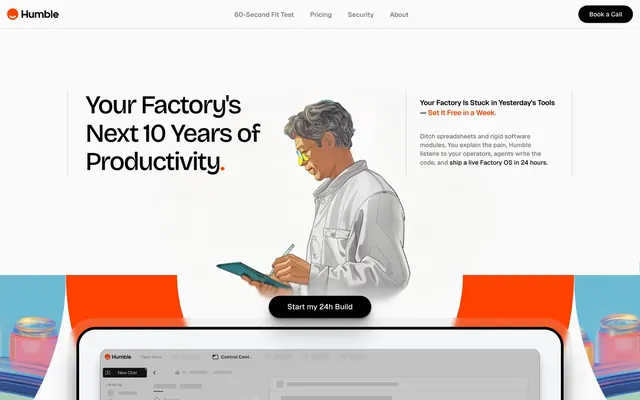
Humble's design system embraces a 'light AI lab' aesthetic: a pristine white canvas contrasted with sharp, functional typography. A singular vibrant orange acts as a dynamic accent, highlighting key actions and brand elements. Components are lightweight with subtle, diffused shadows that lift elements gently from the background rather than anchoring them with heavy forms. The overall impression is one of clarity, precision, and restrained energy.
The page primarily uses a max-width contained layout section by section, centered on the screen, adhering to a light, open grid. The hero section breaks this with a full-bleed dark background and a central illustration flanked by textual content. Sections often alternate between full-width content blocks and more contained textual descriptions paired with product UI illustrations or screenshots occupying a two-column layout. Vertical rhythm is established by defined section gaps, creating breathing room between distinct content areas. The navigation is a sticky top bar with a primary 'Book a Call' button.
The visual language combines stylized vector illustrations of people and abstract product graphics with embedded product UI screenshots. Illustrations are often dimensional, with subtle shading, and feature a light, almost ethereal quality, often set against the pristine white background or within a contained dark gradient. Product screenshots are typically clean, full UI captures, often presented within mock devices or floating as elevated cards with soft shadows, showcasing the interface directly. Icons are minimalist, outlined, and monochromatic, maintaining a precise and functional style.
Reminiscent of Braintrust, Linear, Framer, Raycast.
# Humble — Style Reference
> Precise White Lab

**Theme:** light

**Site:** https://humbleops.ai

Humble's design system embraces a 'light AI lab' aesthetic: a pristine white canvas contrasted with sharp, functional typography. A singular vibrant orange acts as a dynamic accent, highlighting key actions and brand elements. Components are lightweight with subtle, diffused shadows that lift elements gently from the background rather than anchoring them with heavy forms. The overall impression is one of clarity, precision, and restrained energy.

## Tokens — Colors

| Name | Value | Token | Role |
|------|------|------|------|
| Electric Orange | `#ff4000` | `--color-electric-orange` | Orange outline accent for tags, dividers, and focused UI edges. Do not promote it to the primary CTA color |
| Canvas White | `#fafafa` | `--color-canvas-white` | Primary page background, default surface for most cards and UI elements. Provides a clean, bright foundation |
| Obsidian Text | `#1c1c1c` | `--color-obsidian-text` | Primary text for headlines and critical information. Near-black for maximal contrast on light surfaces |
| Granite Gray | `#6e6e6e` | `--color-granite-gray` | Secondary text, navigation items, and muted interface elements. Provides visual relief from primary text |
| Ink Black | `#000000` | `--color-ink-black` | Dark borders and separators for elevated surfaces and inverted UI. Do not promote it to the primary CTA color; Background gradient primarily for hero sections or full-width elements where text needs to stand out against imagery or product graphics |
| Ghost White | `#f1f1f1` | `--color-ghost-white` | Subtly darker background for alternative card surfaces or subtle section separation |
| Alabaster Gray | `#ecebe8` | `--color-alabaster-gray` | Tertiary background for cards or distinct content blocks, providing minimal contrast to the main canvas |

## Tokens — Typography

### sans-serif
- **Weights:** 400
- **Sizes:** 12px
- **Line height:** 1.2
- **Role:** sans-serif — detected in extracted data but not described by AI

### Bricolage Grotesque
- **Weights:** 500, 600
- **Sizes:** 16px, 18px, 20px, 24px, 32px, 42px, 44px, 50px, 58px
- **Line height:** 0.7, 1.1, 1.2, 1.4, 1.5
- **Letter spacing:** -0.0520em (58px), -0.0500em (50px), -0.0360em (44px), -0.0300em (42px), -0.0200em (32px)
- **Role:** Primary display and heading font. Its generous x-height and slightly condensed structure give it a modern, capable feel. Letter spacing is consistently tight, especially at larger sizes, to pull words together.

### Geist
- **Weights:** 500, 600
- **Sizes:** 13px, 14px, 15px, 16px, 24px
- **Line height:** 1.3, 1.4
- **Letter spacing:** -0.0200em (24px, 16px), -0.0070em (14px)
- **Role:** Secondary sans-serif for UI elements, navigation, and detailed body text. Its clean, technical aesthetic complements the primary heading font while maintaining readability at smaller sizes. Features like 'ss01' are activated for a distinct geometric feel.

### Geist Variable
- **Weights:** 400
- **Sizes:** 12px, 14px, 17px
- **Line height:** 1, 1.2, 1.3, 1.4
- **Letter spacing:** normal
- **Role:** A more flexible variant of Geist, used for compact informational text like captions, labels, and possibly code snippets due to its variable nature.

### Inter
- **Substitute:** system-ui
- **Weights:** 400, 500, 600
- **Sizes:** 14px, 16px, 18px
- **Line height:** 1.2, 1.4
- **Letter spacing:** -0.0400em (18px), -0.0200em (16px), -0.0100em (14px)
- **Role:** Fallback and utility font for general body text and links where a more standard, highly readable sans-serif is preferred.

## Tokens — Type Scale

Major Third (1.25) from 14px base.

| Role | Size | Line height | Letter spacing |
|------|------|------|------|
| caption | 12px | 1.4 | — |
| body | 14px | 1.4 | -0.007em |
| body-lg | 16px | 1.4 | -0.02em |
| subheading | 18px | 1.4 | -0.04em |
| heading-sm | 24px | 1.2 | -0.02em |
| heading | 32px | 1.5 | -0.02em |
| heading-lg | 42px | 0.7 | -0.03em |
| display | 58px | 0.7 | -0.052em |

## Tokens — Spacing

- **Section gap:** 64px
- **Card padding:** 32px
- **Element gap:** 10px

## Tokens — Radius

- **Buttons:** 100px
- **Controls:** 6px
- **Cards:** 30px
- **Images:** 40px
- **Large blocks:** 70px

## Tokens — Elevation

- **Product Features Card:** `rgba(0, 0, 0, 0.03) 0px 0.706592px 0.706592px -0.416667px, rgba(0, 0, 0, 0.03) 0px 1.80656px 1.80656px -0.833333px, rgba(0, 0, 0, 0.03) 0px 3.62176px 3.62176px -1.25px, rgba(0, 0, 0, 0.03) 0px 6.8656px 6.8656px -1.66667px, rgba(0, 0, 0, 0.03) 0px 13.6468px 13.6468px -2.08333px, rgba(0, 0, 0, 0.03) 0px 30px 30px -2.5px`
- **Enclosed Content Block:** `rgba(0, 0, 0, 0.03) 0px 0.706592px 0.706592px -0.416667px, rgba(0, 0, 0, 0.03) 0px 1.80656px 1.80656px -0.833333px, rgba(0, 0, 0, 0.03) 0px 3.62176px 3.62176px -1.25px, rgba(0, 0, 0, 0.03) 0px 6.8656px 6.8656px -1.66667px, rgba(0, 0, 0, 0.03) 0px 13.6468px 13.6468px -2.08333px, rgba(0, 0, 0, 0.03) 0px 30px 30px -2.5px`

## Layout

The page primarily uses a max-width contained layout section by section, centered on the screen, adhering to a light, open grid. The hero section breaks this with a full-bleed dark background and a central illustration flanked by textual content. Sections often alternate between full-width content blocks and more contained textual descriptions paired with product UI illustrations or screenshots occupying a two-column layout. Vertical rhythm is established by defined section gaps, creating breathing room between distinct content areas. The navigation is a sticky top bar with a primary 'Book a Call' button.

## Imagery

The visual language combines stylized vector illustrations of people and abstract product graphics with embedded product UI screenshots. Illustrations are often dimensional, with subtle shading, and feature a light, almost ethereal quality, often set against the pristine white background or within a contained dark gradient. Product screenshots are typically clean, full UI captures, often presented within mock devices or floating as elevated cards with soft shadows, showcasing the interface directly. Icons are minimalist, outlined, and monochromatic, maintaining a precise and functional style.

## Components

### Ghost Button
*Primary call to action in hero sections or when a less prominent action is needed. Its inverse color scheme suggests a 'build' action for dark backgrounds.*

Background rgba(255, 255, 255, 0.08), Ink Black text, 100px border-radius for a pill shape.

### Product Features Card
*Standard card for content grouping, features, or product showcases. Characterized by soft elevation.*

Background Canvas White (#fafafa), 30px border-radius, diffused shadow: rgba(0, 0, 0, 0.03) 0px 30px 30px -2.5px.

### Enclosed Content Block
*A variant for structured content with internal padding, like forms or detailed information panels, maintaining the elevated card aesthetic.*

Background Canvas White (#fafafa), 24px border-radius, padded 30px all sides, diffused shadow: rgba(0, 0, 0, 0.03) 0px 30px 30px -2.5px.

### Subtle Background Card
*Used for secondary information panels or a background for elements that need less visual weight, blending more into the canvas.*

Background Alabaster Gray (#ecebe8), 48px border-radius, 16px padding all sides, no shadow.

### Hero Section Callout
*A distinct background shape within a hero section, often for a title or subtitle. Its rounded and translucent nature makes it suitable for overlays.*

Background rgba(204, 204, 204, 0.2), 60px border-radius, 26px padding all sides, no shadow.

### Navigation Link
*Top-level navigation item, subtly styled to integrate into the header.*

Granite Gray (#6e6e6e) text in Geist font, 14px size, 6px border-radius for interaction states, 10px internal spacing.

### Main Navigation Button
*Prominent action in the header, signaling a primary user journey.*

Background Ink Black (#000000), Canvas White (#fafafa) text, 100px border-radius.

## Guidelines

### Do

- Prioritize Canvas White (#fafafa) for all primary backgrounds and surfaces.
- Use Bricolage Grotesque (weights 500, 600) for all headings, applying appropriate tight letter-spacing for each size.
- Apply Geist (weights 500, 600) for UI labels, navigation, and body text where precision is key.
- Elevate cards with a subtle, diffused shadow: rgba(0, 0, 0, 0.03) 0px 30px 30px -2.5px.
- Apply 30px border-radius to main content cards and 100px to all buttons for a consistent rounded feel.
- Reserve Electric Orange (#ff4000) strictly for accents, interactive links, and strong highlights, never for large background areas or primary text.
- Maintain comfortable spacing with 10px element gaps and 32px card padding, ensuring visual breathability.

### Don't

- Avoid heavy or high-contrast shadows; only use the subtle, diffused dark shadow.
- Do not introduce new display fonts; stick to Bricolage Grotesque for all headings.
- Never use Electric Orange (#ff4000) as a primary button background unless it's a small, icon-centric interaction.
- Do not use dark backgrounds for sections unless explicitly defined as a full-bleed hero or product showcase with the Dark Overlay Gradient.
- Avoid strong border strokes on cards; rely on elevation shadows or background color variations for differentiation.
- Do not deviate from the established border radii; 30px for cards, 100px for buttons, 6px for controls, and 40px for images ensures consistency.
- Refrain from using bold typefaces for body text; rely on weight 500 or 600 from Geist for emphasis.

## Agent Prompt Guide

Quick Color Reference:
- text: #1c1c1c
- background: #fafafa
- border: #000000
- accent: #ff4000
- primary action: no distinct CTA color

Example Component Prompts:
1. Create a hero section headline: 'Your Factory's Next 10 Years of Productivity.' in Bricolage Grotesque, weight 600, size 58px, Obsidian Text (#1c1c1c), letter-spacing -0.052em.
2. Build a footer button: Button text 'Book a Call' in Geist, weight 600, size 16px, Ink Black (#000000) text on a Canvas White (#fafafa) background, 100px border-radius, 16px vertical padding, 20px horizontal padding.
3. Design a product feature card: Main content on Canvas White (#fafafa) background, 30px border-radius, with the specified diffused shadow (rgba(0, 0, 0, 0.03) 0px 30px 30px -2.5px), 32px padding inside.
4. Create a navigation link: 'Pricing' in Geist, weight 500, size 14px, Granite Gray (#6e6e6e), with a 6px border-radius for hover states and 10px padding.
5. Assemble a Ghost button: 'Start my 24h Build' text in Ink Black (#000000), on a rgba(255, 255, 255, 0.08) background, with a 100px border-radius.
More like this






Keep what you find
A free account saves references to boards and can send you a weekly email of picks based on what you save.
To see every result, go Pro.