Preview image. Unlock full-res
Midnight Grid Command Center
Color palette
Brand accent for service cards, links, and interactive elements. Signifies connection and information
Green action color for filled buttons, selected navigation states, and focused conversion moments
Brand accent for interactive elements and service cards
Brand accent for service cards and links, contributing to the rich palette of connection types
Brand accent for service cards, denoting a specific category or attention-grabbing element
Brand accent for service cards, a deeper alternative to Vivid Green
Brand accent for service cards
Brand accent for service cards, a saturated attention-grabbing color
Primary surface for page backgrounds and content sections, often paired with white text for high contrast. Used for dark mode buttons and input fields
Primary text color against dark backgrounds, light mode button fills, and input text. Provides a strong visual break as background for lighter content sections
Subtler dark surfaces, card backgrounds, and occasionally text. Creates a slightly softer contrast against Canvas White than Midnight Ink
Secondary text color for descriptive labels and helper text, providing readability without competing with primary contrast
Light backgrounds for cards, subtle button borders, and decorative fills in light sections
Typography
- Weights
- 400, 500, 600, 700, 800, 900
- Sizes
- 14px, 15px, 16px, 18px, 20px, 24px, 25px, 28px, 29px, 32px, 36px, 38px, 43px, 48px, 68px
- Line height
- 1, 1.11, 1.17, 1.18, 1.19, 1.2, 1.32, 1.33, 1.36, 1.4, 1.43, 1.5, 1.71, 1.75, 1.9, 2.67, 3
- Letter spacing
- 0.0200em
- Fallback
- system-ui, -apple-system, BlinkMacSystemFont, 'Segoe UI', Roboto, Helvetica, Arial, sans-serif, 'Apple Color Emoji', 'Segoe UI Emoji', 'Segoe UI Symbol'
The primary typeface for all textual content, from headings to body text and UI elements. Its strong, geometric character provides a clear, authoritative voice for headlines at heavy weights, while maintaining legibility for small interface labels at lighter weights. The consistent, slightly open letter-spacing helps legibility across varied sizes and content densities.
Spacing & shape
Components
Filled with Midnight Ink (#222222), white text (#ffffff). Features a fully rounded 'pill' shape with 100px border-radius. Generous padding of 16px vertical and 56px horizontal.
Filled with Canvas White (#ffffff), Midnight Ink text (#222222). Also features a 100px border-radius with 16px vertical and 56px horizontal padding.
Filled with Canvas White (#ffffff), Midnight Ink text (#222222). Features an 8px border-radius and 12px vertical, 20px horizontal padding. A subtle #eeeeee border indicates its boundary.
Filled with Midnight Ink (#222222), Canvas White text (#ffffff), and a semi-transparent white border at rgba(255, 255, 255, 0.3). 8px border-radius with 8px vertical and 54px left, 58px right padding.
Dynamic background colors (e.g. Ocean Blue #0099ff, Vivid Green #2cbe60, Electric Violet #2c6efc, etc.) with Canvas White text. Square, 8px border-radius. Content typically has no internal padding.
Filled with Light Ghost (#eeeeee), Midnight Ink text (#222222). 8px border-radius. 16px padding on all sides.
Backgrounds vary (often Midnight Ink #222222) with Canvas White text and a small icon. 8px border-radius. No explicit padding mentioned in data but implied by content fitting.
Canvas White background (#ffffff), Midnight Ink text (#222222). 8px border-radius with 8px vertical and 16px horizontal padding.
Guidelines
- Prioritize high contrast between text and background, typically #ffffff on #222222 or #333333, and vice-versa, for all primary content.
- Use Avenir Next across all text, carefully selecting from its weights to establish hierarchy and tone, with consistent '0.0200em' letter-spacing.
- Apply 100px border-radius for primary action buttons to achieve a distinct 'pill' shape, indicating interactive elements.
- Utilize the diverse palette of saturated brand colors (#0099ff, #2cbe60, #2c6efc, etc.) as solid background fills for service cards and functional blocks, promoting immediate recognition.
- Maintain an 8px border-radius for all cards, input fields, and category filter buttons to ensure a consistent, approachable geometry for non-primary interactive elements.
- Employ a base unit of 8px for all spacing decisions, including padding, margins, and gaps, for harmonious scaling and alignment.
- Emphasize the dark theme by setting section backgrounds to Midnight Ink (#222222) or Deep Graphite (#333333), using Canvas White (#ffffff) for foreground elements and text.
- Avoid using soft shadows or subtle gradients for elevation; rely instead on solid color blocks and sharp contrast for visual layering.
- Do not deviate from Avenir Next as the primary typeface; introducing other fonts will break the established typographic rhythm.
- Refrain from using achromatic colors for brand accents; all visual branding should leverage the vibrant, saturated palette.
- Do not introduce complex border styles; all borders should be simple solid lines, usually in neutral tones like rgba(255, 255, 255, 0.3) or #eeeeee.
- Avoid excessive whitespace; the design system leans towards a comfortable density, ensuring elements are clearly delineated but not overly spaced.
- Do not use subtle tonal variations for states (e.g., hover, active); instead, use distinct color shifts or outline changes from the defined color palette.
- Avoid blurring or masking imagery; visuals should typically be presented within clear, defined card or section boundaries.
About this system
ShowHide
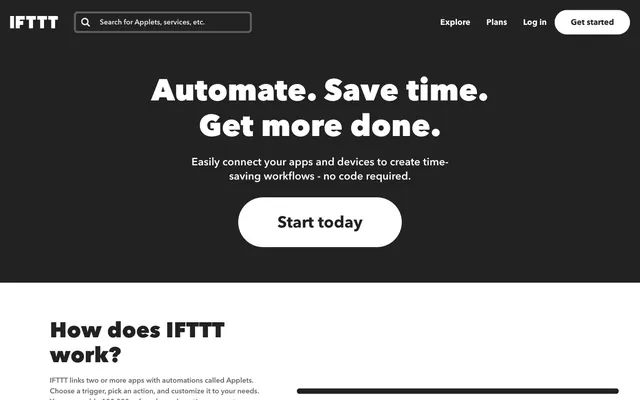
IFTTT's design system is a high-contrast, functionally colorful environment where dark surfaces meet crisp white text and vivid branded modules. The aesthetic emphasizes a clear, almost utilitarian presentation of information and service connections. Visual hierarchy is achieved through a mix of typography and distinct color blocks rather than extensive use of elevation or soft gradients. Components are well-defined, often with generous padding and prominent rounded corners, facilitating clear interaction in a dense ecosystem.
The typical page structure is a hybrid: a full-width dark hero section at the top, centered text-heavy headlines, and a prominent 'pill' action button. Following the hero, content often transitions to a mixed layout, using a max-width container. Sections alternate between dark (Midnight Ink or Deep Graphite) and light (Canvas White) backgrounds, creating a clear vertical rhythm. Content is frequently arranged in card grids (e.g., 2-column or 4-column) for features and services, or simple centered stacks for informational blocks. Navigation is a sticky top bar, containing a prominent logo, search input, and right-aligned text links leading to a ghost 'Get started' button.
The imagery predominantly features app icons and service logos, often rendered against solid, vibrant brand-colored backgrounds or contained within monochrome cards. Product screenshots are rare, with a focus on abstract visual representations of connections or functional icons. When present, images are contained within defined boundaries (cards/sections), not full-bleed or overlapping. Iconography is clean, solid-filled, and uses the full color palette or high-contrast monochromatics, serving both decorative and explanatory roles. The system is text-dominant, with imagery acting as clear, concise visual cues rather than elaborate showcases.
Reminiscent of Zapier, Notion, Linear, Makerpad.
# IFTTT — Style Reference
> Midnight Grid Command Center

**Theme:** dark

**Site:** https://ifttt.com

IFTTT's design system is a high-contrast, functionally colorful environment where dark surfaces meet crisp white text and vivid branded modules. The aesthetic emphasizes a clear, almost utilitarian presentation of information and service connections. Visual hierarchy is achieved through a mix of typography and distinct color blocks rather than extensive use of elevation or soft gradients. Components are well-defined, often with generous padding and prominent rounded corners, facilitating clear interaction in a dense ecosystem.

## Tokens — Colors

| Name | Value | Token | Role |
|------|------|------|------|
| Ocean Blue | `#0099ff` | `--color-ocean-blue` | Brand accent for service cards, links, and interactive elements. Signifies connection and information |
| Vivid Green | `#2cbe60` | `--color-vivid-green` | Green action color for filled buttons, selected navigation states, and focused conversion moments |
| Electric Violet | `#2c6efc` | `--color-electric-violet` | Brand accent for interactive elements and service cards |
| Royal Blue | `#23448b` | `--color-royal-blue` | Brand accent for service cards and links, contributing to the rich palette of connection types |
| Fire Red | `#e44332` | `--color-fire-red` | Brand accent for service cards, denoting a specific category or attention-grabbing element |
| Forest Green | `#1d9a59` | `--color-forest-green` | Brand accent for service cards, a deeper alternative to Vivid Green |
| Warm Orange | `#ec7505` | `--color-warm-orange` | Brand accent for service cards |
| Pure Red | `#ff0000` | `--color-pure-red` | Brand accent for service cards, a saturated attention-grabbing color |
| Midnight Ink | `#222222` | `--color-midnight-ink` | Primary surface for page backgrounds and content sections, often paired with white text for high contrast. Used for dark mode buttons and input fields |
| Canvas White | `#ffffff` | `--color-canvas-white` | Primary text color against dark backgrounds, light mode button fills, and input text. Provides a strong visual break as background for lighter content sections |
| Deep Graphite | `#333333` | `--color-deep-graphite` | Subtler dark surfaces, card backgrounds, and occasionally text. Creates a slightly softer contrast against Canvas White than Midnight Ink |
| Muted Ash | `#666666` | `--color-muted-ash` | Secondary text color for descriptive labels and helper text, providing readability without competing with primary contrast |
| Light Ghost | `#eeeeee` | `--color-light-ghost` | Light backgrounds for cards, subtle button borders, and decorative fills in light sections |

## Tokens — Typography

### Avenir Next
- **Substitute:** system-ui, -apple-system, BlinkMacSystemFont, 'Segoe UI', Roboto, Helvetica, Arial, sans-serif, 'Apple Color Emoji', 'Segoe UI Emoji', 'Segoe UI Symbol'
- **Weights:** 400, 500, 600, 700, 800, 900
- **Sizes:** 14px, 15px, 16px, 18px, 20px, 24px, 25px, 28px, 29px, 32px, 36px, 38px, 43px, 48px, 68px
- **Line height:** 1, 1.11, 1.17, 1.18, 1.19, 1.2, 1.32, 1.33, 1.36, 1.4, 1.43, 1.5, 1.71, 1.75, 1.9, 2.67, 3
- **Letter spacing:** 0.0200em
- **Role:** The primary typeface for all textual content, from headings to body text and UI elements. Its strong, geometric character provides a clear, authoritative voice for headlines at heavy weights, while maintaining legibility for small interface labels at lighter weights. The consistent, slightly open letter-spacing helps legibility across varied sizes and content densities.

## Tokens — Type Scale

Minor Third (1.2) from 16px base.

| Role | Size | Line height | Letter spacing |
|------|------|------|------|
| caption | 14px | 1.71 | — |
| body | 16px | 1.5 | — |
| subheading | 20px | 1.4 | — |
| heading-sm | 24px | 1.33 | — |
| heading | 28px | 1.18 | — |
| heading-lg | 38px | 1.2 | — |
| display | 48px | 1.17 | — |

## Tokens — Spacing

- **Section gap:** 24px
- **Card padding:** 16px
- **Element gap:** 16px

## Tokens — Radius

- **Buttons:** 100px
- **Inputs:** 8px
- **Cards:** 8px
- **appletCards:** 8px
- **badges:** 8px

## Layout

The typical page structure is a hybrid: a full-width dark hero section at the top, centered text-heavy headlines, and a prominent 'pill' action button. Following the hero, content often transitions to a mixed layout, using a max-width container. Sections alternate between dark (Midnight Ink or Deep Graphite) and light (Canvas White) backgrounds, creating a clear vertical rhythm. Content is frequently arranged in card grids (e.g., 2-column or 4-column) for features and services, or simple centered stacks for informational blocks. Navigation is a sticky top bar, containing a prominent logo, search input, and right-aligned text links leading to a ghost 'Get started' button.

## Imagery

The imagery predominantly features app icons and service logos, often rendered against solid, vibrant brand-colored backgrounds or contained within monochrome cards. Product screenshots are rare, with a focus on abstract visual representations of connections or functional icons. When present, images are contained within defined boundaries (cards/sections), not full-bleed or overlapping. Iconography is clean, solid-filled, and uses the full color palette or high-contrast monochromatics, serving both decorative and explanatory roles. The system is text-dominant, with imagery acting as clear, concise visual cues rather than elaborate showcases.

## Components

### Primary Pillar Button
*Main call to action button for high-impact interactions.*

Filled with Midnight Ink (#222222), white text (#ffffff). Features a fully rounded 'pill' shape with 100px border-radius. Generous padding of 16px vertical and 56px horizontal.

### Ghost Pillar Button
*Alternative call to action, offering similar prominence to the Primary Pillar Button but with inverted colors for secondary intent.*

Filled with Canvas White (#ffffff), Midnight Ink text (#222222). Also features a 100px border-radius with 16px vertical and 56px horizontal padding.

### Category Filter Button
*Small, contained button for filtering content or selecting categories.*

Filled with Canvas White (#ffffff), Midnight Ink text (#222222). Features an 8px border-radius and 12px vertical, 20px horizontal padding. A subtle #eeeeee border indicates its boundary.

### Standard Input Field
*Interactive text input for search or data entry.*

Filled with Midnight Ink (#222222), Canvas White text (#ffffff), and a semi-transparent white border at rgba(255, 255, 255, 0.3). 8px border-radius with 8px vertical and 54px left, 58px right padding.

### Full-Color Applet Card
*Prominent display block for showcasing automated 'Applets' with distinct brand colors.*

Dynamic background colors (e.g. Ocean Blue #0099ff, Vivid Green #2cbe60, Electric Violet #2c6efc, etc.) with Canvas White text. Square, 8px border-radius. Content typically has no internal padding.

### Grey Background Applet Card
*An Applet card with a neutral background for less emphasis or general categories.*

Filled with Light Ghost (#eeeeee), Midnight Ink text (#222222). 8px border-radius. 16px padding on all sides.

### Monochrome Service Card
*Small squares representing integrated services, often in a grid.*

Backgrounds vary (often Midnight Ink #222222) with Canvas White text and a small icon. 8px border-radius. No explicit padding mentioned in data but implied by content fitting.

### Compact Info Badge
*Small informational tag that appears on cards.*

Canvas White background (#ffffff), Midnight Ink text (#222222). 8px border-radius with 8px vertical and 16px horizontal padding.

## Guidelines

### Do

- Prioritize high contrast between text and background, typically #ffffff on #222222 or #333333, and vice-versa, for all primary content.
- Use Avenir Next across all text, carefully selecting from its weights to establish hierarchy and tone, with consistent '0.0200em' letter-spacing.
- Apply 100px border-radius for primary action buttons to achieve a distinct 'pill' shape, indicating interactive elements.
- Utilize the diverse palette of saturated brand colors (#0099ff, #2cbe60, #2c6efc, etc.) as solid background fills for service cards and functional blocks, promoting immediate recognition.
- Maintain an 8px border-radius for all cards, input fields, and category filter buttons to ensure a consistent, approachable geometry for non-primary interactive elements.
- Employ a base unit of 8px for all spacing decisions, including padding, margins, and gaps, for harmonious scaling and alignment.
- Emphasize the dark theme by setting section backgrounds to Midnight Ink (#222222) or Deep Graphite (#333333), using Canvas White (#ffffff) for foreground elements and text.

### Don't

- Avoid using soft shadows or subtle gradients for elevation; rely instead on solid color blocks and sharp contrast for visual layering.
- Do not deviate from Avenir Next as the primary typeface; introducing other fonts will break the established typographic rhythm.
- Refrain from using achromatic colors for brand accents; all visual branding should leverage the vibrant, saturated palette.
- Do not introduce complex border styles; all borders should be simple solid lines, usually in neutral tones like rgba(255, 255, 255, 0.3) or #eeeeee.
- Avoid excessive whitespace; the design system leans towards a comfortable density, ensuring elements are clearly delineated but not overly spaced.
- Do not use subtle tonal variations for states (e.g., hover, active); instead, use distinct color shifts or outline changes from the defined color palette.
- Avoid blurring or masking imagery; visuals should typically be presented within clear, defined card or section boundaries.

## Agent Prompt Guide

Quick Color Reference:
text: #ffffff
background: #222222
border: #eeeeee
accent: #0099ff
primary action: #ffffff (filled action)

Example Component Prompts:
Create a Primary Action Button: #ffffff background, #111111 text, 9999px radius, compact pill padding. Use this filled treatment for the main CTA.

Create a 'Popular' category filter group: Category filter buttons in row. Each button: Canvas White background (#ffffff), Deep Graphite text (#333333), 8px border-radius, 12px vertical/20px horizontal padding, subtle #eeeeee border. Example: 'Popular', 'Business', 'Productivity'. Element gap 16px.

Create a Full-Color Applet Card: Square card. Background #0099ff. Inside, white icon for Spotify. Headline 'Save new Spotify Discover Weekly songs to an archive' at 20px Avenir Next weight 700, #ffffff. Small subtext 'Spotify' at 15px Avenir Next weight 400, #ffffff beneath. Followed by '124K' at 14px Avenir Next weight 500, #ffffff. 8px border-radius. No internal padding.

Create a Monochrome Service Card: 100x100px square card. Midnight Ink background (#222222). Centered white icon for Slack. Text 'Slack' at 16px Avenir Next weight 500, #ffffff below the icon. 8px border-radius.
More like this





Keep what you find
A free account saves references to boards and can send you a weekly email of picks based on what you save.
To see every result, go Pro.