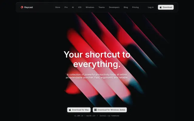
Preview image. Unlock full-res
Obsidian command terminal — a near-black void where UI surfaces emerge like backlit glass panels, depth created by shadow layering rather than color contrast.
Color palette
Observed in body borderColor, other backgroundColor, other fill.
Observed in other backgroundColor, other borderColor.
Observed in other backgroundColor. Semantic/state role was not supported by extracted badge/input evidence.
Observed in other backgroundColor. Semantic/state role was not supported by extracted badge/input evidence.; Hero gradient highlight — linear-gradient(135deg, #56c2ff 0%, #138af2 100%) used for product feature illustration accents
Radial section atmosphere gradient — low-opacity blue bloom behind hero and feature sections
Radial section atmosphere gradient — low-opacity purple bloom for alternate feature sections
Dominant page canvas and deepest shadow color — the ground state everything floats above
Primary card and section backgrounds; the first surface level above canvas
Secondary surface and elevated card backgrounds
Observed in other boxShadow, link boxShadow, badge backgroundColor. Extracted usage does not support a distinct primary control color.
Border color for dividers, shadow tones on elevated components
Subtle borders, muted button borders, body divider lines
Secondary body text, icon fills, disabled states
Tertiary text, muted links, placeholder-level labels
Primary download/CTA button background — warm near-white on black for maximum contrast without pure white aggression
Primary text on dark surfaces, nav links, headline text, icon strokes, border highlights
Typography
- Weights
- 400, 500, 600
- Sizes
- 11px, 12px, 13px, 14px, 16px, 18px, 20px, 22px, 24px, 32px, 56px, 64px
- Line height
- 1, looser at body)
- Letter spacing
- -0.112px at 56px (≈-0.002em), up to +4.088px at 56px positive range; small sizes use +0.004em to +0.073em
- Fallback
- Inter (Google Fonts) — identical; this is the Google-hosted version
Universal UI font covering everything from 11px badge labels to 64px hero headlines. The negative tracking at display sizes (-0.11em at 56px) is the anti-convention choice — most launcher/productivity tools use neutral tracking, but Raycast's headlines contract inward, creating pressure and density. Feature settings 'ss03' (alternate 'a') distinguish it from default Inter. At small sizes (11–13px), tracking goes strongly positive (up to +0.073em) making metadata scannable at tiny scales.
- Weights
- 300, 400, 500
- Sizes
- 10px, 12px, 14px
- Line height
- 1
- Letter spacing
- +0.017em to +0.05em across all sizes
- Fallback
- JetBrains Mono or IBM Plex Mono
Monospaced font for version strings (v1.104.14), code snippets, homebrew install commands, and keyboard shortcut labels. Weight 300 at 10px for ultra-minimal metadata; weight 500 at 14px for readable code. Positive tracking (+0.017em to +0.05em) keeps characters from colliding at small sizes.
- Weights
- 500, 700
- Sizes
- 16px, 24px, 32px
- Line height
- 1.15
- Fallback
- Inter weight 500/700
System font fallback appearing in macOS-rendered product screenshots and simulated app UI within the page. Not a deliberate web font choice — appears in contexts where the browser renders macOS system UI.
- Weights
- 700
- Sizes
- 13px
- Line height
- 1.23
SF Pro — detected in extracted data but not described by AI
Spacing & shape
Elevation
Components
Background #E6E6E6, text #2F3031, border-radius 8px, padding 8px 12px. Carries an Apple logo icon inline. On the dark canvas this near-white button reads as the highest-contrast interactive element without being a harsh pure white. Font Inter 14px weight 500.
Transparent background, text #9C9C9D at 14px Inter weight 400, no border. Zero padding on top/bottom. On hover text shifts toward #FFFFFF. The muted gray-on-black keeps nav from competing with hero content — links recede until needed.
Transparent background, border-radius 86px (oval pill shape for key tops), padding 20px all sides. Shadow stack: `rgba(0,0,0,0.4) 0px 1.5px 0.5px 2.5px, rgb(0,0,0) 0px 0px 0.5px 1px, rgba(0,0,0,0.25) 0px 2px 1px 1px inset, rgba(255,255,255,0.2) 0px 1px 1px 1px inset` — the inset white/black pair creates a physical bevel. Text #6A6B6C. Animates --key-bg-start-color and --key-bg-end-color on interaction.
Background transparent (inherits surface), border-radius 16px, padding 24px all sides, no box-shadow. Used in 2–3 column grid layouts. Inner content arranged with 15px element gap. Border defined by 1px solid #222225 or the layered inset white shadow system.
Background transparent, border-radius 12px, shadow `rgba(0,0,0,0.28) 0px 1.189px 2.377px 0px`. Backdrop filter blur(36px) to blur(48px) creates frosted glass effect behind app window mockups. Border 1px solid rgba(255,255,255,0.1).
Background transparent, border-radius 8px, padding 8px, shadow `rgba(255,255,255,0.05) 0px 1px 0px 0px inset, rgba(255,255,255,0.25) 0px 0px 0px 1px, rgba(0,0,0,0.2) 0px -1px 0px 0px inset`. The white 0.25 opacity outer ring makes cards appear to glow on the dark background — used to highlight selected/featured extensions.
Background #1B1C1, text #FFFFFF, border-radius 6px, padding 0px 6px. Inter 12px weight 500, letter-spacing +0.04em. Used for version strings like 'v1.104.14' and feature category chips. The near-black background barely distinguishes from the canvas — a whisper label.
Background rgba(255,255,255,0.05), text #FFFFFF, border rgba(255,255,255,0.05), border-radius 8px, padding 8px 12px. The 5% white background is nearly invisible against dark surfaces — maintains the low-contrast dark-mode aesthetic while still signaling an editable field.
Transparent background, text #9C9C9D at 13px Inter, border-radius 0px, padding 1px 6px, border #9C9C9D. Used for subsidiary CTAs like 'Install via homebrew' that should not compete with primary download buttons.
Transparent background, border-radius 86px (full oval), padding 20px, border rgba(255,255,255,0.06). Shadow `rgba(215,201,175,0.05) 0px 0px 20px 5px, rgba(215,201,175,0.05) 0px 0px 16px -7px` — a barely-perceptible warm bloom. Text #6A6B6C.
Background #FF6363 for red states, #59D499 for green online, #56C2FF for blue info. Border-radius 99999px (circular). 8px diameter. These appear inside the simulated app UI screenshots to represent clipboard colors, status dots, or category tags.
Full-bleed radial gradient positioned at top-center: `radial-gradient(84.6% 73.49% at 50% 26.51%, rgba(4,63,150,0.7), rgba(6,18,37,0.25))` for blue sections, or the purple variant for alternate sections. Sits behind all content at z-index 0. No border, no radius. Creates the impression of a distant colored light source without any surface color change.
Guidelines
- Use #040506 as the page canvas ground — never a warm or cool-tinted near-black, only this near-pure neutral void
- Apply the keyboard key shadow stack (rgba(0,0,0,0.4) outer, rgba(255,255,255,0.2) inset top highlight) on any element meant to feel physically pressable
- Keep headline letter-spacing negative at display sizes: -0.11em at 56px, -0.13em at 64px — critical to the compressed, dense headline feel
- Use radial gradients (blue or violet, max 0.7 opacity core fading to transparent) as per-section atmosphere layers behind content — never flat colored sections
- Badge and chip text: Inter weight 500, positive letter-spacing +0.04em to +0.073em, on #1B1C1 background — the tracking contrast with headlines is part of the two-register system
- For primary CTAs use #E6E6E6 background with #2F3031 text at 8px radius — not white, not a chromatic color
- Use GeistMono weight 300–400 for all code, version strings, and terminal commands at 10–14px with +0.017em to +0.05em tracking
- Do not use any colored backgrounds for section containers — all surface backgrounds must be from the #040506 → #1B1C1 neutral stack only
- Do not apply border-radius above 20px to cards — the design uses 8px, 11px, 16px, 20px; rounder forms break the precision instrument aesthetic
- Do not use #FF6363 as a button fill or large background — it appears only as a small status dot, icon accent, or single-word label text
- Do not use white (#FFFFFF) as a button background — the primary action uses #E6E6E6 specifically; pure white reads as system/OS chrome at this scale
- Do not use positive letter-spacing on headings above 24px — all display and heading text must track neutral-to-negative
- Do not create dividers between sections using horizontal rules or color changes — section separation happens through 80px vertical gaps and radial gradient shifts only
- Do not use drop-shadows with color tints (blue, red, etc.) — all shadows must be rgba(0,0,0,x) or rgba(255,255,255,x) only, keeping elevation monochromatic
About this system
ShowHide
Raycast lives in near-total darkness — a #040506 void where UI surfaces emerge as barely-lighter charcoal strata rather than conventional cards. The signature move is depth through shadow layering: the keyboard-key shadow `rgba(0,0,0,0.4) 0px 1.5px 0.5px 2.5px, rgb(0,0,0) 0px 0px 0.5px 1px, rgba(0,0,0,0.25) 0px 2px 1px 1px inset, rgba(255,255,255,0.2) 0px 1px 1px 1px inset` makes interactive elements feel physically pressable — a tactile metaphor for keyboard shortcuts. The brand red (#FF6363) appears sparingly as a status signal and logo accent rather than a CTA color; primary download buttons are a near-white #E6E6E6 pill on black — inverted convention. Radial gradients with blue and purple cores bleed into the dark canvas at very low opacity, creating the impression of colored light sources behind frosted obsidian. Type is Inter with tight negative tracking at display sizes, shifting to loose positive tracking on micro labels and badges — creating a two-register system where headlines contract and metadata breathes.
Max-width ~1200px centered on wide viewports, but hero section is full-bleed dark with no side constraints. Navigation is a fixed top bar: ~740px wide pill-shaped container with rounded edges (11px radius), dark #1B1C1 background, logo left + nav links center + CTA right. Hero: full-viewport height with centered headline (2-line display text) over full-bleed abstract photography, CTA buttons centered below. Second section: dark background with centered 2-line heading, then a contained macOS window mockup (70% width) floating below. Section rhythm: seamless dark-to-dark flow with no visible dividers — depth changes come from radial gradient atmosphere shifts rather than alternating light/dark bands. Feature sections use 2-3 column card grids at 11–16px radius. Spacing between sections: ~80px vertical. The overall impression is vertical scrolling through a continuous dark space with distinct 'zones' of light created by radial gradients.
Primarily abstract photography — the hero uses extreme close-up macro shots of diagonal red/pink forms on black (appear to be keyboard key edges or geometric objects) treated with deep shadow and vivid red-to-pink chromatic saturation. These fill the full viewport bleed with no containment border or radius, bleeding edge-to-edge. Product screenshots appear in the second section as contained glass-panel mockups with 12px radius and dark UI chrome, simulating a live macOS window. No lifestyle photography, no human subjects. Icons are monochromatic filled/outlined at ~16px in #6A6B6C or #9C9C9D — uniform low-contrast weight. The visual density is image-light: one full-bleed hero photograph, then a transition to text + contained product UI mockup. Decorative SVG graphics (blue/violet strokes in the color data: #02193b, #143ca3, #63a1ff) serve as background illustration layers behind feature sections at very low opacity, not visible as content.
Reminiscent of Linear, Vercel, Arc Browser, Fig (Withfig), Warp Terminal.
# Raycast — Style Reference
> Obsidian command terminal — a near-black void where UI surfaces emerge like backlit glass panels, depth created by shadow layering rather than color contrast.

**Theme:** dark

**Site:** https://raycast.com

Raycast lives in near-total darkness — a #040506 void where UI surfaces emerge as barely-lighter charcoal strata rather than conventional cards. The signature move is depth through shadow layering: the keyboard-key shadow `rgba(0,0,0,0.4) 0px 1.5px 0.5px 2.5px, rgb(0,0,0) 0px 0px 0.5px 1px, rgba(0,0,0,0.25) 0px 2px 1px 1px inset, rgba(255,255,255,0.2) 0px 1px 1px 1px inset` makes interactive elements feel physically pressable — a tactile metaphor for keyboard shortcuts. The brand red (#FF6363) appears sparingly as a status signal and logo accent rather than a CTA color; primary download buttons are a near-white #E6E6E6 pill on black — inverted convention. Radial gradients with blue and purple cores bleed into the dark canvas at very low opacity, creating the impression of colored light sources behind frosted obsidian. Type is Inter with tight negative tracking at display sizes, shifting to loose positive tracking on micro labels and badges — creating a two-register system where headlines contract and metadata breathes.

## Tokens — Colors

| Name | Value | Token | Role |
|------|------|------|------|
| Ember Red | `#ff6363` | `--color-ember-red` | Observed in body borderColor, other backgroundColor, other fill. |
| Ember Dark | `#452324` | `--color-ember-dark` | Observed in other backgroundColor, other borderColor. |
| Mint Signal | `#59d499` | `--color-mint-signal` | Observed in other backgroundColor. Semantic/state role was not supported by extracted badge/input evidence. |
| Sky Signal | `#56c2ff` | `--color-sky-signal` | Observed in other backgroundColor. Semantic/state role was not supported by extracted badge/input evidence.; Hero gradient highlight — linear-gradient(135deg, #56c2ff 0%, #138af2 100%) used for product feature illustration accents |
| Nebula Glow | `#043f96` | `--color-nebula-glow` | Radial section atmosphere gradient — low-opacity blue bloom behind hero and feature sections |
| Violet Haze | `#523091` | `--color-violet-haze` | Radial section atmosphere gradient — low-opacity purple bloom for alternate feature sections |
| Void Black | `#040506` | `--color-void-black` | Dominant page canvas and deepest shadow color — the ground state everything floats above |
| Deep Charcoal | `#07080a` | `--color-deep-charcoal` | Primary card and section backgrounds; the first surface level above canvas |
| Graphite 700 | `#111214` | `--color-graphite-700` | Secondary surface and elevated card backgrounds |
| Graphite 600 | `#1b1c1e` | `--color-graphite-600` | Observed in other boxShadow, link boxShadow, badge backgroundColor. Extracted usage does not support a distinct primary control color. |
| Graphite 500 | `#363739` | `--color-graphite-500` | Border color for dividers, shadow tones on elevated components |
| Graphite 400 | `#454647` | `--color-graphite-400` | Subtle borders, muted button borders, body divider lines |
| Slate 300 | `#6a6b6c` | `--color-slate-300` | Secondary body text, icon fills, disabled states |
| Slate 200 | `#9c9c9d` | `--color-slate-200` | Tertiary text, muted links, placeholder-level labels |
| Ash 50 | `#e6e6e6` | `--color-ash-50` | Primary download/CTA button background — warm near-white on black for maximum contrast without pure white aggression |
| Snow | `#ffffff` | `--color-snow` | Primary text on dark surfaces, nav links, headline text, icon strokes, border highlights |

## Tokens — Typography

### Inter
- **Substitute:** Inter (Google Fonts) — identical; this is the Google-hosted version
- **Weights:** 400, 500, 600
- **Sizes:** 11px, 12px, 13px, 14px, 16px, 18px, 20px, 22px, 24px, 32px, 56px, 64px
- **Line height:** 1, looser at body)
- **Letter spacing:** -0.112px at 56px (≈-0.002em), up to +4.088px at 56px positive range; small sizes use +0.004em to +0.073em
- **Role:** Universal UI font covering everything from 11px badge labels to 64px hero headlines. The negative tracking at display sizes (-0.11em at 56px) is the anti-convention choice — most launcher/productivity tools use neutral tracking, but Raycast's headlines contract inward, creating pressure and density. Feature settings 'ss03' (alternate 'a') distinguish it from default Inter. At small sizes (11–13px), tracking goes strongly positive (up to +0.073em) making metadata scannable at tiny scales.

### GeistMono
- **Substitute:** JetBrains Mono or IBM Plex Mono
- **Weights:** 300, 400, 500
- **Sizes:** 10px, 12px, 14px
- **Line height:** 1
- **Letter spacing:** +0.017em to +0.05em across all sizes
- **Role:** Monospaced font for version strings (v1.104.14), code snippets, homebrew install commands, and keyboard shortcut labels. Weight 300 at 10px for ultra-minimal metadata; weight 500 at 14px for readable code. Positive tracking (+0.017em to +0.05em) keeps characters from colliding at small sizes.

### SF Pro Text
- **Substitute:** Inter weight 500/700
- **Weights:** 500, 700
- **Sizes:** 16px, 24px, 32px
- **Line height:** 1.15
- **Role:** System font fallback appearing in macOS-rendered product screenshots and simulated app UI within the page. Not a deliberate web font choice — appears in contexts where the browser renders macOS system UI.

### SF Pro
- **Weights:** 700
- **Sizes:** 13px
- **Line height:** 1.23
- **Role:** SF Pro — detected in extracted data but not described by AI

## Tokens — Type Scale

Perfect Fourth (1.333) from 16px base.

| Role | Size | Line height | Letter spacing |
|------|------|------|------|
| caption | 11px | 1.45 | 0.8px |
| body | 16px | 1.5 | 0.1px |
| subheading | 18px | 1.4 | 0.06em |
| heading-sm | 24px | 1.33 | -0.05em |
| heading | 32px | 1.2 | -0.06em |
| heading-lg | 56px | 1.1 | -0.11px |
| display | 64px | 1 | -0.13px |

## Tokens — Spacing

- **Max width:** 1200px
- **Section gap:** 80px
- **Card padding:** 24px
- **Element gap:** 15px

## Tokens — Radius

- **Buttons:** 8px
- **Inputs:** 8px
- **Cards:** 11px
- **badges:** 6px
- **buttonPill:** 86px
- **cardLarge:** 20px
- **icons:** 99999px
- **modals:** 16px

## Tokens — Elevation

- **Keyboard Key:** `rgba(0,0,0,0.4) 0px 1.5px 0.5px 2.5px, rgb(0,0,0) 0px 0px 0.5px 1px, rgba(0,0,0,0.25) 0px 2px 1px 1px inset, rgba(255,255,255,0.2) 0px 1px 1px 1px inset`
- **Ring-Border Interactive:** `rgb(27,28,30) 0px 0px 0px 1px, rgb(7,8,10) 0px 0px 0px 1px inset`
- **Outlined Highlight Card:** `rgba(255,255,255,0.05) 0px 1px 0px 0px inset, rgba(255,255,255,0.25) 0px 0px 0px 1px, rgba(0,0,0,0.2) 0px -1px 0px 0px inset`
- **Navigation Ring Link:** `rgba(215,201,175,0.05) 0px 0px 20px 5px, rgba(215,201,175,0.05) 0px 0px 16px -7px`
- **Glass Product Card:** `rgba(0,0,0,0.28) 0px 1.189px 2.377px 0px`
- **Button/Dropdown:** `rgba(0,0,0,0.03) 0px 7px 3px 0px, rgba(0,0,0,0.25) 0px 4px 4px 0px`

## Layout

Max-width ~1200px centered on wide viewports, but hero section is full-bleed dark with no side constraints. Navigation is a fixed top bar: ~740px wide pill-shaped container with rounded edges (11px radius), dark #1B1C1 background, logo left + nav links center + CTA right. Hero: full-viewport height with centered headline (2-line display text) over full-bleed abstract photography, CTA buttons centered below. Second section: dark background with centered 2-line heading, then a contained macOS window mockup (70% width) floating below. Section rhythm: seamless dark-to-dark flow with no visible dividers — depth changes come from radial gradient atmosphere shifts rather than alternating light/dark bands. Feature sections use 2-3 column card grids at 11–16px radius. Spacing between sections: ~80px vertical. The overall impression is vertical scrolling through a continuous dark space with distinct 'zones' of light created by radial gradients.

## Imagery

Primarily abstract photography — the hero uses extreme close-up macro shots of diagonal red/pink forms on black (appear to be keyboard key edges or geometric objects) treated with deep shadow and vivid red-to-pink chromatic saturation. These fill the full viewport bleed with no containment border or radius, bleeding edge-to-edge. Product screenshots appear in the second section as contained glass-panel mockups with 12px radius and dark UI chrome, simulating a live macOS window. No lifestyle photography, no human subjects. Icons are monochromatic filled/outlined at ~16px in #6A6B6C or #9C9C9D — uniform low-contrast weight. The visual density is image-light: one full-bleed hero photograph, then a transition to text + contained product UI mockup. Decorative SVG graphics (blue/violet strokes in the color data: #02193b, #143ca3, #63a1ff) serve as background illustration layers behind feature sections at very low opacity, not visible as content.

## Components

### Download Button Group

### Dark Badge / Status Indicator Collection

### Raycast Search Input — App Filter UI

### Primary Download Button
*Main CTA for app download*

Background #E6E6E6, text #2F3031, border-radius 8px, padding 8px 12px. Carries an Apple logo icon inline. On the dark canvas this near-white button reads as the highest-contrast interactive element without being a harsh pure white. Font Inter 14px weight 500.

### Ghost Navigation Link
*Top navigation items*

Transparent background, text #9C9C9D at 14px Inter weight 400, no border. Zero padding on top/bottom. On hover text shifts toward #FFFFFF. The muted gray-on-black keeps nav from competing with hero content — links recede until needed.

### Keyboard Key Element
*Interactive keyboard shortcut visualizer*

Transparent background, border-radius 86px (oval pill shape for key tops), padding 20px all sides. Shadow stack: `rgba(0,0,0,0.4) 0px 1.5px 0.5px 2.5px, rgb(0,0,0) 0px 0px 0.5px 1px, rgba(0,0,0,0.25) 0px 2px 1px 1px inset, rgba(255,255,255,0.2) 0px 1px 1px 1px inset` — the inset white/black pair creates a physical bevel. Text #6A6B6C. Animates --key-bg-start-color and --key-bg-end-color on interaction.

### Feature Card
*Marketing feature section cards*

Background transparent (inherits surface), border-radius 16px, padding 24px all sides, no box-shadow. Used in 2–3 column grid layouts. Inner content arranged with 15px element gap. Border defined by 1px solid #222225 or the layered inset white shadow system.

### Glass Product Card
*Product screenshot / app UI demo containers*

Background transparent, border-radius 12px, shadow `rgba(0,0,0,0.28) 0px 1.189px 2.377px 0px`. Backdrop filter blur(36px) to blur(48px) creates frosted glass effect behind app window mockups. Border 1px solid rgba(255,255,255,0.1).

### Outlined Highlight Card
*Extension/store item cards with white ring*

Background transparent, border-radius 8px, padding 8px, shadow `rgba(255,255,255,0.05) 0px 1px 0px 0px inset, rgba(255,255,255,0.25) 0px 0px 0px 1px, rgba(0,0,0,0.2) 0px -1px 0px 0px inset`. The white 0.25 opacity outer ring makes cards appear to glow on the dark background — used to highlight selected/featured extensions.

### Dark Badge
*Version numbers, category labels, status chips*

Background #1B1C1, text #FFFFFF, border-radius 6px, padding 0px 6px. Inter 12px weight 500, letter-spacing +0.04em. Used for version strings like 'v1.104.14' and feature category chips. The near-black background barely distinguishes from the canvas — a whisper label.

### Search Input
*In-app filter/search within product demo*

Background rgba(255,255,255,0.05), text #FFFFFF, border rgba(255,255,255,0.05), border-radius 8px, padding 8px 12px. The 5% white background is nearly invisible against dark surfaces — maintains the low-contrast dark-mode aesthetic while still signaling an editable field.

### Muted Inline Button
*Secondary text actions and version badges*

Transparent background, text #9C9C9D at 13px Inter, border-radius 0px, padding 1px 6px, border #9C9C9D. Used for subsidiary CTAs like 'Install via homebrew' that should not compete with primary download buttons.

### Navigation Ring Link
*Circular icon links in nav or social areas*

Transparent background, border-radius 86px (full oval), padding 20px, border rgba(255,255,255,0.06). Shadow `rgba(215,201,175,0.05) 0px 0px 20px 5px, rgba(215,201,175,0.05) 0px 0px 16px -7px` — a barely-perceptible warm bloom. Text #6A6B6C.

### Ember Status Indicator
*Colored dot or label for status signals inside product UI*

Background #FF6363 for red states, #59D499 for green online, #56C2FF for blue info. Border-radius 99999px (circular). 8px diameter. These appear inside the simulated app UI screenshots to represent clipboard colors, status dots, or category tags.

### Section Atmosphere Backdrop
*Per-section colored radial glow behind content*

Full-bleed radial gradient positioned at top-center: `radial-gradient(84.6% 73.49% at 50% 26.51%, rgba(4,63,150,0.7), rgba(6,18,37,0.25))` for blue sections, or the purple variant for alternate sections. Sits behind all content at z-index 0. No border, no radius. Creates the impression of a distant colored light source without any surface color change.

## Guidelines

### Do

- Use #040506 as the page canvas ground — never a warm or cool-tinted near-black, only this near-pure neutral void
- Apply the keyboard key shadow stack (rgba(0,0,0,0.4) outer, rgba(255,255,255,0.2) inset top highlight) on any element meant to feel physically pressable
- Keep headline letter-spacing negative at display sizes: -0.11em at 56px, -0.13em at 64px — critical to the compressed, dense headline feel
- Use radial gradients (blue or violet, max 0.7 opacity core fading to transparent) as per-section atmosphere layers behind content — never flat colored sections
- Badge and chip text: Inter weight 500, positive letter-spacing +0.04em to +0.073em, on #1B1C1 background — the tracking contrast with headlines is part of the two-register system
- For primary CTAs use #E6E6E6 background with #2F3031 text at 8px radius — not white, not a chromatic color
- Use GeistMono weight 300–400 for all code, version strings, and terminal commands at 10–14px with +0.017em to +0.05em tracking

### Don't

- Do not use any colored backgrounds for section containers — all surface backgrounds must be from the #040506 → #1B1C1 neutral stack only
- Do not apply border-radius above 20px to cards — the design uses 8px, 11px, 16px, 20px; rounder forms break the precision instrument aesthetic
- Do not use #FF6363 as a button fill or large background — it appears only as a small status dot, icon accent, or single-word label text
- Do not use white (#FFFFFF) as a button background — the primary action uses #E6E6E6 specifically; pure white reads as system/OS chrome at this scale
- Do not use positive letter-spacing on headings above 24px — all display and heading text must track neutral-to-negative
- Do not create dividers between sections using horizontal rules or color changes — section separation happens through 80px vertical gaps and radial gradient shifts only
- Do not use drop-shadows with color tints (blue, red, etc.) — all shadows must be rgba(0,0,0,x) or rgba(255,255,255,x) only, keeping elevation monochromatic

## Agent Prompt Guide

**Quick Color Reference**
- text primary: #FFFFFF
- text secondary: #9C9C9D
- text tertiary: #6A6B6C
- background (canvas): #040506
- surface (card): #07080a
- border: #363739 (or rgba(255,255,255,0.06) for subtle)
- accent/brand: #FF6363 (status and logo only)
- primary action: #e6e6e6 (filled action)

**Example Component Prompts**

1. **Hero Section**: Full-viewport dark section, background #040506 with radial-gradient(84.6% 73.49% at 50% 26.51%, rgba(4,63,150,0.7), rgba(6,18,37,0.25)) layered behind. Full-bleed abstract photography at top 60% of viewport. Centered headline at 64px Inter weight 600, #FFFFFF, letter-spacing -0.13em, line-height 1.0. Subheadline at 18px Inter weight 400, #9C9C9D, line-height 1.4. Two side-by-side buttons below: #E6E6E6 background, #2F3031 text, 8px radius, 8px 12px padding; second button transparent, #9C9C9D text, 8px radius, 1px solid #454647 border.

2. **Feature Card Grid**: 3-column grid with 15px gap. Each card: transparent background, border-radius 16px, padding 24px, border 1px solid #222225. Icon area 32px × 32px, icon color #6A6B6C. Card title at 20px Inter weight 600, #FFFFFF. Body text at 14px Inter weight 400, #6A6B6C, line-height 1.57.

3. **Navigation Bar**: Fixed top, background #07080a, border-bottom 1px solid #1b1c1e, max-width 1200px centered, height 52px. Logo left (red flame icon #FF6363 + 'Raycast' text #FFFFFF Inter 14px weight 600). Center nav links at 14px Inter weight 400, #9C9C9D, gap 24px. Right: 'Log in' text link #9C9C9D + Download button #E6E6E6 bg, #2F3031 text, 8px radius, 8px 12px padding.

4. **Dark Badge / Version Chip**: Background #1b1c1e, text #FFFFFF, border-radius 6px, padding 0px 6px, Inter 12px weight 500, letter-spacing +0.048px. Use for 'v1.104.14', 'macOS 13+', category labels.

5. **Product Screenshot Section**: Centered heading at 32px Inter weight 600, #FFFFFF, letter-spacing -0.06em. Subheading 16px Inter weight 400, #9C9C9D, 8px below. Below: contained app window mockup at 70% page width, border-radius 12px, shadow rgba(0,0,0,0.28) 0px 1.189px 2.377px 0px, backdrop-filter blur(36px), border 1px solid rgba(255,255,255,0.1). Background of mockup #111214.

## Animation Philosophy

Transitions default to `ease` (not ease-in-out) at 200ms for micro-interactions (color, opacity, box-shadow) and 400ms for transforms. The custom easing `cubic-bezier(0.23, 1, 0.32, 1)` (outQuint) is used for entrances — fast attack, long settle — giving UI elements a snap-in character rather than a float-in. Keyboard key elements animate `--key-bg-start-color` and `--key-bg-end-color` CSS custom properties at 200ms, enabling per-key gradient transitions without class toggling. Named animations `page_fade-in-up` use upward translate + opacity for section reveals. Motion is expressive but never decorative-slow — nothing exceeds 700ms.

## Gradient System

Three gradient types serve distinct functions:

1. **Section Atmosphere Radials** (blue, violet, steel variants): Positioned at top-center of each marketing section, covering ~85% width × ~75% height, fading from 0.7 opacity core to transparent edges. Color-codes sections: blue = AI/productivity, violet = Pro/premium, steel-gray = general features.

2. **Product Feature Linear**: `linear-gradient(135deg, rgb(86,194,255) 0%, rgb(19,138,242) 100%)` used inside product UI illustration elements — a vivid sky-to-blue for chart/icon accents.

3. **Hero Announcement Conic**: `conic-gradient(from 100deg at 113.455px 15px, rgba(0,0,0,0) 0deg, rgb(236,165,167) 20%, rgba(0,0,0,0) 25%)` — single-use rotating effect for the 'Introducing Glaze' announcement badge sweep animation.

Rule: All section backgrounds must use transparent-to-transparent radial gradients only. Never use opaque gradient fills as section backgrounds.
More like this






Keep what you find
A free account saves references to boards and can send you a weekly email of picks based on what you save.
To see every result, go Pro.