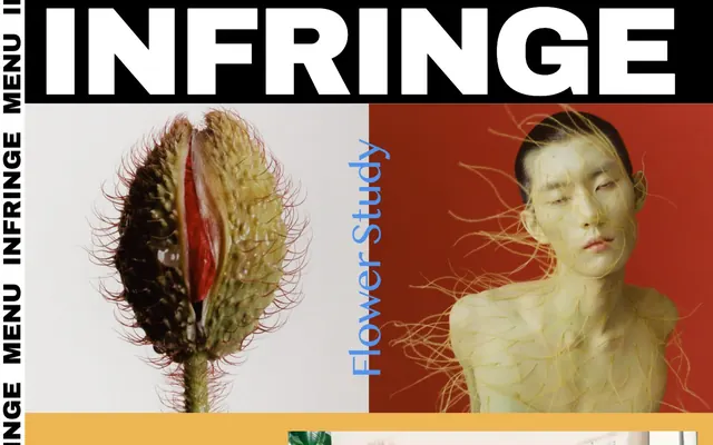
Preview image. Unlock full-res
Graphic Brutalism, Yellow Accent
Color palette
Yellow wash for highlight backgrounds, decorative bands, and soft emphasis behind content. Do not promote it to the primary CTA color
Page backgrounds, large content blocks, primary surface
Neutral form states, badge text, and quiet UI feedback where color should stay understated. Do not promote it to the primary CTA color
Input borders and placeholder text, secondary textual elements within interfaces
Typography
- Weights
- 100, 400, 700
- Sizes
- 12px, 16px, 32px, 48px, 108px, 252px
- Line height
- 0.8, 1, 1.2
- Letter spacing
- 0.276, 0.052, -0.992, -1.488, -3.348, -7.812
- Fallback
- Anton
All textual content, from headlines to body copy and navigation. Its condensed, heavy form is central to the graphic, editorial aesthetic.
Spacing & shape
Components
Large-format Archivo Black, #000000 on a #ffffff or #ffff01 background. Text is often uppercase, full-width, and can be split across contrasting background blocks. Sizes range from 108px to 252px with a line height of 0.8.
Archivo Black, 16px, #000000 on #ffffff. Vertical stacking with tight spacing, borders often present on hover or active states. Letter spacing 0.052px.
Archivo Black, 48px, #000000, line height 0.8. Often offset visually against large images or solid colored backgrounds. Letter spacing -1.488px.
Text color #666666, border-bottom #666666. No padding or radius beyond content. Archivo Black font.
Archivo Black, typically 12px or 16px, #000000. Closely spaced, often in a list format. Letter spacing 0.276px for 12px, 0.052px for 16px.
Guidelines
- Prioritize Archivo Black for all text elements to maintain a unified graphic aesthetic.
- Use Midnight Black (#000000) for primary text and borders, establishing strong contrast against Canvas White (#ffffff).
- Employ Vivid Marigold (#ffff01) sparingly for high-impact accents or background blocks to punctuate the black and white palette.
- Maintain a stark visual hierarchy through dramatic changes in font size and background color, rather than subtle elevation or spacing.
- Utilize 0px border-radius consistently across all UI elements for a sharp, unyielding aesthetic, matching the site's brutalist tone.
- Ensure all interactive elements, even if ghost-like, have a clear #000000 border for definition, with no distinct fill color.
- Avoid using soft shadows or gentle gradients; the design relies on flat, high-contrast forms.
- Do not introduce additional chromatic colors (e.g., blue, green, red) beyond Vivid Marigold (#ffff01); maintain the restricted color palette.
- Refrain from excessive use of visual padding around content blocks; adopt a dense, tightly packed layout where elements abut each other.
- Do not use rounded corners on any elements; the design emphasizes hard edges (0px border-radius).
- Avoid subtle text distinctions (e.g., light gray on white for secondary text); maintain strong contrast for all textual content.
- Do not feature generic stock photography; all imagery should be bold, fashion-forward, and integrated as a graphic element.
About this system
ShowHide
INFRINGE presents a stark, high-contrast editorial aesthetic, driven by large-format imagery and bold, condensed typography. The design operates on a black and white canvas, punctuated dramatically by a single vivid yellow accent that captures attention without softening the overall hard-edged feel. Layouts are dynamic, often utilizing split screens and full-bleed visuals, with text acting as an integrated, graphic element rather than a separate content block. Visual density is high, with a deliberate lack of soft spacing or subtle visual cues, creating a distinct, impactful browsing experience.
The page model is full-bleed, expanding to the edges of the viewport, with a strong emphasis on split-screen layouts and large, impactful visual blocks. The hero section often features a massive, all-caps headline integrated directly into high-contrast black or white background areas, often juxtaposed with large, conceptual photography. Section rhythm is driven by alternating high-contrast panels (black on white, white on black, or vivid yellow accents), with content blocks frequently appearing side-by-side rather than in a single column. Content arrangement is dynamic, with text tightly integrated into graphic areas, sometimes vertically oriented or overlapping, functioning as visual elements themselves. There's a notable absence of traditional grid systems for content, instead favoring an asymmetric, collage-like feel.
Photography is dominant and serves as a primary content vehicle, often full-bleed or split-screen. Images are bold, conceptual, and highly stylized, showcasing hair culture with an artistic, unconventional lens. They frequently feature strong composition, high impact, and a clear editorial sensibility, often with figures making direct eye contact or striking unusual poses. No product shots, purely editorial and artistic. Icons are minimal, primarily utility-focused, and starkly black on white.
Reminiscent of 032c, Dover Street Market, AWAY Journal.
# INFRINGE — Style Reference
> Graphic Brutalism, Yellow Accent

**Theme:** light

**Site:** https://www.infringe.com

INFRINGE presents a stark, high-contrast editorial aesthetic, driven by large-format imagery and bold, condensed typography. The design operates on a black and white canvas, punctuated dramatically by a single vivid yellow accent that captures attention without softening the overall hard-edged feel. Layouts are dynamic, often utilizing split screens and full-bleed visuals, with text acting as an integrated, graphic element rather than a separate content block. Visual density is high, with a deliberate lack of soft spacing or subtle visual cues, creating a distinct, impactful browsing experience.

## Tokens — Colors

| Name | Value | Token | Role |
|------|------|------|------|
| Vivid Marigold | `#ffff01` | `--color-vivid-marigold` | Yellow wash for highlight backgrounds, decorative bands, and soft emphasis behind content. Do not promote it to the primary CTA color |
| Canvas White | `#ffffff` | `--color-canvas-white` | Page backgrounds, large content blocks, primary surface |
| Midnight Black | `#000000` | `--color-midnight-black` | Neutral form states, badge text, and quiet UI feedback where color should stay understated. Do not promote it to the primary CTA color |
| Ash Gray | `#666666` | `--color-ash-gray` | Input borders and placeholder text, secondary textual elements within interfaces |

## Tokens — Typography

### Archivo Black
- **Substitute:** Anton
- **Weights:** 100, 400, 700
- **Sizes:** 12px, 16px, 32px, 48px, 108px, 252px
- **Line height:** 0.8, 1, 1.2
- **Letter spacing:** 0.276, 0.052, -0.992, -1.488, -3.348, -7.812
- **Role:** All textual content, from headlines to body copy and navigation. Its condensed, heavy form is central to the graphic, editorial aesthetic.

## Tokens — Type Scale

| Role | Size | Line height | Letter spacing |
|------|------|------|------|
| caption | 12px | 1.2 | 0.276px |
| body-sm | 16px | 1.2 | 0.052em |
| subheading | 32px | 1.2 | -0.992px |
| heading | 48px | 0.8 | -1.488px |
| display-lg | 108px | 0.8 | -3.348px |
| display-xl | 252px | 0.8 | -7.812px |

## Tokens — Spacing

- **Section gap:** 32px
- **Card padding:** 16px
- **Element gap:** 16px

## Tokens — Radius

- **none:** 0px

## Layout

The page model is full-bleed, expanding to the edges of the viewport, with a strong emphasis on split-screen layouts and large, impactful visual blocks. The hero section often features a massive, all-caps headline integrated directly into high-contrast black or white background areas, often juxtaposed with large, conceptual photography. Section rhythm is driven by alternating high-contrast panels (black on white, white on black, or vivid yellow accents), with content blocks frequently appearing side-by-side rather than in a single column. Content arrangement is dynamic, with text tightly integrated into graphic areas, sometimes vertically oriented or overlapping, functioning as visual elements themselves. There's a notable absence of traditional grid systems for content, instead favoring an asymmetric, collage-like feel.

## Imagery

Photography is dominant and serves as a primary content vehicle, often full-bleed or split-screen. Images are bold, conceptual, and highly stylized, showcasing hair culture with an artistic, unconventional lens. They frequently feature strong composition, high impact, and a clear editorial sensibility, often with figures making direct eye contact or striking unusual poses. No product shots, purely editorial and artistic. Icons are minimal, primarily utility-focused, and starkly black on white.

## Components

### Mega Headline Block
*Primary page titles and section headers*

Large-format Archivo Black, #000000 on a #ffffff or #ffff01 background. Text is often uppercase, full-width, and can be split across contrasting background blocks. Sizes range from 108px to 252px with a line height of 0.8.

### Navigation Link
*Primary navigation and interactive menu items*

Archivo Black, 16px, #000000 on #ffffff. Vertical stacking with tight spacing, borders often present on hover or active states. Letter spacing 0.052px.

### Content Block Headline
*Headings within content sections*

Archivo Black, 48px, #000000, line height 0.8. Often offset visually against large images or solid colored backgrounds. Letter spacing -1.488px.

### Muted Input Field
*Form input elements*

Text color #666666, border-bottom #666666. No padding or radius beyond content. Archivo Black font.

### Footer Link/Item
*Informational or secondary navigation links in the footer*

Archivo Black, typically 12px or 16px, #000000. Closely spaced, often in a list format. Letter spacing 0.276px for 12px, 0.052px for 16px.

## Guidelines

### Do

- Prioritize Archivo Black for all text elements to maintain a unified graphic aesthetic.
- Use Midnight Black (#000000) for primary text and borders, establishing strong contrast against Canvas White (#ffffff).
- Employ Vivid Marigold (#ffff01) sparingly for high-impact accents or background blocks to punctuate the black and white palette.
- Maintain a stark visual hierarchy through dramatic changes in font size and background color, rather than subtle elevation or spacing.
- Utilize 0px border-radius consistently across all UI elements for a sharp, unyielding aesthetic, matching the site's brutalist tone.
- Ensure all interactive elements, even if ghost-like, have a clear #000000 border for definition, with no distinct fill color.

### Don't

- Avoid using soft shadows or gentle gradients; the design relies on flat, high-contrast forms.
- Do not introduce additional chromatic colors (e.g., blue, green, red) beyond Vivid Marigold (#ffff01); maintain the restricted color palette.
- Refrain from excessive use of visual padding around content blocks; adopt a dense, tightly packed layout where elements abut each other.
- Do not use rounded corners on any elements; the design emphasizes hard edges (0px border-radius).
- Avoid subtle text distinctions (e.g., light gray on white for secondary text); maintain strong contrast for all textual content.
- Do not feature generic stock photography; all imagery should be bold, fashion-forward, and integrated as a graphic element.

## Agent Prompt Guide

Quick Color Reference:
text: #000000
background: #ffffff
border: #000000
accent: #ffff01
primary action: no distinct CTA color

Example Component Prompts:
1. Create a hero section: background split horizontally, left half Midnight Black (#000000), right half Canvas White (#ffffff). On the left, 'INFRINGE' headline Archivo Black 252px, Canvas White text, line-height 0.8, letter-spacing -7.812px. On the right, a large, conceptual image. Overlay a vertical navigation link 'MENU' in Archivo Black 16px, Midnight Black text, letter-spacing 0.052px, rotated 90 degrees.
2. Design a content block: background Canvas White (#ffffff). Headline 'ANTOINE MANCINI' in Archivo Black 48px, Midnight Black text, line-height 0.8, letter-spacing -1.488px. To its right, a vivid Marigold (#ffff01) background panel with a large, editorial photograph. Content block padding all around 16px.
3. Create a Footer Entry: Archivo Black `caption` (12px), Midnight Black text, letter-spacing 0.276px. Items are tightly packed, with 4px spacing between them. The footer itself has a Midnight Black background (#000000) with Canvas White text.
More like this







Keep what you find
A free account saves references to boards and can send you a weekly email of picks based on what you save.
To see every result, go Pro.