Preview image. Unlock full-res
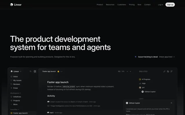
Midnight Command Center: A dark, layered interface lit by precise accents, like a high-tech control panel.
Color palette
Primary action indicators, active states, and focus elements — a high-energy focal point.
Decorative highlights and occasional background elements, suggesting a technological or informational context.
Informational highlights and unique icon fills, providing a cool accent.
Background accents in specific content blocks, indicating a distinct informational category.
Another variant of violet for backgrounds, used interchangeably with Deep Violet for visual diversity.
Page background, primary surface for base elements, subtly integrated into shadows for depth.
Elevated card backgrounds, slightly lighter than the canvas to denote layering.
Secondary elevated card backgrounds, providing another layer of visual hierarchy.
Borders and some shadowed card surfaces, framing elements with a subtle distinction.
Subtle borders and dividers, indicating soft separations within the dark theme.
Tertiary background elements and input borders, a darker neutral for functional elements.
Primary text and icons, providing strong contrast for readability against dark backgrounds.
Secondary text and borders, for less prominent information or structural lines.
Tertiary text, descriptive labels, and inactive states, recedes into the background for low-priority details.
Muted text for metadata, timestamps, and further de-emphasized content.
Informational borders and subtle fills, often seen in code blocks or explanatory components.
Positive status indicators, success messages, and related iconography.
Success and completion states, often paired with green text.
Observed in icon fill, body borderColor, other fill. Extracted usage does not support a distinct primary control color.
Typography
- Weights
- 300, 400, 510, 590
- Sizes
- 10px, 11px, 12px, 13px, 14px, 15px, 16px, 17px, 20px, 24px, 32px, 48px, 64px, 72px
- Line height
- 1, 1.13, 1.2, 1.33, 1.4, 1.47, 1.5, 1.6, 2, 2.46, 2.75
- Letter spacing
- -0.22, -0.15, -0.13, -0.12, -0.11, -0.1
- Fallback
- Inter
Primary UI typeface for all content including headings, body text, and interactive elements. Its variable weights provide a clean, modern aesthetic with strong technical readability.
- Weights
- 400
- Sizes
- 12px, 13px, 14px
- Line height
- 1.3, 1.4, 1.5, 1.71
- Letter spacing
- -0.15
- Fallback
- IBM Plex Mono
Monospaced font for code snippets, technical details, and certain data displays, ensuring consistent character alignment and technical clarity.
Spacing & shape
Elevation
Components
Filled button with 'Neon Lime' background (#e4f222), 'Pitch Black' text (#08090a), 6px border-radius, and variable padding. Used for primary user actions.
Ghost button with transparent background, 'Porcelain' text (#f7f8f8), no explicit padding, and 0px border-radius. Navigational links or simple interactive elements.
Ghost button with transparent background, 'Light Steel' text (#d0d6e0), 6px border-radius, and minimal padding (0px top/bottom, 6px left/right). Used for less prominent interactive elements or textual links.
Ghost button with transparent background, 'Storm Cloud' text (#8a8f98), 2px border-radius, and no explicit padding. Used for items in a navigation list.
Card with 'Graphite' background (#0f1011), 6px border-radius, and an outer shadow of rgba(0, 0, 0, 0.4) 0px 2px 4px 0px. Padding is 8px on all sides.
Card with 'Deep Slate' background (#161718), 12px top border-radius (0px bottom), and an inset shadow of rgb(35, 37, 42) 0px 0px 0px 1px. Padding is 24px vertical and 0px horizontal.
Card with 'Pitch Black' background (#08090a) and 12px border-radius, no shadow. Padding 8px on all sides, used for containing sub-elements within larger cards.
Input field with transparent background, 'Porcelain' text (#f7f8f8), 'Charcoal Grey' border (#23252a), and 6px border-radius. Padding is 12px vertical and 14px horizontal.
Input field with 'Gunmetal' background (#383b3f), 'Porcelain' text (#f7f8f8), no explicit border, and 0px border-radius. Used for less emphasized data entry.
Badge with a 'Gunmetal' background (#383b3f), 'Storm Cloud' text (#8a8f98), 4px border-radius, and padding of 0px vertical and 6px horizontal. Used for small categorical labels.
Guidelines
- Use 'Pitch Black' (#08090a) for the primary page background to establish the dark theme.
- Apply 'Porcelain' (#f7f8f8) for all primary text and important icons to ensure readability.
- Highlight primary interactive elements exclusively with 'Neon Lime' (#e4f222) as a background, restricting its use to guide user attention.
- Create depth and hierarchy by layering surfaces using 'Pitch Black' (#08090a), 'Graphite' (#0f1011), and 'Deep Slate' (#161718) backgrounds.
- Employ the Inter Variable font family with specific letter-spacing adjustments for all UI text, such as -0.22px for display sizes and -0.11px for body text, to maintain a tight, precise feel.
- Utilize 6px border-radius for all primary buttons, cards, and input fields to maintain a consistent, subtly rounded aesthetic.
- Use 'Storm Cloud' (#8a8f98) for secondary text and descriptive labels to recede into the background.
- Do not introduce additional bright or saturated colors beyond 'Neon Lime' (#e4f222) for interactive elements; maintain its singular role.
- Avoid using harsh white backgrounds or light-themed patterns, as the system is anchored in a dark mode aesthetic.
- Do not deviate from the specified typeface choices; 'Inter Variable' and 'Berkeley Mono' are fundamental to the visual identity.
- Refrain from using strong, diffuse shadows; elevation is achieved through subtle layering and sharp, contained shadows like rgba(0, 0, 0, 0.4) 0px 2px 4px 0px.
- Do not apply broad, decorative background gradients across large sections of the UI; gradients are subtle and contained to specific functional areas.
- Do not use generic border-radii; adhere to 6px for key components like cards and buttons, and 2px for smaller tags, to preserve the signature balance of softness and precision.
- Avoid large amounts of white space; the design is compact, leveraging an 8px element gap as a standard measurement.
About this system
ShowHide
Linear presents a sophisticated and focused dark-mode experience, reminiscent of a command center dashboard. A deep charcoal base creates a serious, immersive canvas, while subtle gradients and layered surfaces build depth without harsh contrasts. Distinctive muted text colors (#8a8f98 for secondary, #62666d for tertiary) maintain readability against the dark backdrop. Critically, interaction is marked by a single vivid lime green (#e4f222), applied selectively to primary calls to action, preventing visual clutter and guiding the user's eye with precision.
The page primarily uses a full-bleed structure for background content, with main content sections constrained by a centered maximum width (not explicitly defined but visually present). The hero section features a full-bleed 'Pitch Black' background with a centered, prominent headline. Subsequent sections alternate between dark backgrounds for narrative content and embedded UI examples, often featuring split layouts (text on one side, product UI on the other). Content is generally arranged in vertical stacks or multi-column grids for feature display. Navigation consists of a sticky top bar and frequently observed left-hand sidebar for application-like structures. Spacing is compact yet deliberate, creating a dense but organized information flow.
The site's visual language is dominated by UI elements and product screenshots, emphasizing functionality over decorative imagery. Where images appear, they are often contained within realistic product mockups or embedded application frames. Abstract graphics are minimal, primarily serving as subtle background textures or data visualizations. Icons are filled, minimalist, and mono-color, often adopting the 'Porcelain' (#f7f8f8) or 'Storm Cloud' (#8a8f98) neutral palette, enhancing the dashboard aesthetic. The overall density of imagery is low; it serves an explanatory or product showcase role rather than a decorative one.
Reminiscent of Vercel, GitHub, Notion (dark mode), Raycast.
# Linear — Style Reference
> Midnight Command Center: A dark, layered interface lit by precise accents, like a high-tech control panel.

**Theme:** dark

**Site:** https://linear.app

Linear presents a sophisticated and focused dark-mode experience, reminiscent of a command center dashboard. A deep charcoal base creates a serious, immersive canvas, while subtle gradients and layered surfaces build depth without harsh contrasts. Distinctive muted text colors (#8a8f98 for secondary, #62666d for tertiary) maintain readability against the dark backdrop. Critically, interaction is marked by a single vivid lime green (#e4f222), applied selectively to primary calls to action, preventing visual clutter and guiding the user's eye with precision.

## Tokens — Colors

| Name | Value | Token | Role |
|------|------|------|------|
| Neon Lime | `#e4f222` | `--color-neon-lime` | Primary action indicators, active states, and focus elements — a high-energy focal point. |
| Aether Blue | `#5e6ad2` | `--color-aether-blue` | Decorative highlights and occasional background elements, suggesting a technological or informational context. |
| Cyan Spark | `#02b8cc` | `--color-cyan-spark` | Informational highlights and unique icon fills, providing a cool accent. |
| Deep Violet | `#6366f1` | `--color-deep-violet` | Background accents in specific content blocks, indicating a distinct informational category. |
| Amethyst | `#8b5cf6` | `--color-amethyst` | Another variant of violet for backgrounds, used interchangeably with Deep Violet for visual diversity. |
| Pitch Black | `#08090a` | `--color-pitch-black` | Page background, primary surface for base elements, subtly integrated into shadows for depth. |
| Graphite | `#0f1011` | `--color-graphite` | Elevated card backgrounds, slightly lighter than the canvas to denote layering. |
| Deep Slate | `#161718` | `--color-deep-slate` | Secondary elevated card backgrounds, providing another layer of visual hierarchy. |
| Charcoal Grey | `#23252a` | `--color-charcoal-grey` | Borders and some shadowed card surfaces, framing elements with a subtle distinction. |
| Muted Ash | `#323334` | `--color-muted-ash` | Subtle borders and dividers, indicating soft separations within the dark theme. |
| Gunmetal | `#383b3f` | `--color-gunmetal` | Tertiary background elements and input borders, a darker neutral for functional elements. |
| Porcelain | `#f7f8f8` | `--color-porcelain` | Primary text and icons, providing strong contrast for readability against dark backgrounds. |
| Light Steel | `#d0d6e0` | `--color-light-steel` | Secondary text and borders, for less prominent information or structural lines. |
| Storm Cloud | `#8a8f98` | `--color-storm-cloud` | Tertiary text, descriptive labels, and inactive states, recedes into the background for low-priority details. |
| Fog Grey | `#62666d` | `--color-fog-grey` | Muted text for metadata, timestamps, and further de-emphasized content. |
| Alabaster | `#e5e5e6` | `--color-alabaster` | Informational borders and subtle fills, often seen in code blocks or explanatory components. |
| Forest Green | `#008d2c` | `--color-forest-green` | Positive status indicators, success messages, and related iconography. |
| Emerald | `#27a644` | `--color-emerald` | Success and completion states, often paired with green text. |
| Warning Red | `#eb5757` | `--color-warning-red` | Observed in icon fill, body borderColor, other fill. Extracted usage does not support a distinct primary control color. |

## Tokens — Typography

### Inter Variable
- **Substitute:** Inter
- **Weights:** 300, 400, 510, 590
- **Sizes:** 10px, 11px, 12px, 13px, 14px, 15px, 16px, 17px, 20px, 24px, 32px, 48px, 64px, 72px
- **Line height:** 1, 1.13, 1.2, 1.33, 1.4, 1.47, 1.5, 1.6, 2, 2.46, 2.75
- **Letter spacing:** -0.22, -0.15, -0.13, -0.12, -0.11, -0.1
- **Role:** Primary UI typeface for all content including headings, body text, and interactive elements. Its variable weights provide a clean, modern aesthetic with strong technical readability.

### Berkeley Mono
- **Substitute:** IBM Plex Mono
- **Weights:** 400
- **Sizes:** 12px, 13px, 14px
- **Line height:** 1.3, 1.4, 1.5, 1.71
- **Letter spacing:** -0.15
- **Role:** Monospaced font for code snippets, technical details, and certain data displays, ensuring consistent character alignment and technical clarity.

## Tokens — Type Scale

Golden Ratio (1.618) from 14px base.

| Role | Size | Line height | Letter spacing |
|------|------|------|------|
| caption | 10px | 1.4 | -0.1px |
| body | 14px | 1.4 | -0.13px |
| heading | 24px | 1.33 | -0.22px |
| heading-lg | 48px | 1.2 | -0.22px |
| display | 72px | 1 | -0.22px |

## Tokens — Spacing

- **Section gap:** 24px
- **Card padding:** 12px
- **Element gap:** 8px

## Tokens — Radius

- **Default:** 6px
- **Buttons:** 6px
- **Inputs:** 6px
- **Cards:** 6px
- **badges:** 4px
- **pill:** 9999px
- **tags:** 2px

## Tokens — Elevation

- **Default Card:** `rgba(0, 0, 0, 0.4) 0px 2px 4px 0px`
- **Sidebar/Menu Element Focus:** `rgba(0, 0, 0, 0.2) 0px 0px 12px 0px inset`
- **Elevated Card Inset:** `rgb(35, 37, 42) 0px 0px 0px 1px inset`
- **Card Border/Input Focus:** `rgba(0, 0, 0, 0.2) 0px 0px 0px 1px`
- **Navigation/Button Subtle Lift:** `rgba(0, 0, 0, 0.01) 0px 5px 2px 0px, rgba(0, 0, 0, 0.04) 0px 3px 2px 0px, rgba(0, 0, 0, 0.07) 0px 1px 1px 0px, rgba(0, 0, 0, 0.08) 0px 0px 1px 0px`

## Layout

The page primarily uses a full-bleed structure for background content, with main content sections constrained by a centered maximum width (not explicitly defined but visually present). The hero section features a full-bleed 'Pitch Black' background with a centered, prominent headline. Subsequent sections alternate between dark backgrounds for narrative content and embedded UI examples, often featuring split layouts (text on one side, product UI on the other). Content is generally arranged in vertical stacks or multi-column grids for feature display. Navigation consists of a sticky top bar and frequently observed left-hand sidebar for application-like structures. Spacing is compact yet deliberate, creating a dense but organized information flow.

## Imagery

The site's visual language is dominated by UI elements and product screenshots, emphasizing functionality over decorative imagery. Where images appear, they are often contained within realistic product mockups or embedded application frames. Abstract graphics are minimal, primarily serving as subtle background textures or data visualizations. Icons are filled, minimalist, and mono-color, often adopting the 'Porcelain' (#f7f8f8) or 'Storm Cloud' (#8a8f98) neutral palette, enhancing the dashboard aesthetic. The overall density of imagery is low; it serves an explanatory or product showcase role rather than a decorative one.

## Components

### Issue Card

### CTA Button Group

### Issue List Board

### Primary Action Button
*Call to action button*

Filled button with 'Neon Lime' background (#e4f222), 'Pitch Black' text (#08090a), 6px border-radius, and variable padding. Used for primary user actions.

### Ghost Navigation Button
*Navigation and secondary actions*

Ghost button with transparent background, 'Porcelain' text (#f7f8f8), no explicit padding, and 0px border-radius. Navigational links or simple interactive elements.

### Subtle Link Button
*Tertiary actions and links*

Ghost button with transparent background, 'Light Steel' text (#d0d6e0), 6px border-radius, and minimal padding (0px top/bottom, 6px left/right). Used for less prominent interactive elements or textual links.

### Navigation Item Button
*Sidebar navigation items*

Ghost button with transparent background, 'Storm Cloud' text (#8a8f98), 2px border-radius, and no explicit padding. Used for items in a navigation list.

### Default Card
*Content container*

Card with 'Graphite' background (#0f1011), 6px border-radius, and an outer shadow of rgba(0, 0, 0, 0.4) 0px 2px 4px 0px. Padding is 8px on all sides.

### Elevated Card
*Prominent content container*

Card with 'Deep Slate' background (#161718), 12px top border-radius (0px bottom), and an inset shadow of rgb(35, 37, 42) 0px 0px 0px 1px. Padding is 24px vertical and 0px horizontal.

### Nested Card
*Internal content grouping*

Card with 'Pitch Black' background (#08090a) and 12px border-radius, no shadow. Padding 8px on all sides, used for containing sub-elements within larger cards.

### Input Field
*User input fields*

Input field with transparent background, 'Porcelain' text (#f7f8f8), 'Charcoal Grey' border (#23252a), and 6px border-radius. Padding is 12px vertical and 14px horizontal.

### Subtle Input Field
*Search or secondary input fields*

Input field with 'Gunmetal' background (#383b3f), 'Porcelain' text (#f7f8f8), no explicit border, and 0px border-radius. Used for less emphasized data entry.

### Badge
*Label or tag*

Badge with a 'Gunmetal' background (#383b3f), 'Storm Cloud' text (#8a8f98), 4px border-radius, and padding of 0px vertical and 6px horizontal. Used for small categorical labels.

## Guidelines

### Do

- Use 'Pitch Black' (#08090a) for the primary page background to establish the dark theme.
- Apply 'Porcelain' (#f7f8f8) for all primary text and important icons to ensure readability.
- Highlight primary interactive elements exclusively with 'Neon Lime' (#e4f222) as a background, restricting its use to guide user attention.
- Create depth and hierarchy by layering surfaces using 'Pitch Black' (#08090a), 'Graphite' (#0f1011), and 'Deep Slate' (#161718) backgrounds.
- Employ the Inter Variable font family with specific letter-spacing adjustments for all UI text, such as -0.22px for display sizes and -0.11px for body text, to maintain a tight, precise feel.
- Utilize 6px border-radius for all primary buttons, cards, and input fields to maintain a consistent, subtly rounded aesthetic.
- Use 'Storm Cloud' (#8a8f98) for secondary text and descriptive labels to recede into the background.

### Don't

- Do not introduce additional bright or saturated colors beyond 'Neon Lime' (#e4f222) for interactive elements; maintain its singular role.
- Avoid using harsh white backgrounds or light-themed patterns, as the system is anchored in a dark mode aesthetic.
- Do not deviate from the specified typeface choices; 'Inter Variable' and 'Berkeley Mono' are fundamental to the visual identity.
- Refrain from using strong, diffuse shadows; elevation is achieved through subtle layering and sharp, contained shadows like rgba(0, 0, 0, 0.4) 0px 2px 4px 0px.
- Do not apply broad, decorative background gradients across large sections of the UI; gradients are subtle and contained to specific functional areas.
- Do not use generic border-radii; adhere to 6px for key components like cards and buttons, and 2px for smaller tags, to preserve the signature balance of softness and precision.
- Avoid large amounts of white space; the design is compact, leveraging an 8px element gap as a standard measurement.

## Agent Prompt Guide

Quick Color Reference:
- text: #f7f8f8 (Porcelain)
- background: #08090a (Pitch Black)
- border: #23252a (Charcoal Grey)
- accent: #5e6ad2 (Aether Blue)
- primary action: #e4f222 (filled action)

3-5 Example Component Prompts:
- Create a call-to-action button: 'Neon Lime' background (#e4f222), 'Pitch Black' text (#08090a), Inter Variable font weight 590 at 15px, 6px border-radius, 12px vertical and 24px horizontal padding.
- Create a default card with content: 'Graphite' background (#0f1011), 6px border-radius, rgba(0, 0, 0, 0.4) 0px 2px 4px 0px shadow. Inside, use Inter Variable font weight 400 at 14px with 'Porcelain' text (#f7f8f8), and a subsection headline at 17px weight 510 with 'Porcelain' text (#f7f8f8). Apply 8px padding internally.
- Create a sidebar navigation item: Ghost button with transparent background, 'Storm Cloud' text (#8a8f98), Inter Variable font weight 400 at 14px, 2px border-radius, no padding.
- Create an input field: transparent background with a 'Gunmetal' fill (#383b3f), 'Light Steel' text (#d0d6e0) using Inter Variable font weight 400 at 14px, 6px border-radius. Inset with a 1px 'Charcoal Grey' border (#23252a). Padding 12px vertical and 14px horizontal.
More like this






Keep what you find
A free account saves references to boards and can send you a weekly email of picks based on what you save.
To see every result, go Pro.