Preview image. Unlock full-res
Vibrant AI workspace
Color palette
Primary interactive elements like CTA buttons, links, and key highlights — creating an energetic focal point.
Used for success states, value propositions, and numerical highlights, signifying positive outcomes.
Accents for section backgrounds or graphical elements, symbolizing a blend of progress and clarity.
Visual emphasis on statistics and features, conveying forward motion.
Page backgrounds, card surfaces, primary text on dark accents.
Primary body text, standard headings.
Secondary text, descriptive elements.
Subtle borders, dividers, ghost button outlines.
Typography
- Weights
- 300, 400, 500, 600, 700
- Sizes
- all
- Line height
- all
- Letter spacing
- -0.01em
- Fallback
- system-ui
Headings, primary body text, buttons, and most UI elements. Its consistent, slightly condensed form with light letter spacing provides a modern, clean textual presence.
- Weights
- 400, 500
- Sizes
- 12px, 13px, 18px
- Line height
- all
- Letter spacing
- normal
- Fallback
- system-ui
Used sparingly for secondary information and card details, offering a slightly more utilitarian contrast to the prominent Poppins.
Spacing & shape
Components
backgroundColor: #5562eb, color: #ffffff, borderRadius: 100px, paddingTop/Bottom: 15px, paddingLeft/Right: 30px, font: Poppins weight 500 equivalent to 16px.
backgroundColor: #ffffff, color: #000000, border: 1px solid #c2caf9, borderRadius: 0px, paddingTop/Bottom: 0px, paddingLeft/Right: 30px, font: Poppins weight 500 equivalent to 16px. Height defined by 0px padding is a specific implementation detail.
backgroundColor: transparent, color: #2b2b2b, no border, borderRadius: 0px, paddingTop/Bottom: 26px, paddingLeft/Right: 0px, font: Poppins weight 500 equivalent to 16px.
backgroundColor: #000000, color: #ffffff, borderRadius: 3px, paddingTop/Bottom: 15px, paddingLeft/Right: 30px, font: Poppins weight 500 equivalent to 16px.
backgroundColor: transparent, borderRadius: 0px, boxShadow: none, paddingTop/Bottom: 0px, paddingLeft/Right: 20px. Content is meant to drive impact without visual framing.
backgroundColor: #ffffff, borderRadius: 0px, boxShadow: none, paddingTop/Bottom/Left/Right: 30px. Used for content blocks that need a clean white background.
backgroundColor: transparent, color: #181d25, borderRadius: 0px, padding: 0px. Text-only tag for unobtrusive labeling.
Large numerical value (e.g., '4.8h') in AI Green #7ac17b, Poppins Bold. Followed by descriptive text in Charcoal #2b2b2b, smaller Poppins regular. Overall composition for high readability and immediate impact.
Guidelines
- Always use Poppins for display headings and primary text, leveraging its -0.01em letterSpacing for a sophisticated feel.
- Apply Electric Violet (#5562eb) exclusively for primary interactive elements, such as main CTA buttons and navigation links.
- Utilize 100px border-radius for all primary buttons and image masks to maintain a consistent soft, modern touch.
- Pair AI Green (#7ac17b) with Poppins Bold for all numerical statistics or positive affirmations.
- Maintain generous vertical spacing between sections to ensure content breathe and visual comfort.
- Use Charcoal (#2b2b2b) for general paragraph text and secondary headings for clear readability against a white background.
- Do not use box shadows for content cards; rely on background color changes for hierarchy when needed.
- Avoid using multiple chromatic colors for primary calls to action; reserve Electric Violet (#5562eb) for this role.
- Do not use Poppins with default letter-spacing; ensure -0.01em is applied for the consistent brand typography.
- Do not introduce square buttons unless for specific dark background contexts (like the Get Started button in the header) to avoid inconsistency with the dominant pill style.
- Do not use dark backgrounds for sections unless explicitly defined with gradient fills or for specific hero moments.
- Avoid arbitrary border-radii; stick to 0px, 10px, or 100px for consistency.
About this system
ShowHide
This design orchestrates a friendly yet authoritative presentation through vibrant accents against a clean, spacious white backdrop. Key information is spotlighted with bold headings and a signature electric violet, while supporting details use muted tones. The frequent use of rounded corners, especially 100px pill shapes, softens the otherwise structured content, creating an approachable and modern feel for an AI-driven tool.
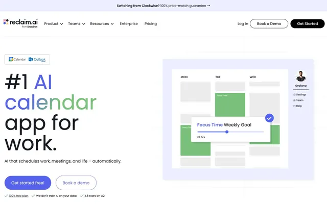
The layout is predominantly max-width contained, centered on the page, with a pageMaxWidth implicitly around 1200px based on visual density. The hero section features a left-aligned, prominent headline over a white background, balanced by a large product screenshot on the right. Subsequent sections alternate between centered content stacks for testimonials or statistics and two-column layouts featuring text on the left and a product graphic or illustration on the right. There's a consistent vertical rhythm from varied margin-bottoms, leading to a comfortable density. The navigation is a sticky top bar with a logo, text links, and prominent pill-shaped buttons for CTAs.
The site uses a combination of abstract graphics and product screenshots. Product imagery features tight crops of the Reclaim UI, often presented on a clean white background with a subtle, friendly purple-tinted shadow like #ebefff. These screenshots are typically contained rather than full-bleed, showcasing the application's functionality. Icons are primarily outlined or subtle filled, using either dark neutrals or brand colors like AI Green, maintaining a clean, technical aesthetic. There are no lifestyle photos.
Reminiscent of Calendly, Asana, Notion, Linear, ClickUp.
# Reclaim — Style Reference
> Vibrant AI workspace

**Theme:** light

**Site:** https://reclaim.ai

This design orchestrates a friendly yet authoritative presentation through vibrant accents against a clean, spacious white backdrop. Key information is spotlighted with bold headings and a signature electric violet, while supporting details use muted tones. The frequent use of rounded corners, especially 100px pill shapes, softens the otherwise structured content, creating an approachable and modern feel for an AI-driven tool.

## Tokens — Colors

| Name | Value | Token | Role |
|------|------|------|------|
| Electric Violet | `#5562eb` | `--color-electric-violet` | Primary interactive elements like CTA buttons, links, and key highlights — creating an energetic focal point. |
| AI Green | `#7ac17b` | `--color-ai-green` | Used for success states, value propositions, and numerical highlights, signifying positive outcomes. |
| Zenith Gradient | `#5562eb` | `--color-zenith-gradient` | Accents for section backgrounds or graphical elements, symbolizing a blend of progress and clarity. |
| Growth Gradient | `#7ac17b` | `--color-growth-gradient` | Visual emphasis on statistics and features, conveying forward motion. |
| White | `#ffffff` | `--color-white` | Page backgrounds, card surfaces, primary text on dark accents. |
| Charcoal | `#2b2b2b` | `--color-charcoal` | Primary body text, standard headings. |
| Graphite | `#474747` | `--color-graphite` | Secondary text, descriptive elements. |
| Light Steel | `#c2c4d0` | `--color-light-steel` | Subtle borders, dividers, ghost button outlines. |

## Tokens — Typography

### Poppins
- **Substitute:** system-ui
- **Weights:** 300, 400, 500, 600, 700
- **Sizes:** all
- **Line height:** all
- **Letter spacing:** -0.01em
- **Role:** Headings, primary body text, buttons, and most UI elements. Its consistent, slightly condensed form with light letter spacing provides a modern, clean textual presence.

### Inter
- **Substitute:** system-ui
- **Weights:** 400, 500
- **Sizes:** 12px, 13px, 18px
- **Line height:** all
- **Letter spacing:** normal
- **Role:** Used sparingly for secondary information and card details, offering a slightly more utilitarian contrast to the prominent Poppins.

## Tokens — Type Scale

Perfect Fifth (1.5) from 16px base.

| Role | Size | Line height | Letter spacing |
|------|------|------|------|
| caption | 10px | 1.5 | — |
| body | 16px | 1.5 | -0.16px |
| subheading | 18px | 1.33 | — |
| heading | 24px | 1.25 | -0.24px |
| heading-lg | 40px | 1.18 | -0.4px |
| display | 70px | 1.05 | -0.7px |

## Tokens — Spacing

- **Section gap:** 40-70px
- **Card padding:** 20-30px
- **Element gap:** 5-15px

## Tokens — Radius

- **Default:** 10px
- **Buttons:** 100px
- **Cards:** 0px

## Layout

The layout is predominantly max-width contained, centered on the page, with a pageMaxWidth implicitly around 1200px based on visual density. The hero section features a left-aligned, prominent headline over a white background, balanced by a large product screenshot on the right. Subsequent sections alternate between centered content stacks for testimonials or statistics and two-column layouts featuring text on the left and a product graphic or illustration on the right. There's a consistent vertical rhythm from varied margin-bottoms, leading to a comfortable density. The navigation is a sticky top bar with a logo, text links, and prominent pill-shaped buttons for CTAs.

## Imagery

The site uses a combination of abstract graphics and product screenshots. Product imagery features tight crops of the Reclaim UI, often presented on a clean white background with a subtle, friendly purple-tinted shadow like #ebefff. These screenshots are typically contained rather than full-bleed, showcasing the application's functionality. Icons are primarily outlined or subtle filled, using either dark neutrals or brand colors like AI Green, maintaining a clean, technical aesthetic. There are no lifestyle photos.

## Components

### CTA Button Group

### Impact Statistics Block

### Announcement Banner

### Primary Pill Button
*Primary call to action.*

backgroundColor: #5562eb, color: #ffffff, borderRadius: 100px, paddingTop/Bottom: 15px, paddingLeft/Right: 30px, font: Poppins weight 500 equivalent to 16px.

### Secondary Outline Button
*Secondary call to action.*

backgroundColor: #ffffff, color: #000000, border: 1px solid #c2caf9, borderRadius: 0px, paddingTop/Bottom: 0px, paddingLeft/Right: 30px, font: Poppins weight 500 equivalent to 16px. Height defined by 0px padding is a specific implementation detail.

### Ghost Header Button
*Navigation or tertiary actions in headers.*

backgroundColor: transparent, color: #2b2b2b, no border, borderRadius: 0px, paddingTop/Bottom: 26px, paddingLeft/Right: 0px, font: Poppins weight 500 equivalent to 16px.

### Dark Square Button
*Secondary navigation or actions, offering higher contrast.*

backgroundColor: #000000, color: #ffffff, borderRadius: 3px, paddingTop/Bottom: 15px, paddingLeft/Right: 30px, font: Poppins weight 500 equivalent to 16px.

### Feature Card
*Highlighting product features or benefits.*

backgroundColor: transparent, borderRadius: 0px, boxShadow: none, paddingTop/Bottom: 0px, paddingLeft/Right: 20px. Content is meant to drive impact without visual framing.

### Product Insight Card
*Displaying key statistics or quotes.*

backgroundColor: #ffffff, borderRadius: 0px, boxShadow: none, paddingTop/Bottom/Left/Right: 30px. Used for content blocks that need a clean white background.

### Accent Tag
*Categorization or small interactive labels.*

backgroundColor: transparent, color: #181d25, borderRadius: 0px, padding: 0px. Text-only tag for unobtrusive labeling.

### Impact Statistic
*Presenting key performance indicators with visual hierarchy.*

Large numerical value (e.g., '4.8h') in AI Green #7ac17b, Poppins Bold. Followed by descriptive text in Charcoal #2b2b2b, smaller Poppins regular. Overall composition for high readability and immediate impact.

## Guidelines

### Do

- Always use Poppins for display headings and primary text, leveraging its -0.01em letterSpacing for a sophisticated feel.
- Apply Electric Violet (#5562eb) exclusively for primary interactive elements, such as main CTA buttons and navigation links.
- Utilize 100px border-radius for all primary buttons and image masks to maintain a consistent soft, modern touch.
- Pair AI Green (#7ac17b) with Poppins Bold for all numerical statistics or positive affirmations.
- Maintain generous vertical spacing between sections to ensure content breathe and visual comfort.
- Use Charcoal (#2b2b2b) for general paragraph text and secondary headings for clear readability against a white background.

### Don't

- Do not use box shadows for content cards; rely on background color changes for hierarchy when needed.
- Avoid using multiple chromatic colors for primary calls to action; reserve Electric Violet (#5562eb) for this role.
- Do not use Poppins with default letter-spacing; ensure -0.01em is applied for the consistent brand typography.
- Do not introduce square buttons unless for specific dark background contexts (like the Get Started button in the header) to avoid inconsistency with the dominant pill style.
- Do not use dark backgrounds for sections unless explicitly defined with gradient fills or for specific hero moments.
- Avoid arbitrary border-radii; stick to 0px, 10px, or 100px for consistency.

## Agent Prompt Guide

### Quick Color Reference
- Text (Charcoal): #2b2b2b
- Background (White): #ffffff
- CTA (Electric Violet): #5562eb
- Border (Light Steel): #c2c4d0
- Accent (AI Green): #7ac17b

### 3-5 Example Component Prompts
1. Create a hero section: white background. Headline '#1 AI calendar app for work.' using Poppins 70px weight 700 letter-spacing -0.7px #2b2b2b. Subtext 'AI that schedules work, meetings, and life – automatically.' using Poppins 18px weight 400 #474747. Primary button 'Get started free!' with backgroundColor #5562eb, color #ffffff, borderRadius 100px, padding 15px 30px, font Poppins 16px weight 500.
2. Design a statistics section: background white. Display a statistic '4.8h' using Poppins 40px weight 700 color #7ac17b. Below it, add descriptive text 'more focus time/week' using Poppins 16px weight 400 color #2b2b2b. Duplicate this pattern for a 4-column layout.
3. Create a secondary navigation link: 'Book a Demo' with backgroundColor #ffffff, color #000000, border 1px solid #c2caf9, borderRadius 0px, padding 0px 30px, font Poppins 16px weight 500.
More like this









Keep what you find
A free account saves references to boards and can send you a weekly email of picks based on what you save.
To see every result, go Pro.