Preview image. Unlock full-res
Deep Slate Terminal
Color palette
Green outline accent for tags, dividers, and focused UI edges. Do not promote it to the primary CTA color
Page background, primary surface for content sections, general canvas
Secondary surface background, used for subtle elevation or interactive elements like buttons
Primary text color, high-contrast against dark backgrounds
Secondary text, muted borders, and subtle iconography
Tertiary text, less prominent borders, and delicate UI lines
Typography
- Weights
- 400, 700
- Sizes
- 12px, 16px, 43px
- Line height
- 0.95, 1, 1.19, 1.2, 1.58
- Letter spacing
- -0.015em at 12px, -0.016em at 16px, 0.083em at 43px
- Fallback
- Arial
Primary typeface for all UI elements, including headings, body text, and interactive components. The variable letter-spacing for different sizes creates an intentional, considered feel, from compact functional text to more open, expressive headlines.
Spacing & shape
Components
Rounded button with `Midnight Ink` background, `Charger Green` text and a `144px` border radius. Padding is `8px` vertical and `10-12px` horizontal. Subtle `1px` border of `rgba(255, 255, 255, 0.05)` on top edge.
Rectangular button with `Obsidian` background, `Frost` text, and `4px` border radius. Padding is `8px` vertical and `12px` horizontal. Subtle `1px` border of `rgba(255, 255, 255, 0.05)` on top edge.
Transparent background, `0px` border radius, no box shadow, with implied interactive states. Text color is `Frost` or `Pale Ash` for inactive states.
Guidelines
- Use `Midnight Ink` (#121212) as the dominant background color for all page sections.
- Prioritize `Frost` (#ffffff) for primary text and `Pale Ash` (#d0d0d0) for secondary text to maintain clear hierarchy against dark backgrounds.
- Apply `Charger Green` (#d9ff00) exclusively for highly interactive elements, text, and icons to draw attention and indicate action.
- Construct buttons with either `144px` (pill) or `4px` (standard) border radius, avoiding other radius values for interactive elements.
- Implement `6px` as the base unit for vertical and horizontal spacing between elements.
- Utilize the `Office` typeface across all headings and body text, adhering to the specified weights and precise letter-spacing values.
- Avoid introducing additional saturated colors; maintain the high-contrast `Charger Green` (#d9ff00) as the sole vivid accent.
- Do not use heavy shadows or gradients for elevation; rely on subtle background opacity changes and thin borders.
- Do not create components with border radii other than `4px` or `144px` for interactive elements.
- Do not vary from the established `Midnight Ink` (#121212) and `Obsidian` (#292929) for background surfaces.
- Avoid large, uncontained imagery; all visuals should either be full-bleed with strong composition or tightly integrated into structured sections.
About this system
ShowHide
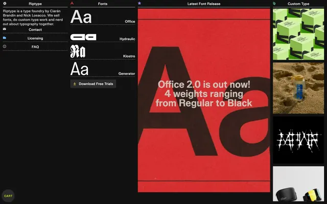
Riptype's design system combines a deep, almost black, background with crisp white typography and sparse, vivid chartreuse accents, creating a high-contrast, edgy aesthetic. Components are compact and minimally decorated, favoring subtle borders over heavy fills or shadows. The overall impression is technical and precise, reflecting its typographic focus. Subtle motion and interaction states provide a responsive, engaging user experience.
The page structure favors a max-width contained layout at `285px` for content, creating a focused, almost terminal-like experience. The hero section is full-bleed, often with a large, striking graphic or textural background and centered, bold typography. Subsequent sections maintain consistent vertical rhythm with minimal dividers, primarily using `6px` element gaps. The overall content arrangement alternates between left-aligned text blocks, centered feature displays, and grid-like presentations for items like font samples. Navigation is present as a minimal top bar and integrated sidebar list.
This system primarily uses bold, high-contrast, full-bleed graphic imagery and abstract product shots, often with a stark black backdrop. Photography, when present, features tightly cropped product details with high textural fidelity or stylized, almost conceptual images. Icons are minimalist, outlined, and monochromatic, often using `Frost` (#ffffff) or `Charger Green` (#d9ff00) for active states. The visual language favors an atmosphere of technical precision and artistic expression rather than lifestyle or extensive explanatory graphics. Imagery is heavy, commanding significant visual space.
Reminiscent of Fonts In Use, Future Fonts, Vercel, Linear.
# Riptype Foundry — Style Reference
> Deep Slate Terminal

**Theme:** dark

**Site:** https://www.riptype.xyz

Riptype's design system combines a deep, almost black, background with crisp white typography and sparse, vivid chartreuse accents, creating a high-contrast, edgy aesthetic. Components are compact and minimally decorated, favoring subtle borders over heavy fills or shadows. The overall impression is technical and precise, reflecting its typographic focus. Subtle motion and interaction states provide a responsive, engaging user experience.

## Tokens — Colors

| Name | Value | Token | Role |
|------|------|------|------|
| Charger Green | `#d9ff00` | `--color-charger-green` | Green outline accent for tags, dividers, and focused UI edges. Do not promote it to the primary CTA color |
| Midnight Ink | `#121212` | `--color-midnight-ink` | Page background, primary surface for content sections, general canvas |
| Obsidian | `#292929` | `--color-obsidian` | Secondary surface background, used for subtle elevation or interactive elements like buttons |
| Frost | `#ffffff` | `--color-frost` | Primary text color, high-contrast against dark backgrounds |
| Pale Ash | `#d0d0d0` | `--color-pale-ash` | Secondary text, muted borders, and subtle iconography |
| Steel Grey | `#a0a0a0` | `--color-steel-grey` | Tertiary text, less prominent borders, and delicate UI lines |

## Tokens — Typography

### Office
- **Substitute:** Arial
- **Weights:** 400, 700
- **Sizes:** 12px, 16px, 43px
- **Line height:** 0.95, 1, 1.19, 1.2, 1.58
- **Letter spacing:** -0.015em at 12px, -0.016em at 16px, 0.083em at 43px
- **Role:** Primary typeface for all UI elements, including headings, body text, and interactive components. The variable letter-spacing for different sizes creates an intentional, considered feel, from compact functional text to more open, expressive headlines.

## Tokens — Type Scale

| Role | Size | Line height | Letter spacing |
|------|------|------|------|
| caption | 12px | 1.58 | -0.18px |
| body | 16px | 1.2 | -0.26px |
| heading | 43px | 0.95 | 0.35px |

## Tokens — Spacing

- **Max width:** 285px
- **Section gap:** 48px
- **Card padding:** 12px
- **Element gap:** 6px

## Tokens — Radius

- **Buttons:** 4px
- **pillButtons:** 144px

## Layout

The page structure favors a max-width contained layout at `285px` for content, creating a focused, almost terminal-like experience. The hero section is full-bleed, often with a large, striking graphic or textural background and centered, bold typography. Subsequent sections maintain consistent vertical rhythm with minimal dividers, primarily using `6px` element gaps. The overall content arrangement alternates between left-aligned text blocks, centered feature displays, and grid-like presentations for items like font samples. Navigation is present as a minimal top bar and integrated sidebar list.

## Imagery

This system primarily uses bold, high-contrast, full-bleed graphic imagery and abstract product shots, often with a stark black backdrop. Photography, when present, features tightly cropped product details with high textural fidelity or stylized, almost conceptual images. Icons are minimalist, outlined, and monochromatic, often using `Frost` (#ffffff) or `Charger Green` (#d9ff00) for active states. The visual language favors an atmosphere of technical precision and artistic expression rather than lifestyle or extensive explanatory graphics. Imagery is heavy, commanding significant visual space.

## Components

### Pill Accent Button
*Primary action button, often for CTAs or key navigation.*

Rounded button with `Midnight Ink` background, `Charger Green` text and a `144px` border radius. Padding is `8px` vertical and `10-12px` horizontal. Subtle `1px` border of `rgba(255, 255, 255, 0.05)` on top edge.

### Standard Button
*Secondary action button for general interactivity.*

Rectangular button with `Obsidian` background, `Frost` text, and `4px` border radius. Padding is `8px` vertical and `12px` horizontal. Subtle `1px` border of `rgba(255, 255, 255, 0.05)` on top edge.

### Menu Item Card
*Interactive list items, used in navigational menus.*

Transparent background, `0px` border radius, no box shadow, with implied interactive states. Text color is `Frost` or `Pale Ash` for inactive states.

## Guidelines

### Do

- Use `Midnight Ink` (#121212) as the dominant background color for all page sections.
- Prioritize `Frost` (#ffffff) for primary text and `Pale Ash` (#d0d0d0) for secondary text to maintain clear hierarchy against dark backgrounds.
- Apply `Charger Green` (#d9ff00) exclusively for highly interactive elements, text, and icons to draw attention and indicate action.
- Construct buttons with either `144px` (pill) or `4px` (standard) border radius, avoiding other radius values for interactive elements.
- Implement `6px` as the base unit for vertical and horizontal spacing between elements.
- Utilize the `Office` typeface across all headings and body text, adhering to the specified weights and precise letter-spacing values.

### Don't

- Avoid introducing additional saturated colors; maintain the high-contrast `Charger Green` (#d9ff00) as the sole vivid accent.
- Do not use heavy shadows or gradients for elevation; rely on subtle background opacity changes and thin borders.
- Do not create components with border radii other than `4px` or `144px` for interactive elements.
- Do not vary from the established `Midnight Ink` (#121212) and `Obsidian` (#292929) for background surfaces.
- Avoid large, uncontained imagery; all visuals should either be full-bleed with strong composition or tightly integrated into structured sections.

## Agent Prompt Guide

Quick Color Reference:
text: #ffffff
background: #121212
border: #d0d0d0
accent: #d9ff00
primary action: no distinct CTA color

Example Component Prompts:
No distinct primary action color was observed; use the extracted neutral button treatments instead of inventing a filled CTA color.
2. Design a feature card: `Midnight Ink` (#121212) background, `0px` border radius, with `Pale Ash` (#d0d0d0) 1px border. Inside, use `Frost` (#ffffff) for headlines (Office, 43px, weight 700) and `Pale Ash` (#d0d0d0) for body text (Office, 16px, weight 400).
3. Generate a secondary button: `Obsidian` (#292929) background, `Frost` (#ffffff) text, `4px` border radius, `8px` vertical padding, `12px` horizontal padding. Use `Office` font weight 400 at 16px.
More like this





Keep what you find
A free account saves references to boards and can send you a weekly email of picks based on what you save.
To see every result, go Pro.