Preview image. Unlock full-res
Engineering clarity on white canvas
Color palette
Primary call-to-action buttons and interactive elements, providing a clear, guiding accent
Page backgrounds, card surfaces, default input backgrounds, base for active states
Subtle background for informational banners or ghost button fills, providing a whisper of color while maintaining neutrality
Card surfaces, subtle section backgrounds, alternative base for UI elements
Section backgrounds, subtle dividers and borders, providing faint separation
Muted borders, inactive states, faint helper text outlines for links
Primary body text, secondary headings, and key UI labels, providing strong contrast against light backgrounds
Secondary body text, less prominent UI text, and outlined button borders, offering a slightly softer contrast than primary text
Headlines, critical labels, primary iconography, and strong borders
Input text, form element borders, and focused states for form elements
Code snippets, footer text, and specific list item details, suggesting a deeper informational layer
Typography
- Weights
- 400, 575, 600, 700
- Sizes
- 12px, 14px, 16px, 20px, 22px, 48px, 60px, 85px
- Line height
- 1, 1.1, 1.3, 1.4, 1.5
- Letter spacing
- -0.02em at larger sizes (48px, 60px, 85px), -0.01em at medium sizes (20px, 22px), normal at smaller sizes.
- Fallback
- Inter
Primary typeface for all UI elements, body text, and most headings. Its varied weights support a robust typographic hierarchy with a precise, condensed feel at display sizes due to tight letter-spacing.
- Weights
- 400
- Sizes
- 36px, 80px
- Line height
- 1.05, 1.2
- Letter spacing
- -0.02em for large display text, -0.01em for other headings.
- Fallback
- Georgia
Used for specific large display headings and quotes, offering a slightly more elegant and less technical counterpoint to bootonFont, with a distinct presence at very large sizes.
Spacing & shape
Components
Filled with Oceanic Teal (#71eaee), text in Canvas White (#ffffff). Rounded corners with 6px radius. Padding 0px top/bottom, 24px left/right. Emphasizes key user actions.
Ghost-filled with Ghost Fog (#e4feff) or transparent background. Text in Ink Black (#000000) or Oceanic Teal (#71eaee). Rounded corners with 6px radius. Padding is minimal, e.g., 6px top/bottom, 12px left/right for smaller variants.
Transparent background, text in Dark Graphite (#5c5c5c) or Ink Black (#000000). No border, 0px radius. Generous vertical spacing (20px top/bottom) with 0px horizontal padding to allow for broad click areas in navigation.
Transparent background with Input Black (#171715) text. No border-radius (0px). Padding 4px top/bottom, 8px left/right. Border color matches Input Black (#171715).
Background is Pale Ash (#edede8) with a large 12px border-radius. Padding 10px top/bottom, 12px left/right. No shadow.
Solid Ink Black (#000000) background with 8px border-radius. No padding or shadow, designed for full-bleed content within the card.
Guidelines
- Prioritize high-contrast achromatic palettes for structural elements, using Ink Black (#000000) for primary text and Canvas White (#ffffff) for backgrounds.
- Apply Oceanic Teal (#71eaee) exclusively as an accent for primary actionable elements like 'Start for free' buttons and key interactive highlights.
- Use bootonFont with tighter letter-spacing (-0.02em) for larger headings (48px and above) to achieve a condensed, modern impact.
- Maintain minimal border-radii: 6px for buttons and general UI elements, 12px for larger cards, and 0px for inputs to reinforce a precise aesthetic.
- Utilize a consistent 8px elementGap to structure component relationships and a 80px sectionGap for clear content separation.
- Ensure all interactive elements provide visual feedback, such as the subtle `rgba(255, 255, 255, 0.2) 0px -1px 0px 0px inset` shadow for primary buttons.
- Position content within a max-width of 1200px, centered on the page, with full-width sections for imagery or background patterns.
- Do not introduce new chromatic colors beyond Oceanic Teal (#71eaee) without explicit brand evolution; maintain a predominantly monochrome aesthetic.
- Avoid heavy drop shadows or aggressive gradients; the system relies on flat surfaces, subtle borders, and minimal inset shadows for elevation.
- Do not deviate from the specified type scale for heading sizes or body text, as precise letter-spacing and line-heights are critical to brand legibility.
- Refrain from using excessively large border radii; the design opts for subtle rounding over overtly soft or pill-shaped elements.
- Do not use generic system fonts for headings; always default to bootonFont or affairsFont to maintain brand voice.
- Avoid dense, information-heavy sections without adequate sectionGap (80px), as the design emphasizes clear separation and comfortable reading zones.
- Do not use `0px` padding for interactive components like buttons, as it negatively impacts usability; maintain at least `6px` vertical and `12px` horizontal padding.
About this system
ShowHide
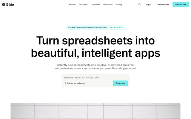
Glide's design system evokes an 'engineering clarity on a white canvas' aesthetic. It features a stark, high-contrast monochrome base, punctuated by a vibrant turquoise accent color for primary actions and interactive feedback. Typography is precise and utilitarian, prioritizing readability with minimal visual flourish. Components are lightweight with subtle radii and no prominent shadows, emphasizing a clean, fast interface designed for productivity.
The page maintains a centered max-width of 1200px for primary content, though some sections, particularly the hero, use full-bleed backgrounds. The hero features a large, centered headline backed by a prominent visual of either static imagery or video. Section rhythm is primarily consistent vertical spacing (80px), with alternating light and dark bands (Canvas White for most, Ink Black for the video section, Pale Ash for feature cards). Content is often arranged in 2-column text+visual layouts or 3-column card grids for features. Navigation is a sticky top bar with text links and a distinct primary action button. The layout prioritizes clear, segmented information over complex interweaving elements.
The imagery leans heavily on product screenshots for explanatory content, often featuring clean, minimalist UI within device mockups which are either full-bleed or contained within cards. Photography is scarce but, when present, shows professional, clean setups focusing on individuals interacting with technology, usually in well-lit, non-distracting environments. Icons are outlined, monochromatic, and subtly sized, serving functional rather than decorative roles. Illustration is absent. The overall density is text-dominant, with images serving as concise visual aids to text explanations rather than decorative elements.
Reminiscent of Airtable, Canva, Linear, Webflow.
# Glideapps — Style Reference
> Engineering clarity on white canvas

**Theme:** light

**Site:** https://www.glideapps.com

Glide's design system evokes an 'engineering clarity on a white canvas' aesthetic. It features a stark, high-contrast monochrome base, punctuated by a vibrant turquoise accent color for primary actions and interactive feedback. Typography is precise and utilitarian, prioritizing readability with minimal visual flourish. Components are lightweight with subtle radii and no prominent shadows, emphasizing a clean, fast interface designed for productivity.

## Tokens — Colors

| Name | Value | Token | Role |
|------|------|------|------|
| Oceanic Teal | `#71eaee` | `--color-oceanic-teal` | Primary call-to-action buttons and interactive elements, providing a clear, guiding accent |
| Canvas White | `#ffffff` | `--color-canvas-white` | Page backgrounds, card surfaces, default input backgrounds, base for active states |
| Ghost Fog | `#e4feff` | `--color-ghost-fog` | Subtle background for informational banners or ghost button fills, providing a whisper of color while maintaining neutrality |
| Pale Ash | `#edede8` | `--color-pale-ash` | Card surfaces, subtle section backgrounds, alternative base for UI elements |
| Warm Mist | `#d9dad3` | `--color-warm-mist` | Section backgrounds, subtle dividers and borders, providing faint separation |
| Steel Gray | `#999991` | `--color-steel-gray` | Muted borders, inactive states, faint helper text outlines for links |
| Charcoal Text | `#303030` | `--color-charcoal-text` | Primary body text, secondary headings, and key UI labels, providing strong contrast against light backgrounds |
| Dark Graphite | `#5c5c5c` | `--color-dark-graphite` | Secondary body text, less prominent UI text, and outlined button borders, offering a slightly softer contrast than primary text |
| Ink Black | `#000000` | `--color-ink-black` | Headlines, critical labels, primary iconography, and strong borders |
| Input Black | `#171715` | `--color-input-black` | Input text, form element borders, and focused states for form elements |
| Midnight Black | `#0e0e0d` | `--color-midnight-black` | Code snippets, footer text, and specific list item details, suggesting a deeper informational layer |

## Tokens — Typography

### bootonFont
- **Substitute:** Inter
- **Weights:** 400, 575, 600, 700
- **Sizes:** 12px, 14px, 16px, 20px, 22px, 48px, 60px, 85px
- **Line height:** 1, 1.1, 1.3, 1.4, 1.5
- **Letter spacing:** -0.02em at larger sizes (48px, 60px, 85px), -0.01em at medium sizes (20px, 22px), normal at smaller sizes.
- **Role:** Primary typeface for all UI elements, body text, and most headings. Its varied weights support a robust typographic hierarchy with a precise, condensed feel at display sizes due to tight letter-spacing.

### affairsFont
- **Substitute:** Georgia
- **Weights:** 400
- **Sizes:** 36px, 80px
- **Line height:** 1.05, 1.2
- **Letter spacing:** -0.02em for large display text, -0.01em for other headings.
- **Role:** Used for specific large display headings and quotes, offering a slightly more elegant and less technical counterpoint to bootonFont, with a distinct presence at very large sizes.

## Tokens — Type Scale

Perfect Fourth (1.333) from 16px base.

| Role | Size | Line height | Letter spacing |
|------|------|------|------|
| caption | 12px | 1.4 | — |
| body-sm | 14px | 1.4 | — |
| body | 16px | 1.4 | — |
| subheading | 20px | 1.3 | -0.2px |
| heading-sm | 22px | 1.3 | -0.22px |
| heading | 36px | 1.2 | -0.36px |
| heading-lg | 48px | 1.1 | -0.48px |
| display | 80px | 1.05 | -0.8px |

## Tokens — Spacing

- **Max width:** 1200px
- **Section gap:** 80px
- **Card padding:** 12px
- **Element gap:** 8px

## Tokens — Radius

- **Buttons:** 6px
- **Inputs:** 0px
- **Cards:** 12px
- **Images:** 6px
- **tags:** 6px

## Layout

The page maintains a centered max-width of 1200px for primary content, though some sections, particularly the hero, use full-bleed backgrounds. The hero features a large, centered headline backed by a prominent visual of either static imagery or video. Section rhythm is primarily consistent vertical spacing (80px), with alternating light and dark bands (Canvas White for most, Ink Black for the video section, Pale Ash for feature cards). Content is often arranged in 2-column text+visual layouts or 3-column card grids for features. Navigation is a sticky top bar with text links and a distinct primary action button. The layout prioritizes clear, segmented information over complex interweaving elements.

## Imagery

The imagery leans heavily on product screenshots for explanatory content, often featuring clean, minimalist UI within device mockups which are either full-bleed or contained within cards. Photography is scarce but, when present, shows professional, clean setups focusing on individuals interacting with technology, usually in well-lit, non-distracting environments. Icons are outlined, monochromatic, and subtly sized, serving functional rather than decorative roles. Illustration is absent. The overall density is text-dominant, with images serving as concise visual aids to text explanations rather than decorative elements.

## Components

### Primary Action Button
*Filled button for main calls to action.*

Filled with Oceanic Teal (#71eaee), text in Canvas White (#ffffff). Rounded corners with 6px radius. Padding 0px top/bottom, 24px left/right. Emphasizes key user actions.

### Ghost Accent Button
*Subtle button for secondary actions or information calls.*

Ghost-filled with Ghost Fog (#e4feff) or transparent background. Text in Ink Black (#000000) or Oceanic Teal (#71eaee). Rounded corners with 6px radius. Padding is minimal, e.g., 6px top/bottom, 12px left/right for smaller variants.

### Navigation Link Button
*Text-only button for navigation or tertiary actions.*

Transparent background, text in Dark Graphite (#5c5c5c) or Ink Black (#000000). No border, 0px radius. Generous vertical spacing (20px top/bottom) with 0px horizontal padding to allow for broad click areas in navigation.

### Text Input (Default)
*Standard text entry field.*

Transparent background with Input Black (#171715) text. No border-radius (0px). Padding 4px top/bottom, 8px left/right. Border color matches Input Black (#171715).

### Informational Card
*Container for content blocks.*

Background is Pale Ash (#edede8) with a large 12px border-radius. Padding 10px top/bottom, 12px left/right. No shadow.

### Dark Content Card
*Specialized card for showcasing rich media or specific content.*

Solid Ink Black (#000000) background with 8px border-radius. No padding or shadow, designed for full-bleed content within the card.

## Guidelines

### Do

- Prioritize high-contrast achromatic palettes for structural elements, using Ink Black (#000000) for primary text and Canvas White (#ffffff) for backgrounds.
- Apply Oceanic Teal (#71eaee) exclusively as an accent for primary actionable elements like 'Start for free' buttons and key interactive highlights.
- Use bootonFont with tighter letter-spacing (-0.02em) for larger headings (48px and above) to achieve a condensed, modern impact.
- Maintain minimal border-radii: 6px for buttons and general UI elements, 12px for larger cards, and 0px for inputs to reinforce a precise aesthetic.
- Utilize a consistent 8px elementGap to structure component relationships and a 80px sectionGap for clear content separation.
- Ensure all interactive elements provide visual feedback, such as the subtle `rgba(255, 255, 255, 0.2) 0px -1px 0px 0px inset` shadow for primary buttons.
- Position content within a max-width of 1200px, centered on the page, with full-width sections for imagery or background patterns.

### Don't

- Do not introduce new chromatic colors beyond Oceanic Teal (#71eaee) without explicit brand evolution; maintain a predominantly monochrome aesthetic.
- Avoid heavy drop shadows or aggressive gradients; the system relies on flat surfaces, subtle borders, and minimal inset shadows for elevation.
- Do not deviate from the specified type scale for heading sizes or body text, as precise letter-spacing and line-heights are critical to brand legibility.
- Refrain from using excessively large border radii; the design opts for subtle rounding over overtly soft or pill-shaped elements.
- Do not use generic system fonts for headings; always default to bootonFont or affairsFont to maintain brand voice.
- Avoid dense, information-heavy sections without adequate sectionGap (80px), as the design emphasizes clear separation and comfortable reading zones.
- Do not use `0px` padding for interactive components like buttons, as it negatively impacts usability; maintain at least `6px` vertical and `12px` horizontal padding.

## Agent Prompt Guide

**Quick Color Reference**
- text: #303030
- background: #ffffff
- border: #000000
- accent: #71eaee
- primary action: #71eaee (filled action)

**3-5 Example Component Prompts**
1. Create a hero section: Canvas White (#ffffff) background. Headline 'Turn spreadsheets into beautiful, intelligent apps' using bootonFont, 85px, weight 700, Ink Black (#000000), letter-spacing -0.02em. Subtext 'Instantly turn spreadsheets into intuitive, AI-powered apps that automate manual work and scale as you grow. No coding required.' using bootonFont, 20px, weight 400, Charcoal Text (#303030). Include a Ghost Accent Button 'Join the waitlist' with Ghost Fog (#e4feff) background, Oceanic Teal (#71eaee) text, 6px radius, and 6px vert, 12px horiz padding.
2. Design a feature card: Informational Card with Pale Ash (#edede8) background, 12px radius, 10px top/bottom and 12px left/right padding. Inside, place a heading 'Modern by design' at 22px, bootonFont weight 600, Input Black (#171715), and body text 'Replace clumsy spreadsheets...' at 16px, bootonFont weight 400, Dark Graphite (#5c5c5c).
3. Create a Primary Action Button: #71eaee background, #000000 text, 9999px radius, compact pill padding. Use this filled treatment for the main CTA.
More like this









Keep what you find
A free account saves references to boards and can send you a weekly email of picks based on what you save.
To see every result, go Pro.