
Preview image. Unlock full-res
Midnight canvas, silver thread
Color palette
Page background (primary canvas), deeply recessed surfaces
Light text on dark surfaces, inverse labels, and high-contrast captions. Do not promote it to the primary CTA color
Hairline borders, subtle dividers, ghost button outlines — providing minimal separation on dark backgrounds
Typography
- Weights
- 400
- Sizes
- 14px
- Line height
- 1.5
- Letter spacing
- normal
- Fallback
- Inter
Primary typeface for all text content, including headings, body, and navigation. Its singularity at a single weight and size reinforces the minimalist and content-focused approach.
- Weights
- 400
- Sizes
- 16px
- Line height
- 1.5
ui-sans-serif — detected in extracted data but not described by AI
Spacing & shape
Components
Transparent background, white text (#ffffff), and a light gray (#e5e7eb) bottom border. Used for navigation links and subtle actions. Features a 0px border-radius, emphasizing sharp, unadorned interaction points. Padding is absent.
Transparent background, no border, no shadow, and 0px border-radius. These cards serve as purely semantic groupings, relying on content and spacing for definition rather than visual affordances. No padding is applied.
Guidelines
- Always use Carbon (#1a1a1a) for primary page backgrounds to maintain the deep, dark ambiance.
- Render all primary text in Frost (#ffffff) to ensure readability against dark surfaces.
- Employ Smoke (#e5e7eb) for all borders and subtle separators, keeping visual distractions to a minimum.
- Use Untitled Sans (or a suitable substitute) at weight 400 for all typographic elements, prioritizing content clarity over size-based hierarchy.
- Maintain 0px border-radius across all UI elements for a consistently sharp and unadorned aesthetic.
- Utilize 12px for horizontal and vertical element separation within components or content blocks.
- Apply 32px as the standard vertical spacing between distinct content sections.
- Avoid using any vibrantly saturated colors; restrict the palette to the defined achromatic grays.
- Do not introduce shadows or elevation; surfaces should remain flat and blend with the background.
- Never use rounded corners on any UI element; the design mandates strict 0px radii.
- Refrain from altering font sizes or weights for hierarchy; rely on spacing and position for emphasis.
- Do not use background colors on buttons or cards; maintain a 'ghost' or 'naked' appearance.
- Avoid using decorative imagery or complex illustrations; the focus is on clean UI and textual content.
- Do not vary paragraph line heights; maintain the established 1.5 ratio for all body text.
About this system
ShowHide
The makkaihang design system establishes a minimal, almost invisible interface ethos. A stark charcoal canvas serves as the dominant background, providing a neutral backdrop for content. Text is a bright white, ensuring high contrast. Subtle light gray borders are used sparingly for visual segmentation rather than heavy containers. The overall aesthetic suggests an emphasis on content and unadorned presentation.
The page maintains a full-bleed, uncontained content model, with no defined `pageMaxWidth`. The headers and navigation are integrated into this full-width presentation. Content appears to be structured in blocks, with 32px vertical gaps separating major sections. The navigation and header elements are positioned at the top of the page, potentially overlapping or layering content. Minimal layout elements are used, giving the feeling of content floating on a dark canvas, with an absence of clear grid structures outside of basic vertical and horizontal spacing.
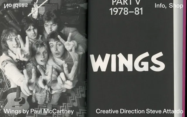
The visual language is characterized by an absence of imagery on the page itself, relying instead on pure UI and typography. When visuals appear, as suggested by the 'Identity Book Design' content, they are likely confined to product showcases or project portfolios, presenting the work directly without decorative framing. Iconography, if present, would likely be minimal, outlined, and monochromatic, maintaining the severe aesthetic. The system is text-dominant.
Reminiscent of Are.na, Manual Studio, Superside, Read.cv.
# makkaihang design — Style Reference
> Midnight canvas, silver thread

**Theme:** dark

**Site:** https://makkaihang.com

The makkaihang design system establishes a minimal, almost invisible interface ethos. A stark charcoal canvas serves as the dominant background, providing a neutral backdrop for content. Text is a bright white, ensuring high contrast. Subtle light gray borders are used sparingly for visual segmentation rather than heavy containers. The overall aesthetic suggests an emphasis on content and unadorned presentation.

## Tokens — Colors

| Name | Value | Token | Role |
|------|------|------|------|
| Carbon | `#1a1a1a` | `--color-carbon` | Page background (primary canvas), deeply recessed surfaces |
| Frost | `#ffffff` | `--color-frost` | Light text on dark surfaces, inverse labels, and high-contrast captions. Do not promote it to the primary CTA color |
| Smoke | `#e5e7eb` | `--color-smoke` | Hairline borders, subtle dividers, ghost button outlines — providing minimal separation on dark backgrounds |

## Tokens — Typography

### Untitled Sans
- **Substitute:** Inter
- **Weights:** 400
- **Sizes:** 14px
- **Line height:** 1.5
- **Letter spacing:** normal
- **Role:** Primary typeface for all text content, including headings, body, and navigation. Its singularity at a single weight and size reinforces the minimalist and content-focused approach.

### ui-sans-serif
- **Weights:** 400
- **Sizes:** 16px
- **Line height:** 1.5
- **Role:** ui-sans-serif — detected in extracted data but not described by AI

## Tokens — Spacing

- **Section gap:** 32px
- **Card padding:** 0px
- **Element gap:** 12px

## Tokens — Radius

- **none:** 0px

## Layout

The page maintains a full-bleed, uncontained content model, with no defined `pageMaxWidth`. The headers and navigation are integrated into this full-width presentation. Content appears to be structured in blocks, with 32px vertical gaps separating major sections. The navigation and header elements are positioned at the top of the page, potentially overlapping or layering content. Minimal layout elements are used, giving the feeling of content floating on a dark canvas, with an absence of clear grid structures outside of basic vertical and horizontal spacing.

## Imagery

The visual language is characterized by an absence of imagery on the page itself, relying instead on pure UI and typography. When visuals appear, as suggested by the 'Identity Book Design' content, they are likely confined to product showcases or project portfolios, presenting the work directly without decorative framing. Iconography, if present, would likely be minimal, outlined, and monochromatic, maintaining the severe aesthetic. The system is text-dominant.

## Components

### Ghost Border Button
*Interactive Element*

Transparent background, white text (#ffffff), and a light gray (#e5e7eb) bottom border. Used for navigation links and subtle actions. Features a 0px border-radius, emphasizing sharp, unadorned interaction points. Padding is absent.

### Naked Card
*Content container*

Transparent background, no border, no shadow, and 0px border-radius. These cards serve as purely semantic groupings, relying on content and spacing for definition rather than visual affordances. No padding is applied.

## Guidelines

### Do

- Always use Carbon (#1a1a1a) for primary page backgrounds to maintain the deep, dark ambiance.
- Render all primary text in Frost (#ffffff) to ensure readability against dark surfaces.
- Employ Smoke (#e5e7eb) for all borders and subtle separators, keeping visual distractions to a minimum.
- Use Untitled Sans (or a suitable substitute) at weight 400 for all typographic elements, prioritizing content clarity over size-based hierarchy.
- Maintain 0px border-radius across all UI elements for a consistently sharp and unadorned aesthetic.
- Utilize 12px for horizontal and vertical element separation within components or content blocks.
- Apply 32px as the standard vertical spacing between distinct content sections.

### Don't

- Avoid using any vibrantly saturated colors; restrict the palette to the defined achromatic grays.
- Do not introduce shadows or elevation; surfaces should remain flat and blend with the background.
- Never use rounded corners on any UI element; the design mandates strict 0px radii.
- Refrain from altering font sizes or weights for hierarchy; rely on spacing and position for emphasis.
- Do not use background colors on buttons or cards; maintain a 'ghost' or 'naked' appearance.
- Avoid using decorative imagery or complex illustrations; the focus is on clean UI and textual content.
- Do not vary paragraph line heights; maintain the established 1.5 ratio for all body text.

## Agent Prompt Guide

Quick Color Reference:
text: #ffffff
background: #1a1a1a
border: #e5e7eb
accent: no distinct accent color
primary action: no distinct CTA color

Example Component Prompts:
1. Create a top navigation bar: background Carbon (#1a1a1a). Navigation links are Ghost Border Buttons with Frost (#ffffff) text and Smoke (#e5e7eb) bottom borders, 0px radius, 0px padding. Elements within the nav should be spaced 12px apart.
2. Design a content section header: Background Carbon (#1a1a1a). Text is a single line 'm a k k a i h a n g Identity Book Design' using Frost (#ffffff) and the default Untitled Sans font at 14px size, line-height 1.5.
3. Implement a 'Naked Card' for a project preview: Transparent background, no borders, no shadows, 0px padding and 0px radius. The card's content should use Frost (#ffffff) text for any titles or descriptions.

## Motion Philosophy

The system employs subtle, expressive transitions primarily using 'ease' timing functions. Durations range from 0.1s to 0.8s, with 0.5s being the most common, suggesting a balance between responsiveness and smooth visual feedback. Common effects include 'fadeIn' and 'slideLeaveUp', indicating a preference for elements appearing and disappearing with gentle vertical motion and opacity changes.
More like this






Keep what you find
A free account saves references to boards and can send you a weekly email of picks based on what you save.
To see every result, go Pro.