Preview image. Unlock full-res
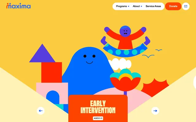
Vibrant, rounded play-world. All surfaces are soft, every color is a smile.
Color palette
Dominant page background, hero accents, main headings — establishes the core playful and optimistic tone.
Navigation active states, interactive card elements, secondary brand accent in illustrations.
Subtle background for UI elements, supportive color for 'Sunshine Yellow'.
Call-to-action buttons, key interactive elements, highlighted card backgrounds — provides high-energy contrast against primary yellow and blue.
Decorative elements, illustration accents, and occasional secondary brand highlights.
Decorative illustration accents, adding to the playful and diverse color palette.
Illustration details, secondary decorative accents.
Vivid accent color in illustrations.
Primary text, critical UI elements, high-contrast outlines.
UI backgrounds, button text on primary accents, badge backgrounds.
Subtle background shading, neutral illustration fills.
Typography
- Weights
- 500, 700
- Sizes
- 14px, 15px, 19px, 24px, 33px
- Line height
- 1.05, 1.2, 2.9
- Letter spacing
- -0.02
- Fallback
- Outfit
Primary UI font for navigation, buttons, badges, and card titles. Its rounded geometric forms reinforce the approachable and friendly aesthetic.
- Weights
- 400
- Sizes
- 62px, 214px
- Line height
- 0.8
- Letter spacing
- 0
- Fallback
- Fredoka One
Display font for large, impactful headlines, particularly in hero sections — its extreme roundness and tight line height create a distinct, jovial character.
- Weights
- 900
- Sizes
- 575px
- Line height
- 1.2
- Letter spacing
- -0.02
- Fallback
- Outfit
Ultra-heavy display text for artistic, oversized visual elements, often as background text or part of a graphical composition. Its monumental scale becomes a design feature.
- Weights
- 400
- Sizes
- 15px
- Line height
- 1.5
- Letter spacing
- 0
- Fallback
- system-ui
System fallback for body text and general content, ensuring legibility and accessibility across various platforms.
Spacing & shape
Components
Text only, uses `ABC Diatype Rounded Plus` weight 500 at 15px, color `Midnight Ink` (#000000). Active state or hover might introduce `Ocean Blue`.
Filled with `Action Orange` (#fd4401), text `Paper White` (`#ffffff`), `ABC Diatype Rounded Plus` font, 47.62px border radius. Padding is generous `26.67px` horizontal.
Circular button with `Paper White` background, `Midnight Ink` content, 50% border radius. No explicit padding mentioned, relies on icon sizing.
Filled with `Action Orange` (#fd4401), 23.81px border radius, substantial `47.62px` horizontal padding and `57.14px` vertical padding. Contains bold headlines and body text in `Paper White`.
Filled with `Sunshine Yellow` (#fdcb40), 23.81px border radius. Used for feature highlights.
Filled with `Paper White` (#ffffff), text `Midnight Ink` (#000000), 4.76px border radius. Text uses `ABC Diatype Rounded Plus` weight 500 at 14px. Padding is `6.67px` horizontal, `4.19px` vertical.
Outline-style with `Paper White` text, transparent background, 47.62px border radius.
Implicitly present (e.g., in footer for email). Appears to have a `Paper White` background, `Midnight Ink` text, and subtle borders in a neutral tone like `#f0f4f7` (from CSS tokens, though not explicitly shown in components data as border color of input).
Guidelines
- Always use 'Sunshine Yellow' (#fdcb40) as the primary background color for pages and major sections to maintain a high-energy, positive mood.
- Apply `Action Orange` (#fd4401) exclusively for primary calls-to-action to maximize impact and user engagement.
- Ensure all interactive elements like buttons and key cards have a `23.81px` or `47.62px` border radius, creating a consistent soft and approachable feel.
- Use `ABC Diatype Rounded Plus` for all UI text, such as navigation, buttons, and card titles, keeping its -0.02em letter spacing for a compact, friendly look.
- Employ `Robuck Rounded` at 62px and above for major display headlines, leveraging its low line height (0.8) to create distinctive, stacked typographic compositions.
- Utilize a generous `48px` padding within cards to ensure sufficient white space and legibility in information-dense areas.
- Integrate the vibrant accent colors like 'Ocean Blue' (#006cff), 'Bubblegum Pink' (#f780d4), and 'Teal Splash' (#04c6c5) primarily in illustrations and decorative elements, carefully balancing their intensity.
- Do not use sharp corners; ensure all UI elements such as cards, buttons, and badges adhere to the specified radii, typically `23.81px` or `47.62px`.
- Avoid generic system fonts for prominent headlines; always prioritize `Robuck Rounded` for its unique, playful character at display sizes.
- Do not desaturate the primary brand colors; the system thrives on vivid hues like 'Sunshine Yellow' and 'Action Orange'.
- Avoid excessive text density; break up content into manageable blocks with ample spacing, referencing the `48px` card padding and `38px` section gaps.
- Do not introduce new primary or accent colors outside the defined palette; the current set is carefully chosen for its energetic harmony.
- Refrain from using shadows for elevation; rely on color contrast and distinct background colors to differentiate surfaces and sections.
- Do not use letter-spacing: normal for text set in `ABC Diatype Rounded Plus`; always apply `-0.02em` to maintain its characteristic compact appearance.
About this system
ShowHide
This design system feels like a playful, vibrant activity center for the mind. A maximalist use of saturated primary and secondary colors, especially the 'Sunshine Yellow' background, instantly communicates an optimistic and engaging environment. Rounded shapes on cards and buttons, paired with a custom rounded display font, create an approachable, friendly aesthetic. The visual energy is high, reflecting a dynamic and supportive approach to therapy.
The page model is primarily full-bleed with a strong emphasis on vivid background colors that extend to the viewport edges. The hero section is a full-viewport illustration with a prominent, vertically centered headline. Section rhythm often alternates between large, visually rich illustrated backgrounds and sections with simpler, solid 'Sunshine Yellow' backgrounds. Content arrangement is flexible, often featuring centered text blocks over the main yellow background, or text overlaid on abstract shapes within illustrations. There's an underlying grid for content cards (not explicitly defined but observable in component structures) and significant vertical spacing between logical sections. Navigation is a consistent top bar, with prominent 'Donate' button.
The visual language is dominantly illustration-based, featuring abstract, organic shapes alongside hard-edged geometric forms, creating a playful and imaginative environment. Illustrations are highly stylized, using a vibrant, multi-color palette (Ocean Blue, Bubblegum Pink, Teal Splash, Grass Green, Grape Punch) that often overlaps or is nested. Figures are simplified and often smiling, conveying warmth and approachability. The purpose of the imagery is primarily decorative atmosphere and to convey a sense of fun and support, rather than explicit content explanation. Density is moderate, with illustrations frequently filling large sections of the canvas, but leaving space for key text elements.
Reminiscent of Headspace, Duolingo, Calm, KiwiCo.
# Maxima Therapy — Style Reference
> Vibrant, rounded play-world. All surfaces are soft, every color is a smile.

**Theme:** light

**Site:** https://maximatherapy.com

This design system feels like a playful, vibrant activity center for the mind. A maximalist use of saturated primary and secondary colors, especially the 'Sunshine Yellow' background, instantly communicates an optimistic and engaging environment. Rounded shapes on cards and buttons, paired with a custom rounded display font, create an approachable, friendly aesthetic. The visual energy is high, reflecting a dynamic and supportive approach to therapy.

## Tokens — Colors

| Name | Value | Token | Role |
|------|------|------|------|
| Sunshine Yellow | `#fdcb40` | `--color-sunshine-yellow` | Dominant page background, hero accents, main headings — establishes the core playful and optimistic tone. |
| Ocean Blue | `#006cff` | `--color-ocean-blue` | Navigation active states, interactive card elements, secondary brand accent in illustrations. |
| Pale Lemon | `#fff2b7` | `--color-pale-lemon` | Subtle background for UI elements, supportive color for 'Sunshine Yellow'. |
| Action Orange | `#fd4401` | `--color-action-orange` | Call-to-action buttons, key interactive elements, highlighted card backgrounds — provides high-energy contrast against primary yellow and blue. |
| Grass Green | `#00b351` | `--color-grass-green` | Decorative elements, illustration accents, and occasional secondary brand highlights. |
| Bubblegum Pink | `#f780d4` | `--color-bubblegum-pink` | Decorative illustration accents, adding to the playful and diverse color palette. |
| Teal Splash | `#04c6c5` | `--color-teal-splash` | Illustration details, secondary decorative accents. |
| Grape Punch | `#a864fd` | `--color-grape-punch` | Vivid accent color in illustrations. |
| Midnight Ink | `#000000` | `--color-midnight-ink` | Primary text, critical UI elements, high-contrast outlines. |
| Paper White | `#ffffff` | `--color-paper-white` | UI backgrounds, button text on primary accents, badge backgrounds. |
| Light Linen | `#fff6ed` | `--color-light-linen` | Subtle background shading, neutral illustration fills. |

## Tokens — Typography

### ABC Diatype Rounded Plus
- **Substitute:** Outfit
- **Weights:** 500, 700
- **Sizes:** 14px, 15px, 19px, 24px, 33px
- **Line height:** 1.05, 1.2, 2.9
- **Letter spacing:** -0.02
- **Role:** Primary UI font for navigation, buttons, badges, and card titles. Its rounded geometric forms reinforce the approachable and friendly aesthetic.

### Robuck Rounded
- **Substitute:** Fredoka One
- **Weights:** 400
- **Sizes:** 62px, 214px
- **Line height:** 0.8
- **Letter spacing:** 0
- **Role:** Display font for large, impactful headlines, particularly in hero sections — its extreme roundness and tight line height create a distinct, jovial character.

### ABC Diatype Rounded
- **Substitute:** Outfit
- **Weights:** 900
- **Sizes:** 575px
- **Line height:** 1.2
- **Letter spacing:** -0.02
- **Role:** Ultra-heavy display text for artistic, oversized visual elements, often as background text or part of a graphical composition. Its monumental scale becomes a design feature.

### ui-sans-serif
- **Substitute:** system-ui
- **Weights:** 400
- **Sizes:** 15px
- **Line height:** 1.5
- **Letter spacing:** 0
- **Role:** System fallback for body text and general content, ensuring legibility and accessibility across various platforms.

## Tokens — Type Scale

| Role | Size | Line height | Letter spacing |
|------|------|------|------|
| caption | 14px | 1.5 | -0.02em |
| subheading | 19px | 1.2 | -0.02em |
| heading | 24px | 1.2 | -0.02em |
| heading-lg | 33px | 1.05 | -0.02em |
| display | 62px | 0.8 | — |

## Tokens — Spacing

- **Section gap:** 38px
- **Card padding:** 48px
- **Element gap:** 4-19px

## Tokens — Radius

- **General:** 9.52px
- **Buttons:** 47.62px
- **Cards:** 23.81px
- **badges:** 4.76px

## Layout

The page model is primarily full-bleed with a strong emphasis on vivid background colors that extend to the viewport edges. The hero section is a full-viewport illustration with a prominent, vertically centered headline. Section rhythm often alternates between large, visually rich illustrated backgrounds and sections with simpler, solid 'Sunshine Yellow' backgrounds. Content arrangement is flexible, often featuring centered text blocks over the main yellow background, or text overlaid on abstract shapes within illustrations. There's an underlying grid for content cards (not explicitly defined but observable in component structures) and significant vertical spacing between logical sections. Navigation is a consistent top bar, with prominent 'Donate' button.

## Imagery

The visual language is dominantly illustration-based, featuring abstract, organic shapes alongside hard-edged geometric forms, creating a playful and imaginative environment. Illustrations are highly stylized, using a vibrant, multi-color palette (Ocean Blue, Bubblegum Pink, Teal Splash, Grass Green, Grape Punch) that often overlaps or is nested. Figures are simplified and often smiling, conveying warmth and approachability. The purpose of the imagery is primarily decorative atmosphere and to convey a sense of fun and support, rather than explicit content explanation. Density is moderate, with illustrations frequently filling large sections of the canvas, but leaving space for key text elements.

## Components

### Hero Section Card — Early Intervention

### Program Age Badges & Button Group

### Slider Navigation Controls

### Navigation Link
*Primary navigation item*

Text only, uses `ABC Diatype Rounded Plus` weight 500 at 15px, color `Midnight Ink` (#000000). Active state or hover might introduce `Ocean Blue`.

### Primary Donate Button
*Call-to-action button*

Filled with `Action Orange` (#fd4401), text `Paper White` (`#ffffff`), `ABC Diatype Rounded Plus` font, 47.62px border radius. Padding is generous `26.67px` horizontal.

### Ghost Arrow Button
*Navigation button for content sliders*

Circular button with `Paper White` background, `Midnight Ink` content, 50% border radius. No explicit padding mentioned, relies on icon sizing.

### Hero Section Card
*Prominent information card in hero section*

Filled with `Action Orange` (#fd4401), 23.81px border radius, substantial `47.62px` horizontal padding and `57.14px` vertical padding. Contains bold headlines and body text in `Paper White`.

### Informational Card - Sunshine Yellow
*General content card*

Filled with `Sunshine Yellow` (#fdcb40), 23.81px border radius. Used for feature highlights.

### Program Age Badge
*Small descriptive tag*

Filled with `Paper White` (#ffffff), text `Midnight Ink` (#000000), 4.76px border radius. Text uses `ABC Diatype Rounded Plus` weight 500 at 14px. Padding is `6.67px` horizontal, `4.19px` vertical.

### Default Button
*Standard interactive element (e.g. cookie preference)*

Outline-style with `Paper White` text, transparent background, 47.62px border radius.

### Input Field
*User input area*

Implicitly present (e.g., in footer for email). Appears to have a `Paper White` background, `Midnight Ink` text, and subtle borders in a neutral tone like `#f0f4f7` (from CSS tokens, though not explicitly shown in components data as border color of input).

## Guidelines

### Do

- Always use 'Sunshine Yellow' (#fdcb40) as the primary background color for pages and major sections to maintain a high-energy, positive mood.
- Apply `Action Orange` (#fd4401) exclusively for primary calls-to-action to maximize impact and user engagement.
- Ensure all interactive elements like buttons and key cards have a `23.81px` or `47.62px` border radius, creating a consistent soft and approachable feel.
- Use `ABC Diatype Rounded Plus` for all UI text, such as navigation, buttons, and card titles, keeping its -0.02em letter spacing for a compact, friendly look.
- Employ `Robuck Rounded` at 62px and above for major display headlines, leveraging its low line height (0.8) to create distinctive, stacked typographic compositions.
- Utilize a generous `48px` padding within cards to ensure sufficient white space and legibility in information-dense areas.
- Integrate the vibrant accent colors like 'Ocean Blue' (#006cff), 'Bubblegum Pink' (#f780d4), and 'Teal Splash' (#04c6c5) primarily in illustrations and decorative elements, carefully balancing their intensity.

### Don't

- Do not use sharp corners; ensure all UI elements such as cards, buttons, and badges adhere to the specified radii, typically `23.81px` or `47.62px`.
- Avoid generic system fonts for prominent headlines; always prioritize `Robuck Rounded` for its unique, playful character at display sizes.
- Do not desaturate the primary brand colors; the system thrives on vivid hues like 'Sunshine Yellow' and 'Action Orange'.
- Avoid excessive text density; break up content into manageable blocks with ample spacing, referencing the `48px` card padding and `38px` section gaps.
- Do not introduce new primary or accent colors outside the defined palette; the current set is carefully chosen for its energetic harmony.
- Refrain from using shadows for elevation; rely on color contrast and distinct background colors to differentiate surfaces and sections.
- Do not use letter-spacing: normal for text set in `ABC Diatype Rounded Plus`; always apply `-0.02em` to maintain its characteristic compact appearance.

## Agent Prompt Guide

### Quick Color Reference
- **Text:** `#000000` (Midnight Ink)
- **Background:** `#fdcb40` (Sunshine Yellow, overall page); `#ffffff` (Paper White, general UI elements)
- **CTA:** `#fd4401` (Action Orange)
- **Border:** `#fd4401` (Action Orange, for outlined elements)
- **Accent:** `#006cff` (Ocean Blue)

### 3-5 Example Component Prompts
1. **Create a Primary Donate Button:** Fill with `#fd4401`, text `#ffffff` using `ABC Diatype Rounded Plus` weight 500 at 15px, `47.62px` border radius, padding `26.67px` horizontal for the content.
2. **Generate a Hero Section Card for a program:** Card background `#fd4401`, `23.81px` border radius. Headline 'EARLY INTERVENTION' in `Robuck Rounded` weight 400 at 62px, color `#ffffff`. Sub-badge 'Ages 0-3' with background `#ffffff`, text `#000000`, `ABC Diatype Rounded Plus` weight 500 at 14px, `4.76px` border radius, `6.67px` horizontal padding. Body text 'Nurturing growth through play, therapy...' in `ABC Diatype Rounded Plus` weight 500 at 15px, color `#ffffff`. Use `48px` card padding.
3. **Design a Navigation Link:** Text 'Programs' in `ABC Diatype Rounded Plus` weight 500 at 15px, color `#000000`, letter-spacing `-0.02em`. Ensure an interactive state indicates with a touch of `Ocean Blue`.
More like this




Keep what you find
A free account saves references to boards and can send you a weekly email of picks based on what you save.
To see every result, go Pro.