Preview image. Unlock full-res
Digital Ledger Precision
Color palette
Primary action backgrounds, interactive highlights — a vivid, almost neon presence against the neutral interface
Alternative accent background for banners or themed cards, a softer complement to Digital Pink
Subtle background for notification cards or soft promotional panels
Illustrative accents, decorative highlights, small icon fills — used sparingly to create vibrant points of interest
Green action color for filled buttons, selected navigation states, and focused conversion moments. Use as a supporting accent, not as a status color
Page backgrounds, card surfaces, UI elements requiring clean separation
Primary text, critical borders, dark mode backgrounds for hero sections
Subtle background for ghost buttons and secondary content cards
Secondary text, less prominent UI elements
Elevated card backgrounds, dark accents
Muted text or icon accents, placeholder states
Hairline borders, subtle dividers
Subtle decorative strokes, icon outlines, or very light text in specific contexts
Typography
- Weights
- 400, 500, 600, 700, 900
- Sizes
- 11px, 12px, 13px, 14px, 15px, 16px, 17px, 18px, 20px, 22px, 28px, 32px, 40px, 48px, 64px, 72px, 96px
- Line height
- 0.8, 0.9, 1, 1.03, 1.1, 1.15, 1.2, 1.35, 1.5
- Letter spacing
- -0.025em for large headlines, gradually relaxing to normal for body text. Tighter tracking for display sizes enhances the modern, precise feel.
- Fallback
- system-ui, 'Segoe UI', Roboto, 'Helvetica Neue', Arial, sans-serif
The primary typeface for all text elements. Features a wide range of weights, used dynamically for commanding headlines, legible body text, and distinct button labels. The tighter letter-spacing especially at larger sizes contributes to a crisp, digital aesthetic.
Spacing & shape
Components
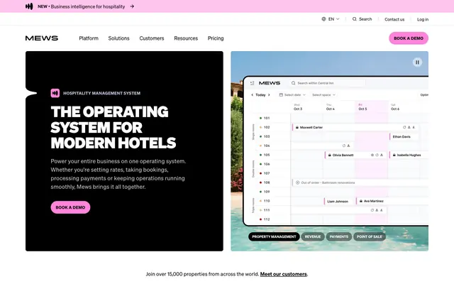
A large, dark surface with a #000000 background, 6px border-radius, and generous 80px padding on all sides. Used for dramatic, text-heavy introductory blocks.
Filled with Digital Pink (#ffc5ee), text is Midnight Ink (#000000), 8px border-radius, 48px vertical padding, 44px horizontal padding. A visually commanding element.
Transparent background with Canvas White (#ffffff) text and border. Features an extreme 9999px border-radius for a pill shape and minimal 0px vertical, 12px horizontal padding. Used for subtle categorization or less prominent actions.
Uses Cloud Gray (#f4f5f9) as background, Midnight Ink (#000000) for text, 8px border-radius, and significant 48px vertical, 44px horizontal padding. Less assertive than the primary action, but still prominent.
A Canvas White (#ffffff) background, 6px border-radius, with crisp implicit content padding, often appearing in grid layouts. Defines distinct content blocks within a section.
A card with Charcoal Black (#161616) background, 6px border-radius, and often no explicit padding (content manages its own internal spacing). Used for high-contrast promotional items.
Uses Canvas White (#ffffff) background with an Outline Gray (#cccccc) 1px border. Text is Midnight Ink (#000000). Active state highlights with a touch of Neon Pop (#ff83da).
Guidelines
- Prioritize Canvas White (#ffffff) as the primary background for all page sections unless an intentional dark contrast is required.
- Use Midnight Ink (#000000) for all primary text elements and critical borders to maintain high contrast and clarity.
- Apply Digital Pink (#ffc5ee) specifically for primary calls to action, ensuring it stands out against neutral backgrounds.
- Incorporate 6px border-radius for all cards and container elements to maintain a consistent subtle softening.
- Maintain an 'elementGap' of 10px where distinct elements require separation in horizontal or vertical stacks.
- Use the soehne typeface with specific negative letter-spacing for headlines (e.g., -0.025em at 96px) to achieve a modern, condensed feel.
- Ensure generous vertical section spacing of 80px between major content blocks to create a comfortable rhythm.
- Do not introduce new vibrant colors unless they serve a specific brand or semantic function; maintain the predominantly achromatic palette with precise accent usage.
- Avoid heavy drop shadows or intrusive gradients; surfaces should primarily be flat or have minimal depth created by a single solid border.
- Do not use generic system fonts; always specify soehne or its recommended substitute with defined weights and line heights.
- Refrain from using small radius values (e.g., 2px) on cards or buttons; maintain 6px for cards and 8px for buttons, with 9999px for pill-shaped elements.
- Do not break content beyond the 1278px pageMaxWidth; all main content should be horizontally centered within these bounds.
- Avoid unnecessary visual clutter. The system thrives on clear visual hierarchy and ample whitespace.
- Do not use plain, neutral grays for interactive states; interactive elements should leverage Digital Pink (#ffc5ee) or a distinct visual change.
About this system
ShowHide
Mews employs a 'digital ledger' aesthetic: a pristine white canvas combined with clear, dark typography creates an impression of precision and order. Components are often outlined or utilize subtle shadow work to define interactive zones rather than heavy fills. A specific vivid pink provides a digital accent for primary actions and highlights, contrasting with the otherwise monochromatic UI background.
Reminiscent of Airtable, Linear, Stripe, Notion.
# Mews — Style Reference
> Digital Ledger Precision

**Theme:** light

**Site:** https://www.mews.com/en

Mews employs a 'digital ledger' aesthetic: a pristine white canvas combined with clear, dark typography creates an impression of precision and order. Components are often outlined or utilize subtle shadow work to define interactive zones rather than heavy fills. A specific vivid pink provides a digital accent for primary actions and highlights, contrasting with the otherwise monochromatic UI background.

## Tokens — Colors

| Name | Value | Token | Role |
|------|------|------|------|
| Digital Pink | `#ffc5ee` | `--color-digital-pink` | Primary action backgrounds, interactive highlights — a vivid, almost neon presence against the neutral interface |
| Soft Lilac | `#f7e1f7` | `--color-soft-lilac` | Alternative accent background for banners or themed cards, a softer complement to Digital Pink |
| Sky Tint | `#d2f4ff` | `--color-sky-tint` | Subtle background for notification cards or soft promotional panels |
| Neon Pop | `#ff83da` | `--color-neon-pop` | Illustrative accents, decorative highlights, small icon fills — used sparingly to create vibrant points of interest |
| Chartreuse Glow | `#e8ff5b` | `--color-chartreuse-glow` | Green action color for filled buttons, selected navigation states, and focused conversion moments. Use as a supporting accent, not as a status color |
| Canvas White | `#ffffff` | `--color-canvas-white` | Page backgrounds, card surfaces, UI elements requiring clean separation |
| Midnight Ink | `#000000` | `--color-midnight-ink` | Primary text, critical borders, dark mode backgrounds for hero sections |
| Cloud Gray | `#f4f5f9` | `--color-cloud-gray` | Subtle background for ghost buttons and secondary content cards |
| Steel Gray | `#333333` | `--color-steel-gray` | Secondary text, less prominent UI elements |
| Charcoal Black | `#161616` | `--color-charcoal-black` | Elevated card backgrounds, dark accents |
| Dusty Gray | `#8c8c8c` | `--color-dusty-gray` | Muted text or icon accents, placeholder states |
| Outline Gray | `#cccccc` | `--color-outline-gray` | Hairline borders, subtle dividers |
| Cool Stone | `#c4c9dd` | `--color-cool-stone` | Subtle decorative strokes, icon outlines, or very light text in specific contexts |

## Tokens — Typography

### soehne
- **Substitute:** system-ui, 'Segoe UI', Roboto, 'Helvetica Neue', Arial, sans-serif
- **Weights:** 400, 500, 600, 700, 900
- **Sizes:** 11px, 12px, 13px, 14px, 15px, 16px, 17px, 18px, 20px, 22px, 28px, 32px, 40px, 48px, 64px, 72px, 96px
- **Line height:** 0.8, 0.9, 1, 1.03, 1.1, 1.15, 1.2, 1.35, 1.5
- **Letter spacing:** -0.025em for large headlines, gradually relaxing to normal for body text. Tighter tracking for display sizes enhances the modern, precise feel.
- **Role:** The primary typeface for all text elements. Features a wide range of weights, used dynamically for commanding headlines, legible body text, and distinct button labels. The tighter letter-spacing especially at larger sizes contributes to a crisp, digital aesthetic.

## Tokens — Type Scale

Augmented Fourth (1.414) from 15px base.

| Role | Size | Line height | Letter spacing |
|------|------|------|------|
| caption | 11px | 1.5 | 0.05em |
| body | 15px | 1.35 | — |
| subheading | 22px | 1.2 | — |
| heading-sm | 28px | 1.15 | — |
| heading | 48px | 1.1 | -0.96px |
| heading-lg | 72px | 1.03 | -1.44px |
| display | 96px | 0.9 | -2.4px |

## Tokens — Spacing

- **Max width:** 1278px
- **Section gap:** 80px
- **Card padding:** 16px
- **Element gap:** 10px

## Tokens — Radius

- **Default:** 4px
- **Buttons:** 8px
- **Cards:** 6px
- **pill:** 9999px

## Components

### Hero Dark Card
*Prominent information display*

A large, dark surface with a #000000 background, 6px border-radius, and generous 80px padding on all sides. Used for dramatic, text-heavy introductory blocks.

### Primary Action Button
*Call to action*

Filled with Digital Pink (#ffc5ee), text is Midnight Ink (#000000), 8px border-radius, 48px vertical padding, 44px horizontal padding. A visually commanding element.

### Ghost Pill Button
*Secondary action or tag*

Transparent background with Canvas White (#ffffff) text and border. Features an extreme 9999px border-radius for a pill shape and minimal 0px vertical, 12px horizontal padding. Used for subtle categorization or less prominent actions.

### Subtle Background Button
*Informational button or filter*

Uses Cloud Gray (#f4f5f9) as background, Midnight Ink (#000000) for text, 8px border-radius, and significant 48px vertical, 44px horizontal padding. Less assertive than the primary action, but still prominent.

### Feature Grid Card
*Display individual features or services*

A Canvas White (#ffffff) background, 6px border-radius, with crisp implicit content padding, often appearing in grid layouts. Defines distinct content blocks within a section.

### Dark Overlay Promo Card
*Specialized content highlight*

A card with Charcoal Black (#161616) background, 6px border-radius, and often no explicit padding (content manages its own internal spacing). Used for high-contrast promotional items.

### Accordion Item
*Collapsible content area*

Uses Canvas White (#ffffff) background with an Outline Gray (#cccccc) 1px border. Text is Midnight Ink (#000000). Active state highlights with a touch of Neon Pop (#ff83da).

## Guidelines

### Do

- Prioritize Canvas White (#ffffff) as the primary background for all page sections unless an intentional dark contrast is required.
- Use Midnight Ink (#000000) for all primary text elements and critical borders to maintain high contrast and clarity.
- Apply Digital Pink (#ffc5ee) specifically for primary calls to action, ensuring it stands out against neutral backgrounds.
- Incorporate 6px border-radius for all cards and container elements to maintain a consistent subtle softening.
- Maintain an 'elementGap' of 10px where distinct elements require separation in horizontal or vertical stacks.
- Use the soehne typeface with specific negative letter-spacing for headlines (e.g., -0.025em at 96px) to achieve a modern, condensed feel.
- Ensure generous vertical section spacing of 80px between major content blocks to create a comfortable rhythm.

### Don't

- Do not introduce new vibrant colors unless they serve a specific brand or semantic function; maintain the predominantly achromatic palette with precise accent usage.
- Avoid heavy drop shadows or intrusive gradients; surfaces should primarily be flat or have minimal depth created by a single solid border.
- Do not use generic system fonts; always specify soehne or its recommended substitute with defined weights and line heights.
- Refrain from using small radius values (e.g., 2px) on cards or buttons; maintain 6px for cards and 8px for buttons, with 9999px for pill-shaped elements.
- Do not break content beyond the 1278px pageMaxWidth; all main content should be horizontally centered within these bounds.
- Avoid unnecessary visual clutter. The system thrives on clear visual hierarchy and ample whitespace.
- Do not use plain, neutral grays for interactive states; interactive elements should leverage Digital Pink (#ffc5ee) or a distinct visual change.

## Agent Prompt Guide

### Quick Color Reference
- text: #000000 (Midnight Ink)
- background: #ffffff (Canvas White)
- border: #cccccc (Outline Gray)
- accent: #ff83da (Neon Pop)
- primary action: #e8ff5b (filled action)

### 3-5 Example Component Prompts
1.  **Create a Hero Dark Card:** Use background #000000 (Midnight Ink), border-radius 6px, and 80px padding. Place a soehne weight 900 headline at 64px, color #ffffff (Canvas White), with letter-spacing -1.6px. Include a Secondary Action Button below it.
2.  Create a Primary Action Button: #e8ff5b background, #000000 text, 9999px radius, compact pill padding. Use this filled treatment for the main CTA.
3.  **Design a Feature Grid Card:** Use background #ffffff (Canvas White), border-radius 6px. Include a soehne weight 600 heading at 20px, color #000000 (Midnight Ink), and body text at 15px, color #333333 (Steel Gray). Maintain at least 16px internal padding for content.
4.  **Create an Accordion Section:** Each item has a #ffffff (Canvas White) background, 1px solid #cccccc (Outline Gray) border. Title is soehne weight 500 at 18px, color #000000 (Midnight Ink). In the active state, highlight the expanding area with a faint touch of #ff83da (Neon Pop) where applicable.
More like this








Keep what you find
A free account saves references to boards and can send you a weekly email of picks based on what you save.
To see every result, go Pro.