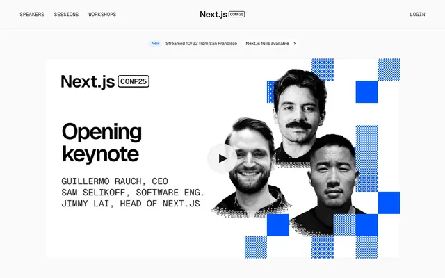
Preview image. Unlock full-res
Pragmatic developer canvas: sharp type on white, pixel grid accents.
Color palette
Primary action buttons, interactive elements, accent for brand and key calls to action
Blue state accent for badges, validation surfaces, and short status labels. Do not promote it to the primary CTA color
Page backgrounds, surface background for cards and hero sections, foundational white
Primary headings, body text, navigation links, high-contrast elements
Secondary body text, descriptive labels, slightly muted information
Helper text, metadata, subtle labels, sponsorship tier labels
Hairline borders for cards, outlined buttons, subtle dividers
Used for some icon fills, high-contrast borders, and occasional background elements, suggesting absolute contrast
Background for informational badges, creating a subtle highlight
Typography
- Weights
- 400, 500, 600
- Sizes
- 12px, 14px, 16px, 32px, 48px, 72px
- Line height
- 1, 1.43, 1.5
- Letter spacing
- -0.0400em, -0.0400em, -0.0400em, -0.0600em, -0.0600em, -0.0600em
- Fallback
- Inter
Primary display font for all headings, body text, nav items, and buttons. Its compact sizing and tight tracking contribute to the system's efficient, technical feel.
- Weights
- 400
- Sizes
- 13px, 14px, 16px, 18px, 20px
- Line height
- 1, 1.11, 1.5
- Letter spacing
- 0.0200em, 0.0200em, 0.0200em, 0.0200em, 0.0200em
- Fallback
- JetBrains Mono
Monospaced font used for code snippets, secondary details, and technical labels, providing a distinct developer aesthetic.
Spacing & shape
Components
Background: Function Blue (#0057ff), Text: Canvas White (#fafafa), Border Radius: 100px. Padding variable from 0px up to 20px on sides based on content.
Background: transparent (rgba(0, 0, 0, 0)), Text: Text Primary (#171717), Border: 1px solid Border Light (#e6e6e6), Border Radius: variable, often 0px.
Background: Canvas White (#fafafa), Border Radius: 8px, No Box Shadow. Padding inside cards is typically 20px, with elements spaced at 24px.
Background: Info Background (#e9f4ff), Text: Accent Blue (#005ff2), Border Radius: 9999px. Padding: 0px vertical, 10px horizontal.
Font: Geist, Weight: 400, Size: 16px (approx), Color: Text Primary (#171717). No explicit background or border, relies on text contrast.
Background: Canvas White (#fafafa), contrasting with large bold headings. Can feature abstract grid patterns using Accent Blue.
Guidelines
- Prioritize Canvas White (#fafafa) for all primary page and content backgrounds.
- Use Function Blue (#0057ff) sparingly and intentionally for primary call-to-actions and brand accents only.
- Employ Geist for all primary text content including headlines, body, and UI labels, leveraging its compact nature.
- Use Geist Mono for all technical or code-related text, and any secondary labels requiring a distinct tone.
- Maintain a clear visual hierarchy with Text Primary (#171717) for main information and progressively lighter neutrals for secondary details.
- Apply 8px border-radius to cards, images, and non-button links, and 100px to primary buttons for distinct visual weighting.
- Utilize Border Light (#e6e6e6) for all hairline dividers, card borders, and ghost button outlines to maintain a minimalist aesthetic.
- Avoid using highly saturated colors beyond Function Blue (#0057ff) and Accent Blue (#005ff2) for interactive elements.
- Do not introduce heavy drop shadows or complex gradients; the system prefers flat surfaces and subtle borders.
- Do not deviate from the Geist and Geist Mono font families or their specified letter-spacing for UI elements.
- Do not create excessive visual clutter; use minimal styling and rely on spacing and typography for clarity.
- Avoid using inconsistent border radii; adhere strictly to 8px for containers and 100px/9999px for buttons/badges.
- Do not use #000000 as a primary text color where #171717 is more appropriate; reserve #000000 for specific graphic elements or absolute contrast needs.
About this system
ShowHide
Next.js Conf 2025 presents a pragmatic, high-contrast digital canvas for technical events. Its design prioritizes clear information hierarchy and functional efficiency, using a predominantly achromatic palette punctuated by a single vibrant blue for key interactions and brand accents. Typography is compact and precise, relying on a modern sans-serif. Visual texture is introduced through subtle grid patterns and pixelated blue blocks, grounding the experience in a developer aesthetic while maintaining a professional, utilitarian feel.
The page primarily uses a max-width contained layout, though the hero section can extend full-bleed. Its hero pattern features a centered headline over a background that combines grayscale photography with abstract blue pixel grid patterns. Section rhythm is driven by consistent vertical spacing (64px) between distinct content blocks, with internal element gaps typically 24px. Content is arranged in alternating text-left/image-right or text-over-image compositions, and includes multi-column grids for features and sponsorships. The navigation is a sticky, minimal top bar on a white background, featuring logo, nav links and login/CTA links.
This site uses a mix of candid, high-contrast portrait photography (monochromatic, sometimes with a subtle gray tint) and abstract, geometric pixelated patterns in Function Blue and neutral tones. The photography serves to humanize the speakers, while the pixel patterns add a technical, digital layer. Imagery is generally contained within sections, not full-bleed, and often integrated directly into the structured layout, acting as a visual accent rather than a dominant element. Iconography is minimalist, outlined or filled, and primarily achromatic, with occasional Accent Blue highlights.
Reminiscent of Vercel, Stripe, Linear, Tailwind CSS.
# Next.js Conf 2025 — Style Reference
> Pragmatic developer canvas: sharp type on white, pixel grid accents.

**Theme:** light

**Site:** https://nextjs.org/conf

Next.js Conf 2025 presents a pragmatic, high-contrast digital canvas for technical events. Its design prioritizes clear information hierarchy and functional efficiency, using a predominantly achromatic palette punctuated by a single vibrant blue for key interactions and brand accents. Typography is compact and precise, relying on a modern sans-serif. Visual texture is introduced through subtle grid patterns and pixelated blue blocks, grounding the experience in a developer aesthetic while maintaining a professional, utilitarian feel.

## Tokens — Colors

| Name | Value | Token | Role |
|------|------|------|------|
| Function Blue | `#0057ff` | `--color-function-blue` | Primary action buttons, interactive elements, accent for brand and key calls to action |
| Accent Blue | `#005ff2` | `--color-accent-blue` | Blue state accent for badges, validation surfaces, and short status labels. Do not promote it to the primary CTA color |
| Canvas White | `#fafafa` | `--color-canvas-white` | Page backgrounds, surface background for cards and hero sections, foundational white |
| Text Primary | `#171717` | `--color-text-primary` | Primary headings, body text, navigation links, high-contrast elements |
| Text Secondary | `#4d4d4d` | `--color-text-secondary` | Secondary body text, descriptive labels, slightly muted information |
| Text Tertiary | `#8f8f8f` | `--color-text-tertiary` | Helper text, metadata, subtle labels, sponsorship tier labels |
| Border Light | `#e6e6e6` | `--color-border-light` | Hairline borders for cards, outlined buttons, subtle dividers |
| Black | `#000000` | `--color-black` | Used for some icon fills, high-contrast borders, and occasional background elements, suggesting absolute contrast |
| Info Background | `#e9f4ff` | `--color-info-background` | Background for informational badges, creating a subtle highlight |

## Tokens — Typography

### Geist
- **Substitute:** Inter
- **Weights:** 400, 500, 600
- **Sizes:** 12px, 14px, 16px, 32px, 48px, 72px
- **Line height:** 1, 1.43, 1.5
- **Letter spacing:** -0.0400em, -0.0400em, -0.0400em, -0.0600em, -0.0600em, -0.0600em
- **Role:** Primary display font for all headings, body text, nav items, and buttons. Its compact sizing and tight tracking contribute to the system's efficient, technical feel.

### Geist Mono
- **Substitute:** JetBrains Mono
- **Weights:** 400
- **Sizes:** 13px, 14px, 16px, 18px, 20px
- **Line height:** 1, 1.11, 1.5
- **Letter spacing:** 0.0200em, 0.0200em, 0.0200em, 0.0200em, 0.0200em
- **Role:** Monospaced font used for code snippets, secondary details, and technical labels, providing a distinct developer aesthetic.

## Tokens — Type Scale

Augmented Fourth (1.414) from 14px base.

| Role | Size | Line height | Letter spacing |
|------|------|------|------|
| caption | 12px | 1.43 | -0.48px |
| body | 14px | 1.43 | -0.56px |
| body-lg | 16px | 1.5 | -0.64px |
| heading | 32px | 1 | -1.92px |
| heading-lg | 48px | 1 | -2.88px |
| display | 72px | 1 | -4.32px |

## Tokens — Spacing

- **Section gap:** 64px
- **Card padding:** 20px
- **Element gap:** 24px

## Tokens — Radius

- **Buttons:** 100px
- **Cards:** 8px
- **Images:** 8px
- **badges:** 9999px
- **links:** 8px

## Layout

The page primarily uses a max-width contained layout, though the hero section can extend full-bleed. Its hero pattern features a centered headline over a background that combines grayscale photography with abstract blue pixel grid patterns. Section rhythm is driven by consistent vertical spacing (64px) between distinct content blocks, with internal element gaps typically 24px. Content is arranged in alternating text-left/image-right or text-over-image compositions, and includes multi-column grids for features and sponsorships. The navigation is a sticky, minimal top bar on a white background, featuring logo, nav links and login/CTA links.

## Imagery

This site uses a mix of candid, high-contrast portrait photography (monochromatic, sometimes with a subtle gray tint) and abstract, geometric pixelated patterns in Function Blue and neutral tones. The photography serves to humanize the speakers, while the pixel patterns add a technical, digital layer. Imagery is generally contained within sections, not full-bleed, and often integrated directly into the structured layout, acting as a visual accent rather than a dominant element. Iconography is minimalist, outlined or filled, and primarily achromatic, with occasional Accent Blue highlights.

## Components

### Primary Filled Button
*Main call-to-action button for initiating key actions.*

Background: Function Blue (#0057ff), Text: Canvas White (#fafafa), Border Radius: 100px. Padding variable from 0px up to 20px on sides based on content.

### Ghost Button
*Secondary action or navigation buttons that should not draw primary attention.*

Background: transparent (rgba(0, 0, 0, 0)), Text: Text Primary (#171717), Border: 1px solid Border Light (#e6e6e6), Border Radius: variable, often 0px.

### Conference Card
*Containers for content blocks like session details or speaker information.*

Background: Canvas White (#fafafa), Border Radius: 8px, No Box Shadow. Padding inside cards is typically 20px, with elements spaced at 24px.

### New Feature Badge
*Highlights new or important informational elements, often associated with updates.*

Background: Info Background (#e9f4ff), Text: Accent Blue (#005ff2), Border Radius: 9999px. Padding: 0px vertical, 10px horizontal.

### Navigation Link
*Top-level navigation items, directing users to main sections.*

Font: Geist, Weight: 400, Size: 16px (approx), Color: Text Primary (#171717). No explicit background or border, relies on text contrast.

### Hero Section
*Prominent initial content area, typically full-width and high impact.*

Background: Canvas White (#fafafa), contrasting with large bold headings. Can feature abstract grid patterns using Accent Blue.

## Guidelines

### Do

- Prioritize Canvas White (#fafafa) for all primary page and content backgrounds.
- Use Function Blue (#0057ff) sparingly and intentionally for primary call-to-actions and brand accents only.
- Employ Geist for all primary text content including headlines, body, and UI labels, leveraging its compact nature.
- Use Geist Mono for all technical or code-related text, and any secondary labels requiring a distinct tone.
- Maintain a clear visual hierarchy with Text Primary (#171717) for main information and progressively lighter neutrals for secondary details.
- Apply 8px border-radius to cards, images, and non-button links, and 100px to primary buttons for distinct visual weighting.
- Utilize Border Light (#e6e6e6) for all hairline dividers, card borders, and ghost button outlines to maintain a minimalist aesthetic.

### Don't

- Avoid using highly saturated colors beyond Function Blue (#0057ff) and Accent Blue (#005ff2) for interactive elements.
- Do not introduce heavy drop shadows or complex gradients; the system prefers flat surfaces and subtle borders.
- Do not deviate from the Geist and Geist Mono font families or their specified letter-spacing for UI elements.
- Do not create excessive visual clutter; use minimal styling and rely on spacing and typography for clarity.
- Avoid using inconsistent border radii; adhere strictly to 8px for containers and 100px/9999px for buttons/badges.
- Do not use #000000 as a primary text color where #171717 is more appropriate; reserve #000000 for specific graphic elements or absolute contrast needs.

## Agent Prompt Guide

Quick Color Reference:
- text: #171717
- background: #fafafa
- border: #e6e6e6
- accent: #005ff2
- primary action: #0057ff (filled action)

Example Component Prompts:
- Create a Primary Action Button: #0057ff background, #4d4d4d text, 9999px radius, compact pill padding. Use this filled treatment for the main CTA.
More like this






Keep what you find
A free account saves references to boards and can send you a weekly email of picks based on what you save.
To see every result, go Pro.