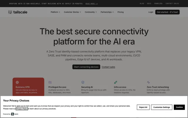
Preview image. Unlock full-res
Architectural technical blueprint.
Color palette
Red action color for filled buttons, selected navigation states, and focused conversion moments
Decorative background gradient used sparingly for visual interest
Primary text, headers, strong borders, dark surface elements
Page backgrounds, card surfaces, ghost button backgrounds, default icon fills
Subtle borders, secondary card backgrounds, muted backgrounds
Secondary text, content backgrounds, button text on light backgrounds
Subtle shadow base color, divider lines
Hover states for light surfaces, subtle background shifts
Muted text, tertiary borders, less prominent icons
Pressed states for dark buttons, darker borders
Deepest shadow tint, overlay backdrops
Typography
- Weights
- 300, 400, 500, 600
- Sizes
- 12px, 14px, 16px, 20px, 32px, 48px, 64px
- Line height
- 1.2, 1.43, 1.5
- Letter spacing
- -0.0300em at 64px, -0.0200em at 48px, -0.0100em at 32px, normal at 16px and below
- Fallback
- system-ui, sans-serif
Primary typeface for all UI elements, body text, headlines, and captions. Its compact nature supports information density without sacrificing legibility.
- Weights
- 400, 500
- Sizes
- 12px, 14px, 20px
- Line height
- 1.2, 1.5
- Letter spacing
- 0.0430em at 20px, 0.0500em at 14px
- Fallback
- Inter, system-ui, sans-serif
Used for specific secondary navigation or stylized text, providing a slightly more structured feel with increased letter-spacing.
- Weights
- 400, 600, 700
- Sizes
- 14px, 16px
- Line height
- 1.5
- Letter spacing
- -0.0110em at 16px, -0.0100em at 14px
- Fallback
- system-ui, sans-serif
A fallback typeface for specific body text or legacy components, favoring slightly tighter letter spacing for efficiency.
Spacing & shape
Elevation
Components
Background: Paper White (#ffffff), Text: Carbon Gray (#2e2d2d), Border: Ghost Gray (#eeebea), Radius: 9999px. Padding: 0px vertical, 18px horizontal.
Background: Inkwell (#181717), Text: Paper White (#ffffff), Border: Inkwell (#181717), Radius: 8px. Padding: 10px vertical, 12px horizontal.
Background: rgba(0, 0, 0, 0), Text: Inkwell (#181717), Border: Inkwell (#181717), Radius: 8px. Padding: 10px vertical, 12px horizontal.
Background: Impact Red (#d04841), Text: Paper White (#ffffff), Border: Impact Red (#d04841), Radius: 8px. Padding: 0px vertical, 12px horizontal. Text uses Inter weight 600.
Background: Paper White (#ffffff), Radius: 16px, Shadow: rgba(24, 23, 23, 0.02) 0px 4px 8px 0px. Padding: 32px.
Background: Paper White (#ffffff), Radius: 32px, Shadow: rgba(24, 23, 23, 0.02) 0px 4px 8px 0px. Padding: 64px.
Background: Carbon Gray (#2e2d2d), Radius: 32px, No Shadow. Padding: 64px vertical, 48px horizontal.
Text: Inkwell (#181717), No explicit background or border. Text uses Inter weight 500 at 16px, letter-spacing -0.16px.
Background: Paper White (#ffffff), Text: Inkwell (#181717), Border: Inkwell (#181717) 1px solid. Functions as an overlay with backdrop rgba(0,0,0,0.24).
Guidelines
- Use Inkwell (#181717) for all primary body text and main headings to ensure strong contrast.
- Apply Ghost Gray (#eeebea) for subtle visual separation, such as thin borders or as a background for secondary surfaces.
- Reserve Impact Red (#d04841) exclusively for primary call-to-action buttons and essential brand accents.
- Prioritize Inter at compact sizes (12-16px) with normal letter-spacing for denser information, such as body text or navigation items.
- Maintain a default border-radius of 8px for most interactive elements and 16px for cards and larger containers.
- Employ the subtle shadow rgba(24, 23, 23, 0.02) 0px 4px 8px 0px for cards and elevated components to provide minimal depth.
- Utilize 12px for consistent internal spacing within components and between closely related elements.
- Do not introduce new vibrant colors outside of the defined Impact Red (#d04841) to maintain the restrained aesthetic.
- Avoid heavy drop shadows or strong gradients on common UI elements; elevation should be subtle.
- Refrain from using Arial for new components or primary text. Inter is the canonical typeface.
- Do not deviate from the established radius values; a consistent 8px for buttons and 16px for cards is key.
- Do not use highly saturated primary colors for text or backgrounds unless it’s the Impact Red (#d04841) for a CTA.
- Avoid large letter-spacing for body text; only use MDIO with increased letter-spacing for specific stylized elements.
- Do not use dark backgrounds for full sections; the primary theme is light with occasional dark cards.
About this system
ShowHide
Tailscale's design system uses a technical and understated aesthetic, built on a foundation of neutral grays and whites. Typography is compact and precise, maintaining clarity in dense information displays. Components are lightweight, favoring subtle borders and soft shadows over heavy fills or strong visual ornaments, contributing to an overall sense of efficiency and focus, punctuated by a single vibrant red accent color for critical actions.
The page primarily uses a max-width contained layout, approximately 1200px wide, centered within the browser. The hero section often features a large, centered headline over a light background, sometimes paired with a dark card containing contextual information. Section rhythm is driven by consistent vertical spacing (sectionGap of 24px) between content blocks, with alternating light and very occasional dark surface treatments creating visual breaks. Content is arranged in alternating text-left/image-right patterns or multi-column card grids (e.g., 3-column features). The navigation is a sticky top bar, providing an always-available global menu.
The visual language focuses on clear product communication. Imagery includes precise product screenshots and abstract vector icons, typically rendered in monochromatic tones or with subtle brand color accents. Photography is minimal, almost absent, favoring a direct, UI-centric presentation. Icons are outlined or filled with a medium stroke weight and are primarily functional and descriptive, not decorative. Imagery supports technical explanations rather than creating atmosphere.
Reminiscent of Figma, Linear, Notion, Vercel.
# Tailscale — Style Reference
> Architectural technical blueprint.

**Theme:** light

**Site:** https://tailscale.com

Tailscale's design system uses a technical and understated aesthetic, built on a foundation of neutral grays and whites. Typography is compact and precise, maintaining clarity in dense information displays. Components are lightweight, favoring subtle borders and soft shadows over heavy fills or strong visual ornaments, contributing to an overall sense of efficiency and focus, punctuated by a single vibrant red accent color for critical actions.

## Tokens — Colors

| Name | Value | Token | Role |
|------|------|------|------|
| Impact Red | `#d04841` | `--color-impact-red` | Red action color for filled buttons, selected navigation states, and focused conversion moments |
| Deep Sky Gradient | `#5a82de` | `--color-deep-sky-gradient` | Decorative background gradient used sparingly for visual interest |
| Inkwell | `#181717` | `--color-inkwell` | Primary text, headers, strong borders, dark surface elements |
| Paper White | `#ffffff` | `--color-paper-white` | Page backgrounds, card surfaces, ghost button backgrounds, default icon fills |
| Ghost Gray | `#eeebea` | `--color-ghost-gray` | Subtle borders, secondary card backgrounds, muted backgrounds |
| Carbon Gray | `#2e2d2d` | `--color-carbon-gray` | Secondary text, content backgrounds, button text on light backgrounds |
| Shadow Tint | `#bdbcbb` | `--color-shadow-tint` | Subtle shadow base color, divider lines |
| Parchment | `#f7f5f4` | `--color-parchment` | Hover states for light surfaces, subtle background shifts |
| Deep Plum | `#575555` | `--color-deep-plum` | Muted text, tertiary borders, less prominent icons |
| Ash Charcoal | `#232222` | `--color-ash-charcoal` | Pressed states for dark buttons, darker borders |
| Backdrop Shadow | `#000000` | `--color-backdrop-shadow` | Deepest shadow tint, overlay backdrops |

## Tokens — Typography

### Inter
- **Substitute:** system-ui, sans-serif
- **Weights:** 300, 400, 500, 600
- **Sizes:** 12px, 14px, 16px, 20px, 32px, 48px, 64px
- **Line height:** 1.2, 1.43, 1.5
- **Letter spacing:** -0.0300em at 64px, -0.0200em at 48px, -0.0100em at 32px, normal at 16px and below
- **Role:** Primary typeface for all UI elements, body text, headlines, and captions. Its compact nature supports information density without sacrificing legibility.

### MDIO
- **Substitute:** Inter, system-ui, sans-serif
- **Weights:** 400, 500
- **Sizes:** 12px, 14px, 20px
- **Line height:** 1.2, 1.5
- **Letter spacing:** 0.0430em at 20px, 0.0500em at 14px
- **Role:** Used for specific secondary navigation or stylized text, providing a slightly more structured feel with increased letter-spacing.

### Arial
- **Substitute:** system-ui, sans-serif
- **Weights:** 400, 600, 700
- **Sizes:** 14px, 16px
- **Line height:** 1.5
- **Letter spacing:** -0.0110em at 16px, -0.0100em at 14px
- **Role:** A fallback typeface for specific body text or legacy components, favoring slightly tighter letter spacing for efficiency.

## Tokens — Type Scale

Perfect Fourth (1.333) from 16px base.

| Role | Size | Line height | Letter spacing |
|------|------|------|------|
| caption | 12px | 1.43 | — |
| body-sm | 14px | 1.43 | — |
| body | 16px | 1.5 | — |
| subheading | 20px | 1.2 | -0.2px |
| heading | 32px | 1.2 | -0.32px |
| heading-lg | 48px | 1.2 | -0.96px |
| display | 64px | 1.2 | -1.92px |

## Tokens — Spacing

- **Section gap:** 24px
- **Card padding:** 12px
- **Element gap:** 12px

## Tokens — Radius

- **Buttons:** 8px
- **Cards:** 16px
- **hero-card:** 32px
- **tags:** 9999px

## Tokens — Elevation

- **Card:** `rgba(24, 23, 23, 0.02) 0px 4px 8px 0px`
- **Elevated Component:** `rgba(24, 23, 23, 0.16) 0px 4px 16px 0px`

## Layout

The page primarily uses a max-width contained layout, approximately 1200px wide, centered within the browser. The hero section often features a large, centered headline over a light background, sometimes paired with a dark card containing contextual information. Section rhythm is driven by consistent vertical spacing (sectionGap of 24px) between content blocks, with alternating light and very occasional dark surface treatments creating visual breaks. Content is arranged in alternating text-left/image-right patterns or multi-column card grids (e.g., 3-column features). The navigation is a sticky top bar, providing an always-available global menu.

## Imagery

The visual language focuses on clear product communication. Imagery includes precise product screenshots and abstract vector icons, typically rendered in monochromatic tones or with subtle brand color accents. Photography is minimal, almost absent, favoring a direct, UI-centric presentation. Icons are outlined or filled with a medium stroke weight and are primarily functional and descriptive, not decorative. Imagery supports technical explanations rather than creating atmosphere.

## Components

### Pill Button
*Rounded button for secondary actions or tags.*

Background: Paper White (#ffffff), Text: Carbon Gray (#2e2d2d), Border: Ghost Gray (#eeebea), Radius: 9999px. Padding: 0px vertical, 18px horizontal.

### Default Button
*Standard button for general actions.*

Background: Inkwell (#181717), Text: Paper White (#ffffff), Border: Inkwell (#181717), Radius: 8px. Padding: 10px vertical, 12px horizontal.

### Outlined Button
*Secondary action button with a defined border.*

Background: rgba(0, 0, 0, 0), Text: Inkwell (#181717), Border: Inkwell (#181717), Radius: 8px. Padding: 10px vertical, 12px horizontal.

### Call to Action Button
*Prominent button for primary user actions.*

Background: Impact Red (#d04841), Text: Paper White (#ffffff), Border: Impact Red (#d04841), Radius: 8px. Padding: 0px vertical, 12px horizontal. Text uses Inter weight 600.

### Feature Card
*Information container for individual features or content blocks.*

Background: Paper White (#ffffff), Radius: 16px, Shadow: rgba(24, 23, 23, 0.02) 0px 4px 8px 0px. Padding: 32px.

### Hero Information Card
*Enlarged card within hero sections, often for key information.*

Background: Paper White (#ffffff), Radius: 32px, Shadow: rgba(24, 23, 23, 0.02) 0px 4px 8px 0px. Padding: 64px.

### Dark Content Card
*Card variant for displaying content on a dark background.*

Background: Carbon Gray (#2e2d2d), Radius: 32px, No Shadow. Padding: 64px vertical, 48px horizontal.

### Navigation Link
*Interactive text link for navigation menus.*

Text: Inkwell (#181717), No explicit background or border. Text uses Inter weight 500 at 16px, letter-spacing -0.16px.

### Privacy Consent Banner
*Persistent notification at the bottom of the page.*

Background: Paper White (#ffffff), Text: Inkwell (#181717), Border: Inkwell (#181717) 1px solid. Functions as an overlay with backdrop rgba(0,0,0,0.24).

## Guidelines

### Do

- Use Inkwell (#181717) for all primary body text and main headings to ensure strong contrast.
- Apply Ghost Gray (#eeebea) for subtle visual separation, such as thin borders or as a background for secondary surfaces.
- Reserve Impact Red (#d04841) exclusively for primary call-to-action buttons and essential brand accents.
- Prioritize Inter at compact sizes (12-16px) with normal letter-spacing for denser information, such as body text or navigation items.
- Maintain a default border-radius of 8px for most interactive elements and 16px for cards and larger containers.
- Employ the subtle shadow rgba(24, 23, 23, 0.02) 0px 4px 8px 0px for cards and elevated components to provide minimal depth.
- Utilize 12px for consistent internal spacing within components and between closely related elements.

### Don't

- Do not introduce new vibrant colors outside of the defined Impact Red (#d04841) to maintain the restrained aesthetic.
- Avoid heavy drop shadows or strong gradients on common UI elements; elevation should be subtle.
- Refrain from using Arial for new components or primary text. Inter is the canonical typeface.
- Do not deviate from the established radius values; a consistent 8px for buttons and 16px for cards is key.
- Do not use highly saturated primary colors for text or backgrounds unless it’s the Impact Red (#d04841) for a CTA.
- Avoid large letter-spacing for body text; only use MDIO with increased letter-spacing for specific stylized elements.
- Do not use dark backgrounds for full sections; the primary theme is light with occasional dark cards.

## Agent Prompt Guide

Quick Color Reference:
- text: #181717
- background: #eeebea
- border: #eeebea
- accent: #d04841
- primary action: #d04841 (filled action)

Example Component Prompts:
- Create a section divider: 1px solid Inkwell (#181717) at 50% opacity, width 100%, with 24px vertical padding. Text: 'Related Resources' in Carbon Gray (#2e2d2d) Inter weight 400, 16px, centered.
- Design a primary call-to-action button: Text 'Get Started' in Inter weight 600, 16px, Paper White (#ffffff). Background Impact Red (#d04841), 8px radius. Padding 10px vertical, 12px horizontal.
- Build a feature card for the hero: Background Paper White (#ffffff), 32px radius, with a subtle box-shadow (rgba(24, 23, 23, 0.02) 0px 4px 8px 0px). Inner content should have 64px padding. Headline 'Zero Trust Security' in Inkwell (#181717) Inter weight 600, 32px, letter-spacing -0.32px.
- Create a ghost button: Text 'Learn More' in Inkwell (#181717) Inter weight 500, 16px, background transparent, border Inkwell (#181717) 1px solid, 8px radius. Padding 10px vertical, 12px horizontal.
- Generate a secondary navigation link: Text 'Docs' in Inkwell (#181717) Inter weight 500, 16px, with no specific background or border. On hover, text color changes to Impact Red (#d04841).
More like this






Keep what you find
A free account saves references to boards and can send you a weekly email of picks based on what you save.
To see every result, go Pro.