Preview image. Unlock full-res
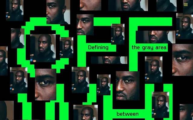
Neon Glitch Arcade — stark black canvas with pixelated neon blocks.
Color palette
Primary action background, interactive button text, link highlights, and significant decorative block accents. This color defines primary interactivity and visual disruption
Red outline accent for tags, dividers, and focused UI edges
Yellow outline accent for tags, dividers, and focused UI edges
Page background, primary text, button text, image borders. The overwhelming majority background, establishing a deep, dark foundation for the vivid accents
Accent backgrounds, secondary text, subtle borders. Provides stark contrast to Midnight Void
Subtle accent text, decorative borders, low-key headings. Offers a softer contrast against the dominant dark background
Typography
- Weights
- 400, 600, 700
- Sizes
- 11px, 18px, 20px, 36px, 38px, 42px, 48px, 56px, 72px, 96px, 180px, 500px
- Line height
- 1, 1.1, 1.15, 1.19, 1.25, 1.3, 1.31, 1.35, 1.4, 1.45, 1.54, 1.55, 1.56
- Fallback
- Arial Bold
Primary brand typeface for all headlines, links, and buttons. Its wide range of sizes, including very large display sizes, allows for highly expressive and impactful typographic statements.
- Weights
- 400
- Sizes
- 16px
- Line height
- 1.2
- Fallback
- Times New Roman
Supplemental text, body copy, and longer content blocks where a traditional, readable serif is desired to contrast with the Offwhite brand font.
- Weights
- 400
- Sizes
- 13px
- Line height
- 1.2
- Fallback
- Helvetica
Used for small, functional text within buttons or secondary UI elements. Chosen for its system availability and compact footprint for supporting details.
Spacing & shape
Components
Transparent background with text in Glitch Green (#00fb34) and a 30px border-radius, emphasizing a 'ghost' or 'outlined' interaction style.
Filled with Glitch Green (#00fb34) background and Midnight Void (#000000) text, with 0px border-radius. This button variant commands immediate attention for primary actions.
Text in Glitch Green (#00fb34) on a transparent background, with a 30px border-radius, visually aligning with Ghost Brand Buttons for a consistent interactive feel.
Large text in Offwhite font, variable size up to 500px, color Midnight Void (#000000) or Glitch Green (#00fb34), with a text border in Warning Red (#ff0000).
Images with a 1px solid Midnight Void (#000000) border, arranged in a dense, overlapping collage style, often framing or breaking up text content. No specific radius is applied to the images themselves beyond their cut-out shape.
Guidelines
- Always use Midnight Void (#000000) as the default page background to maintain the stark, dark canvas.
- Utilize Glitch Green (#00fb34) for all primary interactive elements such as buttons and active links.
- Apply a 30px border-radius only to Ghost Brand Buttons and Rounded Links, no other UI elements.
- When using typography, prioritize the Offwhite font for all headings and brand text, with Times/Arial reserved for body/small functional text.
- Emphasize content through high-contrast color pairings, specifically Glitch Green on Midnight Void, or Warning Red as a highlight against Midnight Void.
- Employ the image collage pattern with Midnight Void (#000000) image borders to break vertical rhythm and add visual density.
- Maintain a spacious density for sections, using 60px or 90px paddingTop and 40px padding for element gaps.
- Do not use subtle shadows or gradients; all visual elements should have hard edges and solid color fills.
- Avoid using Glitch Green (#00fb34), Warning Red (#ff0000), or Digital Yellow (#fff500) for large, static decorative backgrounds; their impact is in their high-contrast disruption.
- Do not introduce additional border-radius values beyond 0px and 30px (for specific interactive elements).
- Do not rely solely on system fonts; the custom 'Offwhite' font is crucial for brand identity and visual impact.
- Avoid standard grid layouts for imagery; instead, prefer a dense, overlapping collage or staggered arrangement.
- Do not use subtle or low-contrast text colors; the palette demands strong contrast (e.g., Midnight Void on Glitch Green, Ghost Canvas on Midnight Void).
- Never use generic spacing that creates unintended visual breathing room; adhere to the specified 40px, 60px, 90px, 120px values as defined.
About this system
ShowHide
This design system conjures a digital arcade aesthetic, vibrant and deliberately chaotic. It layers a stark black canvas with an aggressive, highly saturated palette of neon 'glitch' green, 'warning' red, and 'digital' yellow, creating a high-contrast, attention-demanding visual rhythm. Text is predominantly rendered in stark black or white, with occasional use of a muted gray. The visual language is defined by the interplay of dense imagery and hard-edged blocks of vivid color, presenting a challenging, yet engaging, interface that resists traditional notions of 'clean' or 'minimal'.
The page adheres to a full-bleed layout, maximizing the screen width without a defined pageMaxWidth. The hero section features a dominant, central headline typography in an oversized custom font, surrounded by the image collage. Content arrangement alternates between dense, overlapping photographic blocks and large, blocky text elements that break normal flow. Vertical rhythm is established by section gaps ranging from 60px to 120px, with no subtle dividers. Navigation is minimal, a hamburger menu icon, suggesting an intentional resistance to conventional, easily discoverable navigation. The overall density is high, with design elements frequently overlapping.
The visual language is dominated by highly treated photography, almost exclusively tight crops of a single individual. The images are contained within rectangular containers, often overlapping or arranged in a dense, 'glitchy' collage pattern against a black background. There are no smooth transitions; images are abruptly cut and bordered with a 1px solid Midnight Void (#000000) line or the vivid brand accent colors. This creates a raw, fragmented, and somewhat aggressive visual density. Imagery's role is primarily decorative atmosphere and brand identity showcase, rather than explanatory content.
# OFF WHITE — Style Reference
> Neon Glitch Arcade — stark black canvas with pixelated neon blocks.

**Theme:** dark

**Site:** https://off-white.valeriafrancis.com

This design system conjures a digital arcade aesthetic, vibrant and deliberately chaotic. It layers a stark black canvas with an aggressive, highly saturated palette of neon 'glitch' green, 'warning' red, and 'digital' yellow, creating a high-contrast, attention-demanding visual rhythm. Text is predominantly rendered in stark black or white, with occasional use of a muted gray. The visual language is defined by the interplay of dense imagery and hard-edged blocks of vivid color, presenting a challenging, yet engaging, interface that resists traditional notions of 'clean' or 'minimal'.

## Tokens — Colors

| Name | Value | Token | Role |
|------|------|------|------|
| Glitch Green | `#00fb34` | `--color-glitch-green` | Primary action background, interactive button text, link highlights, and significant decorative block accents. This color defines primary interactivity and visual disruption |
| Warning Red | `#ff0000` | `--color-warning-red` | Red outline accent for tags, dividers, and focused UI edges |
| Digital Yellow | `#fff500` | `--color-digital-yellow` | Yellow outline accent for tags, dividers, and focused UI edges |
| Midnight Void | `#000000` | `--color-midnight-void` | Page background, primary text, button text, image borders. The overwhelming majority background, establishing a deep, dark foundation for the vivid accents |
| Ghost Canvas | `#ffffff` | `--color-ghost-canvas` | Accent backgrounds, secondary text, subtle borders. Provides stark contrast to Midnight Void |
| Muted Grey | `#aba4a4` | `--color-muted-grey` | Subtle accent text, decorative borders, low-key headings. Offers a softer contrast against the dominant dark background |

## Tokens — Typography

### Offwhite
- **Substitute:** Arial Bold
- **Weights:** 400, 600, 700
- **Sizes:** 11px, 18px, 20px, 36px, 38px, 42px, 48px, 56px, 72px, 96px, 180px, 500px
- **Line height:** 1, 1.1, 1.15, 1.19, 1.25, 1.3, 1.31, 1.35, 1.4, 1.45, 1.54, 1.55, 1.56
- **Role:** Primary brand typeface for all headlines, links, and buttons. Its wide range of sizes, including very large display sizes, allows for highly expressive and impactful typographic statements.

### Times
- **Substitute:** Times New Roman
- **Weights:** 400
- **Sizes:** 16px
- **Line height:** 1.2
- **Role:** Supplemental text, body copy, and longer content blocks where a traditional, readable serif is desired to contrast with the Offwhite brand font.

### Arial
- **Substitute:** Helvetica
- **Weights:** 400
- **Sizes:** 13px
- **Line height:** 1.2
- **Role:** Used for small, functional text within buttons or secondary UI elements. Chosen for its system availability and compact footprint for supporting details.

## Tokens — Type Scale

Golden Ratio (1.618) from 36px base.

| Role | Size | Line height | Letter spacing |
|------|------|------|------|
| caption | 11px | 1.31 | — |
| body-sm | 18px | 1.31 | — |
| body | 36px | 1.3 | — |
| body-lg | 38px | 1.3 | — |
| heading-sm | 48px | 1.3 | — |
| heading | 56px | 1.3 | — |
| heading-lg | 72px | 1.3 | — |
| display-sm | 180px | 1.3 | — |
| display | 500px | 1.3 | — |

## Tokens — Spacing

- **Section gap:** 60-120px
- **Card padding:** 0px
- **Element gap:** 40px

## Tokens — Radius

- **Buttons:** 30px
- **links:** 30px

## Layout

The page adheres to a full-bleed layout, maximizing the screen width without a defined pageMaxWidth. The hero section features a dominant, central headline typography in an oversized custom font, surrounded by the image collage. Content arrangement alternates between dense, overlapping photographic blocks and large, blocky text elements that break normal flow. Vertical rhythm is established by section gaps ranging from 60px to 120px, with no subtle dividers. Navigation is minimal, a hamburger menu icon, suggesting an intentional resistance to conventional, easily discoverable navigation. The overall density is high, with design elements frequently overlapping.

## Imagery

The visual language is dominated by highly treated photography, almost exclusively tight crops of a single individual. The images are contained within rectangular containers, often overlapping or arranged in a dense, 'glitchy' collage pattern against a black background. There are no smooth transitions; images are abruptly cut and bordered with a 1px solid Midnight Void (#000000) line or the vivid brand accent colors. This creates a raw, fragmented, and somewhat aggressive visual density. Imagery's role is primarily decorative atmosphere and brand identity showcase, rather than explanatory content.

## Components

### Ghost Brand Button
*Interactive element*

Transparent background with text in Glitch Green (#00fb34) and a 30px border-radius, emphasizing a 'ghost' or 'outlined' interaction style.

### Filled Brand Button
*Primary action*

Filled with Glitch Green (#00fb34) background and Midnight Void (#000000) text, with 0px border-radius. This button variant commands immediate attention for primary actions.

### Rounded Link
*Navigation or secondary interaction*

Text in Glitch Green (#00fb34) on a transparent background, with a 30px border-radius, visually aligning with Ghost Brand Buttons for a consistent interactive feel.

### Hero Headline Text Block
*Primary page title*

Large text in Offwhite font, variable size up to 500px, color Midnight Void (#000000) or Glitch Green (#00fb34), with a text border in Warning Red (#ff0000).

### Image Collage Block
*Content display*

Images with a 1px solid Midnight Void (#000000) border, arranged in a dense, overlapping collage style, often framing or breaking up text content. No specific radius is applied to the images themselves beyond their cut-out shape.

## Guidelines

### Do

- Always use Midnight Void (#000000) as the default page background to maintain the stark, dark canvas.
- Utilize Glitch Green (#00fb34) for all primary interactive elements such as buttons and active links.
- Apply a 30px border-radius only to Ghost Brand Buttons and Rounded Links, no other UI elements.
- When using typography, prioritize the Offwhite font for all headings and brand text, with Times/Arial reserved for body/small functional text.
- Emphasize content through high-contrast color pairings, specifically Glitch Green on Midnight Void, or Warning Red as a highlight against Midnight Void.
- Employ the image collage pattern with Midnight Void (#000000) image borders to break vertical rhythm and add visual density.
- Maintain a spacious density for sections, using 60px or 90px paddingTop and 40px padding for element gaps.

### Don't

- Do not use subtle shadows or gradients; all visual elements should have hard edges and solid color fills.
- Avoid using Glitch Green (#00fb34), Warning Red (#ff0000), or Digital Yellow (#fff500) for large, static decorative backgrounds; their impact is in their high-contrast disruption.
- Do not introduce additional border-radius values beyond 0px and 30px (for specific interactive elements).
- Do not rely solely on system fonts; the custom 'Offwhite' font is crucial for brand identity and visual impact.
- Avoid standard grid layouts for imagery; instead, prefer a dense, overlapping collage or staggered arrangement.
- Do not use subtle or low-contrast text colors; the palette demands strong contrast (e.g., Midnight Void on Glitch Green, Ghost Canvas on Midnight Void).
- Never use generic spacing that creates unintended visual breathing room; adhere to the specified 40px, 60px, 90px, 120px values as defined.

## Agent Prompt Guide

primary action: #00fb34 (filled action)
Create a Primary Action Button: #00fb34 background, #000000 text, 9999px radius, compact pill padding. Use this filled treatment for the main CTA.
More like this





Keep what you find
A free account saves references to boards and can send you a weekly email of picks based on what you save.
To see every result, go Pro.