Preview image. Unlock full-res
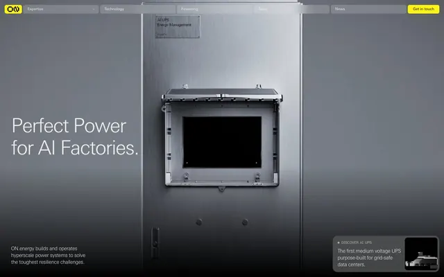
Industrial Luxe on a Dark Stage. The UI feels like a high-tech data center interior, where essential information is presented with precision and a focused burst of energy.
Color palette
Primary accent, CTA buttons, active navigation indicators, key highlights. Commands attention with high saturation.
Primary background, text on yellow accents, outlines for key elements.
Secondary background surfaces, creating subtle depth against Midnight Steel.
Subtle text, inactive states, borders on dark backgrounds. Gives a mechanical sheen.
Prominent text on dark backgrounds, active states, outlines. Provides high contrast for readability.
Link colors, subtle separators, less prominent text on hero sections.
Typography
- Weights
- 300, 400
- Sizes
- 10px, 12px, 14px, 16px, 24px, 36px, 64px
- Line height
- 1, 1.13, 1.17, 1.2, 1.38
- Letter spacing
- -0.0400em at 64px, -0.0200em at 36px and 24px, 0em at 16px and below
- Fallback
- Inter
All textual content: headlines, body text, navigation, buttons. The custom font contributes significantly to the industrial, precise aesthetic, especially with its specific letter spacing at larger sizes. Weight 300 is often reserved for impactful headlines, signaling authority through lightness rather than heavy bolding.
Spacing & shape
Components
Background: rgba(237, 237, 237, 0.2), Text: #eeeeee, Border: #eeeeee. Radius: 6px. Padding: 0px 14px.
Background: #fff313, Text: #000000, Border: #000000. Radius: 6px. Padding: 0px 17px.
Background: rgba(255, 255, 255, 0.2), Text: #eeeeee, Border: #eeeeee. Radius: 16px. Padding: 6px 16px.
Background: rgba(0, 0, 0, 0), Text: #fff313, Border: #fff313. Radius: 0px. Padding: 0px 24px.
Background: rgba(0, 0, 0, 0), No border or shadow. Radius: 0px. Padding: 6.5px 0px.
Background: rgba(0, 0, 0, 0), No border or shadow. Radius: 9px. Padding: 0px.
Text: #eeeeee (default), #fff313 (active). Background: rgba(0, 0, 0, 0) (default), #333333 (hover/active pseudo-background). Font: Univers Next Pro, weight 400, size 16px. Padding: 0px 16px (approx).
Guidelines
- Use Electric Yellow (#fff313) exclusively for primary CTAs and active states.
- Apply Univers Next Pro weight 300 with negative letter-spacing for all significant headlines to achieve a whispered authority.
- Maintain a default border-radius of 6px for most interactive elements and a 9px radius for image cards.
- Layer backgrounds using Midnight Steel (#000000) and Data Center Graphite (#202020) to create depth without shadows, like nested panels.
- Ensure high contrast text (#eeeeee or #000000) against background colors, adhering to AAA accessibility standards.
- Use System 4px as the base unit for all dimensional measurements, ensuring consistent spacing multiples.
- Do not introduce new vibrant colors outside of the defined Electric Yellow; maintain the stark achromatic palette.
- Avoid using drop shadows for elevation; rely on background layering and subtle borders for perceived depth.
- Do not use highly decorative or script fonts; stick to Univers Next Pro to maintain the technical, precise aesthetic.
- Never use positive letter spacing; the brand's typographic signature relies on condensing character forms.
- Do not apply large, soft gradients; the system prefers solid, well-defined color blocks and sharp lines.
- Avoid generic stock photography; imagery should be technical, product-focused, or abstract, aligning with the industrial feel.
About this system
ShowHide
This system evokes a technical, industrial luxury with its stark achromatic palette punctuated by a single vibrant yellow. The dark background (#202020 or #000000) serves as a canvas for precise typography, predominantly the custom Univers Next Pro, often rendered in negative letter-spacing for a sophisticated, whispered delivery. Rounded corners are selectively applied, with the default being 6px, but larger curves for specific button styles introduce a subtle tension, softening otherwise rigid industrial forms.
The page uses a mixed layout approach, beginning with a full-bleed dark hero section featuring a centered headline over a large product image. Subsequent sections alternate between full-width dark backgrounds and lighter #eeeeee sections. Content is primarily centered within a 1350px max-width container, often featuring side-by-side text and visuals (text-left/image-right alternating). Vertical spacing between sections is generous (64px). Navigation is a fixed top bar on a dark background, featuring subtle interactive states. The rhythm is highly structured, almost architectural, creating a sense of order and high performance.
Imagery primarily consists of tight product photography presented with industrial precision, showcasing high-tech hardware or abstract representations of energy flow. There is a strong emphasis on product shots of machinery. Photography is often presented in a muted, desaturated palette or integrated almost as textures within the dark UI. Corner radii on image cards are subtle (9px). Icons are minimalist and outlined, supporting the technical atmosphere without adding visual clutter. The overall density of imagery is balanced with text, serving to explain or showcase rather than purely decorate.
Reminiscent of OpenAI, Palantir, Supabase.
# ON.energy — Style Reference
> Industrial Luxe on a Dark Stage. The UI feels like a high-tech data center interior, where essential information is presented with precision and a focused burst of energy.

**Theme:** dark

**Site:** https://www.on.energy

This system evokes a technical, industrial luxury with its stark achromatic palette punctuated by a single vibrant yellow. The dark background (#202020 or #000000) serves as a canvas for precise typography, predominantly the custom Univers Next Pro, often rendered in negative letter-spacing for a sophisticated, whispered delivery. Rounded corners are selectively applied, with the default being 6px, but larger curves for specific button styles introduce a subtle tension, softening otherwise rigid industrial forms.

## Tokens — Colors

| Name | Value | Token | Role |
|------|------|------|------|
| Electric Yellow | `#fff313` | `--color-electric-yellow` | Primary accent, CTA buttons, active navigation indicators, key highlights. Commands attention with high saturation. |
| Midnight Steel | `#000000` | `--color-midnight-steel` | Primary background, text on yellow accents, outlines for key elements. |
| Data Center Graphite | `#202020` | `--color-data-center-graphite` | Secondary background surfaces, creating subtle depth against Midnight Steel. |
| Industrial Silver | `#afafaf` | `--color-industrial-silver` | Subtle text, inactive states, borders on dark backgrounds. Gives a mechanical sheen. |
| Screen White | `#eeeeee` | `--color-screen-white` | Prominent text on dark backgrounds, active states, outlines. Provides high contrast for readability. |
| Asphalt Gray | `#4b4b4b` | `--color-asphalt-gray` | Link colors, subtle separators, less prominent text on hero sections. |

## Tokens — Typography

### Univers Next Pro
- **Substitute:** Inter
- **Weights:** 300, 400
- **Sizes:** 10px, 12px, 14px, 16px, 24px, 36px, 64px
- **Line height:** 1, 1.13, 1.17, 1.2, 1.38
- **Letter spacing:** -0.0400em at 64px, -0.0200em at 36px and 24px, 0em at 16px and below
- **Role:** All textual content: headlines, body text, navigation, buttons. The custom font contributes significantly to the industrial, precise aesthetic, especially with its specific letter spacing at larger sizes. Weight 300 is often reserved for impactful headlines, signaling authority through lightness rather than heavy bolding.

## Tokens — Type Scale

| Role | Size | Line height | Letter spacing |
|------|------|------|------|
| caption | 10px | 1.38 | — |
| body | 14px | 1.2 | — |
| heading | 24px | 1.13 | -0.48px |
| display | 64px | 1 | -2.56px |

## Tokens — Spacing

- **Max width:** 1350px
- **Section gap:** 64px
- **Element gap:** 16px

## Tokens — Radius

- **Default:** 6px
- **Buttons:** 6px
- **Cards:** 9px
- **specialButton:** 16px

## Layout

The page uses a mixed layout approach, beginning with a full-bleed dark hero section featuring a centered headline over a large product image. Subsequent sections alternate between full-width dark backgrounds and lighter #eeeeee sections. Content is primarily centered within a 1350px max-width container, often featuring side-by-side text and visuals (text-left/image-right alternating). Vertical spacing between sections is generous (64px). Navigation is a fixed top bar on a dark background, featuring subtle interactive states. The rhythm is highly structured, almost architectural, creating a sense of order and high performance.

## Imagery

Imagery primarily consists of tight product photography presented with industrial precision, showcasing high-tech hardware or abstract representations of energy flow. There is a strong emphasis on product shots of machinery. Photography is often presented in a muted, desaturated palette or integrated almost as textures within the dark UI. Corner radii on image cards are subtle (9px). Icons are minimalist and outlined, supporting the technical atmosphere without adding visual clutter. The overall density of imagery is balanced with text, serving to explain or showcase rather than purely decorate.

## Components

### Electric CTA Button Group

### Discover AI UPS — Overlay Card

### Latest News Cards

### Dark Ghost Button
*Secondary interactive elements within dark sections.*

Background: rgba(237, 237, 237, 0.2), Text: #eeeeee, Border: #eeeeee. Radius: 6px. Padding: 0px 14px.

### Electric CTA Button
*Primary calls to action.*

Background: #fff313, Text: #000000, Border: #000000. Radius: 6px. Padding: 0px 17px.

### Accent Pill Button
*Subtle interactive elements, often within hero or image overlays.*

Background: rgba(255, 255, 255, 0.2), Text: #eeeeee, Border: #eeeeee. Radius: 16px. Padding: 6px 16px.

### Outline Accent Button
*Navigation or tertiary actions, particularly on lighter backgrounds.*

Background: rgba(0, 0, 0, 0), Text: #fff313, Border: #fff313. Radius: 0px. Padding: 0px 24px.

### News List Item
*Informational cards within news feeds.*

Background: rgba(0, 0, 0, 0), No border or shadow. Radius: 0px. Padding: 6.5px 0px.

### Image Card
*Content presentation with imagery.*

Background: rgba(0, 0, 0, 0), No border or shadow. Radius: 9px. Padding: 0px.

### Header Navigation Item
*Top-level site navigation links.*

Text: #eeeeee (default), #fff313 (active). Background: rgba(0, 0, 0, 0) (default), #333333 (hover/active pseudo-background). Font: Univers Next Pro, weight 400, size 16px. Padding: 0px 16px (approx).

## Guidelines

### Do

- Use Electric Yellow (#fff313) exclusively for primary CTAs and active states.
- Apply Univers Next Pro weight 300 with negative letter-spacing for all significant headlines to achieve a whispered authority.
- Maintain a default border-radius of 6px for most interactive elements and a 9px radius for image cards.
- Layer backgrounds using Midnight Steel (#000000) and Data Center Graphite (#202020) to create depth without shadows, like nested panels.
- Ensure high contrast text (#eeeeee or #000000) against background colors, adhering to AAA accessibility standards.
- Use System 4px as the base unit for all dimensional measurements, ensuring consistent spacing multiples.

### Don't

- Do not introduce new vibrant colors outside of the defined Electric Yellow; maintain the stark achromatic palette.
- Avoid using drop shadows for elevation; rely on background layering and subtle borders for perceived depth.
- Do not use highly decorative or script fonts; stick to Univers Next Pro to maintain the technical, precise aesthetic.
- Never use positive letter spacing; the brand's typographic signature relies on condensing character forms.
- Do not apply large, soft gradients; the system prefers solid, well-defined color blocks and sharp lines.
- Avoid generic stock photography; imagery should be technical, product-focused, or abstract, aligning with the industrial feel.

## Agent Prompt Guide

Quick Color Reference:
- Text on dark: #eeeeee
- Background: #000000
- CTA: #fff313
- Border/Inactive: #afafaf
- Secondary Background: #202020

Example Component Prompts:
1. Create a hero section with a Midnight Steel (#000000) background. Headline 'Perfect Power for AI Factories.' using Univers Next Pro weight 300, size 64px, #eeeeee, letter-spacing -2.56px. Below it, add body text 'ON.energy builds and operates hyperscale power systems to solve the toughest resilience challenges.' Univers Next Pro weight 400, size 14px, #eeeeee, line-height 1.2.
2. Create an Electric CTA Button: background #fff313, text #000000, radius 6px, padding 0px 17px. Button text 'Get in touch' Univers Next Pro weight 400, size 16px.
3. Create a Dark Ghost Button: background rgba(237, 237, 237, 0.2), text #eeeeee, border #eeeeee, radius 6px, padding 0px 14px. Button text 'Expertise' Univers Next Pro weight 400, size 16px.
4. Design a News List Item card without background or shadow. It should include a link: 'ON.energy Deploys Medium Voltage AI UPS for Grid-Safe AI Campuses...', Univers Next Pro weight 400, size 14px, color #afafaf (default), color #fff313 (hover), padding 6.5px 0px.
More like this







Keep what you find
A free account saves references to boards and can send you a weekly email of picks based on what you save.
To see every result, go Pro.