Preview image. Unlock full-res
Lemon Drop Arcade. Bright, blocky, and instantly recognizable, like a classic handheld console that makes a statement.
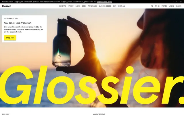
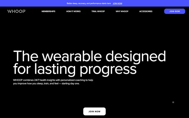
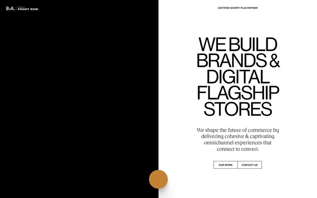
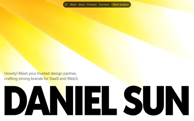
This design system is a cheerful, high-contrast playground. It marries a distinctive vivid yellow with deep, grounded neutrals and a playful violet, creating an energetic yet sturdy aesthetic. The use of a single, custom typeface (Roobert) across all textual elements unifies the brand's voice, while varied weights and sizes carve out hierarchy. The system intentionally avoids complex shadows and layers, favoring bold color blocks and a crisp, almost physical, presentation.
Prioritize Roobert font for all text elements; variations in weight and size, not font family, should create hierarchy.
Use Playdate Yellow (#ffc500) for section backgrounds and major highlights to emphasize key content.
Employ Crank Violet (#7700ff) or its gradient variant for primary call-to-action buttons to ensure high visibility and playful urgency.
Maintain high contrast pairings like Charcoal Text (#312f27) on Pure White (#ffffff) or Playdate Yellow for optimal readability.
Apply 152.19px radius for primary CTA buttons to achieve the signature pill shape; use 6px for general buttons and input fields.
Utilize 3px and 11px as the core elementGap values for consistent vertical rhythm and spacing between small elements.
In sections with neutral backgrounds, use Charcoal Text (#312f27) for headings and Pure White (#ffffff) for subtle highlights on interactive elements.
Avoid introducing additional font families; Roobert is the sole typographic voice.
Refrain from using complex box-shadow effects; the design relies on direct color blocking and shape for visual depth.
Do not deviate from the core color palette; unexpected hues will clash with the brand's vivid but defined identity.
Do not use generic button shapes; prefer 152.19px (pill) or 6px radius for specific button types.
Avoid overly tight vertical spacing; ensure a 68px sectionGap between major content blocks to provide breathing room.
Do not use Midnight Absolute (#000000) for body text; reserve it for outlines, shadows, or very bold statements, preferring Charcoal Text (#312f27) for readability.