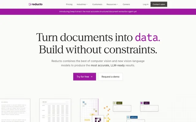
Preview image. Unlock full-res
Crisp Data Canvas
Color palette
Deepest purple for key informational text, emphasized content
Primary action backgrounds, critical headings, active navigation elements. This is the brand's primary interactive color
Borders for primary action buttons, highlighting interactive elements
Link color, hover states for text links, subtle accents
Green text accent for links, tags, and emphasized short phrases
Orange text accent for links, tags, and emphasized short phrases
Blue text accent for links, tags, and emphasized short phrases
Page background, light surfaces, header background
Strongest body text, primary headings, navigation links
Muted body text, secondary navigation, icon strokes
Body text in darker areas, bolder icon fills
Interactive elements, content card backgrounds, selected text
Typography
- Weights
- 400, 500
- Sizes
- 14px, 15px, 16px, 17px, 18px, 20px, 24px
- Line height
- 1.33, 1.43, 1.5, 1.56, 1.6
- Letter spacing
- normal
- Fallback
- system-ui, sans-serif
Primary UI font for body text, navigation, and button labels. Optimized for clarity and consistency across digital interfaces.
- Weights
- 400, 470, 650
- Sizes
- 16px, 24px, 32px, 64px, 80px, 136px
- Line height
- 0.74, 1.13, 1.25, 1.33, 1.5
- Letter spacing
- -0.01em
- Fallback
- serif
Display font for 'hero' sections and impactful headlines. Its slight letter-spacing reduction gives it a more refined, precise appearance at large sizes.
- Weights
- 400, 500
- Sizes
- 14px, 15px, 16px
- Line height
- 1.43, 1.5, 1.6
- Letter spacing
- normal
- Fallback
- system-ui, sans-serif
Secondary sans-serif for annotations, small utility text, and supporting information. It complements Inter by providing a slightly different texture at smaller scales.
- Weights
- 400
- Sizes
- 80px
- Line height
- 1.13
- Letter spacing
- -0.03em
- Fallback
- monospace
Distinct monospace font used for numerical display, particularly large statistics or code-like elements where horizontal alignment is key. The tight letter-spacing emphasizes its structured nature.
Spacing & shape
Components
Background: #9d17a0. Text: #ffffff. Border: #690f6b (subtle darker shade of purple). Padding: 12px vertical, 16px horizontal. Corners: 0px (sharp).
Background: transparent. Text: #310632. Padding: 5px vertical, 0px horizontal. Corners: 0px (sharp).
Background: #ffffff. Text: #292524. Border: None. Padding: 5px vertical, 0px horizontal. Corners: 0px (sharp).
Background: #ffffff. Text: #57534d. Border: 1px solid #d7ccc1. Padding: 12px vertical, 24px horizontal. Corners: 0px (sharp).
Font: reductoSerif, Weight: 400. Size: 136px (for largest). Letter-spacing: -0.01em. Color: #292524, with accent words in #310632. Line Height: 0.74.
Background: #fafaf9. Border: 1px solid #e7e5e4. No visible standard padding, content likely uses element gaps. Corners: 0px (sharp).
Background: #9d17a0. Text: #dcbffb. Font: Inter, Weight: 400. Size: 14px. Padding: 4px vertical, 8px horizontal. Line Height: 1.5.
Guidelines
- Use Reducto Purple Accent (#9d17a0) sparingly and intentionally for primary interactive elements, such as buttons and active states, to create clear focal points.
- Maintain strict square edges (0px border-radius) for all interactive components and foundational elements like cards, adhering to the crisp aesthetic.
- Prioritize ReductoSerif for large, impactful headlines, leveraging its reduced letter-spacing (-0.01em) to convey a sense of precision.
- Structure layouts using strong visual borders like 1px solid #d7ccc1 or #e7e5e4 to define sections and separate content rather than relying on heavy shadows or background colors.
- Apply Reducto Black (#292524) for primary content text and headings, ensuring high contrast against light backgrounds.
- Utilize Inter for all functional UI text, ensuring readability and consistency across smaller text elements.
- Ensure all buttons use sharp 0px corners, reinforcing the precise and direct brand identity.
- Avoid using multiple chromatic colors in close proximity; maintain a largely monochrome palette punctuated by the Reducto Purple Accent.
- Do not introduce rounded corners on primary components like buttons, cards, or input fields, as this conflicts with the sharp aesthetic.
- Refrain from heavy drop shadows or diffused elevation; rely on subtle inset shadows for interactive states or thin borders for separation.
- Do not use generic sans-serif fonts for main display text; always use reductoSerif for a distinct brand voice in headlines.
- Avoid large areas of saturated color that are not Reducto Purple Accent; color should serve a functional or highlight purpose.
- Do not clutter layouts with excessive elements; maintain comfortable density with explicit spacing tokens like 24px element gaps and 64px section gaps.
- Avoid using light text on light backgrounds or dark text on dark backgrounds without ensuring sufficient contrast (minimum AAA).
About this system
ShowHide
Reducto embraces a clean, purposeful aesthetic, pairing high-contrast typography with a striking purple accent. The visual system features sharp edges and minimal elevation, emphasizing data clarity and directness. Monochrome interfaces are punctuated by a single vibrant brand color, creating focal points and guiding user interaction. Strong borders and subtle textural backgrounds provide structure without adding visual weight.
The page adheres to a max-width, center-aligned containment model, with content breaking into a full-bleed purple announcement bar at the very top. The hero section features a centered headline over a light background, followed by sections that alternate between centered stacks of text and visual elements, and multi-column card grids. Vertical rhythm is maintained by consistent section gaps. Navigation is a persistent top bar with a distinct call-to-action button, while internal navigation within content blocks appears as simple text links. The overall density is comfortable, balancing whitespace with structured information blocks.
The visual language for imagery is primarily functional and illustrative. It features abstract, sparse dot-grid patterns and wireframe-style product renders, suggesting data structures and digital processes. These illustrations use simple lines and occasional brand-colored accents, never photographic. Icons are minimal, featuring thin strokes or solid fills, often monochrome with occasional use of spot accent colors (Sage Green, Sunburst Orange, Ocean Blue). Imagery serves to explain abstract concepts or showcase product functionality in a clean, technical context, often contained within defined sections rather than full-bleed.
Reminiscent of Linear, Stripe, Vercel, Replit.
# Reducto — Style Reference
> Crisp Data Canvas

**Theme:** light

**Site:** https://reducto.ai

Reducto embraces a clean, purposeful aesthetic, pairing high-contrast typography with a striking purple accent. The visual system features sharp edges and minimal elevation, emphasizing data clarity and directness. Monochrome interfaces are punctuated by a single vibrant brand color, creating focal points and guiding user interaction. Strong borders and subtle textural backgrounds provide structure without adding visual weight.

## Tokens — Colors

| Name | Value | Token | Role |
|------|------|------|------|
| Reducto Purple Dark | `#310632` | `--color-reducto-purple-dark` | Deepest purple for key informational text, emphasized content |
| Reducto Purple Accent | `#9d17a0` | `--color-reducto-purple-accent` | Primary action backgrounds, critical headings, active navigation elements. This is the brand's primary interactive color |
| Reducto Purple Border | `#690f6b` | `--color-reducto-purple-border` | Borders for primary action buttons, highlighting interactive elements |
| Whisper Lilac | `#dcbffb` | `--color-whisper-lilac` | Link color, hover states for text links, subtle accents |
| Sage Green | `#718613` | `--color-sage-green` | Green text accent for links, tags, and emphasized short phrases |
| Sunburst Orange | `#a2541b` | `--color-sunburst-orange` | Orange text accent for links, tags, and emphasized short phrases |
| Ocean Blue | `#2482db` | `--color-ocean-blue` | Blue text accent for links, tags, and emphasized short phrases |
| Ghostly Gray | `#fafaf9` | `--color-ghostly-gray` | Page background, light surfaces, header background |
| Reducto Black | `#292524` | `--color-reducto-black` | Strongest body text, primary headings, navigation links |
| Subtle Ash | `#79716b` | `--color-subtle-ash` | Muted body text, secondary navigation, icon strokes |
| Medium Gray | `#57534d` | `--color-medium-gray` | Body text in darker areas, bolder icon fills |
| Canvas White | `#ffffff` | `--color-canvas-white` | Interactive elements, content card backgrounds, selected text |

## Tokens — Typography

### Inter
- **Substitute:** system-ui, sans-serif
- **Weights:** 400, 500
- **Sizes:** 14px, 15px, 16px, 17px, 18px, 20px, 24px
- **Line height:** 1.33, 1.43, 1.5, 1.56, 1.6
- **Letter spacing:** normal
- **Role:** Primary UI font for body text, navigation, and button labels. Optimized for clarity and consistency across digital interfaces.

### reductoSerif
- **Substitute:** serif
- **Weights:** 400, 470, 650
- **Sizes:** 16px, 24px, 32px, 64px, 80px, 136px
- **Line height:** 0.74, 1.13, 1.25, 1.33, 1.5
- **Letter spacing:** -0.01em
- **Role:** Display font for 'hero' sections and impactful headlines. Its slight letter-spacing reduction gives it a more refined, precise appearance at large sizes.

### reductosans
- **Substitute:** system-ui, sans-serif
- **Weights:** 400, 500
- **Sizes:** 14px, 15px, 16px
- **Line height:** 1.43, 1.5, 1.6
- **Letter spacing:** normal
- **Role:** Secondary sans-serif for annotations, small utility text, and supporting information. It complements Inter by providing a slightly different texture at smaller scales.

### Reddit Mono
- **Substitute:** monospace
- **Weights:** 400
- **Sizes:** 80px
- **Line height:** 1.13
- **Letter spacing:** -0.03em
- **Role:** Distinct monospace font used for numerical display, particularly large statistics or code-like elements where horizontal alignment is key. The tight letter-spacing emphasizes its structured nature.

## Tokens — Type Scale

| Role | Size | Line height | Letter spacing |
|------|------|------|------|
| caption | 14px | 1.5 | — |
| body | 16px | 1.5 | — |
| subheading | 24px | 1.33 | -0.24px |
| heading | 32px | 1.25 | -0.32px |
| heading-lg | 64px | 1.13 | -0.64px |
| display | 136px | 0.74 | -1.36px |

## Tokens — Spacing

- **Section gap:** 64px
- **Card padding:** 24px
- **Element gap:** 24px

## Tokens — Radius

- **none:** 0px

## Layout

The page adheres to a max-width, center-aligned containment model, with content breaking into a full-bleed purple announcement bar at the very top. The hero section features a centered headline over a light background, followed by sections that alternate between centered stacks of text and visual elements, and multi-column card grids. Vertical rhythm is maintained by consistent section gaps. Navigation is a persistent top bar with a distinct call-to-action button, while internal navigation within content blocks appears as simple text links. The overall density is comfortable, balancing whitespace with structured information blocks.

## Imagery

The visual language for imagery is primarily functional and illustrative. It features abstract, sparse dot-grid patterns and wireframe-style product renders, suggesting data structures and digital processes. These illustrations use simple lines and occasional brand-colored accents, never photographic. Icons are minimal, featuring thin strokes or solid fills, often monochrome with occasional use of spot accent colors (Sage Green, Sunburst Orange, Ocean Blue). Imagery serves to explain abstract concepts or showcase product functionality in a clean, technical context, often contained within defined sections rather than full-bleed.

## Components

### Primary Action Button
*Filled button for primary calls to action.*

Background: #9d17a0. Text: #ffffff. Border: #690f6b (subtle darker shade of purple). Padding: 12px vertical, 16px horizontal. Corners: 0px (sharp).

### Ghost Action Button
*Outlined button for secondary or tertiary actions.*

Background: transparent. Text: #310632. Padding: 5px vertical, 0px horizontal. Corners: 0px (sharp).

### Navigation Link Button
*Small, ghost-like button for navigation items.*

Background: #ffffff. Text: #292524. Border: None. Padding: 5px vertical, 0px horizontal. Corners: 0px (sharp).

### Outline Secondary Button
*Outlined button variant for less prominent actions, found in content areas.*

Background: #ffffff. Text: #57534d. Border: 1px solid #d7ccc1. Padding: 12px vertical, 24px horizontal. Corners: 0px (sharp).

### Hero Headline
*Large, impactful display text for hero sections.*

Font: reductoSerif, Weight: 400. Size: 136px (for largest). Letter-spacing: -0.01em. Color: #292524, with accent words in #310632. Line Height: 0.74.

### Feature Card
*Container for individual feature descriptions within a grid.*

Background: #fafaf9. Border: 1px solid #e7e5e4. No visible standard padding, content likely uses element gaps. Corners: 0px (sharp).

### Brand Notification Bar
*Top-banner for important announcements.*

Background: #9d17a0. Text: #dcbffb. Font: Inter, Weight: 400. Size: 14px. Padding: 4px vertical, 8px horizontal. Line Height: 1.5.

## Guidelines

### Do

- Use Reducto Purple Accent (#9d17a0) sparingly and intentionally for primary interactive elements, such as buttons and active states, to create clear focal points.
- Maintain strict square edges (0px border-radius) for all interactive components and foundational elements like cards, adhering to the crisp aesthetic.
- Prioritize ReductoSerif for large, impactful headlines, leveraging its reduced letter-spacing (-0.01em) to convey a sense of precision.
- Structure layouts using strong visual borders like 1px solid #d7ccc1 or #e7e5e4 to define sections and separate content rather than relying on heavy shadows or background colors.
- Apply Reducto Black (#292524) for primary content text and headings, ensuring high contrast against light backgrounds.
- Utilize Inter for all functional UI text, ensuring readability and consistency across smaller text elements.
- Ensure all buttons use sharp 0px corners, reinforcing the precise and direct brand identity.

### Don't

- Avoid using multiple chromatic colors in close proximity; maintain a largely monochrome palette punctuated by the Reducto Purple Accent.
- Do not introduce rounded corners on primary components like buttons, cards, or input fields, as this conflicts with the sharp aesthetic.
- Refrain from heavy drop shadows or diffused elevation; rely on subtle inset shadows for interactive states or thin borders for separation.
- Do not use generic sans-serif fonts for main display text; always use reductoSerif for a distinct brand voice in headlines.
- Avoid large areas of saturated color that are not Reducto Purple Accent; color should serve a functional or highlight purpose.
- Do not clutter layouts with excessive elements; maintain comfortable density with explicit spacing tokens like 24px element gaps and 64px section gaps.
- Avoid using light text on light backgrounds or dark text on dark backgrounds without ensuring sufficient contrast (minimum AAA).

## Agent Prompt Guide

### Quick Color Reference
text: #292524
background: #fafaf9
border: #d7ccc1
accent: #310632
primary action: #9d17a0 (filled action)

### 3-5 Example Component Prompts
1. Create a Primary Action Button: #9d17a0 background, #ffffff text, 9999px radius, compact pill padding. Use this filled treatment for the main CTA.
3. Create a feature card: Canvas White (#ffffff) background, 1px solid #e7e5e4 border, 0px radius. Inside, use a heading (Inter weight 500, 24px, Reducto Black #292524) and body text (Inter weight 400, 16px, Subtle Ash #79716b). Ensure a 24px card padding internally.
More like this





Keep what you find
A free account saves references to boards and can send you a weekly email of picks based on what you save.
To see every result, go Pro.