Preview image. Unlock full-res
Color palette
Primary interactive elements, text links, navigation outlines, decorative borders, and strong textual emphasis – defines the core brand identity with an electric, high-energy hue
Decorative text accents, small callouts, border details – its vivid punch provides visual punctuation against the violet and white, drawing immediate attention
Page backgrounds, card surfaces, button backgrounds — a stark, pure white for a clean, unbounded canvas
Typography
- Weights
- 300, 500
- Sizes
- 20px, 23px, 25px, 65px, 82px
- Line height
- 0.78, 1.19, 1.27, 1.33, 1.5
- Letter spacing
- normal
- Fallback
- Space Mono
Primary body text, navigation, links, and all UI elements. Its monospaced nature delivers a precise, code-like, and structured feel that is central to the brand's technical identity.
- Weights
- 600
- Sizes
- 32px, 41px, 46px
- Line height
- 1.17, 1.23, 1.29
- Letter spacing
- normal
- Fallback
- Source Serif Pro
Headlines and prominent textual callouts. Its structured serif form contrasts with the monospaced text, adding a subtle touch of traditional authority without losing the system's clean edge.
Spacing & shape
Components
A filled button with 'Canvas White' background and 'Code Violet' text, featuring 2px border-radius and generous padding of 22px vertical, 32px horizontal. This button style combines a clean surface with a distinct brand color for text.
Uses 'DM Mono' text in 'Code Violet'. Underlines are implied by an active border, reinforcing the structured, block-like design. Spacing: 8px vertical margin, 12px right margin, 32px horizontal padding.
Thin, dashed lines predominantly in 'Code Violet', used to strongly delineate content blocks with a technical blueprint aesthetic.
A white background with a subtle border of 'Code Violet'. Padding internal to the card is 32px (cardPadding), with element gaps of 15px for internal components. Text is primarily 'DM Mono' in 'Code Violet', with 'Accent Scarlet' used for small decorative elements or special text highlights. Icons often appear as outlines.
Guidelines
- Use 'Canvas White' as the default background for all primary content surfaces.
- Apply 'Code Violet' for all active states, primary text links, and interactive borders to maintain brand consistency.
- Employ 'DM Mono' for all body text, UI elements, and navigation to preserve the system's technical precision.
- Use 2px border-radius consistently for all buttons and interactive elements for a subtle, crisp edge.
- Delineate major content sections using dashed lines in 'Code Violet', mimicking a design grid.
- Maintain a spacious rhythm by applying a 'sectionGap' of 30px between major content blocks.
- Utilize 'Accent Scarlet' sparingly as a highlight color for small, important textual elements or decorative touches, not for primary text or backgrounds.
- Avoid gradients or complex shadows; the system relies on flat, high-contrast visuals.
- Do not introduce a third primary color; the system is defined by its strict 'Canvas White', 'Code Violet', and 'Accent Scarlet' palette.
- Refrain from using excessively rounded corners; stick to the precise 2px radius for interactive elements.
- Do not use generic system fonts; 'DM Mono' and 'alverata' are integral to the brand's unique typographic voice.
- Avoid dense, information-packed layouts; maintain generous 'elementGap' of 15px and 'cardPadding' of 32px for clarity and breathability.
- Do not use subtle, low-contrast text; ensure text is always in 'Code Violet' against 'Canvas White' for high readability.
About this system
ShowHide
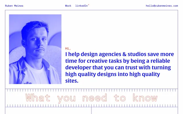
Ruben Meines uses a digital blueprint aesthetic: stark white planes, grid-aligned elements, and a high-contrast palette of electric violet and vibrant scarlet. Visuals are intentionally flat, with outlines and solid blocks of color. Typography is predominantly monospaced, giving the system a technical, code-like precision, and reinforced by subtle red accents that punctuate key information. Layouts feel spacious and structured, emphasizing clarity and directness.
Reminiscent of Figma, Linear, Superlist, Read.cv, Stripe (earlier versions).
# Ruben Meines — Style Reference
> Electric Blueprint

**Theme:** light

**Site:** https://rubenmeines.com

Ruben Meines uses a digital blueprint aesthetic: stark white planes, grid-aligned elements, and a high-contrast palette of electric violet and vibrant scarlet. Visuals are intentionally flat, with outlines and solid blocks of color. Typography is predominantly monospaced, giving the system a technical, code-like precision, and reinforced by subtle red accents that punctuate key information. Layouts feel spacious and structured, emphasizing clarity and directness.

## Tokens — Colors

| Name | Value | Token | Role |
|------|------|------|------|
| Code Violet | `#0002ff` | `--color-code-violet` | Primary interactive elements, text links, navigation outlines, decorative borders, and strong textual emphasis – defines the core brand identity with an electric, high-energy hue |
| Accent Scarlet | `#ff1f00` | `--color-accent-scarlet` | Decorative text accents, small callouts, border details – its vivid punch provides visual punctuation against the violet and white, drawing immediate attention |
| Canvas White | `#ffffff` | `--color-canvas-white` | Page backgrounds, card surfaces, button backgrounds — a stark, pure white for a clean, unbounded canvas |

## Tokens — Typography

### DM Mono
- **Substitute:** Space Mono
- **Weights:** 300, 500
- **Sizes:** 20px, 23px, 25px, 65px, 82px
- **Line height:** 0.78, 1.19, 1.27, 1.33, 1.5
- **Letter spacing:** normal
- **Role:** Primary body text, navigation, links, and all UI elements. Its monospaced nature delivers a precise, code-like, and structured feel that is central to the brand's technical identity.

### alverata
- **Substitute:** Source Serif Pro
- **Weights:** 600
- **Sizes:** 32px, 41px, 46px
- **Line height:** 1.17, 1.23, 1.29
- **Letter spacing:** normal
- **Role:** Headlines and prominent textual callouts. Its structured serif form contrasts with the monospaced text, adding a subtle touch of traditional authority without losing the system's clean edge.

## Tokens — Type Scale

Major Third (1.25) from 23px base.

| Role | Size | Line height | Letter spacing |
|------|------|------|------|
| body-sm | 20px | 1.5 | — |
| body | 23px | 1.33 | — |
| subheading | 25px | 1.27 | — |
| heading-sm | 32px | 1.29 | — |
| heading | 41px | 1.23 | — |
| heading-lg | 46px | 1.17 | — |
| display | 82px | 0.78 | — |

## Tokens — Spacing

- **Section gap:** 30px
- **Card padding:** 32px
- **Element gap:** 15px

## Tokens — Radius

- **Buttons:** 2px

## Components

### Primary Action Button
*Interactive call to action*

A filled button with 'Canvas White' background and 'Code Violet' text, featuring 2px border-radius and generous padding of 22px vertical, 32px horizontal. This button style combines a clean surface with a distinct brand color for text.

### Navigation Link
*Primary navigation item*

Uses 'DM Mono' text in 'Code Violet'. Underlines are implied by an active border, reinforcing the structured, block-like design. Spacing: 8px vertical margin, 12px right margin, 32px horizontal padding.

### Section Divider
*Visual separation for content sections*

Thin, dashed lines predominantly in 'Code Violet', used to strongly delineate content blocks with a technical blueprint aesthetic.

### Feature Card
*Information display card*

A white background with a subtle border of 'Code Violet'. Padding internal to the card is 32px (cardPadding), with element gaps of 15px for internal components. Text is primarily 'DM Mono' in 'Code Violet', with 'Accent Scarlet' used for small decorative elements or special text highlights. Icons often appear as outlines.

## Guidelines

### Do

- Use 'Canvas White' as the default background for all primary content surfaces.
- Apply 'Code Violet' for all active states, primary text links, and interactive borders to maintain brand consistency.
- Employ 'DM Mono' for all body text, UI elements, and navigation to preserve the system's technical precision.
- Use 2px border-radius consistently for all buttons and interactive elements for a subtle, crisp edge.
- Delineate major content sections using dashed lines in 'Code Violet', mimicking a design grid.
- Maintain a spacious rhythm by applying a 'sectionGap' of 30px between major content blocks.
- Utilize 'Accent Scarlet' sparingly as a highlight color for small, important textual elements or decorative touches, not for primary text or backgrounds.

### Don't

- Avoid gradients or complex shadows; the system relies on flat, high-contrast visuals.
- Do not introduce a third primary color; the system is defined by its strict 'Canvas White', 'Code Violet', and 'Accent Scarlet' palette.
- Refrain from using excessively rounded corners; stick to the precise 2px radius for interactive elements.
- Do not use generic system fonts; 'DM Mono' and 'alverata' are integral to the brand's unique typographic voice.
- Avoid dense, information-packed layouts; maintain generous 'elementGap' of 15px and 'cardPadding' of 32px for clarity and breathability.
- Do not use subtle, low-contrast text; ensure text is always in 'Code Violet' against 'Canvas White' for high readability.

## Agent Prompt Guide

Quick Color Reference:
text: #0002ff
background: #ffffff
border: #0002ff
accent: #ff1f00
primary action: #0002ff (outlined action border)

Example Component Prompts:
1. Create a header: 'Canvas White' background, 'DM Mono' text (#0002ff) at 20px, 'Work' and 'linkedIn' navigation items. Include a 'Code Violet' email button as an outlined action (border: 1px solid #0002ff, background: #ffffff, text: #0002ff, padding: 22px 32px, radius: 2px).
2. Design a hero section: 'Canvas White' background. Main headline: 'I help design agencies & studios save more time for creative tasks...' using 'alverata' weight 600, size 82px, #0002ff. A smaller 'Hi,' intro text in 'Accent Scarlet' using 'DM Mono', 25px. Image next to text with violet overlay.
3. Build a feature card: 'Canvas White' background, internal padding of 32px, bordered by 1px 'Code Violet' lines. Headline 'Your whitespace is safe with me' at 'alverata' weight 600, size 32px, #0002ff. Body text in 'DM Mono' weight 300, size 20px, #0002ff. Include a small outlined icon in 'Accent Scarlet' at the top.
More like this





Keep what you find
A free account saves references to boards and can send you a weekly email of picks based on what you save.
To see every result, go Pro.