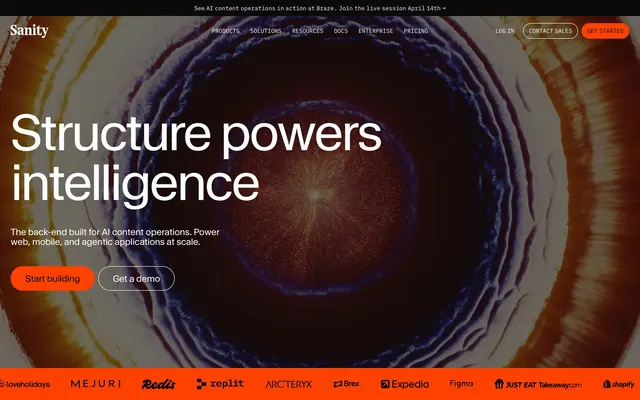
Preview image. Unlock full-res
Data grid, pulsing with neon light. A clean terminal-like layout where vibrant color accents pinpoint critical information within structured data.
Color palette
Primary call-to-action buttons, active navigation indicators, crucial accents. This vivid orange demands immediate attention.
Secondary call-to-action buttons, interactive link highlights, branded elements. Provides a strong alternative accent to Pumpkin Spill.
Prominent success states, code snippets, highlights within content. Its high saturation makes it pop against neutrals.
Button backgrounds, icons, specific content highlights. A darker, more grounded green than Neon Green.
Decorative elements, specific data visualizations, sub-brand highlights. A dramatic and modern accent color.
Primary text, surface backgrounds, interactive element outlines. Establishes a bold and clear contrast for readability.
Page backgrounds, primary surface color. Provides a stark, clean backdrop for the dark text and vibrant accents.
Subtle surface contrast, input borders, secondary text in dark contexts. Slightly softer than Absolute Black.
Secondary text, disabled states, borders on light surfaces. Provides visual hierarchy below primary text.
Tertiary text, subtle icons. Used for less prominent information.
Typography
- Weights
- 400, 425, 500, 600
- Sizes
- 11px, 12px, 13px, 15px, 16px, 18px, 20px, 24px, 32px, 38px, 48px, 60px, 72px, 112px
- Line height
- 0.8, 1, 1.05, 1.08, 1.1, 1.13, 1.2, 1.24, 1.3, 1.5
- Letter spacing
- -0.0400em, -0.0350em, -0.0300em, -0.0100em, -0.0010em
- Fallback
- system-ui, sans-serif
Primary display font for all headings and most body text. Headings lean heavily on extremely tight letter-spacing and varied weights (425, 600) to create a striking, modern presence, particularly at larger sizes.
- Weights
- 400, 500
- Sizes
- 10px, 12px, 13px, 15px
- Line height
- 1.3, 1.4, 1.5, 1.7
- Letter spacing
- normal
- Fallback
- SFMono-Regular, Consolas, Liberation Mono, Menlo, monospace
Used for all technical content, code snippets, and as stylistic secondary text on buttons/inputs. The monospaced nature reinforces the 'structured content' message and provides a consistent 'developer first' aesthetic.
Spacing & shape
Components
backgroundColor: rgba(0, 0, 0, 0), color: #ffffff, border: 1px solid #ffffff, borderRadius: 0px, padding: 8px 8px.
backgroundColor: rgba(0, 0, 0, 0), color: #ffffff, border: 1px solid #ffffff, borderRadius: 99999px, padding: 4px 12px.
backgroundColor: rgba(0, 0, 0, 0), color: #0b0b0b, border: 1px solid #0b0b0b, borderRadius: 99999px, padding: 4px 12px.
backgroundColor: rgba(0, 0, 0, 0), color: #0b0b0b, border: 1px solid #0b0b0b, borderRadius: 6px, padding: 12px 12px.
backgroundColor: rgba(0, 0, 0, 0), color: #ffffff, borderBottom: 1px solid #ffffff, borderRadius: 0px, padding: 0px.
backgroundColor: rgba(0, 0, 0, 0), color: #b9b9b9, border: 1px solid #b9b9b9, borderRadius: 3px, padding: 0px 12px.
backgroundColor: #0b0b0b, color: #b9b9b9, border: 1px solid #212121, borderRadius: 3px, padding: 8px 12px.
backgroundColor: rgba(0, 0, 0, 0), color: #0b0b0b, borderBottom: 1px solid #0b0b0b, borderRadius: 0px, padding: 0px.
Guidelines
- Use Waldenburg Normal for all marketing headlines and body text to leverage its distinctive tight letter-spacing and varied weights.
- Apply IBM Plex Mono for all code examples, technical labels, and data displays (e.g., in tables or pseudo-terminal interfaces) to maintain a developer-centric aesthetic.
- Prioritize Pumpkin Spill (#ff4100) or Electric Blue (#0052ef) for all primary interactive elements to clearly signpost user actions.
- Employ `border-radius: 99999px` for all interactive button shapes when a pill style is desired.
- Maintain a clear visual hierarchy: use Absolute Black (#0b0b0b) for primary text, Medium Gray (#b9b9b9) for secondary, and Silver Mist (#797979) for tertiary information.
- Ensure generous spacing: sections should have at least `48px` vertical padding, and content elements `12px` horizontal and vertical gaps.
- Utilize Neon Green (#45ff00) or Future Violet (#f500ff) sparingly for specific content highlights or data visualizations to maximize their visual impact as accents.
- Do not use generic sans-serif fonts for code or technical content; always use IBM Plex Mono.
- Avoid applying brand or accent colors to non-interactive elements or large blocks of text; they are reserved for emphasis and action.
- Do not introduce complex shadows or depth effects; the system relies on flat backgrounds and borders for element separation.
- Do not use highly rounded corners outside of intended button/pill shapes; maintain `0px` or `3px` for structural elements and inputs.
- Do not use the tight letter-spacing for IBM Plex Mono; it should remain `normal` to preserve code readability.
- Avoid using a cluttered layout; maintain comfortable element gaps of `12px` and `24px` to ensure visual breathing room.
- Do not introduce additional bold, saturated colors beyond the defined brand and accent palette; they would dilute the visual identity.
About this system
ShowHide
Sanity.io's design system feels like a high-performance data visualization interface, where structure and precision meet dynamic, glowing content. A strong black-on-white foundation is punctuated by a spectrum of vivid, almost neon, colors that appear as focal points, indicating interactivity or highlighting data points within a clean, monospaced programming-like aesthetic. The interplay of crisp typography and tightly integrated elements creates a sense of efficiency and controlled power, reflecting its role as a content operating system.
The layout is predominantly a max-width, center-aligned container system, although the initial hero section can be full-bleed with a prominent visual background. Sections alternate between dark (black) and light (white) backgrounds, creating a clear visual rhythm and demarcation of content blocks. The hero section often features a large, centrally-aligned headline with supporting text and calls to action. Content arrangement frequently employs a dual-column structure for features, where text (often a numbered list or descriptive paragraph) is paired with a corresponding image or graphic, alternating left/right alignment. Information density progresses from spacious, impact-driven hero sections to more compact, data-rich product feature displays. Navigation is a sticky top bar, transforming colors based on the underlying section, featuring prominent CTA buttons at the far right. The overall impression is one of structured modularity and precise alignment.
Imagery at Sanity.io is a blend of abstract, generative art, and product-focused UI screenshots with a technical overlay. The abstract graphics often feature intense, vibrant colors (like the hero's multi-hued vortex) that provide a dynamic backdrop or visual metaphor for 'structure' and 'intelligence'. Product UI screenshots are usually presented on dark surfaces, displaying code editors or content management interfaces, sometimes with specific elements pixilated or highlighted by a vivid accent color. There's a strong emphasis on showing the *system* rather than lifestyle; visuals are contained or masked into geometric shapes, occasionally overlapping to suggest layering and complexity. Iconography appears as outlined or filled, using muted greens and grays, maintaining functional clarity over decorative flourish. The density is moderate, with images serving an explanatory or atmospheric role alongside significant blocks of text.
Reminiscent of Vercel, Linear, Stripe (Dev Docs), Supabase.
# Sanity.io — Style Reference
> Data grid, pulsing with neon light. A clean terminal-like layout where vibrant color accents pinpoint critical information within structured data.

**Theme:** light

**Site:** https://sanity.io

Sanity.io's design system feels like a high-performance data visualization interface, where structure and precision meet dynamic, glowing content. A strong black-on-white foundation is punctuated by a spectrum of vivid, almost neon, colors that appear as focal points, indicating interactivity or highlighting data points within a clean, monospaced programming-like aesthetic. The interplay of crisp typography and tightly integrated elements creates a sense of efficiency and controlled power, reflecting its role as a content operating system.

## Tokens — Colors

| Name | Value | Token | Role |
|------|------|------|------|
| Pumpkin Spill | `#ff4100` | `--color-pumpkin-spill` | Primary call-to-action buttons, active navigation indicators, crucial accents. This vivid orange demands immediate attention. |
| Electric Blue | `#0052ef` | `--color-electric-blue` | Secondary call-to-action buttons, interactive link highlights, branded elements. Provides a strong alternative accent to Pumpkin Spill. |
| Neon Green | `#45ff00` | `--color-neon-green` | Prominent success states, code snippets, highlights within content. Its high saturation makes it pop against neutrals. |
| Terminal Green | `#19d600` | `--color-terminal-green` | Button backgrounds, icons, specific content highlights. A darker, more grounded green than Neon Green. |
| Future Violet | `#f500ff` | `--color-future-violet` | Decorative elements, specific data visualizations, sub-brand highlights. A dramatic and modern accent color. |
| Absolute Black | `#0b0b0b` | `--color-absolute-black` | Primary text, surface backgrounds, interactive element outlines. Establishes a bold and clear contrast for readability. |
| Canvas White | `#ffffff` | `--color-canvas-white` | Page backgrounds, primary surface color. Provides a stark, clean backdrop for the dark text and vibrant accents. |
| Graphite | `#212121` | `--color-graphite` | Subtle surface contrast, input borders, secondary text in dark contexts. Slightly softer than Absolute Black. |
| Medium Gray | `#b9b9b9` | `--color-medium-gray` | Secondary text, disabled states, borders on light surfaces. Provides visual hierarchy below primary text. |
| Silver Mist | `#797979` | `--color-silver-mist` | Tertiary text, subtle icons. Used for less prominent information. |

## Tokens — Typography

### Waldenburg Normal
- **Substitute:** system-ui, sans-serif
- **Weights:** 400, 425, 500, 600
- **Sizes:** 11px, 12px, 13px, 15px, 16px, 18px, 20px, 24px, 32px, 38px, 48px, 60px, 72px, 112px
- **Line height:** 0.8, 1, 1.05, 1.08, 1.1, 1.13, 1.2, 1.24, 1.3, 1.5
- **Letter spacing:** -0.0400em, -0.0350em, -0.0300em, -0.0100em, -0.0010em
- **Role:** Primary display font for all headings and most body text. Headings lean heavily on extremely tight letter-spacing and varied weights (425, 600) to create a striking, modern presence, particularly at larger sizes.

### IBM Plex Mono
- **Substitute:** SFMono-Regular, Consolas, Liberation Mono, Menlo, monospace
- **Weights:** 400, 500
- **Sizes:** 10px, 12px, 13px, 15px
- **Line height:** 1.3, 1.4, 1.5, 1.7
- **Letter spacing:** normal
- **Role:** Used for all technical content, code snippets, and as stylistic secondary text on buttons/inputs. The monospaced nature reinforces the 'structured content' message and provides a consistent 'developer first' aesthetic.

## Tokens — Type Scale

Golden Ratio (1.618) from 15px base.

| Role | Size | Line height | Letter spacing |
|------|------|------|------|
| caption | 10px | 1.7 | — |
| body | 15px | 1.3 | — |
| subheading | 20px | 1.24 | -0.01em |
| heading | 38px | 1.13 | -0.01em |
| heading-lg | 72px | 1.05 | -0.035em |
| display | 112px | 0.8 | -0.04em |

## Tokens — Spacing

- **Section gap:** 48px
- **Card padding:** 24px
- **Element gap:** 12px

## Tokens — Radius

- **Default:** 0px
- **Buttons:** 99999px
- **Cards:** 12px
- **buttons-sm:** 6px
- **input-sm:** 3px

## Layout

The layout is predominantly a max-width, center-aligned container system, although the initial hero section can be full-bleed with a prominent visual background. Sections alternate between dark (black) and light (white) backgrounds, creating a clear visual rhythm and demarcation of content blocks. The hero section often features a large, centrally-aligned headline with supporting text and calls to action. Content arrangement frequently employs a dual-column structure for features, where text (often a numbered list or descriptive paragraph) is paired with a corresponding image or graphic, alternating left/right alignment. Information density progresses from spacious, impact-driven hero sections to more compact, data-rich product feature displays. Navigation is a sticky top bar, transforming colors based on the underlying section, featuring prominent CTA buttons at the far right. The overall impression is one of structured modularity and precise alignment.

## Imagery

Imagery at Sanity.io is a blend of abstract, generative art, and product-focused UI screenshots with a technical overlay. The abstract graphics often feature intense, vibrant colors (like the hero's multi-hued vortex) that provide a dynamic backdrop or visual metaphor for 'structure' and 'intelligence'. Product UI screenshots are usually presented on dark surfaces, displaying code editors or content management interfaces, sometimes with specific elements pixilated or highlighted by a vivid accent color. There's a strong emphasis on showing the *system* rather than lifestyle; visuals are contained or masked into geometric shapes, occasionally overlapping to suggest layering and complexity. Iconography appears as outlined or filled, using muted greens and grays, maintaining functional clarity over decorative flourish. The density is moderate, with images serving an explanatory or atmospheric role alongside significant blocks of text.

## Components

### Button Group

### Feature Tab Selector

### Announcement Banner + Stats Block

### Primary Ghost Button (Dark)
*Primary calls to action on dark backgrounds*

backgroundColor: rgba(0, 0, 0, 0), color: #ffffff, border: 1px solid #ffffff, borderRadius: 0px, padding: 8px 8px.

### Pill Ghost Button (Dark)
*Secondary actions on dark backgrounds, navigation elements*

backgroundColor: rgba(0, 0, 0, 0), color: #ffffff, border: 1px solid #ffffff, borderRadius: 99999px, padding: 4px 12px.

### Pill Ghost Button (Light)
*Secondary actions on light backgrounds, navigation elements*

backgroundColor: rgba(0, 0, 0, 0), color: #0b0b0b, border: 1px solid #0b0b0b, borderRadius: 99999px, padding: 4px 12px.

### Square Ghost Button (Light)
*General utility buttons, often for non-primary actions on light surfaces*

backgroundColor: rgba(0, 0, 0, 0), color: #0b0b0b, border: 1px solid #0b0b0b, borderRadius: 6px, padding: 12px 12px.

### Underlined Input (Dark)
*Minimalist text input fields on dark surfaces*

backgroundColor: rgba(0, 0, 0, 0), color: #ffffff, borderBottom: 1px solid #ffffff, borderRadius: 0px, padding: 0px.

### Minimal Input (Light)
*Subtle input fields on light surfaces*

backgroundColor: rgba(0, 0, 0, 0), color: #b9b9b9, border: 1px solid #b9b9b9, borderRadius: 3px, padding: 0px 12px.

### Filled Input (Dark)
*Standard input fields on dark surfaces, with a distinct background*

backgroundColor: #0b0b0b, color: #b9b9b9, border: 1px solid #212121, borderRadius: 3px, padding: 8px 12px.

### Plain Input (Light)
*Simple text input on light backgrounds, minimal styling*

backgroundColor: rgba(0, 0, 0, 0), color: #0b0b0b, borderBottom: 1px solid #0b0b0b, borderRadius: 0px, padding: 0px.

## Guidelines

### Do

- Use Waldenburg Normal for all marketing headlines and body text to leverage its distinctive tight letter-spacing and varied weights.
- Apply IBM Plex Mono for all code examples, technical labels, and data displays (e.g., in tables or pseudo-terminal interfaces) to maintain a developer-centric aesthetic.
- Prioritize Pumpkin Spill (#ff4100) or Electric Blue (#0052ef) for all primary interactive elements to clearly signpost user actions.
- Employ `border-radius: 99999px` for all interactive button shapes when a pill style is desired.
- Maintain a clear visual hierarchy: use Absolute Black (#0b0b0b) for primary text, Medium Gray (#b9b9b9) for secondary, and Silver Mist (#797979) for tertiary information.
- Ensure generous spacing: sections should have at least `48px` vertical padding, and content elements `12px` horizontal and vertical gaps.
- Utilize Neon Green (#45ff00) or Future Violet (#f500ff) sparingly for specific content highlights or data visualizations to maximize their visual impact as accents.

### Don't

- Do not use generic sans-serif fonts for code or technical content; always use IBM Plex Mono.
- Avoid applying brand or accent colors to non-interactive elements or large blocks of text; they are reserved for emphasis and action.
- Do not introduce complex shadows or depth effects; the system relies on flat backgrounds and borders for element separation.
- Do not use highly rounded corners outside of intended button/pill shapes; maintain `0px` or `3px` for structural elements and inputs.
- Do not use the tight letter-spacing for IBM Plex Mono; it should remain `normal` to preserve code readability.
- Avoid using a cluttered layout; maintain comfortable element gaps of `12px` and `24px` to ensure visual breathing room.
- Do not introduce additional bold, saturated colors beyond the defined brand and accent palette; they would dilute the visual identity.

## Agent Prompt Guide

### Quick Color Reference
- Text: #0b0b0b
- Background: #ffffff
- CTA: #ff4100
- Border (light): #b9b9b9
- Accent: #0052ef

### Example Component Prompts
1. Create a primary ghost button (dark theme): `backgroundColor: rgba(0, 0, 0, 0); color: #ffffff; border: 1px solid #ffffff; borderRadius: 0px; padding: 8px 8px; font-family: Waldenburg Normal, sans-serif; font-weight: 425; font-size: 15px;`
2. Design a hero section headline: `Text: 'Structure powers intelligence'; font-family: Waldenburg Normal, sans-serif; font-weight: 600; font-size: 112px; line-height: 0.8; letter-spacing: -0.04em; color: #0b0b0b;`
3. Generate a secondary pill button (light theme): `backgroundColor: rgba(0, 0, 0, 0); color: #0b0b0b; border: 1px solid #0b0b0b; borderRadius: 99999px; padding: 4px 12px; font-family: IBM Plex Mono, monospace; font-weight: 400; font-size: 13px;`
4. Create an input field for a dark card: `backgroundColor: #0b0b0b; color: #b9b9b9; border: 1px solid #212121; borderRadius: 3px; padding: 8px 12px; font-family: IBM Plex Mono, monospace; font-weight: 400; font-size: 15px;`
5. Implement a body paragraph with highlight: `Paragraph text: 'The back-end built for AI content operations. Power web, mobile, and agentic applications at scale.'; font-family: Waldenburg Normal, sans-serif; font-weight: 400; font-size: 18px; line-height: 1.5; color: #0b0b0b; Highlight a word with color: #0052ef.`
More like this






Keep what you find
A free account saves references to boards and can send you a weekly email of picks based on what you save.
To see every result, go Pro.