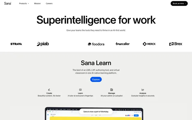
Preview image. Unlock full-res
AI Blueprint on Polished Glass
Color palette
Primary call-to-action buttons – a vivid, energetic blue that draws immediate attention
Orange action color for filled buttons, selected navigation states, and focused conversion moments
Page backgrounds, card backgrounds, button backgrounds for ghost/outlined states, text on dark backgrounds
Subtle background for UI sections and elevated cards, providing gentle visual separation from the main canvas
Primary text, headings, most iconography, borders, and input text – a core color for content and structure
Headings on light backgrounds, filled button backgrounds, and strong accent borders for interactive elements
Subtle borders, dividers, and background elements, especially in footers or less prominent UI areas
Typography
- Weights
- 400, 450, 500
- Sizes
- 14px, 15px, 16px, 32px, 40px, 48px, 83px
- Line height
- 0.95, 1, 1.1, 1.23, 1.4, 1.49, 1.6
- Letter spacing
- -0.0300em (at 83px), -0.0200em (at 48px), -0.0110em (at 40px), -0.0100em (at 32px), -0.0040em (at 16px)
- Fallback
- Inter
All textual elements on the site, from large display headings to fine print. The custom Sana Sans ensures a distinct brand voice through precise tracking and varied weights, establishing authority without formality. The tight letter-spacing on larger sizes creates a sense of precision and modernism.
Spacing & shape
Components
Filled button with 'Action Blue' (#0057f3) background, 'Canvas White' text, and a generous 32px border-radius, giving it a soft, approachable feel. Padding is 10px vertical and 16px horizontal to ensure a comfortable tap target.
Filled button with 'Warning Orange' (#ff5102) background, 'Canvas White' text, and 32px border-radius. Padding is 10px vertical and 16px horizontal.
Black filled button with 'Abyssal Black' (#000000) background, 'Canvas White' text, and 32px border-radius for high contrast. Padding is 10px vertical and 16px horizontal.
Black button with 'Abyssal Black' (#000000) background and 'Canvas White' text, but with a specific 36px border-radius and minimal vertical padding (4px top, 0px bottom), suggesting a smaller, more integrated control.
Button with 'Canvas White' (#ffffff) background, 'Abyssal Black' (#000000) text and border, maintaining a 32px border-radius and 10px vertical, 16px horizontal padding. Integrates into surfaces for less prominence than filled buttons.
Card with 'Ghost Fog' (#efefed) background, 16px border-radius, and generous interior padding (64px top, 43px horizontal) for structured content presentation. No explicit shadow, relying on background color for elevation.
Card with no background, 24px border-radius, and internal padding of 40px on all sides, used for more prominent content blocks or to create internal grouping without a strong visual boundary.
Text link using 'Midnight Ink' (#090909) with Sana Sans font. Features a subtle 6px border-radius for containing small interactive elements within navigation, and horizontal padding of 8px to 16px.
Guidelines
- Prioritize 'Midnight Ink' (#090909) and 'Abyssal Black' (#000000) for all primary text and headings, ensuring high contrast against light backgrounds.
- Use 'Canvas White' (#ffffff) as the default page background and for ghost-style interactive elements.
- Apply 'Ghost Fog' (#efefed) for secondary section backgrounds or cards to create a subtle depth layer without shadows.
- Reserve 'Action Blue' (#0057f3) for the primary call-to-action buttons, maximizing urgency and visibility.
- Maintain a clear visual hierarchy with distinct font sizes and precise letter-spacing from the Sana Sans typography scale, especially for larger headings.
- Employ rounded corners consistently: 32px for most buttons and 16px for cards, giving elements a soft, approachable character.
- Utilize 16px as the primary value for horizontal and vertical spacing between related elements and for internal component padding to maintain comfortable density.
- Avoid arbitrary color usage; limit chromatic colors strictly to 'Action Blue' (#0057f3) and 'Warning Orange' (#ff5102) for interactive elements.
- Do not introduce strong shadows or complex elevation schemes; the design relies on subtle background color shifts for depth.
- Do not deviate from the defined Sana Sans font family, weights, and letter-spacing values to preserve the brand's typographic precision.
- Do not use sharp corners; maintain the rounded aesthetic across all interactive and content-containing components.
- Avoid overly dense layouts; ensure ample 'Ghost Fog' (#efefed) or 'Canvas White' (#ffffff) space between content blocks and sections.
- Do not use dark backgrounds for large content areas; the system is designed for a light-themed interface with dark typography.
- Do not use generic system fonts; the custom Sana Sans is integral to the brand's visual identity.
About this system
ShowHide
Sana embodies a high-contrast, polished AI platform aesthetic: a largely white canvas punctuated by deep dark text and occasional vibrant accents. Components are lightweight and confident, favoring rounded shapes and minimal elevation. Typography is distinctive with a custom sans-serif that uses precise letter-spacing for a sophisticated, modern feel. Color appears primarily as functional cues, highlighting calls to action or distinguishing interactive elements within an otherwise achromatic UI.
The page primarily uses a max-width contained layout, though the hero section can be full-bleed. The hero pattern prominently features a centered, bold headline over a clean background. Sections typically follow a consistent vertical rhythm with comfortable spacing, often alternating between a 'Canvas White' and 'Ghost Fog' background to delineate content blocks. Content arrangement favors a balanced, often centered, stacking of elements, occasionally incorporating two-column layouts for text-plus-image sections. There's a subtle use of a card-like grid for features, maintaining generous padding and rounded corners. Navigation is a simple, fixed top bar with minimal links.
The site uses a mix of realistic product screenshots and staged photography. Product visuals often feature a clean, bright aesthetic against light backgrounds, emphasizing the UI. Photography includes close-ups of people, often with a natural, unposed style that conveys approachability and authentic engagement, rather than highly stylized studio shots. Illustrations are minimal and typically brand-aligned, such as simplified vector icons or subtle graphic elements within UI. Imagery serves both to showcase the product's functionality and to foster a sense of human connection, with a density that allows generous white space for a premium feel.
Reminiscent of Workday, Stripe, Linear, Amie.
# Superintelligence for work — Style Reference
> AI Blueprint on Polished Glass

**Theme:** light

**Site:** https://sanalabs.com

Sana embodies a high-contrast, polished AI platform aesthetic: a largely white canvas punctuated by deep dark text and occasional vibrant accents. Components are lightweight and confident, favoring rounded shapes and minimal elevation. Typography is distinctive with a custom sans-serif that uses precise letter-spacing for a sophisticated, modern feel. Color appears primarily as functional cues, highlighting calls to action or distinguishing interactive elements within an otherwise achromatic UI.

## Tokens — Colors

| Name | Value | Token | Role |
|------|------|------|------|
| Action Blue | `#0057f3` | `--color-action-blue` | Primary call-to-action buttons – a vivid, energetic blue that draws immediate attention |
| Warning Orange | `#ff5102` | `--color-warning-orange` | Orange action color for filled buttons, selected navigation states, and focused conversion moments |
| Canvas White | `#ffffff` | `--color-canvas-white` | Page backgrounds, card backgrounds, button backgrounds for ghost/outlined states, text on dark backgrounds |
| Ghost Fog | `#efefed` | `--color-ghost-fog` | Subtle background for UI sections and elevated cards, providing gentle visual separation from the main canvas |
| Midnight Ink | `#090909` | `--color-midnight-ink` | Primary text, headings, most iconography, borders, and input text – a core color for content and structure |
| Abyssal Black | `#000000` | `--color-abyssal-black` | Headings on light backgrounds, filled button backgrounds, and strong accent borders for interactive elements |
| Sterling Gray | `#d9d9d9` | `--color-sterling-gray` | Subtle borders, dividers, and background elements, especially in footers or less prominent UI areas |

## Tokens — Typography

### Sana Sans
- **Substitute:** Inter
- **Weights:** 400, 450, 500
- **Sizes:** 14px, 15px, 16px, 32px, 40px, 48px, 83px
- **Line height:** 0.95, 1, 1.1, 1.23, 1.4, 1.49, 1.6
- **Letter spacing:** -0.0300em (at 83px), -0.0200em (at 48px), -0.0110em (at 40px), -0.0100em (at 32px), -0.0040em (at 16px)
- **Role:** All textual elements on the site, from large display headings to fine print. The custom Sana Sans ensures a distinct brand voice through precise tracking and varied weights, establishing authority without formality. The tight letter-spacing on larger sizes creates a sense of precision and modernism.

## Tokens — Type Scale

Augmented Fourth (1.414) from 16px base.

| Role | Size | Line height | Letter spacing |
|------|------|------|------|
| caption | 14px | 1.49 | -0.056em |
| body | 16px | 1.4 | -0.064em |
| subheading | 32px | 1.1 | -0.32px |
| heading-sm | 40px | 1.1 | -0.44px |
| heading | 48px | 1.1 | -0.96px |
| display | 83px | 0.95 | -2.49px |

## Tokens — Spacing

- **Section gap:** 64px
- **Card padding:** 40px
- **Element gap:** 16px

## Tokens — Radius

- **Buttons:** 32px
- **Cards:** 16px
- **largeFeatures:** 24px
- **navigation:** 6px
- **specialButtons:** 36px

## Layout

The page primarily uses a max-width contained layout, though the hero section can be full-bleed. The hero pattern prominently features a centered, bold headline over a clean background. Sections typically follow a consistent vertical rhythm with comfortable spacing, often alternating between a 'Canvas White' and 'Ghost Fog' background to delineate content blocks. Content arrangement favors a balanced, often centered, stacking of elements, occasionally incorporating two-column layouts for text-plus-image sections. There's a subtle use of a card-like grid for features, maintaining generous padding and rounded corners. Navigation is a simple, fixed top bar with minimal links.

## Imagery

The site uses a mix of realistic product screenshots and staged photography. Product visuals often feature a clean, bright aesthetic against light backgrounds, emphasizing the UI. Photography includes close-ups of people, often with a natural, unposed style that conveys approachability and authentic engagement, rather than highly stylized studio shots. Illustrations are minimal and typically brand-aligned, such as simplified vector icons or subtle graphic elements within UI. Imagery serves both to showcase the product's functionality and to foster a sense of human connection, with a density that allows generous white space for a premium feel.

## Components

### Main Call to Action Button
*Interactive element*

Filled button with 'Action Blue' (#0057f3) background, 'Canvas White' text, and a generous 32px border-radius, giving it a soft, approachable feel. Padding is 10px vertical and 16px horizontal to ensure a comfortable tap target.

### Secondary Call to Action Button
*Interactive element*

Filled button with 'Warning Orange' (#ff5102) background, 'Canvas White' text, and 32px border-radius. Padding is 10px vertical and 16px horizontal.

### Call to Action Button (Dark)
*Interactive element*

Black filled button with 'Abyssal Black' (#000000) background, 'Canvas White' text, and 32px border-radius for high contrast. Padding is 10px vertical and 16px horizontal.

### Ghost Button (Book an Intro)
*Interactive element*

Black button with 'Abyssal Black' (#000000) background and 'Canvas White' text, but with a specific 36px border-radius and minimal vertical padding (4px top, 0px bottom), suggesting a smaller, more integrated control.

### Outlined Button (Watch video)
*Interactive element*

Button with 'Canvas White' (#ffffff) background, 'Abyssal Black' (#000000) text and border, maintaining a 32px border-radius and 10px vertical, 16px horizontal padding. Integrates into surfaces for less prominence than filled buttons.

### Feature Card (Subtle BG)
*Information display*

Card with 'Ghost Fog' (#efefed) background, 16px border-radius, and generous interior padding (64px top, 43px horizontal) for structured content presentation. No explicit shadow, relying on background color for elevation.

### Feature Card (Large Radius)
*Information display*

Card with no background, 24px border-radius, and internal padding of 40px on all sides, used for more prominent content blocks or to create internal grouping without a strong visual boundary.

### Navigation Link
*Interactive element*

Text link using 'Midnight Ink' (#090909) with Sana Sans font. Features a subtle 6px border-radius for containing small interactive elements within navigation, and horizontal padding of 8px to 16px.

## Guidelines

### Do

- Prioritize 'Midnight Ink' (#090909) and 'Abyssal Black' (#000000) for all primary text and headings, ensuring high contrast against light backgrounds.
- Use 'Canvas White' (#ffffff) as the default page background and for ghost-style interactive elements.
- Apply 'Ghost Fog' (#efefed) for secondary section backgrounds or cards to create a subtle depth layer without shadows.
- Reserve 'Action Blue' (#0057f3) for the primary call-to-action buttons, maximizing urgency and visibility.
- Maintain a clear visual hierarchy with distinct font sizes and precise letter-spacing from the Sana Sans typography scale, especially for larger headings.
- Employ rounded corners consistently: 32px for most buttons and 16px for cards, giving elements a soft, approachable character.
- Utilize 16px as the primary value for horizontal and vertical spacing between related elements and for internal component padding to maintain comfortable density.

### Don't

- Avoid arbitrary color usage; limit chromatic colors strictly to 'Action Blue' (#0057f3) and 'Warning Orange' (#ff5102) for interactive elements.
- Do not introduce strong shadows or complex elevation schemes; the design relies on subtle background color shifts for depth.
- Do not deviate from the defined Sana Sans font family, weights, and letter-spacing values to preserve the brand's typographic precision.
- Do not use sharp corners; maintain the rounded aesthetic across all interactive and content-containing components.
- Avoid overly dense layouts; ensure ample 'Ghost Fog' (#efefed) or 'Canvas White' (#ffffff) space between content blocks and sections.
- Do not use dark backgrounds for large content areas; the system is designed for a light-themed interface with dark typography.
- Do not use generic system fonts; the custom Sana Sans is integral to the brand's visual identity.

## Agent Prompt Guide

### Quick Color Reference
text: #090909
background: #ffffff
border: #090909
accent: #ff5102
primary action: #000000 (filled action)

### 3-5 Example Component Prompts
1. Create a Hero Section: 'Canvas White' (#ffffff) background. Headline 'Superintelligence for work' using Sana Sans 83px, weight 400, 'Abyssal Black' (#000000), letter-spacing -2.49px, line-height 0.95. Subtext 'Give your teams the tools they need to thrive in an AI-first world.' using Sana Sans 16px, weight 400, 'Midnight Ink' (#090909), letter-spacing -0.064px, line-height 1.4. Center both vertically and horizontally.
2. Create a Primary Action Button: #000000 background, #ffffff text, 9999px radius, compact pill padding. Use this filled treatment for the main CTA.
3. Create an Outlined Button: Text 'Watch video', 'Canvas White' (#ffffff) background, 'Abyssal Black' (#000000) text, 1px 'Abyssal Black' (#000000) border, Sana Sans 16px, weight 450, 32px border-radius, 10px vertical padding, 16px horizontal padding.
4. Create a Section Card: 'Ghost Fog' (#efefed) background, 16px border-radius, 64px top padding, 43px horizontal padding. Title 'Sana Learn' Sana Sans 40px, weight 400, 'Midnight Ink' (#090909), letter-spacing -0.44px, line-height 1.1.
More like this





Keep what you find
A free account saves references to boards and can send you a weekly email of picks based on what you save.
To see every result, go Pro.