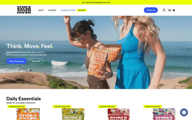
Preview image. Unlock full-res
Juicy electric canvas
Color palette
Primary action buttons, interactive elements, significant iconography – brings energy and focus
Promotional banners, decorative elements, accents for key information, secondary content borders
Green wash for highlight backgrounds, decorative bands, and soft emphasis behind content
Page backgrounds, card surfaces, input fields, navigation elements
Secondary surface background, subtle section dividers
Primary text, core iconography, strong borders, footer background
Muted text, placeholder text in input fields, supporting detail
Subtle borders, light dividers, background for disabled states
Typography
- Weights
- 400, 500, 700
- Sizes
- 12px, 14px, 16px, 17px, 18px, 20px, 32px, 34px, 36px, 40px, 43px, 48px
- Line height
- 1, 1.04, 1.15, 1.17, 1.21, 1.25, 1.4, 1.5, 1.6, 1.67
- Letter spacing
- normal
- Fallback
- Inter
Primary headings, body text, navigation elements, input labels – delivers a clean, confident, and highly readable voice across the interface.
- Weights
- 400, 500, 700
- Sizes
- 10px, 11px, 13px, 14px, 16px, 18px, 20px
- Line height
- 1, 1.15, 1.25, 1.29, 1.6
- Letter spacing
- normal
- Fallback
- Montserrat
Secondary text, descriptive elements, button text, and certain navigation links – offers a complementary, slightly more technical feel.
- Weights
- 300
- Sizes
- 18px
- Line height
- 1
Font Awesome 5 Pro — detected in extracted data but not described by AI
Spacing & shape
Components
Background: Accent Blue (#2f59f8). Text: Canvas White (#ffffff). Fully rounded corners (50px radius). Padding: 10px vertical, 20px horizontal. Font: GT Planar, weight 500.
Background: transparent. Text: Midnight Ink (#000000). No explicit border radius. Padding: 0px. Font: Founders Grotesk.
Background: Active Yellow (#eaff00) or Highlight Orange (#ff632a). Text: Midnight Ink (#000000). Fully rounded (50px radius). Padding: 4px vertical, 8px horizontal (inferred small item padding). Font: GT Planar.
Background: #d9d9d9. Text: Midnight Ink (#000000). Fully rounded (50% radius). No explicit padding observed.
Background: transparent. Border: none. Border-radius: 0px. Internal padding: 0. Some cards may have a subtle transparent background rgba(0, 0, 0, 0.1) and 16px border-radius, with 48px vertical and 16px horizontal internal padding.
Background: Canvas White (#ffffff). Border-radius: 16px. Padding: 48px vertical, 16px horizontal. No box shadow.
Background: Canvas White (#ffffff). Text color: Graphite (#707170). Border: 1px solid Steel Gray (#eeeeee). Fully rounded corners (1.67772e+07px radius). Padding: 12px vertical, 16px left, 32px right.
Guidelines
- Use Accent Blue (#2f59f8) for all primary calls to action, ensuring a fully rounded 'pill' shape with 50px border-radius and Canvas White (#ffffff) text.
- Apply Highlight Orange (#ff632a) sparingly for promotional banners, secondary content borders, and decorative accents to draw attention.
- Structure primary content on Canvas White (#ffffff) backgrounds, using Off White Clay (#f5f4f1) or transparent backgrounds for secondary sections or cards to create subtle visual breaks.
- Ensure all body text uses Founders Grotesk at appropriate weights, with Midnight Ink (#000000) for primary content and Graphite (#707170) for muted or helper text.
- Utilize a 16px border-radius for all content cards that require a defined surface, maintaining a light background.
- Maintain comfortable spacing with a base unit of 4px. Use 8px as the default element gap and 16px for card padding.
- Highlight sale or special offers with a distinctly bright Active Yellow (#eaff00) background, paired with Midnight Ink (#000000) text and a pill shape.
- Do not use dark backgrounds for general page sections; the theme is predominantly light and airy.
- Avoid arbitrary uses of color; Limit saturated colors (Highlight Orange, Accent Blue, Active Yellow) to functional or branding purposes.
- Do not introduce square corners for buttons or interactive elements; prioritize soft, rounded edges (50px or greater radius).
- Do not use complex drop shadows or elevation effects; elements should generally appear flat or with minimal, subtle elevation.
- Avoid using multiple font families beyond Founders Grotesk and GT Planar to maintain brand consistency.
- Do not decrease letter-spacing below 'normal'; the brand maintains an open and readable typographic feel.
- Avoid padding less than 10px on interactive elements to ensure adequate tap/click targets.
About this system
ShowHide
SuperMush employs a vibrant, energetic visual system akin to a modern wellness brand. It layers a crisp white canvas with a bright, electric blue for primary actions and a playful, warm orange for highlighting key information. Typography is direct and confident, favoring sans-serifs with ample letter spacing and line height for readability. Components are lightweight with subtly rounded corners, emphasizing content and a clean user experience.
The page adheres to a max-width contained layout generally centered, though specific section widths can vary to accommodate full-bleed image backgrounds. The hero section often features a full-bleed vibrant image with centered, overlaid text and calls to action. Sections maintain a consistent vertical rhythm, with content arranged in alternating text-left/image-right or centered stacks. Card grids are used for product displays with typically 4 columns. Navigation is a sticky top bar with a distinct brand logo and minimal links, complemented by the prominent Accent Blue 'Shop All' button.
Photography is dominant, featuring lifestyle shots of people using products in active, natural settings (beaches, outdoors) alongside clean, focused product photography. Treatments are largely unedited and natural-looking, showing vibrant colors and real-world contexts. Product shots are typically contained within cards with 8px radius. Icons are monochrome, often using a thin stroke, mainly for utility and navigation, appearing as simple outlines or filled shapes depending on context. Imagery serves both decorative atmosphere and product showcase, usually occupying significant visual space.
Reminiscent of Oura Ring, Athletic Greens (AG1), Huel, Ritual.
# SuperMush — Style Reference
> Juicy electric canvas

**Theme:** light

**Site:** https://supermush.com

SuperMush employs a vibrant, energetic visual system akin to a modern wellness brand. It layers a crisp white canvas with a bright, electric blue for primary actions and a playful, warm orange for highlighting key information. Typography is direct and confident, favoring sans-serifs with ample letter spacing and line height for readability. Components are lightweight with subtly rounded corners, emphasizing content and a clean user experience.

## Tokens — Colors

| Name | Value | Token | Role |
|------|------|------|------|
| Accent Blue | `#2f59f8` | `--color-accent-blue` | Primary action buttons, interactive elements, significant iconography – brings energy and focus |
| Highlight Orange | `#ff632a` | `--color-highlight-orange` | Promotional banners, decorative elements, accents for key information, secondary content borders |
| Active Yellow | `#eaff00` | `--color-active-yellow` | Green wash for highlight backgrounds, decorative bands, and soft emphasis behind content |
| Canvas White | `#ffffff` | `--color-canvas-white` | Page backgrounds, card surfaces, input fields, navigation elements |
| Off White Clay | `#f5f4f1` | `--color-off-white-clay` | Secondary surface background, subtle section dividers |
| Midnight Ink | `#000000` | `--color-midnight-ink` | Primary text, core iconography, strong borders, footer background |
| Graphite | `#707170` | `--color-graphite` | Muted text, placeholder text in input fields, supporting detail |
| Steel Gray | `#eeeeee` | `--color-steel-gray` | Subtle borders, light dividers, background for disabled states |

## Tokens — Typography

### Founders Grotesk
- **Substitute:** Inter
- **Weights:** 400, 500, 700
- **Sizes:** 12px, 14px, 16px, 17px, 18px, 20px, 32px, 34px, 36px, 40px, 43px, 48px
- **Line height:** 1, 1.04, 1.15, 1.17, 1.21, 1.25, 1.4, 1.5, 1.6, 1.67
- **Letter spacing:** normal
- **Role:** Primary headings, body text, navigation elements, input labels – delivers a clean, confident, and highly readable voice across the interface.

### GT Planar
- **Substitute:** Montserrat
- **Weights:** 400, 500, 700
- **Sizes:** 10px, 11px, 13px, 14px, 16px, 18px, 20px
- **Line height:** 1, 1.15, 1.25, 1.29, 1.6
- **Letter spacing:** normal
- **Role:** Secondary text, descriptive elements, button text, and certain navigation links – offers a complementary, slightly more technical feel.

### Font Awesome 5 Pro
- **Weights:** 300
- **Sizes:** 18px
- **Line height:** 1
- **Role:** Font Awesome 5 Pro — detected in extracted data but not described by AI

## Tokens — Type Scale

| Role | Size | Line height | Letter spacing |
|------|------|------|------|
| caption | 10px | 1.6 | — |
| body | 14px | 1.25 | — |
| body-lg | 17px | 1.5 | — |
| subheading | 20px | 1.21 | — |
| heading | 32px | 1.4 | — |
| heading-lg | 36px | 1.15 | — |
| display | 48px | 1 | — |

## Tokens — Spacing

- **Section gap:** 24px
- **Card padding:** 16px
- **Element gap:** 8px

## Tokens — Radius

- **General:** 4px
- **Buttons:** 50px
- **Inputs:** 1.67772e+07px
- **Cards:** 16px
- **imagery:** 8px

## Layout

The page adheres to a max-width contained layout generally centered, though specific section widths can vary to accommodate full-bleed image backgrounds. The hero section often features a full-bleed vibrant image with centered, overlaid text and calls to action. Sections maintain a consistent vertical rhythm, with content arranged in alternating text-left/image-right or centered stacks. Card grids are used for product displays with typically 4 columns. Navigation is a sticky top bar with a distinct brand logo and minimal links, complemented by the prominent Accent Blue 'Shop All' button.

## Imagery

Photography is dominant, featuring lifestyle shots of people using products in active, natural settings (beaches, outdoors) alongside clean, focused product photography. Treatments are largely unedited and natural-looking, showing vibrant colors and real-world contexts. Product shots are typically contained within cards with 8px radius. Icons are monochrome, often using a thin stroke, mainly for utility and navigation, appearing as simple outlines or filled shapes depending on context. Imagery serves both decorative atmosphere and product showcase, usually occupying significant visual space.

## Components

### Primary Filled Button
*Calls to action, form submissions.*

Background: Accent Blue (#2f59f8). Text: Canvas White (#ffffff). Fully rounded corners (50px radius). Padding: 10px vertical, 20px horizontal. Font: GT Planar, weight 500.

### Ghost Button (Header Nav)
*Secondary navigation in header.*

Background: transparent. Text: Midnight Ink (#000000). No explicit border radius. Padding: 0px. Font: Founders Grotesk.

### Pill Accent Button
*Information tags, small labels, sale indicators.*

Background: Active Yellow (#eaff00) or Highlight Orange (#ff632a). Text: Midnight Ink (#000000). Fully rounded (50px radius). Padding: 4px vertical, 8px horizontal (inferred small item padding). Font: GT Planar.

### Neutral Rounded Button
*Quantity selectors, small interactive elements.*

Background: #d9d9d9. Text: Midnight Ink (#000000). Fully rounded (50% radius). No explicit padding observed.

### Product Card
*Displaying product items in grids.*

Background: transparent. Border: none. Border-radius: 0px. Internal padding: 0. Some cards may have a subtle transparent background rgba(0, 0, 0, 0.1) and 16px border-radius, with 48px vertical and 16px horizontal internal padding.

### Subtle Elevated Card
*For reviews or distinct content blocks.*

Background: Canvas White (#ffffff). Border-radius: 16px. Padding: 48px vertical, 16px horizontal. No box shadow.

### Pill Input Field
*Text input forms.*

Background: Canvas White (#ffffff). Text color: Graphite (#707170). Border: 1px solid Steel Gray (#eeeeee). Fully rounded corners (1.67772e+07px radius). Padding: 12px vertical, 16px left, 32px right.

## Guidelines

### Do

- Use Accent Blue (#2f59f8) for all primary calls to action, ensuring a fully rounded 'pill' shape with 50px border-radius and Canvas White (#ffffff) text.
- Apply Highlight Orange (#ff632a) sparingly for promotional banners, secondary content borders, and decorative accents to draw attention.
- Structure primary content on Canvas White (#ffffff) backgrounds, using Off White Clay (#f5f4f1) or transparent backgrounds for secondary sections or cards to create subtle visual breaks.
- Ensure all body text uses Founders Grotesk at appropriate weights, with Midnight Ink (#000000) for primary content and Graphite (#707170) for muted or helper text.
- Utilize a 16px border-radius for all content cards that require a defined surface, maintaining a light background.
- Maintain comfortable spacing with a base unit of 4px. Use 8px as the default element gap and 16px for card padding.
- Highlight sale or special offers with a distinctly bright Active Yellow (#eaff00) background, paired with Midnight Ink (#000000) text and a pill shape.

### Don't

- Do not use dark backgrounds for general page sections; the theme is predominantly light and airy.
- Avoid arbitrary uses of color; Limit saturated colors (Highlight Orange, Accent Blue, Active Yellow) to functional or branding purposes.
- Do not introduce square corners for buttons or interactive elements; prioritize soft, rounded edges (50px or greater radius).
- Do not use complex drop shadows or elevation effects; elements should generally appear flat or with minimal, subtle elevation.
- Avoid using multiple font families beyond Founders Grotesk and GT Planar to maintain brand consistency.
- Do not decrease letter-spacing below 'normal'; the brand maintains an open and readable typographic feel.
- Avoid padding less than 10px on interactive elements to ensure adequate tap/click targets.

## Agent Prompt Guide

Quick Color Reference:
text: #000000
background: #ffffff
border: #eeeeee
accent: #ff632a
primary action: #2f59f8 (filled action)

Example Component Prompts:
1. Create a Primary Action Button: #2f59f8 background, #ffffff text, 9999px radius, compact pill padding. Use this filled treatment for the main CTA.
3. Create a review card: use Subtle Elevated Card style, with review text in Founders Grotesk weight 400 at 14px, color Midnight Ink (#000000). Reviewer name in GT Planar weight 500 at 12px, color Graphite (#707170).
More like this






Keep what you find
A free account saves references to boards and can send you a weekly email of picks based on what you save.
To see every result, go Pro.