Preview image. Unlock full-res
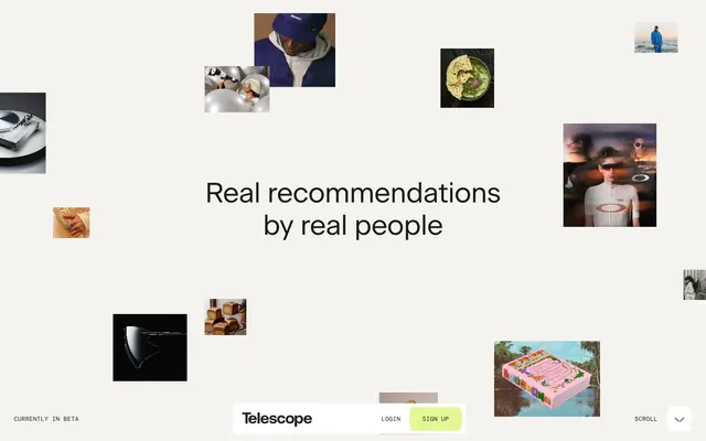
Warm parchment, scattered Polaroids
Color palette
Green wash for highlight backgrounds, decorative bands, and soft emphasis behind content. Do not promote it to the primary CTA color
Page backgrounds, card surfaces, UI canvases — a foundational warm off-white
Neutral form states, badge text, and quiet UI feedback where color should stay understated. Do not promote it to the primary CTA color
Secondary surface background, elevated UI elements
Muted body text, secondary icons, subtle borders for informational elements
Decorative SVG fills, illustrative elements
Typography
- Weights
- 400
- Sizes
- 19px, 23px, 55px, 57px
- Line height
- 1.05, 1.15
- Letter spacing
- -0.0200em, -0.0170em, -0.0070em
- Fallback
- system-ui
Primary headings and body text — conveys a premium, relaxed editorial style with its wide tracking for large sizes, tightening for smaller text.
- Weights
- 400
- Sizes
- 12px
- Line height
- 1.1
- Letter spacing
- 0.0300em
- Fallback
- Menlo
Utility text, badges, and smaller labels — a clear, spaced-out monospace for functional elements.
- Weights
- 400
- Sizes
- 250px
- Line height
- 1
- Letter spacing
- -0.0020em
- Fallback
- system-ui
Display headings — reserved for high-impact, oversized titles; its negative letter-spacing creates a sense of gravitas and modernity.
Spacing & shape
Components
Text-only buttons using Deep Graphite (#1a1915) for text and border, with 0px radius and minimal padding.
Filled button with Spring Bud (#e3f794) background and Deep Graphite (#1a1915) text, using 0px radius.
Text-only badges with Deep Graphite (#1a1915) text on a transparent background, 0px radius.
Image-focused cards with 0px radius borders, no background, and no shadow, acting as unconstrained visual elements.
Guidelines
- Prioritize Deep Graphite (#1a1915) for all primary text and headers to maintain a grounded aesthetic.
- Use Soft Vanilla (#f4f3f0) as the default background for most page sections and card surfaces.
- Apply Spring Bud (#e3f794) sparingly for action indicators, accent fills, and highlights to provide a focused point of interest.
- Maintain 0px border radius for all buttons and content cards, promoting a sharp, clean edge.
- Utilize a 135px vertical section gap to ensure abundant breathing room between distinct content blocks.
- Set the letter-spacing for display typography (250px CM Geom) to -0.0020em to achieve a refined, tight fit.
- Employ DM Mono at 12px with 0.0300em letter spacing for small functional text like captions and badges.
- Avoid using harsh white backgrounds directly adjacent to type; prefer the softer Soft Vanilla (#f4f3f0).
- Do not introduce additional saturated colors; the Spring Bud (#e3f794) is the singular chromatic accent.
- Refrain from using shadows or elevation on cards; content should feel flat and unburdened.
- Do not deviate from 0px border radius for primary UI elements like buttons and cards, as rounded corners are not part of this visual system.
- Avoid dense, stacked content; prioritize whitespace and generous element gaps (10px minimum).
- Do not use overly bold or heavy weights for headings; maintain the Beausite 400 weight for a refined feel.
About this system
ShowHide
Telescope embraces a warm, organic minimalism with off-white canvases and rich, dark typography. The design feels grounded through a single vibrant green accent used sparingly for active states and highlights. A sense of relaxed, curated discovery is conveyed by the loose typographic arrangements and the overall spaciousness. Imagery, when present, is small, floating, and acts as visual anchors in a predominantly airy layout.
Reminiscent of Are.na, Read.cv, Letterboxd.
# Telescope — Style Reference
> Warm parchment, scattered Polaroids

**Theme:** light

**Site:** https://telescope.fyi

Telescope embraces a warm, organic minimalism with off-white canvases and rich, dark typography. The design feels grounded through a single vibrant green accent used sparingly for active states and highlights. A sense of relaxed, curated discovery is conveyed by the loose typographic arrangements and the overall spaciousness. Imagery, when present, is small, floating, and acts as visual anchors in a predominantly airy layout.

## Tokens — Colors

| Name | Value | Token | Role |
|------|------|------|------|
| Spring Bud | `#e3f794` | `--color-spring-bud` | Green wash for highlight backgrounds, decorative bands, and soft emphasis behind content. Do not promote it to the primary CTA color |
| Soft Vanilla | `#f4f3f0` | `--color-soft-vanilla` | Page backgrounds, card surfaces, UI canvases — a foundational warm off-white |
| Deep Graphite | `#1a1915` | `--color-deep-graphite` | Neutral form states, badge text, and quiet UI feedback where color should stay understated. Do not promote it to the primary CTA color |
| White Canvas | `#ffffff` | `--color-white-canvas` | Secondary surface background, elevated UI elements |
| Ash Gray | `#82868e` | `--color-ash-gray` | Muted body text, secondary icons, subtle borders for informational elements |
| Pure Black | `#000000` | `--color-pure-black` | Decorative SVG fills, illustrative elements |

## Tokens — Typography

### Beausite
- **Substitute:** system-ui
- **Weights:** 400
- **Sizes:** 19px, 23px, 55px, 57px
- **Line height:** 1.05, 1.15
- **Letter spacing:** -0.0200em, -0.0170em, -0.0070em
- **Role:** Primary headings and body text — conveys a premium, relaxed editorial style with its wide tracking for large sizes, tightening for smaller text.

### DM Mono
- **Substitute:** Menlo
- **Weights:** 400
- **Sizes:** 12px
- **Line height:** 1.1
- **Letter spacing:** 0.0300em
- **Role:** Utility text, badges, and smaller labels — a clear, spaced-out monospace for functional elements.

### CM Geom
- **Substitute:** system-ui
- **Weights:** 400
- **Sizes:** 250px
- **Line height:** 1
- **Letter spacing:** -0.0020em
- **Role:** Display headings — reserved for high-impact, oversized titles; its negative letter-spacing creates a sense of gravitas and modernity.

## Tokens — Type Scale

| Role | Size | Line height | Letter spacing |
|------|------|------|------|
| caption | 12px | 1.1 | 0.36px |
| body | 19px | 1.15 | -0.38px |
| subheading | 23px | 1.15 | -0.39px |
| heading | 55px | 1.05 | -0.38px |
| display | 250px | 1 | -0.5px |

## Tokens — Spacing

- **Section gap:** 135px
- **Card padding:** 0px
- **Element gap:** 10px

## Tokens — Radius

- **Default:** 2px
- **Buttons:** 0px
- **Cards:** 0px

## Components

### Ghost Button
*Secondary action button*

Text-only buttons using Deep Graphite (#1a1915) for text and border, with 0px radius and minimal padding.

### Accent Filled Button
*Primary action button*

Filled button with Spring Bud (#e3f794) background and Deep Graphite (#1a1915) text, using 0px radius.

### Information Badge
*Informational tag*

Text-only badges with Deep Graphite (#1a1915) text on a transparent background, 0px radius.

### Floating Content Card
*Visual content container*

Image-focused cards with 0px radius borders, no background, and no shadow, acting as unconstrained visual elements.

## Guidelines

### Do

- Prioritize Deep Graphite (#1a1915) for all primary text and headers to maintain a grounded aesthetic.
- Use Soft Vanilla (#f4f3f0) as the default background for most page sections and card surfaces.
- Apply Spring Bud (#e3f794) sparingly for action indicators, accent fills, and highlights to provide a focused point of interest.
- Maintain 0px border radius for all buttons and content cards, promoting a sharp, clean edge.
- Utilize a 135px vertical section gap to ensure abundant breathing room between distinct content blocks.
- Set the letter-spacing for display typography (250px CM Geom) to -0.0020em to achieve a refined, tight fit.
- Employ DM Mono at 12px with 0.0300em letter spacing for small functional text like captions and badges.

### Don't

- Avoid using harsh white backgrounds directly adjacent to type; prefer the softer Soft Vanilla (#f4f3f0).
- Do not introduce additional saturated colors; the Spring Bud (#e3f794) is the singular chromatic accent.
- Refrain from using shadows or elevation on cards; content should feel flat and unburdened.
- Do not deviate from 0px border radius for primary UI elements like buttons and cards, as rounded corners are not part of this visual system.
- Avoid dense, stacked content; prioritize whitespace and generous element gaps (10px minimum).
- Do not use overly bold or heavy weights for headings; maintain the Beausite 400 weight for a refined feel.

## Agent Prompt Guide

Quick Color Reference:
text: #1a1915
background: #f4f3f0
border: #1a1915 (for interactive elements), #82868e (for muted/informational borders)
accent: #e3f794
primary action: no distinct CTA color

Example Component Prompts:
1. Create a Primary Headline: 'Real recommendations by real people' using Beausite 400 at 57px, line height 1.05 and letter-spacing -0.96px, color Deep Graphite (#1a1915), centered. Ensure ample space around it using sectionGap.
No distinct primary action color was observed; use the extracted neutral button treatments instead of inventing a filled CTA color.
3. Create a Subtext line: 'Currently in Beta' using DM Mono 400 at 12px, line height 1.1, letter-spacing 0.36px, color Ash Gray (#82868e).
More like this









Keep what you find
A free account saves references to boards and can send you a weekly email of picks based on what you save.
To see every result, go Pro.