Preview image. Unlock full-res
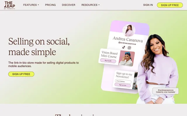
Playful digital canvas: light, rounded, and vividly accented.
Color palette
Primary text, prominent links, heading, and subtle outlined borders. This deep, muted brown provides a grounded contrast to the otherwise light and vibrant palette
Background gradient for hero sections and prominent visual areas, creating a soft, organic wash of color
Primary calls to action, active navigation states, and highlight backgrounds. This vivid yellow-green injects energy and a playful urgency into interactive elements
Background for secondary cards or content sections, offering a cool, muted contrast to the warmer greens and yellows
Decorative card backgrounds and gradient components, contributing to the fresh, vibrant feel; Accent gradient for specific sections, blending earthy green with soft gray
Secondary card backgrounds and visual accents, deepening the site's overall green-yellow thematic
Dynamic visual gradients hinting at interactivity or depth
Dominant page background, neutral borders, and subtle separators. This light gray serves as the primary canvas for the UI
Card backgrounds and secondary surface elements, providing a slightly brighter white for content areas
Typography
- Weights
- 350, 400
- Sizes
- 13px, 15px, 16px, 20px, 29px
- Line height
- 1, 1.5
- Letter spacing
- 0.13, 0.15, 0.13, 0.2, -0.435
- Fallback
- Inter
Body text and user interface elements. This custom sans-serif brings a friendly, approachable tone to detailed information and controls.
- Weights
- 350, 400
- Sizes
- 14px, 15px, 16px, 20px, 22px, 25px, 27px, 30px
- Line height
- 1, 1.07, 1.2
- Letter spacing
- 0.14, 0.15, 0.14, 0.2, 0.22, 0.175, -0.54, -0.6
- Fallback
- Inter
Subheadings, specific callouts, and secondary buttons. It extends the Favorit family with slightly more robust proportions for mid-size text.
- Weights
- 700
- Sizes
- 18px, 24px
- Line height
- 1, 1.2
- Letter spacing
- 0.18, -0.888
- Fallback
- Inter
Section titles and emphasized short phrases. Its bold weight brings hierarchy and impact without losing the friendly character.
- Weights
- 300
- Sizes
- 54px, 60px, 70px
- Line height
- 1.03, 1.2
- Letter spacing
- -1.08, -1.2, -1.4
- Fallback
- Playfair Display
Hero and display headings. This light-weight serif exudes a refined confidence, creating a distinctive and memorable brand voice.
- Weights
- 400
- Sizes
- 20px
- Line height
- 1.2
- Letter spacing
- 0.16
- Fallback
- Inter
Specific iconography and decorative text elements. Provides a consistent base for small, functional text.
Spacing & shape
Components
Filled button with 'Lemon Zest' (#ecf956) background, 'Earth Clay' (#482317) text, and a highly rounded '100px' border-radius. Padding is 10px top / 7px bottom, 30px horizontal, creating an elongated, soft pill shape. Text uses ABC Favorit weight 400.
Text link using Favorit font, weight 350, with 'Earth Clay' (#482317) color. No background, minimal padding, and an implicit active state shown through 'Lemon Zest' (#ecf956) backgrounds in specific contexts.
Utilizes 'Whisper White' (#fafafa) background, '30px' border-radius, and no explicit border or shadow, relying on spacing and background contrast for definition. Inner padding is '40px' all around.
Features 'Whisper White' (#fafafa) background, a '15px' border-radius, and no shadow. Internal padding is tighter at '15px' vertical and '22px' horizontal.
Uses 'Whisper White' (#fafafa) background with a '30px' border-radius, similar to standard but with more generous '53px' vertical and '50px' horizontal padding.
A visually distinct card with 'Sky Mist' (#b1dcfc) background and a '28px' border-radius. It appears to act as a background element for layered content, featuring no explicit padding as the inner content dictates spacing.
Guidelines
- Prioritize 'Earth Clay' (#482317) for all primary text and 'Lemon Zest' (#ecf956) for primary interactive elements.
- Use 'Tobias' weight 300 for significant display headings, emphasizing its unique character and light visual weight.
- Apply a '100px' border-radius to buttons and tags to maintain the soft, playful aesthetic.
- Layer text on 'Page Canvas' (#e5e7eb) or 'Whisper White' (#fafafa) for optimal contrast, ensuring readability for smaller text sizes.
- Employ linear gradients like 'Lavender Bloom Gradient' for backgrounds to create subtle depth and organic visual interest.
- Maintain a comfortable density with an 'elementGap' of '16px' and 'cardPadding' of '30px' for most content blocks.
- Avoid sharp corners; all functional elements like cards and buttons should use generous border-radii (e.g., 30px or 100px).
- Do not use dark or opaque backgrounds for body text; maintain the light theme with high contrast text on pale surfaces.
- Refrain from heavy drop shadows; rely on background gradients and distinct background colors for visual separation.
- Do not introduce new typefaces; utilize the established Favorit and Tobias families exclusively.
- Avoid overly dense layouts; use generous spacing including a 'sectionGap' of '24px' to provide breathing room.
- Do not use highly saturated blues or reds outside of the approved accent and semantic palettes; these would clash with the existing vibrant but pastel-influenced brand colors.
About this system
ShowHide
The Leap channels a vibrant, upbeat digital playground aesthetic through a light canvas, rounded organic shapes, and a playful brand palette. Typography uses custom, expressive sans-serifs, reserving a sophisticated serif for display headings. Surfaces are flat and borderless, relying on soft elevation and vivid background gradients to define regions. The system embraces a joyful, approachable tone, making heavy use of a bright yellow-green accent for calls to action and highlights, contrasting with a deep, muted brown for primary text. Design elements feel organic and friendly, avoiding sharp angles or heavy dividers.
The page uses a full-bleed model with content centered within an implied maximum width, creating a spacious feel. The hero section features a large, sophisticated serif headline centered over a soft gradient background with a prominent product mockup on the right. Sections alternate between a light 'Page Canvas' background and soft decorative gradients. Content is often arranged in prominent two-column layouts, combining text on the left with a visual element on the right, or three-column card grids for features and testimonials. Vertical section spacing is comfortable, promoting a flow from one block to the next without harsh dividers. The sticky top navigation is minimal, featuring a discreet logo, text links, and a 'Lemon Zest' pill-shaped primary action button.
The site predominantly uses product screenshots and abstract, playful illustrations to convey its message. Product screenshots are typically presented as mobile device mockups, often within a blurred, pastel-gradient background, showing clear, staged UI. Illustrations are flat, geometric, and often outlined, depicting abstract concepts or simplified figures with brand colors like 'Lemon Zest' as accents. Photography is primarily lifestyle-oriented, showcasing creators, often cropped with organic, soft-edged masking or placed within decorative frames. Icons are minimalist, outlined, and mono-color, typically in 'Earth Clay'. Imagery plays a dual role: explanatory for product features and aspirational for creator lifestyle, maintaining a light, approachable density within sections.
Reminiscent of Canva, FloDesk, Linktree, Buffer, Notion.
# The Leap — Style Reference
> Playful digital canvas: light, rounded, and vividly accented.

**Theme:** light

**Site:** https://www.theleap.co

The Leap channels a vibrant, upbeat digital playground aesthetic through a light canvas, rounded organic shapes, and a playful brand palette. Typography uses custom, expressive sans-serifs, reserving a sophisticated serif for display headings. Surfaces are flat and borderless, relying on soft elevation and vivid background gradients to define regions. The system embraces a joyful, approachable tone, making heavy use of a bright yellow-green accent for calls to action and highlights, contrasting with a deep, muted brown for primary text. Design elements feel organic and friendly, avoiding sharp angles or heavy dividers.

## Tokens — Colors

| Name | Value | Token | Role |
|------|------|------|------|
| Earth Clay | `#482317` | `--color-earth-clay` | Primary text, prominent links, heading, and subtle outlined borders. This deep, muted brown provides a grounded contrast to the otherwise light and vibrant palette |
| Lavender Bloom Gradient | `#f3e8f3` | `--color-lavender-bloom-gradient` | Background gradient for hero sections and prominent visual areas, creating a soft, organic wash of color |
| Lemon Zest | `#ecf956` | `--color-lemon-zest` | Primary calls to action, active navigation states, and highlight backgrounds. This vivid yellow-green injects energy and a playful urgency into interactive elements |
| Sky Mist | `#b1dcfc` | `--color-sky-mist` | Background for secondary cards or content sections, offering a cool, muted contrast to the warmer greens and yellows |
| Lime Spritz | `#c6e57d` | `--color-lime-spritz` | Decorative card backgrounds and gradient components, contributing to the fresh, vibrant feel; Accent gradient for specific sections, blending earthy green with soft gray |
| Meadow Glow | `#f3fb9a` | `--color-meadow-glow` | Secondary card backgrounds and visual accents, deepening the site's overall green-yellow thematic |
| Sky Burst Gradient | `#29a7ff` | `--color-sky-burst-gradient` | Dynamic visual gradients hinting at interactivity or depth |
| Page Canvas | `#e5e7eb` | `--color-page-canvas` | Dominant page background, neutral borders, and subtle separators. This light gray serves as the primary canvas for the UI |
| Whisper White | `#fafafa` | `--color-whisper-white` | Card backgrounds and secondary surface elements, providing a slightly brighter white for content areas |

## Tokens — Typography

### Favorit
- **Substitute:** Inter
- **Weights:** 350, 400
- **Sizes:** 13px, 15px, 16px, 20px, 29px
- **Line height:** 1, 1.5
- **Letter spacing:** 0.13, 0.15, 0.13, 0.2, -0.435
- **Role:** Body text and user interface elements. This custom sans-serif brings a friendly, approachable tone to detailed information and controls.

### ABC Favorit
- **Substitute:** Inter
- **Weights:** 350, 400
- **Sizes:** 14px, 15px, 16px, 20px, 22px, 25px, 27px, 30px
- **Line height:** 1, 1.07, 1.2
- **Letter spacing:** 0.14, 0.15, 0.14, 0.2, 0.22, 0.175, -0.54, -0.6
- **Role:** Subheadings, specific callouts, and secondary buttons. It extends the Favorit family with slightly more robust proportions for mid-size text.

### Favorit-Bold
- **Substitute:** Inter
- **Weights:** 700
- **Sizes:** 18px, 24px
- **Line height:** 1, 1.2
- **Letter spacing:** 0.18, -0.888
- **Role:** Section titles and emphasized short phrases. Its bold weight brings hierarchy and impact without losing the friendly character.

### Tobias
- **Substitute:** Playfair Display
- **Weights:** 300
- **Sizes:** 54px, 60px, 70px
- **Line height:** 1.03, 1.2
- **Letter spacing:** -1.08, -1.2, -1.4
- **Role:** Hero and display headings. This light-weight serif exudes a refined confidence, creating a distinctive and memorable brand voice.

### Favorit-Regular
- **Substitute:** Inter
- **Weights:** 400
- **Sizes:** 20px
- **Line height:** 1.2
- **Letter spacing:** 0.16
- **Role:** Specific iconography and decorative text elements. Provides a consistent base for small, functional text.

## Tokens — Type Scale

Perfect Fourth (1.333) from 13px base.

| Role | Size | Line height | Letter spacing |
|------|------|------|------|
| caption | 13px | 1 | 0.13px |
| body-sm | 15px | 1 | 0.15px |
| subheading | 20px | 1.2 | 0.2px |
| heading | 24px | 1 | -0.888px |
| heading-lg | 29px | 1 | -0.435px |
| display | 60px | 1.03 | -1.2px |

## Tokens — Spacing

- **Section gap:** 24px
- **Card padding:** 30px
- **Element gap:** 16px

## Tokens — Radius

- **Buttons:** 100px
- **Cards:** 30px
- **badges:** 100px
- **elements:** 30px
- **navigation:** 20px

## Layout

The page uses a full-bleed model with content centered within an implied maximum width, creating a spacious feel. The hero section features a large, sophisticated serif headline centered over a soft gradient background with a prominent product mockup on the right. Sections alternate between a light 'Page Canvas' background and soft decorative gradients. Content is often arranged in prominent two-column layouts, combining text on the left with a visual element on the right, or three-column card grids for features and testimonials. Vertical section spacing is comfortable, promoting a flow from one block to the next without harsh dividers. The sticky top navigation is minimal, featuring a discreet logo, text links, and a 'Lemon Zest' pill-shaped primary action button.

## Imagery

The site predominantly uses product screenshots and abstract, playful illustrations to convey its message. Product screenshots are typically presented as mobile device mockups, often within a blurred, pastel-gradient background, showing clear, staged UI. Illustrations are flat, geometric, and often outlined, depicting abstract concepts or simplified figures with brand colors like 'Lemon Zest' as accents. Photography is primarily lifestyle-oriented, showcasing creators, often cropped with organic, soft-edged masking or placed within decorative frames. Icons are minimalist, outlined, and mono-color, typically in 'Earth Clay'. Imagery plays a dual role: explanatory for product features and aspirational for creator lifestyle, maintaining a light, approachable density within sections.

## Components

### Primary Action Button
*Call to action*

Filled button with 'Lemon Zest' (#ecf956) background, 'Earth Clay' (#482317) text, and a highly rounded '100px' border-radius. Padding is 10px top / 7px bottom, 30px horizontal, creating an elongated, soft pill shape. Text uses ABC Favorit weight 400.

### Navigation Link
*Navigation element*

Text link using Favorit font, weight 350, with 'Earth Clay' (#482317) color. No background, minimal padding, and an implicit active state shown through 'Lemon Zest' (#ecf956) backgrounds in specific contexts.

### Standard Content Card
*Content container*

Utilizes 'Whisper White' (#fafafa) background, '30px' border-radius, and no explicit border or shadow, relying on spacing and background contrast for definition. Inner padding is '40px' all around.

### Review Card
*Testimonial display*

Features 'Whisper White' (#fafafa) background, a '15px' border-radius, and no shadow. Internal padding is tighter at '15px' vertical and '22px' horizontal.

### Featured Content Card
*Prominent content container*

Uses 'Whisper White' (#fafafa) background with a '30px' border-radius, similar to standard but with more generous '53px' vertical and '50px' horizontal padding.

### Highlight Card
*Decorative content block*

A visually distinct card with 'Sky Mist' (#b1dcfc) background and a '28px' border-radius. It appears to act as a background element for layered content, featuring no explicit padding as the inner content dictates spacing.

## Guidelines

### Do

- Prioritize 'Earth Clay' (#482317) for all primary text and 'Lemon Zest' (#ecf956) for primary interactive elements.
- Use 'Tobias' weight 300 for significant display headings, emphasizing its unique character and light visual weight.
- Apply a '100px' border-radius to buttons and tags to maintain the soft, playful aesthetic.
- Layer text on 'Page Canvas' (#e5e7eb) or 'Whisper White' (#fafafa) for optimal contrast, ensuring readability for smaller text sizes.
- Employ linear gradients like 'Lavender Bloom Gradient' for backgrounds to create subtle depth and organic visual interest.
- Maintain a comfortable density with an 'elementGap' of '16px' and 'cardPadding' of '30px' for most content blocks.

### Don't

- Avoid sharp corners; all functional elements like cards and buttons should use generous border-radii (e.g., 30px or 100px).
- Do not use dark or opaque backgrounds for body text; maintain the light theme with high contrast text on pale surfaces.
- Refrain from heavy drop shadows; rely on background gradients and distinct background colors for visual separation.
- Do not introduce new typefaces; utilize the established Favorit and Tobias families exclusively.
- Avoid overly dense layouts; use generous spacing including a 'sectionGap' of '24px' to provide breathing room.
- Do not use highly saturated blues or reds outside of the approved accent and semantic palettes; these would clash with the existing vibrant but pastel-influenced brand colors.

## Agent Prompt Guide

### Quick Color Reference
text: #482317
background: #e5e7eb
border: #e5e7eb
accent: #c6e57d
primary action: #ecf956 (filled action)

### 3-5 Example Component Prompts
1. Create a hero section: 'Lavender Bloom Gradient' background. Headline "Selling on social, made simple" using Tobias weight 300 at 70px, color 'Earth Clay' (#482317), letter-spacing -1.4px. Subtitle "The link-in-bio store made for selling digital products to mobile audiences." using Favorit weight 400 at 20px, color 'Earth Clay'. A Primary Action Button: 'Lemon Zest' (#ecf956) background, 'Earth Clay' (#482317) text "SIGN UP FREE", 100px radius, 10px 30px padding.
2. Design a feature card: 'Whisper White' (#fafafa) background, 30px border-radius, 40px padding. Title "Seamless customer experience" using Favorit-Bold weight 700 at 24px, color 'Earth Clay' (#482317), letter-spacing -0.888px. Body text "Create a seamless customer experience that earns you $$$, all with one simple tool." using Favorit weight 400 at 16px, color 'Earth Clay'.
3. Construct a navigation bar: 'Page Canvas' (#e5e7eb) background with a subtle nav shadow: rgba(0, 0, 0, 0.1) 0px 4px 6px -1px, rgba(0, 0, 0, 0.06) 0px 2px 4px -1px. Standard navigation links "Features", "Pricing" using Favorit weight 350 at 15px, color 'Earth Clay' (#482317). A Primary Action Button "SIGN UP FREE" using 'Lemon Zest' (#ecf956) background, 'Earth Clay' (#482317) text, 100px radius, 10px 30px padding.
4. Build a testimonial card: 'Whisper White' (#fafafa) background, 15px border-radius, 15px 22px padding. Testimonial quote text "My link in bio is GORGEOUS!" using Favorit weight 400 at 16px, color 'Earth Clay' (#482317). Author name using Favorit weight 350 at 13px, color 'Earth Clay' (#482317).
More like this







Keep what you find
A free account saves references to boards and can send you a weekly email of picks based on what you save.
To see every result, go Pro.