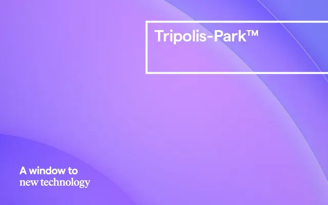
Preview image. Unlock full-res
Architectural grid on frosted glass
Color palette
Dominant background gradient for the hero section
Primary text, headings, strong borders, icon fills. Establishes a bold, high-contrast look
Page backgrounds, card surfaces, ghost button text/borders. Creates an airy, expansive feel
Subtle background surfaces, dividers. Adds a secondary layer of visual depth without strong chromatic impact
Fine graphic strokes, decorative elements where a very light touch is needed
Decorative graphic strokes and subtle dividers, creating visual separation without harshness
Alternative canvas background for certain sections, providing a slight warmth off-white
Typography
- Weights
- 400
- Sizes
- 14px, 18px, 27px, 47px
- Line height
- 1.08, 1.12, 1.2, 1.25
- Letter spacing
- -0.0250em, -0.0240em, -0.0150em, -0.0100em
- Fallback
- Inter
Versatile body and utility text for navigation, buttons, and detailed content. Its consistent weight across sizes maintains a clean, functional feel. The variable tracking adds precision.
- Weights
- 400
- Sizes
- 47px
- Line height
- 1.08, 1.12
- Letter spacing
- -0.0150em, -0.0100em
- Fallback
- Playfair Display
Distinctive display font for main headings. Its medium weight and subtle tracking create a sophisticated presence without being overpowering, suggesting gravitas.
Spacing & shape
Components
Transparent background, Canvas White text and border. Radius 0px. Text color: #ffffff, Border color: #ffffff, Background color: transparent. Padding values are handled inline by text container layout, but generally minimal, around 5px.
Transparent background, Midnight Ink text and border. Radius 0px. Text color: #000000, Border color: #000000, Background color: transparent. Padding values are handled inline by text container layout, but generally minimal, around 5px.
Solid Canvas White background with Midnight Ink text, or Midnight Ink text with a white circular border. Radius 50% for a perfect circle. Text color: #000000, Background color: #ffffff, Border: 1px solid #ffffff. No explicit padding mentioned in token but visual implies text is contained simply by circular shape.
IvarHeadline-Medium, 47px, lineHeight 1.08-1.12, letter-spacing -0.0150em or -0.0100em, Midnight Ink (#000000). Followed by 11px or 12px margin-bottom.
Matter-Regular, 14px or 18px, lineHeight 1.20-1.25, Midnight Ink (#000000). Standard padding-bottom is 23px.
Matter-Regular, 18px, Midnight Ink (#000000) or Canvas White (#ffffff) depending on background. Inherits the thin border style of Ghost Buttons.
Matter-Regular, 14px, Midnight Ink (#000000) or Canvas White (#ffffff). Features a prominent arrow icon as part of the text, often with horizontal spacing of 10px-18px from the text.
Guidelines
- Use Midnight Ink (#000000) for all primary text, headings, and distinct borders.
- Maintain Canvas White (#ffffff) as the dominant background color for most page sections, and for ghost button text/borders on dark backgrounds.
- Apply Matter-Regular (400) for body text and interactive elements, ensuring 'tnum' font feature settings are enabled for numerical consistency.
- Reserve IvarHeadline-Medium (400) at 47px for main section headings, with letter-spacing of -0.0150em or -0.0100em to establish a strong, but restrained, visual hierarchy.
- Employ a 0px border-radius for most UI elements like buttons, adhering to a sharp, modern aesthetic, unless explicitly defined as circular (50%).
- Separate content blocks and sections with a consistent 64px vertical gap where content transitions are visually distinct.
- Ensure all interactive text and ghost buttons have transparent backgrounds, with their color and border adapting to the underlying section's lightness.
- Do not introduce strong chromatic colors for backgrounds or primary UI elements outside of the hero gradient.
- Avoid using heavy shadows or distinct elevation styles; prefer subtle background color shifts or thin borders for visual separation.
- Do not deviate from the Matter and IvarHeadline font families; these are central to the brand's typographic identity.
- Do not use generic button styles; stick to the ghosted/outlined or circularly-bordered variants seen in the components section.
- Do not apply padding directly to button elements; allow the content and context to define its interactive area, or refer to button component variants.
- Avoid inconsistent horizontal spacing; adhere to the established element gaps like 5px, 10px, 18px where present.
- Do not use letter-spacing on Matter-Regular body text; it should generally use 'normal'.
About this system
ShowHide
Tripolis-Park embodies a confident-minimalist design language, characterized by a predominantly achromatic palette with only subtle background shifts. Typography is the primary conveyor of hierarchy and brand attitude, employing a mix of strong, impactful display fonts and versatile body text. Components are lightweight, often ghosted or outlined, emphasizing content and space rather than heavy ornamentation. The visual system prioritizes clarity and directness, letting information and subtle background textures speak for themselves.
The page primarily uses a max-width contained layout of 900px, centered on the screen, creating a focused content experience. The hero section, however, is full-bleed, using a dynamic violet gradient background with centered text, setting an immersive tone. Subsequent sections maintain a consistent vertical rhythm with a 64px section gap, creating a structured flow. Content often appears in stacked blocks or simple two-column arrangements, with strong headings and accompanying body text. Navigation is a sticky top bar, minimal and functional, adapting its color to the background.
This site features abstract graphics and gradients as primary visual elements, particularly in hero sections. When photography or detailed imagery is used, it appears to be tightly cropped or isolated, without busy backgrounds or lifestyle context, focusing on the essence of the subject matter. Iconography, when present, is minimalist, likely outlined or filled in achromatic tones, serving functional rather than decorative roles. The overall density of imagery is low, with visuals serving to enhance specific content sections rather than dominating the layout, creating a text-dominant feel.
Reminiscent of Framer, Linear, Pitch, Superhuman.
# Tripolis-Park™ — Style Reference
> Architectural grid on frosted glass

**Theme:** light

**Site:** https://www.tripolis-park.com

Tripolis-Park embodies a confident-minimalist design language, characterized by a predominantly achromatic palette with only subtle background shifts. Typography is the primary conveyor of hierarchy and brand attitude, employing a mix of strong, impactful display fonts and versatile body text. Components are lightweight, often ghosted or outlined, emphasizing content and space rather than heavy ornamentation. The visual system prioritizes clarity and directness, letting information and subtle background textures speak for themselves.

## Tokens — Colors

| Name | Value | Token | Role |
|------|------|------|------|
| Tripolis Violet | `#ab8ff2` | `--color-tripolis-violet` | Dominant background gradient for the hero section |
| Midnight Ink | `#000000` | `--color-midnight-ink` | Primary text, headings, strong borders, icon fills. Establishes a bold, high-contrast look |
| Canvas White | `#ffffff` | `--color-canvas-white` | Page backgrounds, card surfaces, ghost button text/borders. Creates an airy, expansive feel |
| Medium Gray | `#808080` | `--color-medium-gray` | Subtle background surfaces, dividers. Adds a secondary layer of visual depth without strong chromatic impact |
| Light Stroke | `#e2e2e2` | `--color-light-stroke` | Fine graphic strokes, decorative elements where a very light touch is needed |
| Subtle Stroke | `#cccccc` | `--color-subtle-stroke` | Decorative graphic strokes and subtle dividers, creating visual separation without harshness |
| Desert White | `#f0edea` | `--color-desert-white` | Alternative canvas background for certain sections, providing a slight warmth off-white |

## Tokens — Typography

### Matter
- **Substitute:** Inter
- **Weights:** 400
- **Sizes:** 14px, 18px, 27px, 47px
- **Line height:** 1.08, 1.12, 1.2, 1.25
- **Letter spacing:** -0.0250em, -0.0240em, -0.0150em, -0.0100em
- **Role:** Versatile body and utility text for navigation, buttons, and detailed content. Its consistent weight across sizes maintains a clean, functional feel. The variable tracking adds precision.

### IvarHeadline
- **Substitute:** Playfair Display
- **Weights:** 400
- **Sizes:** 47px
- **Line height:** 1.08, 1.12
- **Letter spacing:** -0.0150em, -0.0100em
- **Role:** Distinctive display font for main headings. Its medium weight and subtle tracking create a sophisticated presence without being overpowering, suggesting gravitas.

## Tokens — Type Scale

Perfect Fifth (1.5) from 18px base.

| Role | Size | Line height | Letter spacing |
|------|------|------|------|
| caption | 14px | 1.2 | — |
| body | 18px | 1.25 | — |
| subheading | 27px | 1.25 | — |
| heading | 47px | 1.08 | -0.48px |

## Tokens — Spacing

- **Max width:** 900px
- **Section gap:** 64px
- **Card padding:** 23px
- **Element gap:** 5px

## Tokens — Radius

- **Default:** 0px
- **circular:** 50%

## Layout

The page primarily uses a max-width contained layout of 900px, centered on the screen, creating a focused content experience. The hero section, however, is full-bleed, using a dynamic violet gradient background with centered text, setting an immersive tone. Subsequent sections maintain a consistent vertical rhythm with a 64px section gap, creating a structured flow. Content often appears in stacked blocks or simple two-column arrangements, with strong headings and accompanying body text. Navigation is a sticky top bar, minimal and functional, adapting its color to the background.

## Imagery

This site features abstract graphics and gradients as primary visual elements, particularly in hero sections. When photography or detailed imagery is used, it appears to be tightly cropped or isolated, without busy backgrounds or lifestyle context, focusing on the essence of the subject matter. Iconography, when present, is minimalist, likely outlined or filled in achromatic tones, serving functional rather than decorative roles. The overall density of imagery is low, with visuals serving to enhance specific content sections rather than dominating the layout, creating a text-dominant feel.

## Components

### Ghost Button (Light)
*Navigation and secondary actions on dark backgrounds.*

Transparent background, Canvas White text and border. Radius 0px. Text color: #ffffff, Border color: #ffffff, Background color: transparent. Padding values are handled inline by text container layout, but generally minimal, around 5px.

### Ghost Button (Dark)
*Navigation and secondary actions on light backgrounds.*

Transparent background, Midnight Ink text and border. Radius 0px. Text color: #000000, Border color: #000000, Background color: transparent. Padding values are handled inline by text container layout, but generally minimal, around 5px.

### Circular Play Button
*Primary action button, typically for media playback.*

Solid Canvas White background with Midnight Ink text, or Midnight Ink text with a white circular border. Radius 50% for a perfect circle. Text color: #000000, Background color: #ffffff, Border: 1px solid #ffffff. No explicit padding mentioned in token but visual implies text is contained simply by circular shape.

### Section Heading (IvarHeadline)
*Main content section titles.*

IvarHeadline-Medium, 47px, lineHeight 1.08-1.12, letter-spacing -0.0150em or -0.0100em, Midnight Ink (#000000). Followed by 11px or 12px margin-bottom.

### Body Text (Matter-Regular)
*General paragraph text and descriptive content.*

Matter-Regular, 14px or 18px, lineHeight 1.20-1.25, Midnight Ink (#000000). Standard padding-bottom is 23px.

### Navigation Link
*Primary navigation items.*

Matter-Regular, 18px, Midnight Ink (#000000) or Canvas White (#ffffff) depending on background. Inherits the thin border style of Ghost Buttons.

### Interactive Link (Arrow)
*Contextual links with directional arrows for actions like 'Learn more'.*

Matter-Regular, 14px, Midnight Ink (#000000) or Canvas White (#ffffff). Features a prominent arrow icon as part of the text, often with horizontal spacing of 10px-18px from the text.

## Guidelines

### Do

- Use Midnight Ink (#000000) for all primary text, headings, and distinct borders.
- Maintain Canvas White (#ffffff) as the dominant background color for most page sections, and for ghost button text/borders on dark backgrounds.
- Apply Matter-Regular (400) for body text and interactive elements, ensuring 'tnum' font feature settings are enabled for numerical consistency.
- Reserve IvarHeadline-Medium (400) at 47px for main section headings, with letter-spacing of -0.0150em or -0.0100em to establish a strong, but restrained, visual hierarchy.
- Employ a 0px border-radius for most UI elements like buttons, adhering to a sharp, modern aesthetic, unless explicitly defined as circular (50%).
- Separate content blocks and sections with a consistent 64px vertical gap where content transitions are visually distinct.
- Ensure all interactive text and ghost buttons have transparent backgrounds, with their color and border adapting to the underlying section's lightness.

### Don't

- Do not introduce strong chromatic colors for backgrounds or primary UI elements outside of the hero gradient.
- Avoid using heavy shadows or distinct elevation styles; prefer subtle background color shifts or thin borders for visual separation.
- Do not deviate from the Matter and IvarHeadline font families; these are central to the brand's typographic identity.
- Do not use generic button styles; stick to the ghosted/outlined or circularly-bordered variants seen in the components section.
- Do not apply padding directly to button elements; allow the content and context to define its interactive area, or refer to button component variants.
- Avoid inconsistent horizontal spacing; adhere to the established element gaps like 5px, 10px, 18px where present.
- Do not use letter-spacing on Matter-Regular body text; it should generally use 'normal'.

## Agent Prompt Guide

**Quick Color Reference:**
- text: #000000
- background: #ffffff
- border: #000000
- accent: #ab8ff2 (gradient start)
- primary action: no distinct CTA color

**3-5 Example Component Prompts:**
- Create a Hero Section: full-bleed background using the Tripolis Violet gradient (linear-gradient(135deg, #ab8ff2, #7a60b9, #5c448d, #493374)). Add a centered main heading: 'Tripolis-Park™' (Matter-SemiBold, 47px, #ffffff, lineHeight 1.12, letterSpacing -1.13px). Below it, add a Ghost Button (Light): '→ → Play film' (Matter-Regular, 18px, #ffffff, border 1px solid #ffffff, 0px radius).
- Create a Feature Section with a Body Heading: background Canvas White (#ffffff). Heading: 'A window to new technology' (IvarHeadline-Medium, 47px, #000000, lineHeight 1.08, letterSpacing -0.71px, with 12px margin-bottom).
- Create a standard paragraph: text 'An eco-conscious campus built to stimulate the mind. Defining a new vision for today’s workforce, right in the heart of Amsterdam.' (Matter-Regular, 18px, #000000, lineHeight 1.25, with 23px margin-bottom).
- Create a Navigation Link: text 'News' (Matter-Regular, 18px, #000000). This should be rendered as a ghost button, adapting its text and border color to the white background.
More like this









Keep what you find
A free account saves references to boards and can send you a weekly email of picks based on what you save.
To see every result, go Pro.