Preview image. Unlock full-res
Monochromatic architectural blueprint – precise, functional forms on a stark, bright canvas.
Color palette
Page background, primary card surfaces, popovers. The foundational bright base.
Secondary background for segmented sections or subtle card differentiation. Lighter than default background.
Border colors for inputs, cards, and dividers. Provides definition without harshness.
Muted text, placeholder text in inputs, secondary icons. Recedes into the background.
Primary text color for body copy, standard icons, badges with white text. High contrast for readability.
Headings, active state button backgrounds, highlighted text. The darkest tone for strong emphasis.
Destructive actions, error states. A muted, serious red.
Success states, positive confirmations. A muted, serious green.
Typography
- Weights
- 400, 500, 600
- Sizes
- 12px, 13px, 14px, 16px, 18px, 48px
- Line height
- 1, 1.1, 1.2, 1.33, 1.38, 1.43, 1.5, 1.56, 1.63, 2
- Letter spacing
- -0.0500em at 48px, -0.0250em at 18px
- Fallback
- Inter
Primary brand font for all UI text, headings, and body. Its varied weights and precise tracking create a modern, technical feel.
- Weights
- 400
- Sizes
- 14px
- Line height
- 1.43
- Letter spacing
- normal
- Fallback
- IBM Plex Mono
Used for code snippets or specific input fields requiring monospaced characters. Reinforces a technical aesthetic.
Spacing & shape
Elevation
Components
Solid Deep Black (#000000) background with Canvas White (#ffffff) text. Features a 10px border-radius, 8px vertical padding, and 48px horizontal padding, making it a prominent rectangular element.
Transparent background with Rich Black (#0a0a0a) text. Uses a 9999px border-radius for a pill shape, with no explicit padding defined by variants, implying content-based sizing.
Canvas White (#ffffff) background with Deep Black (#000000) text. Features a 10px border-radius on the left, 0px on the right, and 10px horizontal padding. Borders in Subtle Ash (#e5e5e5).
Canvas White (#ffffff) background with Deep Black (#000000) text. Features a 10px border-radius on the right, 0px on the left. Borders in Subtle Ash (#e5e5e5).
Canvas White (#ffffff) background with a 14px border-radius. Features a subtle shadow: oklab(0.145 -0.00000143796 0.00000340492 / 0.1) 0px 0px 0px 1px, providing minimal elevation. Inner content padding is 16px.
Transparent background with Rich Black (#0a0a0a) text. Defined by a 1px Subtle Ash (#e5e5e5) border and a 10px border-radius. Inner padding is 4px vertical, 10px horizontal.
Transparent background with Rich Black (#0a0a0a) text. Features a 10px border-radius on the left and 0px on the right. Defined by a 1px Subtle Ash (#e5e5e5) border. Inner padding is 4px vertical, 10px horizontal.
Deep Black (#171717) background with Canvas White (#ffffff) text. Features a 26px border-radius, creating a pill shape. Padding is 2px vertical, 8px horizontal.
Ghost Gray (#f2f2f2) background with Rich Black (#0a0a0a) text. Features a 26px border-radius, creating a pill shape. Padding is 2px vertical, 8px horizontal.
Transparent background with Rich Black (#0a0a0a) text. Features a 26px border-radius and a Light Ash (#a1a1a1) border. Padding is 2px vertical, 8px horizontal.
Guidelines
- Use Deep Black (#000000) for primary headings and active states to command attention.
- Apply Subtle Ash (#e5e5e5) for all primary borders and dividers to maintain a subtle visual separation.
- Ensure input fields and cards consistently use a 10px or 14px border-radius, respectively, for geometric stability.
- Employ Geist font universally, leveraging its 400, 500, and 600 weights to establish clear hierarchy without introducing new typefaces.
- Maintain a default element gap of 8px, but use 16px for card inner padding to create adequate breathing room for content.
- Utilize 9999px or 26px border-radius for all interactive buttons and badges to create a soft, approachable pill shape.
- Avoid using highly saturated colors; stick to the achromatic scale and the two semantic reds and greens.
- Do not introduce additional font families; the current choices are sufficient for all typographic needs.
- Refrain from using strong, multi-directional shadows; rely on minimal 1px shadows or simple borders for elevation.
- Do not deviate from the established border-radius values; the mix of sharp 0px (in split elements), 10px, 14px, and 9999px is intentional.
- Don't add excessive padding or margin; the design favors a compact density with specific, calculated spacing.
- Avoid decorative gradients; the brand's aesthetic is built on flat colors and subtle depth.
About this system
ShowHide
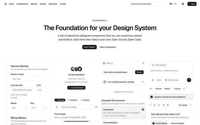
This design system feels like a finely tuned machine, presenting a clean and precise interface with a stark black-and-white aesthetic. The visual mood is serious and functional, achieved through a dominant achromatic palette and very subtle elevation. Geometric balance is created by mixing hard 10-14px radii for cards and inputs with highly rounded (near-pill) buttons and badges, suggesting both structure and approachability. The use of a custom sans-serif font across all elements with meticulous letter-spacing creates a unified, crisp typographic voice.
The page maintains a centered, contained layout with a maximum visible width, creating a focused content area. The hero section features a prominent, centered headline and subtext over the Canvas White background, followed by centrally aligned CTA buttons. Sections below are arranged in a multi-column grid, showcasing various UI components (forms, cards, controls). The rhythm is consistent vertical spacing, creating an organized, information-dense display. Navigation is a sticky top-bar with compact links and utility actions.
The visual language is purely utilitarian and functional. No photography or complex illustrations are present. Icons are monochromatic, typically black stroke or fill on white backgrounds, aligning with the stark aesthetic. Product components are presented directly, with an emphasis on UI elements rather than lifestyle or marketing visuals. Imagery's role is explanatory (via icons) or for showcasing UI components, maintaining a text-dominant layout. There are no decorative visuals.
Reminiscent of Vercel, Linear, Figma, Revolut (early UI).
# Ui — Style Reference
> Monochromatic architectural blueprint – precise, functional forms on a stark, bright canvas.

**Theme:** light

**Site:** https://ui.shadcn.com

This design system feels like a finely tuned machine, presenting a clean and precise interface with a stark black-and-white aesthetic. The visual mood is serious and functional, achieved through a dominant achromatic palette and very subtle elevation. Geometric balance is created by mixing hard 10-14px radii for cards and inputs with highly rounded (near-pill) buttons and badges, suggesting both structure and approachability. The use of a custom sans-serif font across all elements with meticulous letter-spacing creates a unified, crisp typographic voice.

## Tokens — Colors

| Name | Value | Token | Role |
|------|------|------|------|
| Canvas White | `#ffffff` | `--color-canvas-white` | Page background, primary card surfaces, popovers. The foundational bright base. |
| Ghost Gray | `#f2f2f2` | `--color-ghost-gray` | Secondary background for segmented sections or subtle card differentiation. Lighter than default background. |
| Subtle Ash | `#e5e5e5` | `--color-subtle-ash` | Border colors for inputs, cards, and dividers. Provides definition without harshness. |
| Midtone Gray | `#737373` | `--color-midtone-gray` | Muted text, placeholder text in inputs, secondary icons. Recedes into the background. |
| Rich Black | `#0a0a0a` | `--color-rich-black` | Primary text color for body copy, standard icons, badges with white text. High contrast for readability. |
| Deep Black | `#000000` | `--color-deep-black` | Headings, active state button backgrounds, highlighted text. The darkest tone for strong emphasis. |
| Callout Red | `#c22b10` | `--color-callout-red` | Destructive actions, error states. A muted, serious red. |
| Success Green | `#10c22b` | `--color-success-green` | Success states, positive confirmations. A muted, serious green. |

## Tokens — Typography

### Geist
- **Substitute:** Inter
- **Weights:** 400, 500, 600
- **Sizes:** 12px, 13px, 14px, 16px, 18px, 48px
- **Line height:** 1, 1.1, 1.2, 1.33, 1.38, 1.43, 1.5, 1.56, 1.63, 2
- **Letter spacing:** -0.0500em at 48px, -0.0250em at 18px
- **Role:** Primary brand font for all UI text, headings, and body. Its varied weights and precise tracking create a modern, technical feel.

### Geist Mono
- **Substitute:** IBM Plex Mono
- **Weights:** 400
- **Sizes:** 14px
- **Line height:** 1.43
- **Letter spacing:** normal
- **Role:** Used for code snippets or specific input fields requiring monospaced characters. Reinforces a technical aesthetic.

## Tokens — Type Scale

Golden Ratio (1.618) from 14px base.

| Role | Size | Line height | Letter spacing |
|------|------|------|------|
| caption | 12px | 1.5 | — |
| body | 14px | 1.43 | — |
| heading | 18px | 1.33 | -0.45px |
| display | 48px | 1 | -2.4px |

## Tokens — Spacing

- **Section gap:** 83px
- **Card padding:** 16px
- **Element gap:** 8px

## Tokens — Radius

- **Default:** 10px
- **Buttons:** 10px
- **Cards:** 14px
- **badge:** 26px
- **input:** 10px
- **pill:** 9999px

## Tokens — Elevation

- **Elevated Card:** `oklab(0.145 -0.00000143796 0.00000340492 / 0.1) 0px 0px 0px 1px`
- **Focus Ring:** `lab(100 0 0) 0px 0px 0px 2px`

## Layout

The page maintains a centered, contained layout with a maximum visible width, creating a focused content area. The hero section features a prominent, centered headline and subtext over the Canvas White background, followed by centrally aligned CTA buttons. Sections below are arranged in a multi-column grid, showcasing various UI components (forms, cards, controls). The rhythm is consistent vertical spacing, creating an organized, information-dense display. Navigation is a sticky top-bar with compact links and utility actions.

## Imagery

The visual language is purely utilitarian and functional. No photography or complex illustrations are present. Icons are monochromatic, typically black stroke or fill on white backgrounds, aligning with the stark aesthetic. Product components are presented directly, with an emphasis on UI elements rather than lifestyle or marketing visuals. Imagery's role is explanatory (via icons) or for showcasing UI components, maintaining a text-dominant layout. There are no decorative visuals.

## Components

### Primary Action Button
*Call to action.*

Solid Deep Black (#000000) background with Canvas White (#ffffff) text. Features a 10px border-radius, 8px vertical padding, and 48px horizontal padding, making it a prominent rectangular element.

### Ghost Button
*Secondary or tertiary actions, often within groups.*

Transparent background with Rich Black (#0a0a0a) text. Uses a 9999px border-radius for a pill shape, with no explicit padding defined by variants, implying content-based sizing.

### Split Button Left
*Left segment of a grouped button control.*

Canvas White (#ffffff) background with Deep Black (#000000) text. Features a 10px border-radius on the left, 0px on the right, and 10px horizontal padding. Borders in Subtle Ash (#e5e5e5).

### Split Button Right
*Right segment of a grouped button control.*

Canvas White (#ffffff) background with Deep Black (#000000) text. Features a 10px border-radius on the right, 0px on the left. Borders in Subtle Ash (#e5e5e5).

### Elevated Card
*Containers for distinct content blocks, forms, or data.*

Canvas White (#ffffff) background with a 14px border-radius. Features a subtle shadow: oklab(0.145 -0.00000143796 0.00000340492 / 0.1) 0px 0px 0px 1px, providing minimal elevation. Inner content padding is 16px.

### Plain Input Field
*Standard text input.*

Transparent background with Rich Black (#0a0a0a) text. Defined by a 1px Subtle Ash (#e5e5e5) border and a 10px border-radius. Inner padding is 4px vertical, 10px horizontal.

### Segmented Input Left
*Left segment of a grouped input control.*

Transparent background with Rich Black (#0a0a0a) text. Features a 10px border-radius on the left and 0px on the right. Defined by a 1px Subtle Ash (#e5e5e5) border. Inner padding is 4px vertical, 10px horizontal.

### Inverse Tag Badge
*Highlighting status or category, with high contrast.*

Deep Black (#171717) background with Canvas White (#ffffff) text. Features a 26px border-radius, creating a pill shape. Padding is 2px vertical, 8px horizontal.

### Neutral Tag Badge
*Subtle categorization or status.*

Ghost Gray (#f2f2f2) background with Rich Black (#0a0a0a) text. Features a 26px border-radius, creating a pill shape. Padding is 2px vertical, 8px horizontal.

### Outline Tag Badge
*Very subtle categorization or option.*

Transparent background with Rich Black (#0a0a0a) text. Features a 26px border-radius and a Light Ash (#a1a1a1) border. Padding is 2px vertical, 8px horizontal.

## Guidelines

### Do

- Use Deep Black (#000000) for primary headings and active states to command attention.
- Apply Subtle Ash (#e5e5e5) for all primary borders and dividers to maintain a subtle visual separation.
- Ensure input fields and cards consistently use a 10px or 14px border-radius, respectively, for geometric stability.
- Employ Geist font universally, leveraging its 400, 500, and 600 weights to establish clear hierarchy without introducing new typefaces.
- Maintain a default element gap of 8px, but use 16px for card inner padding to create adequate breathing room for content.
- Utilize 9999px or 26px border-radius for all interactive buttons and badges to create a soft, approachable pill shape.

### Don't

- Avoid using highly saturated colors; stick to the achromatic scale and the two semantic reds and greens.
- Do not introduce additional font families; the current choices are sufficient for all typographic needs.
- Refrain from using strong, multi-directional shadows; rely on minimal 1px shadows or simple borders for elevation.
- Do not deviate from the established border-radius values; the mix of sharp 0px (in split elements), 10px, 14px, and 9999px is intentional.
- Don't add excessive padding or margin; the design favors a compact density with specific, calculated spacing.
- Avoid decorative gradients; the brand's aesthetic is built on flat colors and subtle depth.

## Agent Prompt Guide

### Quick Color Reference
- **Text Primary:** #0a0a0a
- **Text Muted:** #737373
- **Background:** #ffffff
- **CTA Background:** #000000
- **Border:** #e5e5e5
- **Accent (Semantic Red):** #c22b10

### Example Component Prompts
1. **Create a Hero Section:** Canvas White (#ffffff) background. Headline 'The Foundation for your Design System' in Geist weight 600, 48px, line-height 1.0, letter-spacing -2.4px, color Deep Black (#000000). Subtext 'A set of beautifully designed components that you can customize...' in Geist weight 400, 18px, line-height 1.33, letter-spacing -0.45px, color Rich Black (#0a0a0a). Below this, a Primary Action Button labeled 'New Project' and a Ghost Button labeled 'View Components'. Section gap 83px.
2. **Generate an Elevated Card:** Canvas White (#ffffff) background, 14px border-radius, with shadow 'oklab(0.145 -0.00000143796 0.00000340492 / 0.1) 0px 0px 0px 1px'. Inside, use 16px internal padding. Title 'Payment Method' in Geist weight 500, 16px, Rich Black (#0a0a0a). Body text 'All transactions are secure...' in Geist weight 400, 14px, Midtone Gray (#737373). Include a Plain Input Field with label 'Name on Card'.
3. **Design a Form Input Group:** Two segmented input fields. The first is a Segmented Input Left for 'Card Number', with placeholder '1234 5678 9012 3456'. The second is a Plain Input Field for 'CVV', placeholder '123'. Both bordered with Subtle Ash (#e5e5e5).
4. **Create a Navigation Bar:** Canvas White (#ffffff) background. Left aligned: 'Docs', 'Components', 'Blocks', 'Charts', 'Directory', 'Create' as text links in Geist weight 400, 14px, Rich Black (#0a0a0a). Right aligned: a Plain Input Field 'Search documentation...' and a Primary Action Button labeled '+ New'. Elements within the nav should have 8px element gap between them.
More like this







Keep what you find
A free account saves references to boards and can send you a weekly email of picks based on what you save.
To see every result, go Pro.