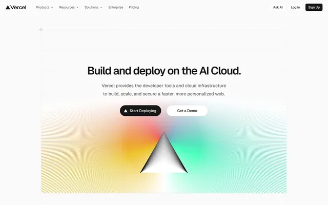
Preview image. Unlock full-res
Advanced schematic on white canvas — every element precisely placed, every line deliberate.
Color palette
Hero section backgrounds, prominent visual accents – used to create dynamic, colorful focal points.
Decorative highlights, very subtle background fills, borders in secondary contexts – a soft visual cue.
Decorative highlights and borders.
Decorative highlights and borders.
Observed in nav borderColor, nav backgroundColor, nav color. Extracted usage does not support a distinct primary control color.
Page backgrounds, elevated surfaces like cards, modal backgrounds — the foundational white that ensures contrast.
Subtle background for UI elements, hover states, or secondary container fill, providing a soft lift from the main canvas.
Primary text, prominent headings, solid button fills for main actions – the dominant dark shade on light backgrounds.
Secondary text, descriptive paragraphs, helper text, and subtle icon fills; a softer contrast than Text Primary.
Observed in nav fill, icon fill, other stroke. Extracted usage does not support a distinct primary control color.
Observed in other borderColor, nav borderColor, card borderColor. Extracted usage does not support a distinct primary control color.
Observed in nav borderColor, nav color, nav fill. Extracted usage does not support a distinct primary control color.
Less prominent text, captions, and disabled states; provides a low contrast for tertiary information.
Typography
- Weights
- 400, 500, 600, 700
- Sizes
- 12px, 13px, 14px, 16px, 18px, 20px, 24px, 32px, 40px, 48px
- Line height
- 1, 1.17, 1.2, 1.25, 1.33, 1.43, 1.5, 1.52, 1.56, 1.8
- Letter spacing
- -0.72, -0.65, -0.56, -0.32
- Fallback
- Inter
The primary typeface for all UI elements, headings, body text, and interactive components. Its distinct 'ss05' stylistic set contributes to the brand's unique typographic identity.
- Weights
- 400, 500, 600
- Sizes
- 8px, 10px, 12px, 13px, 14px, 16px
- Line height
- 1, 1.2, 1.43, 1.54, 1.67
- Letter spacing
- normal
- Fallback
- SFMono-Regular
Used for code snippets, technical information, and elements requiring fixed-width alignment, offering clarity and a distinct developer-centric feel.
Spacing & shape
Elevation
Components
backgroundColor: #171717, color: #ffffff, borderRadius: 100px, padding: 0px 14px (vertical padding often inferred or handled by line-height, horizontal is explicit).
backgroundColor: rgba(0, 0, 0, 0), color: #000000, border: 1px solid #000000, borderRadius: 64px, padding: 0px 16px (vertical padding often inferred or handled by line-height, horizontal is explicit).
backgroundColor: rgba(0, 0, 0, 0), color: #4d4d4d, border: 1px solid #4d4d4d, borderRadius: 9999px, padding: 8px 12px.
backgroundColor: #ffffff, color: #171717, border: none, borderRadius: 100px, padding: 0px 14px.
backgroundColor: #ffffff, borderRadius: 6px, boxShadow: rgba(0, 0, 0, 0.08) 0px 0px 0px 1px, rgba(0, 0, 0, 0.04) 0px 2px 2px 0px, rgb(250, 250, 250) 0px 0px 0px 1px, padding: 0px.
backgroundColor: rgba(0, 0, 0, 0), boxShadow: none, borderRadius: 0px, padding: 0px.
backgroundColor: rgba(0, 0, 0, 0), color: #000000, border: 1px solid #000000, borderRadius: 0px, padding: 0px.
backgroundColor: rgba(0, 0, 0, 0), color: #000000, border: none, borderRadius: 0px, padding: 0px.
Guidelines
- Use Geist font for all text elements with 'liga' and 'ss05' font feature settings enabled.
- Apply #171717 for primary text content and #fafafa for page backgrounds to maintain strong contrast.
- Round corners of all interactive elements like buttons and tags with `borderRadius: 9999px` for a continuous pill shape when content allows, or `borderRadius: 100px` for less extreme pill shapes.
- Maintain a clear visual hierarchy using #171717 for headings and primary actions, and #4d4d4d for supporting text.
- Introduce elements elevation using `box-shadow: rgba(0, 0, 0, 0.08) 0px 0px 0px 1px, rgba(0, 0, 0, 0.04) 0px 2px 2px 0px, rgb(250, 250, 250) 0px 0px 0px 1px` for cards and interactive components.
- Use Electric Blue (#0070f3) exclusively for critical interactive states, active navigation, or significant accents.
- Keep element spacing tight, using `12px` for gaps between related elements.
- Avoid using multiple chromatic colors for primary UI elements; reserve them for decorative highlights or specific branding.
- Do not use generic system fonts; always utilize Geist and Geist Mono for maintaining brand consistency.
- Refrain from heavy, diffused shadows; prefer crisp, subtle box shadows with minimal offset.
- Do not use letter spacing on body or paragraph text; apply negative letter spacing only to display and larger headings as specified.
- Avoid arbitrary border radii; stick to the defined 6px, 64px, 100px, or 9999px tokens.
- Do not rely on opaque solid backgrounds for content cards when a transparent or border-defined card variant is more appropriate.
- Do not use a large number of distinct background colors; focus on the primary `Cloud Canvas` and `Storm Gray Wash` neutrals.
About this system
ShowHide
Vercel's design embodies a technical precision, like an advanced schematic unfolded on a clean, bright canvas. The interplay of crisp, near-achromatic grays for backgrounds and text creates a serious, developer-focused atmosphere, punctuated by strategic accents of rich, vivid hues. Nearly-monochromatic elements and a tight typographic scale prioritize information density, while subtly rounded corners and soft drop shadows prevent the interface from feeling clinical. The overall impression is one of high performance and controlled complexity.
The layout is primarily a max-width contained design with content centered, though specific hero sections can stretch full-bleed visually. The hero pattern often features a large, centered headline over a dynamic background element like the conic gradient. Subsequent sections display a consistent vertical rhythm, often alternating between white and very light gray backgrounds implicitly, without hard dividers. Content is frequently arranged in two-column text-left/image-right (or vice-versa) patterns, or in multi-column card grids (e.g., 3-column features). The spacing is compact, maximizing information density without feeling cramped. A sticky top navigation bar provides constant access to primary links and actions.
The site uses a mix of abstract generative art and minimalist technical graphics. The hero section features a dynamic conic gradient, often paired with geometric shapes, creating a sense of advanced technology. Product screenshots focus on clean UI with code examples. Illustrations, when present, are flat, line-based, and integrate well with the overall minimalist aesthetic, often using subtle brand colors. Icons are outlined, mono-color (either #171717 or #000000), with a consistent stroke weight. Imagery serves both decorative atmosphere in hero sections and explanatory content within product features, generally occupying a balanced visual space alongside text.
Reminiscent of Stripe, Linear, Render, Framer.
# Vercel — Style Reference
> Advanced schematic on white canvas — every element precisely placed, every line deliberate.

**Theme:** light

**Site:** https://vercel.com

Vercel's design embodies a technical precision, like an advanced schematic unfolded on a clean, bright canvas. The interplay of crisp, near-achromatic grays for backgrounds and text creates a serious, developer-focused atmosphere, punctuated by strategic accents of rich, vivid hues. Nearly-monochromatic elements and a tight typographic scale prioritize information density, while subtly rounded corners and soft drop shadows prevent the interface from feeling clinical. The overall impression is one of high performance and controlled complexity.

## Tokens — Colors

| Name | Value | Token | Role |
|------|------|------|------|
| Conic Gradient | `#eeca2d` | `--color-conic-gradient` | Hero section backgrounds, prominent visual accents – used to create dynamic, colorful focal points. |
| Sky Blue Accent | `#52aeff` | `--color-sky-blue-accent` | Decorative highlights, very subtle background fills, borders in secondary contexts – a soft visual cue. |
| Vivid Crimson | `#e5484d` | `--color-vivid-crimson` | Decorative highlights and borders. |
| Vivid Teal | `#45dec5` | `--color-vivid-teal` | Decorative highlights and borders. |
| Electric Blue | `#0070f3` | `--color-electric-blue` | Observed in nav borderColor, nav backgroundColor, nav color. Extracted usage does not support a distinct primary control color. |
| Cloud Canvas | `#fafafa` | `--color-cloud-canvas` | Page backgrounds, elevated surfaces like cards, modal backgrounds — the foundational white that ensures contrast. |
| Storm Gray Wash | `#f0fbff` | `--color-storm-gray-wash` | Subtle background for UI elements, hover states, or secondary container fill, providing a soft lift from the main canvas. |
| Text Primary | `#171717` | `--color-text-primary` | Primary text, prominent headings, solid button fills for main actions – the dominant dark shade on light backgrounds. |
| Text Secondary | `#4d4d4d` | `--color-text-secondary` | Secondary text, descriptive paragraphs, helper text, and subtle icon fills; a softer contrast than Text Primary. |
| Graphite Accent | `#000000` | `--color-graphite-accent` | Observed in nav fill, icon fill, other stroke. Extracted usage does not support a distinct primary control color. |
| Border Light | `#ebebeb` | `--color-border-light` | Observed in other borderColor, nav borderColor, card borderColor. Extracted usage does not support a distinct primary control color. |
| Border Neutral | `#666666` | `--color-border-neutral` | Observed in nav borderColor, nav color, nav fill. Extracted usage does not support a distinct primary control color. |
| Text Muted | `#7d7d7d` | `--color-text-muted` | Less prominent text, captions, and disabled states; provides a low contrast for tertiary information. |

## Tokens — Typography

### Geist
- **Substitute:** Inter
- **Weights:** 400, 500, 600, 700
- **Sizes:** 12px, 13px, 14px, 16px, 18px, 20px, 24px, 32px, 40px, 48px
- **Line height:** 1, 1.17, 1.2, 1.25, 1.33, 1.43, 1.5, 1.52, 1.56, 1.8
- **Letter spacing:** -0.72, -0.65, -0.56, -0.32
- **Role:** The primary typeface for all UI elements, headings, body text, and interactive components. Its distinct 'ss05' stylistic set contributes to the brand's unique typographic identity.

### Geist Mono
- **Substitute:** SFMono-Regular
- **Weights:** 400, 500, 600
- **Sizes:** 8px, 10px, 12px, 13px, 14px, 16px
- **Line height:** 1, 1.2, 1.43, 1.54, 1.67
- **Letter spacing:** normal
- **Role:** Used for code snippets, technical information, and elements requiring fixed-width alignment, offering clarity and a distinct developer-centric feel.

## Tokens — Type Scale

Major Third (1.25) from 14px base.

| Role | Size | Line height | Letter spacing |
|------|------|------|------|
| caption | 12px | 1.5 | -0.32px |
| body | 14px | 1.56 | -0.32px |
| heading-sm | 18px | 1.43 | -0.32px |
| heading | 24px | 1.33 | -0.48px |
| heading-lg | 32px | 1.25 | -0.65px |
| display | 40px | 1.2 | -0.72px |
| display-lg | 48px | 1.17 | -0.72px |

## Tokens — Spacing

- **Section gap:** 48px
- **Card padding:** 12px
- **Element gap:** 12px

## Tokens — Radius

- **Default:** 6px
- **Buttons:** 9999px
- **large:** 12px
- **minimal:** 6px
- **pills:** 100px

## Tokens — Elevation

- **Content Card:** `rgba(0, 0, 0, 0.08) 0px 0px 0px 1px, rgba(0, 0, 0, 0.04) 0px 2px 2px 0px, rgb(250, 250, 250) 0px 0px 0px 1px`
- **Interactive Elements/Hover:** `rgba(0, 0, 0, 0.08) 0px 0px 0px 1px, rgba(0, 0, 0, 0.04) 0px 2px 2px 0px, rgba(0, 0, 0, 0.04) 0px 8px 8px -8px, rgb(250, 250, 250) 0px 0px 0px 1px`

## Layout

The layout is primarily a max-width contained design with content centered, though specific hero sections can stretch full-bleed visually. The hero pattern often features a large, centered headline over a dynamic background element like the conic gradient. Subsequent sections display a consistent vertical rhythm, often alternating between white and very light gray backgrounds implicitly, without hard dividers. Content is frequently arranged in two-column text-left/image-right (or vice-versa) patterns, or in multi-column card grids (e.g., 3-column features). The spacing is compact, maximizing information density without feeling cramped. A sticky top navigation bar provides constant access to primary links and actions.

## Imagery

The site uses a mix of abstract generative art and minimalist technical graphics. The hero section features a dynamic conic gradient, often paired with geometric shapes, creating a sense of advanced technology. Product screenshots focus on clean UI with code examples. Illustrations, when present, are flat, line-based, and integrate well with the overall minimalist aesthetic, often using subtle brand colors. Icons are outlined, mono-color (either #171717 or #000000), with a consistent stroke weight. Imagery serves both decorative atmosphere in hero sections and explanatory content within product features, generally occupying a balanced visual space alongside text.

## Components

### Filled Primary Button
*Main call-to-action button, dark background, light text.*

backgroundColor: #171717, color: #ffffff, borderRadius: 100px, padding: 0px 14px (vertical padding often inferred or handled by line-height, horizontal is explicit).

### Outlined Secondary Button Flexible
*Secondary action button, transparent background, dark text, flexible border radius.*

backgroundColor: rgba(0, 0, 0, 0), color: #000000, border: 1px solid #000000, borderRadius: 64px, padding: 0px 16px (vertical padding often inferred or handled by line-height, horizontal is explicit).

### Outlined Muted Button
*Tertiary action button, transparent background, muted gray text and border, large pill radius.*

backgroundColor: rgba(0, 0, 0, 0), color: #4d4d4d, border: 1px solid #4d4d4d, borderRadius: 9999px, padding: 8px 12px.

### Ghost Button
*Low-prominence or navigation item button, dark text on transparent background.*

backgroundColor: #ffffff, color: #171717, border: none, borderRadius: 100px, padding: 0px 14px.

### Elevated Content Card
*Primary content container, featuring a subtle shadow for depth.*

backgroundColor: #ffffff, borderRadius: 6px, boxShadow: rgba(0, 0, 0, 0.08) 0px 0px 0px 1px, rgba(0, 0, 0, 0.04) 0px 2px 2px 0px, rgb(250, 250, 250) 0px 0px 0px 1px, padding: 0px.

### Transparent Card
*Simple content grouping without a background or shadow, relying on layout alone.*

backgroundColor: rgba(0, 0, 0, 0), boxShadow: none, borderRadius: 0px, padding: 0px.

### Subtle Inset Card
*Card with minimal visual difference from the background, often used for form elements or groups.*

backgroundColor: rgba(0, 0, 0, 0), color: #000000, border: 1px solid #000000, borderRadius: 0px, padding: 0px.

### Text Input Minimal
*Basic text input field.*

backgroundColor: rgba(0, 0, 0, 0), color: #000000, border: none, borderRadius: 0px, padding: 0px.

## Guidelines

### Do

- Use Geist font for all text elements with 'liga' and 'ss05' font feature settings enabled.
- Apply #171717 for primary text content and #fafafa for page backgrounds to maintain strong contrast.
- Round corners of all interactive elements like buttons and tags with `borderRadius: 9999px` for a continuous pill shape when content allows, or `borderRadius: 100px` for less extreme pill shapes.
- Maintain a clear visual hierarchy using #171717 for headings and primary actions, and #4d4d4d for supporting text.
- Introduce elements elevation using `box-shadow: rgba(0, 0, 0, 0.08) 0px 0px 0px 1px, rgba(0, 0, 0, 0.04) 0px 2px 2px 0px, rgb(250, 250, 250) 0px 0px 0px 1px` for cards and interactive components.
- Use Electric Blue (#0070f3) exclusively for critical interactive states, active navigation, or significant accents.
- Keep element spacing tight, using `12px` for gaps between related elements.

### Don't

- Avoid using multiple chromatic colors for primary UI elements; reserve them for decorative highlights or specific branding.
- Do not use generic system fonts; always utilize Geist and Geist Mono for maintaining brand consistency.
- Refrain from heavy, diffused shadows; prefer crisp, subtle box shadows with minimal offset.
- Do not use letter spacing on body or paragraph text; apply negative letter spacing only to display and larger headings as specified.
- Avoid arbitrary border radii; stick to the defined 6px, 64px, 100px, or 9999px tokens.
- Do not rely on opaque solid backgrounds for content cards when a transparent or border-defined card variant is more appropriate.
- Do not use a large number of distinct background colors; focus on the primary `Cloud Canvas` and `Storm Gray Wash` neutrals.

## Agent Prompt Guide

Quick Color Reference:
text: #171717
background: #fafafa
border: #ebebeb
accent: #0070f3
primary action: #171717 (filled action)

Example Component Prompts:
1. Create a primary call-to-action button: background #171717, text #ffffff, border-radius 100px, padding 0px 14px, using Geist font weight 400.
2. Create a main page section: background #fafafa. Headline 'Build and deploy' using Geist font weight 700 at 48px, color #171717, letter-spacing -0.72px. Body text 'Vercel provides...' using Geist font weight 400 at 18px, color #4d4d4d.
3. Create an outlined secondary button: transparent background, text color #000000, border 1px solid #000000, border-radius 64px, padding 0px 16px, using Geist font weight 400.
4. Create an Elevated Content Card: background #ffffff, border-radius 6px, box-shadow rgba(0,0,0,0.08) 0px 0px 0px 1px, rgba(0,0,0,0.04) 0px 2px 2px 0px, rgb(250,250,250) 0px 0px 0px 1px, padding 12px.
More like this






Keep what you find
A free account saves references to boards and can send you a weekly email of picks based on what you save.
To see every result, go Pro.