Preview image. Unlock full-res
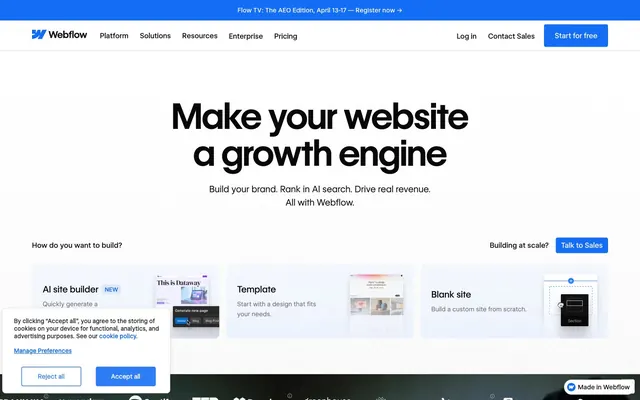
Precise Blueprint on Stark Canvas — where every element serves a clear function against a bright, expansive backdrop.
Color palette
Primary calls to action, interactive elements, links, active states — provides a clear visual anchor for user interaction.
Accent text, secondary interactive elements, lighter shades of brand blue.
Background for feature sections, adding visual interest and depth to key areas.
Page backgrounds, card backgrounds, primary surface.
Primary heading and body text, button text on light surfaces.
Secondary text, muted icons, subtle borders.
Subtle section backgrounds, alternative surface color for differentiation.
Dividers, input borders, inactive element outlines.
Highlighting success messages, occasional textual accents.
Highlighting attention points, warning-like accents.
Typography
- Weights
- 400, 500, 550, 600
- Sizes
- 10px, 13px, 14px, 16px, 20px, 24px, 32px, 40px, 56px, 80px
- Line height
- 1, 1.04, 1.2, 1.3, 1.4, 1.5, 1.6
- Letter spacing
- -0.0100em
- Fallback
- Inter
Primary typeface for all text content including headings, body text, and UI elements. Its variable nature allows for precise visual hierarchy and strong visual impact at large sizes, while maintaining clarity in smaller text.
- Weights
- 400
- Sizes
- 12px, 16px
- Line height
- 1.5, 1.6
- Letter spacing
- normal
- Fallback
- JetBrains Mono
Used for technical content, code snippets, or areas requiring precise, monospaced alignment. Distinctive font features for enhanced readability of numerical and technical data.
Spacing & shape
Elevation
Components
Filled button with Webflow Blue background and Canvas White text, 4px border radius. Uses 16px horizontal padding.
Transparent background with Ink Black text and 1px Ink Black border, no border radius. Used for less prominent actions.
Transparent background with Ink Black text, no border or radius. Padding of 20px top and 19px bottom for visual separation in navigation.
Card with Canvas White background, 4px border radius, and minimal shadow. Internal padding of 16px.
Transparent background with Ink Black text and 1px Ink Black border, no border radius. Compact padding of 1px vertical and 6px horizontal.
Bottom-fixed dark overlay with Canvas White text, featuring two primary interaction buttons: 'Reject all' (transparent with Webflow Blue border) and 'Accept all' (Webflow Blue filled).
Guidelines
- Use WF Visual Sans Variable weight 600 for main headlines to convey importance with a modern, sharp tone.
- Apply Webflow Blue (#146ef5) exclusively to primary calls to action and critical interactive elements.
- Maintain a clear visual hierarchy by utilizing Ink Black (#080808) for primary text and Slate Gray (#5a5a5a) for secondary, descriptive content.
- Employ a 4px border-radius for all interactive buttons and smaller UI elements to establish a consistent subtle softness.
- Use the Ink Black to Canvas White (20:1) contrast for all essential text to ensure AAA legibility.
- Apply subtle, multi-layered shadows (e.g., rgba(0,0,0,0.01) 0px 54px 22px 0px) to interactive or elevated elements for depth, avoiding heavy dropshadows.
- Do not introduce additional vibrant colors beyond the established Webflow Blue, Emerald Green, and Amber Glow accents.
- Avoid using flat black (#000000) for text; opt for Ink Black (#080808) for a softer, yet still direct, appearance.
- Do not use overly large line heights for headlines; maintain a tight `1.0` to `1.2` ratio to keep headlines compact and powerful.
- Refrain from varying letter-spacing on body text; apply only to large headlines with the specified negative tracking for impact.
- Do not use sharp 0px corners in functional components, except for subtle decorative elements like specific input borders.
About this system
ShowHide
Webflow's design system projects confident utility through a sharp, clean interface. A monochromatic foundation of stark blacks and whites is punctuated by a singular, vibrant blue, drawing focus to interactive elements. Typography is the primary conveyor of brand personality, with large, precisely tracked sans-serif headlines creating a modern, impactful presence while subtle shadows add depth to interactive elements without overwhelming the clean aesthetic.
The site uses a max-width 1440px centered container for most content, creating a focused presentation. The hero section often features large, centered headlines followed by a subheading, establishing a bold and direct introduction. Content sections primarily use a clean, modular layout with both single-column stacks and multi-column grids (like 3-column cards). Vertical rhythm is maintained with consistent section gaps, creating breathing room between content blocks. The navigation is a sticky top bar with clear functional links and a Webflow Blue 'Start for free' CTA.
The visual language is UI-heavy, with product screenshots of the Webflow interface integrated to explain features rather than purely decorative photography. These product screenshots often feature subtle elevation via shadows. Minimal abstract or illustrative graphics are used sparingly with strong brand blue accents. Icons are monochromatic, contributing to the functional aesthetic. Imagery primarily serves an explanatory role, showcasing the product directly.
Reminiscent of Figma, Notion, Vercel, Linear.
# Webflow — Style Reference
> Precise Blueprint on Stark Canvas — where every element serves a clear function against a bright, expansive backdrop.

**Theme:** light

**Site:** https://webflow.com

Webflow's design system projects confident utility through a sharp, clean interface. A monochromatic foundation of stark blacks and whites is punctuated by a singular, vibrant blue, drawing focus to interactive elements. Typography is the primary conveyor of brand personality, with large, precisely tracked sans-serif headlines creating a modern, impactful presence while subtle shadows add depth to interactive elements without overwhelming the clean aesthetic.

## Tokens — Colors

| Name | Value | Token | Role |
|------|------|------|------|
| Webflow Blue | `#146ef5` | `--color-webflow-blue` | Primary calls to action, interactive elements, links, active states — provides a clear visual anchor for user interaction. |
| Sky Blue | `#6ca7ff` | `--color-sky-blue` | Accent text, secondary interactive elements, lighter shades of brand blue. |
| Deep Blue Gradient | `#146ef5` | `--color-deep-blue-gradient` | Background for feature sections, adding visual interest and depth to key areas. |
| Canvas White | `#ffffff` | `--color-canvas-white` | Page backgrounds, card backgrounds, primary surface. |
| Ink Black | `#080808` | `--color-ink-black` | Primary heading and body text, button text on light surfaces. |
| Slate Gray | `#5a5a5a` | `--color-slate-gray` | Secondary text, muted icons, subtle borders. |
| Whisper Gray | `#f0f0f0` | `--color-whisper-gray` | Subtle section backgrounds, alternative surface color for differentiation. |
| Outline Gray | `#d8d8d8` | `--color-outline-gray` | Dividers, input borders, inactive element outlines. |
| Emerald Green | `#60ed76` | `--color-emerald-green` | Highlighting success messages, occasional textual accents. |
| Amber Glow | `#ffa666` | `--color-amber-glow` | Highlighting attention points, warning-like accents. |

## Tokens — Typography

### WF Visual Sans Variable
- **Substitute:** Inter
- **Weights:** 400, 500, 550, 600
- **Sizes:** 10px, 13px, 14px, 16px, 20px, 24px, 32px, 40px, 56px, 80px
- **Line height:** 1, 1.04, 1.2, 1.3, 1.4, 1.5, 1.6
- **Letter spacing:** -0.0100em
- **Role:** Primary typeface for all text content including headings, body text, and UI elements. Its variable nature allows for precise visual hierarchy and strong visual impact at large sizes, while maintaining clarity in smaller text.

### WFVisualSans-Mono
- **Substitute:** JetBrains Mono
- **Weights:** 400
- **Sizes:** 12px, 16px
- **Line height:** 1.5, 1.6
- **Letter spacing:** normal
- **Role:** Used for technical content, code snippets, or areas requiring precise, monospaced alignment. Distinctive font features for enhanced readability of numerical and technical data.

## Tokens — Type Scale

Augmented Fourth (1.414) from 16px base.

| Role | Size | Line height | Letter spacing |
|------|------|------|------|
| caption | 10px | 1.5 | 0.1px |
| body | 16px | 1.5 | — |
| subheading | 20px | 1.4 | — |
| heading-sm | 24px | 1.3 | — |
| heading | 40px | 1.2 | — |
| heading-lg | 56px | 1.04 | -0.01em |
| display | 80px | 1 | -0.01em |

## Tokens — Spacing

- **Max width:** 1440px
- **Section gap:** 24px
- **Card padding:** 16px
- **Element gap:** 16px

## Tokens — Radius

- **Default:** 8px
- **Buttons:** 4px
- **Cards:** 4px
- **image:** 8px
- **pill:** 1440px

## Tokens — Elevation

- **Interactive Card:** `rgba(0, 0, 0, 0.01) 0px 54px 22px 0px, rgba(0, 0, 0, 0.04) 0px 30px 18px 0px, rgba(0, 0, 0, 0.08) 0px 13px 13px 0px, rgba(0, 0, 0, 0.09) 0px 3px 7px 0px`
- **Elevated Image/Icon:** `rgba(0, 0, 0, 0.02) 0px 67px 27px 0px, rgba(0, 0, 0, 0.06) 0px 38px 23px 0px, rgba(0, 0, 0, 0.1) 0px 17px 17px 0px, rgba(0, 0, 0, 0.12) 0px 4px 9px 0px`
- **Prominent Element (e.g. Hero Card):** `rgba(0, 0, 0, 0.01) 0px 148px 42px 0px, rgba(0, 0, 0, 0.04) 0px 95px 38px 0px, rgba(0, 0, 0, 0.15) 0px 53px 32px 0px, rgba(0, 0, 0, 0.26) 0px 24px 24px 0px, rgba(0, 0, 0, 0.29) 0px 6px 13px 0px`

## Layout

The site uses a max-width 1440px centered container for most content, creating a focused presentation. The hero section often features large, centered headlines followed by a subheading, establishing a bold and direct introduction. Content sections primarily use a clean, modular layout with both single-column stacks and multi-column grids (like 3-column cards). Vertical rhythm is maintained with consistent section gaps, creating breathing room between content blocks. The navigation is a sticky top bar with clear functional links and a Webflow Blue 'Start for free' CTA.

## Imagery

The visual language is UI-heavy, with product screenshots of the Webflow interface integrated to explain features rather than purely decorative photography. These product screenshots often feature subtle elevation via shadows. Minimal abstract or illustrative graphics are used sparingly with strong brand blue accents. Icons are monochromatic, contributing to the functional aesthetic. Imagery primarily serves an explanatory role, showcasing the product directly.

## Components

### Build Mode Selector Cards

### Feature List with Arrow Links

### Cookie Consent Banner

### Primary CTA Button
*Call to Action*

Filled button with Webflow Blue background and Canvas White text, 4px border radius. Uses 16px horizontal padding.

### Secondary Ghost Button
*Secondary Action*

Transparent background with Ink Black text and 1px Ink Black border, no border radius. Used for less prominent actions.

### Navigation Link Button
*Navigation/Menu*

Transparent background with Ink Black text, no border or radius. Padding of 20px top and 19px bottom for visual separation in navigation.

### Compact Feature Card
*Informational Display*

Card with Canvas White background, 4px border radius, and minimal shadow. Internal padding of 16px.

### Outline Tag Button
*Filter/Small Action*

Transparent background with Ink Black text and 1px Ink Black border, no border radius. Compact padding of 1px vertical and 6px horizontal.

### Cookie Consent Banner
*Regulatory Notification*

Bottom-fixed dark overlay with Canvas White text, featuring two primary interaction buttons: 'Reject all' (transparent with Webflow Blue border) and 'Accept all' (Webflow Blue filled).

## Guidelines

### Do

- Use WF Visual Sans Variable weight 600 for main headlines to convey importance with a modern, sharp tone.
- Apply Webflow Blue (#146ef5) exclusively to primary calls to action and critical interactive elements.
- Maintain a clear visual hierarchy by utilizing Ink Black (#080808) for primary text and Slate Gray (#5a5a5a) for secondary, descriptive content.
- Employ a 4px border-radius for all interactive buttons and smaller UI elements to establish a consistent subtle softness.
- Use the Ink Black to Canvas White (20:1) contrast for all essential text to ensure AAA legibility.
- Apply subtle, multi-layered shadows (e.g., rgba(0,0,0,0.01) 0px 54px 22px 0px) to interactive or elevated elements for depth, avoiding heavy dropshadows.

### Don't

- Do not introduce additional vibrant colors beyond the established Webflow Blue, Emerald Green, and Amber Glow accents.
- Avoid using flat black (#000000) for text; opt for Ink Black (#080808) for a softer, yet still direct, appearance.
- Do not use overly large line heights for headlines; maintain a tight `1.0` to `1.2` ratio to keep headlines compact and powerful.
- Refrain from varying letter-spacing on body text; apply only to large headlines with the specified negative tracking for impact.
- Do not use sharp 0px corners in functional components, except for subtle decorative elements like specific input borders.

## Agent Prompt Guide

### Quick Color Reference
- Text: Ink Black (#080808)
- Background: Canvas White (#ffffff)
- CTA: Webflow Blue (#146ef5)
- Border: Outline Gray (#d8d8d8)
- Accent: Sky Blue (#6ca7ff)

### 3-5 Example Component Prompts
1. Create a hero section: Canvas White background. Headline at 80px WF Visual Sans Variable weight 600, Ink Black color, letter-spacing -0.01em. Subheading at 20px WF Visual Sans Variable weight 400, Slate Gray color. Below, a Primary CTA Button (Webflow Blue background, Canvas White text, 4px radius, 16px horizontal padding).
2. Design a feature card: Canvas White background, 4px border radius. Apply the 'Interactive Card' shadow (rgba(0, 0, 0, 0.01) 0px 54px 22px 0px, rgba(0, 0, 0, 0.04) 0px 30px 18px 0px, rgba(0, 0, 0, 0.08) 0px 13px 13px 0px, rgba(0, 0, 0, 0.09) 0px 3px 7px 0px). Use Ink Black for the title (24px WF Visual Sans Variable weight 550) and Slate Gray for body text (16px WF Visual Sans Variable weight 400).
3. Implement a navigation bar: Canvas White background. 'Webflow' logo in Ink Black (WF Visual Sans Variable weight 600, 24px). Navigation links using Navigation Link Button style (transparent background, Ink Black text, 16px WF Visual Sans Variable weight 400). A 'Start for free' Primary CTA Button (Webflow Blue background, Canvas White text, 4px radius, 16px horizontal padding).
More like this






Keep what you find
A free account saves references to boards and can send you a weekly email of picks based on what you save.
To see every result, go Pro.