Preview image. Unlock full-res
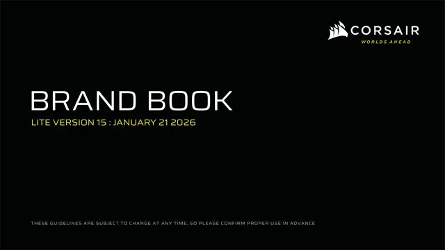
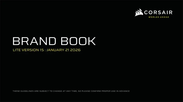
Corsair gaming-hardware brand book on pitch-black backgrounds with a single electric-yellow accent and a wide-tracked technical sans.
Summary
The Corsair "Worlds Ahead" brand book, a gaming-hardware identity system built almost entirely on pitch-black backgrounds with one functional accent color, an electric chartreuse yellow, and a wide-tracked technical sans. The defining move is extreme restraint: black plus white plus a sliver of yellow, with the loud energy coming from dramatic product renders rather than color.
Visual description
Sixteen-by-nine landscape pages. Backgrounds are almost always pitch black (#000000) or a near-black anthracite; a few content pages sit on dark grey. The accent is a single bright yellow (#ECE81A, Pantone 395) used sparingly for the second half of kicker labels, key words, CTA fills, and the tagline. Type is the Saira superfamily: oversized white display headlines (often with one word bolded), small all-caps kickers in the "WORD // WORD" pattern with the second half in yellow, and light grey body copy set in narrow columns. Every content page carries a tiny footer ("CORPORATE DESIGN" left, "CORSAIR BRAND BOOK LITE VERSION 15" right). The sail-mark icon plus CORSAIR wordmark appears in horizontal and vertical lockups, with "WORLDS AHEAD" set in yellow italics beneath. Product photography is high-contrast, low-key studio work, black peripherals lit with cool rim light and occasional RGB pops. The recurring graphic device is a thin hairline callout line meeting a slab label box with a yellow tab on its left edge. A signature "Y" focus glyph (a three-pronged mark derived from the sail) appears as an interactive hotspot.
Key takeaway
The discipline of one accent color used as a true functional signal, never decoration: yellow only marks "this is interactive or important." The "LABEL // SUBLABEL" kicker with a yellow color-break is a clean, reusable section-header system. The hairline-line-into-slab-callout box with a yellow left tab is a strong, gamer-flavored way to annotate product shots. Section dividers that are nothing but one yellow word on pure black give the deck rhythm at zero cost.
Reuse notes
Reach for this when an identity needs to read premium-technical and high-energy without going full RGB-rainbow, especially gaming, esports, hardware, or performance-tech brands. The black-plus-single-yellow formula depends on excellent product photography to carry the visual weight, and on a wide technical sans (Saira here) for the right voice. The system only works on dark; the book itself shows the logo flipping to black for light or colorful backgrounds. Yellow on black is high-contrast but the very pale-yellow-on-black footer text is low-contrast and easy to miss.