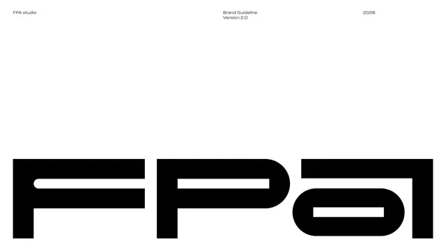
Preview image. Unlock full-res
Bilingual brand guideline for FPA (Floating Point Art) studio built on a geometric logo, Field Gothic type and a neutral palette accented by Arithmetic Blue.
Summary
A 48-page bilingual brand guideline for FPA (Floating Point Art) studio, a creative design-art-technology studio. The system pairs a custom geometric logo derived from floating-point 0 and 1 symbols with the Field Gothic typeface and a near-monochrome palette accented by a single vivid Arithmetic Blue.
Visual description
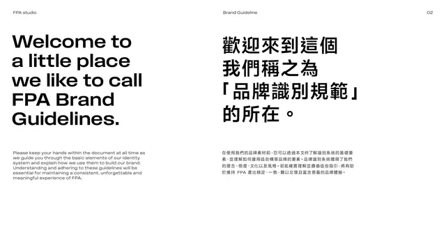
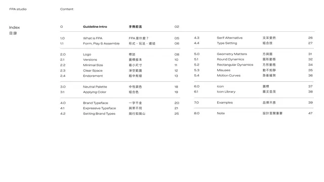
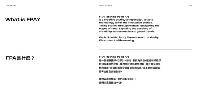
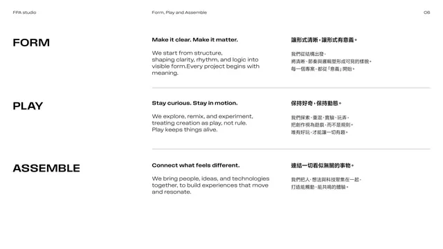
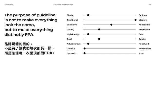
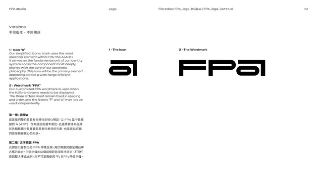
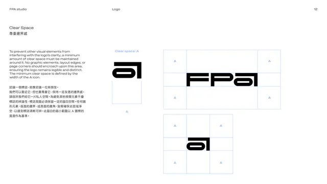
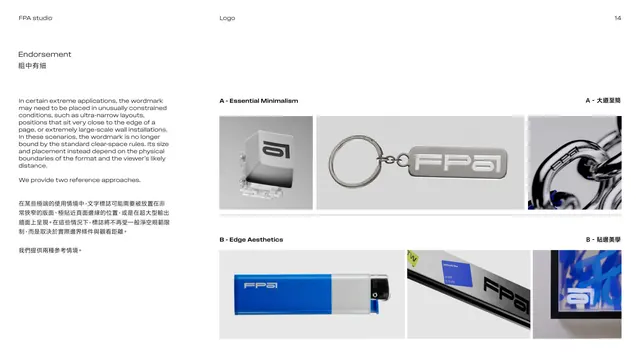
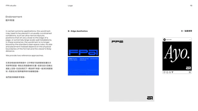
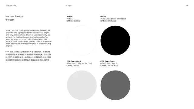
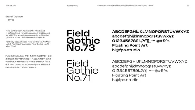
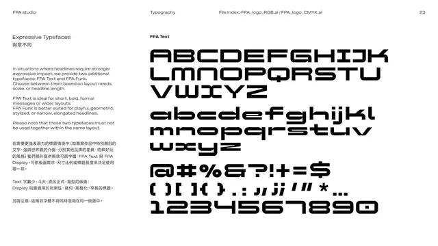
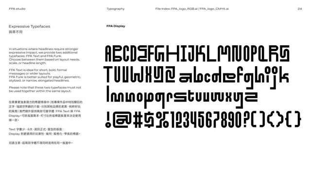
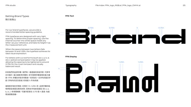
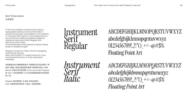
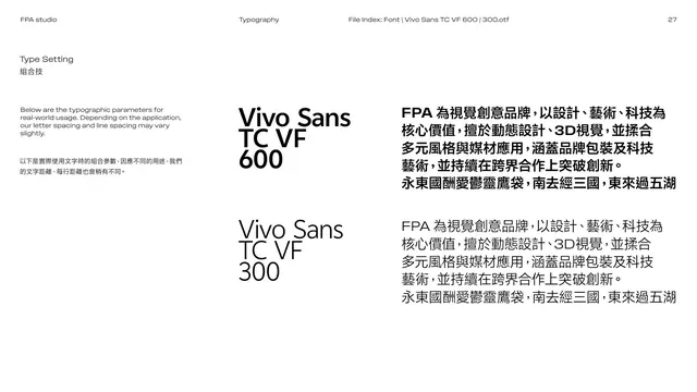
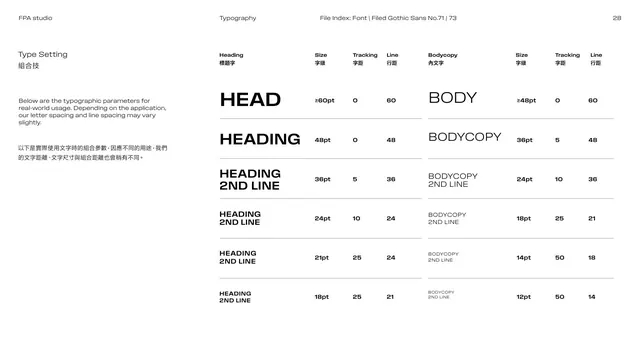
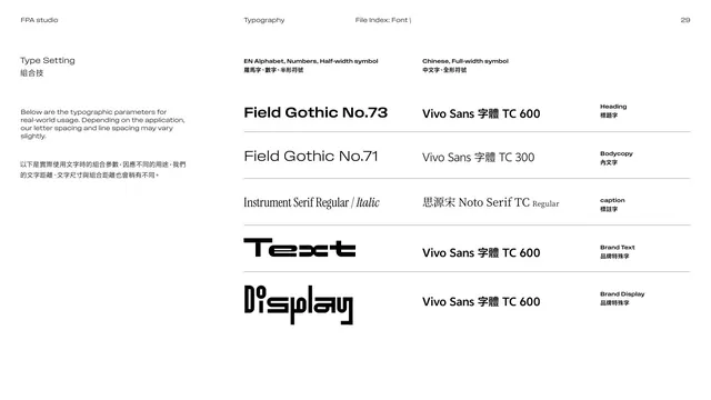
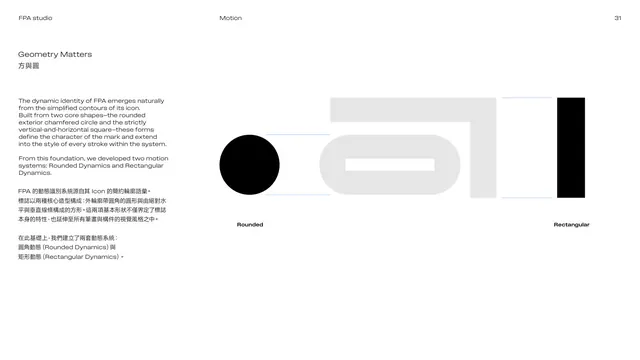
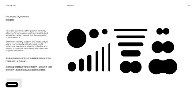
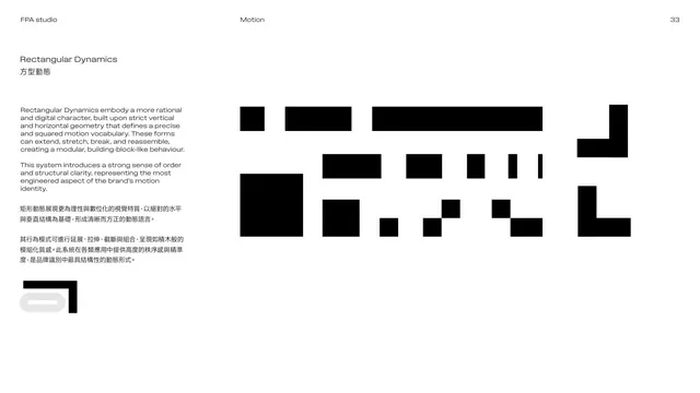
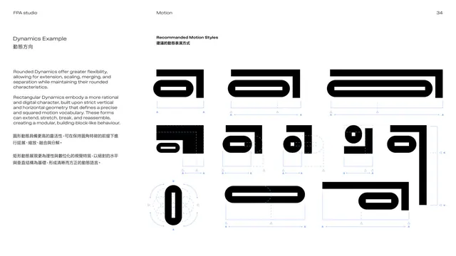
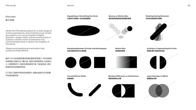
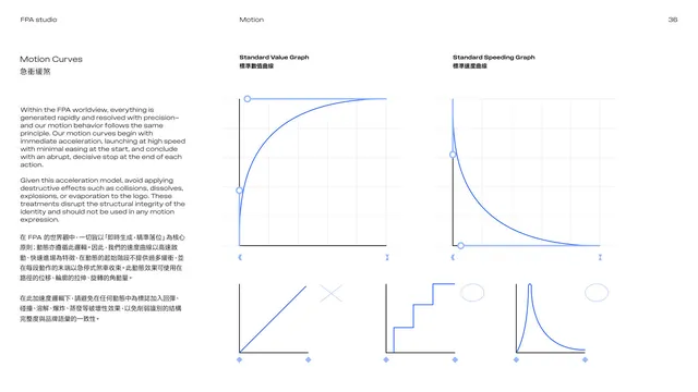
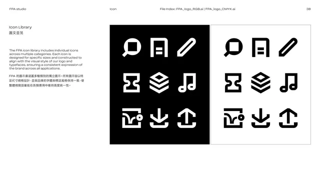
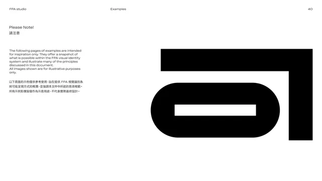
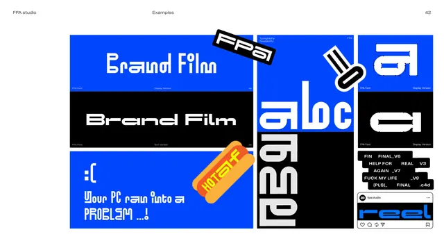
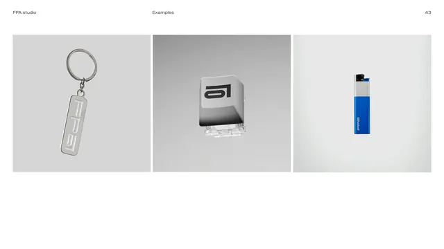
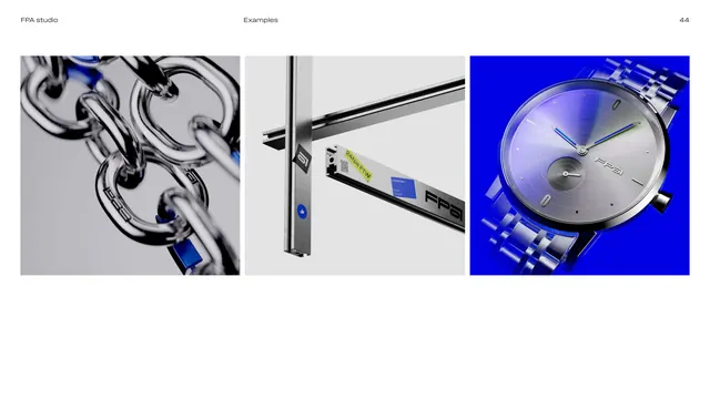
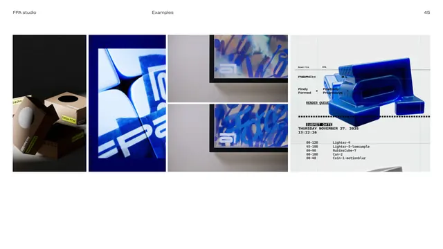
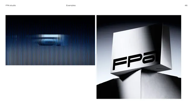
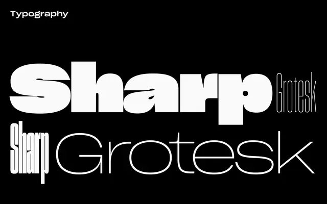
The document runs on a strict editorial grammar: a thin running header on every page (FPA studio on the left, section name centered, page number top-right) over a generous two-column or split layout. Most content spreads keep a left text column with English over its Traditional Chinese translation, and right-hand columns for specimens, swatches, mockups or diagrams. Section dividers invert to full-bleed black with a thin white outline numeral and section name set in a light-weight sans (for example "01 Introduction", "02 LOGO", "03 Color"). The palette is overwhelmingly white and black with cool greys, and one saturated Arithmetic Blue (#0046ff) used sparingly for accents, charts and product renders. The logo is a heavy, horizontally grounded geometric wordmark FPA whose forms read as circular-outside, squared-inside, with a standalone "a" icon. Typography combines Field Gothic No.73 (headings) and No.71 (body) with two expressive display faces (FPA Text, FPA Display), Instrument Serif as a serif alternative, and Vivo Sans TC / Noto Serif TC for Chinese. Later sections cover a motion system (Rounded Dynamics and Rectangular Dynamics built from the icon's two core shapes, motion curves, misuse grids), an icon library, and a long Examples gallery of stationery, merch (keyrings, lighters, watches, keycaps), 3D chrome renders and editorial poster mockups.
Key takeaway
The discipline of a near-monochrome system with one electric accent color does a lot of identity work with very little. The logo concept (deriving letterforms from the 0/1 of floating-point math) is a clean way to tie a wordmark to a studio's name and ethos. The dedicated motion-system section, splitting motion into two named families anchored to the logo's two primitive shapes, is an unusually thorough way to make a static identity feel kinetic.
Reuse notes
A strong reference for a technical, design-forward studio or agency identity, especially bilingual (CJK + Latin) systems that need a translation column baked into the grid. The two-column English-over-Chinese layout is reusable for any dual-language guideline. Best when you have a genuinely custom display typeface and good 3D render capability to carry the Examples section; the neutral base means the accent color choice carries most of the brand personality.
From this deck: FPA studio brand guideline (v2.0)
View deck









More like this









Keep what you find
A free account saves references to boards and can send you a weekly email of picks based on what you save.
To see every result, go Pro.