
Preview image. Unlock full-res
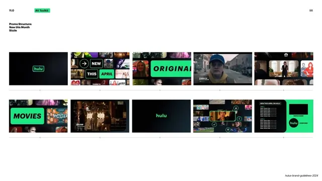
Hulu's 99-slide brand guideline deck built on a strict black-and-Hulu-green system, oversized black grotesque headlines, and tiny green utility labels.
Summary
Hulu's internal brand guidelines, nicknamed the "Big Green Guide," running 99 slides across the full identity system. Its whole personality comes from one ruthless two-color system: near-black backgrounds and a single saturated Hulu green, with oversized black grotesque headlines doing the heavy lifting and tiny green pill labels carrying navigation.
Visual description
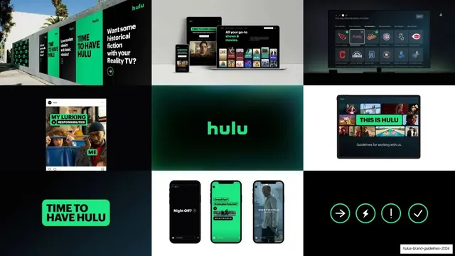
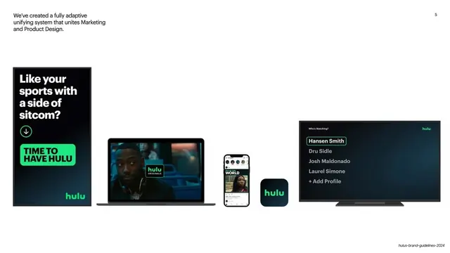
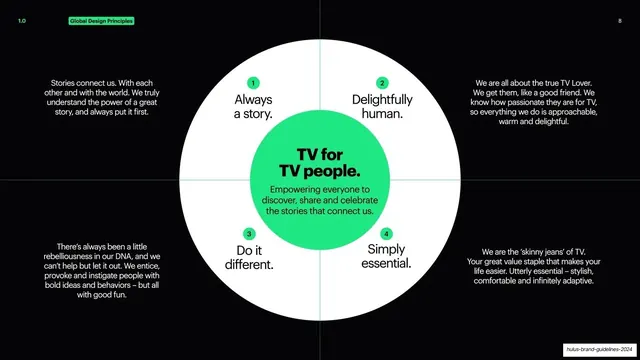
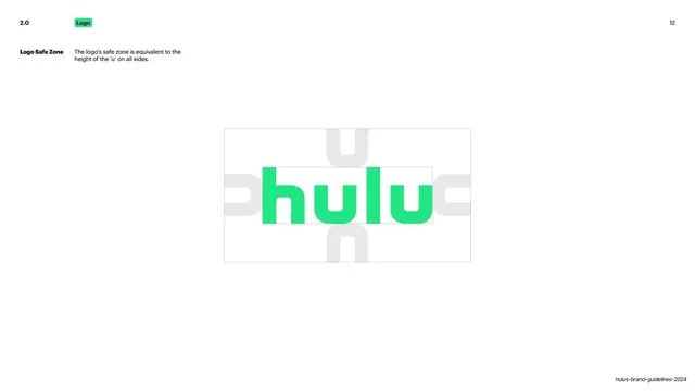
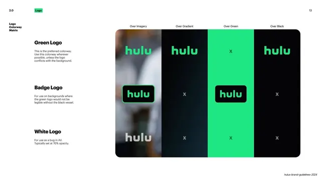
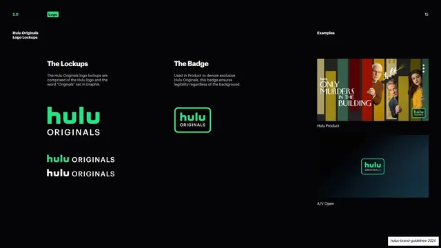
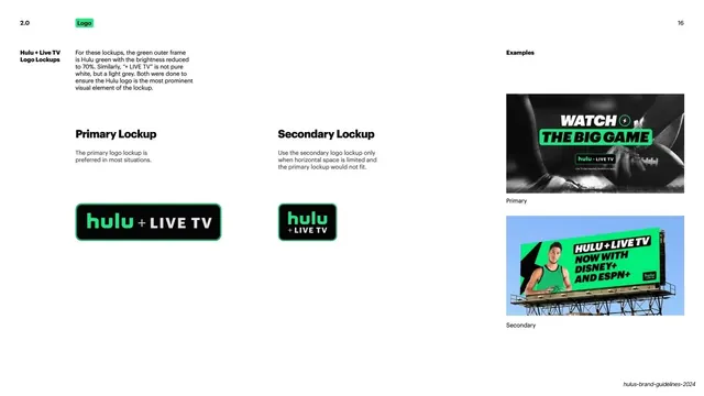
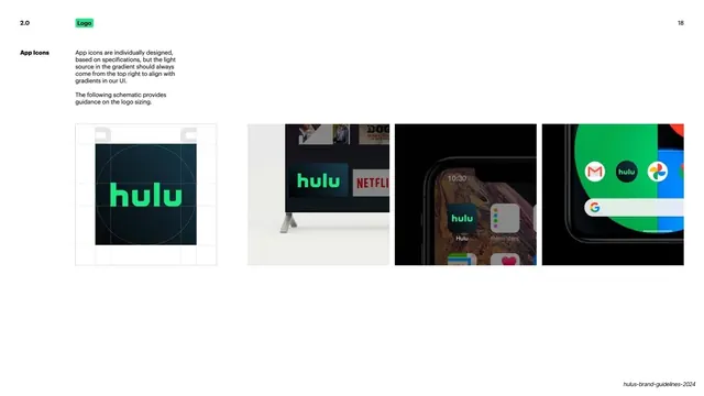
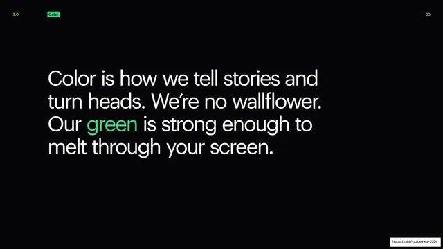
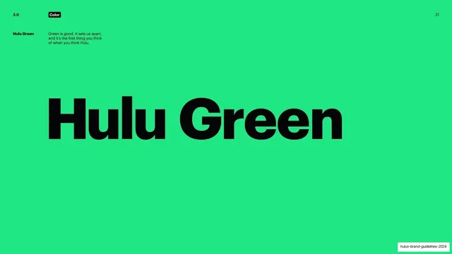
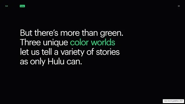
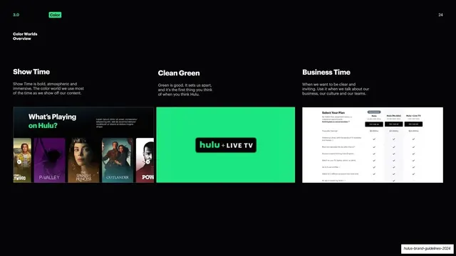
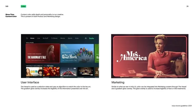
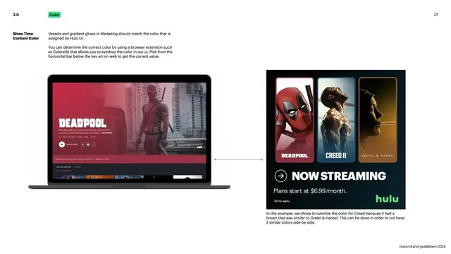
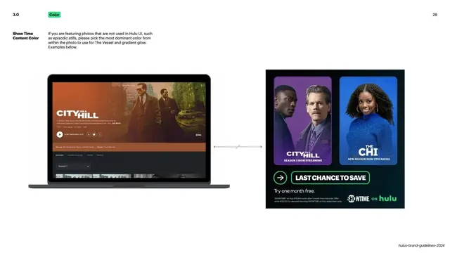
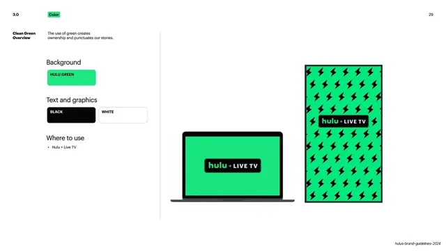
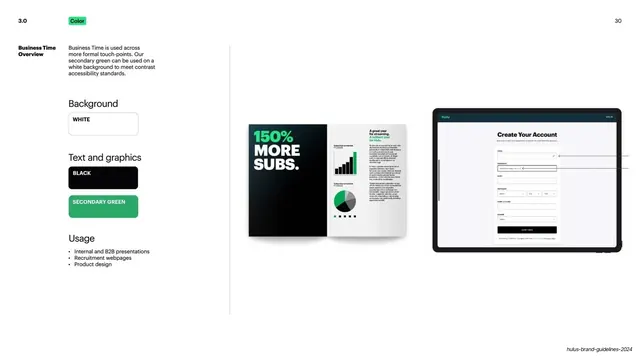
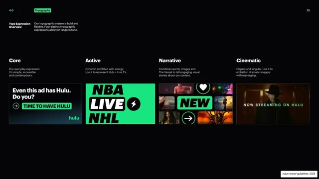
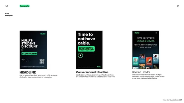
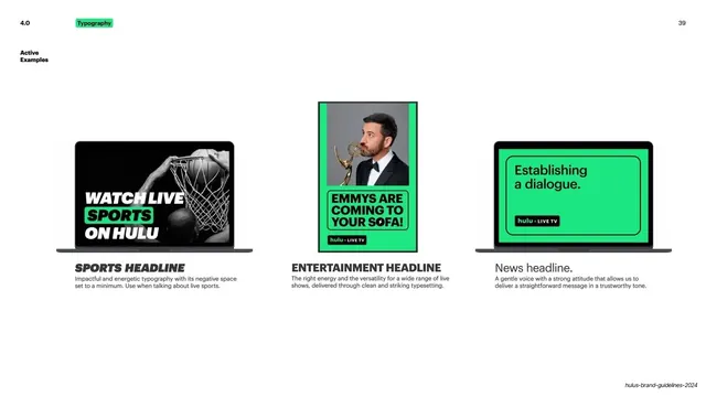
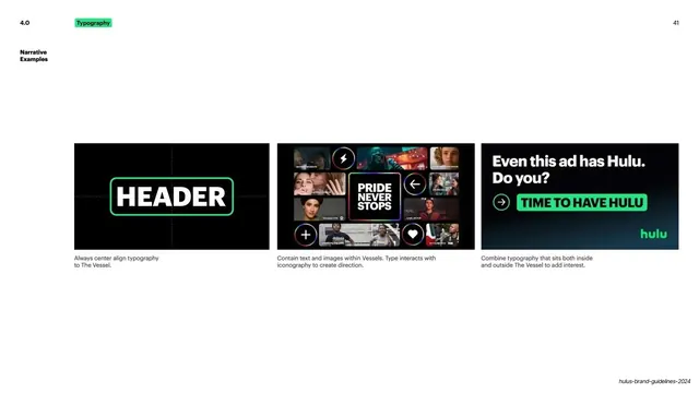
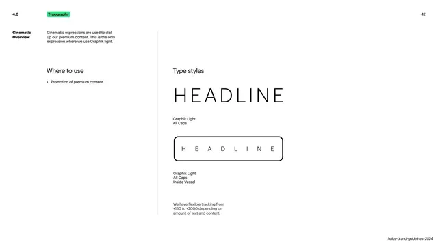
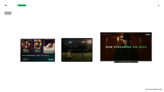
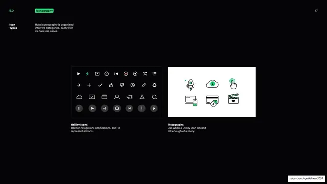
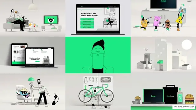
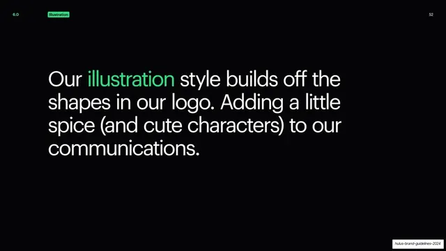
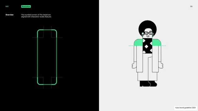
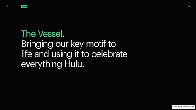
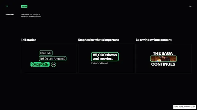
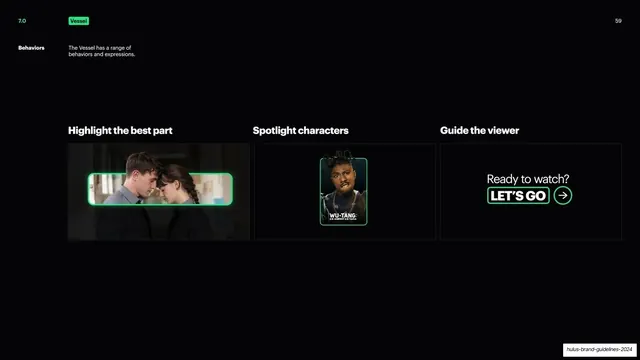
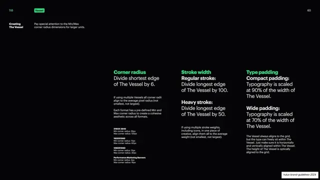
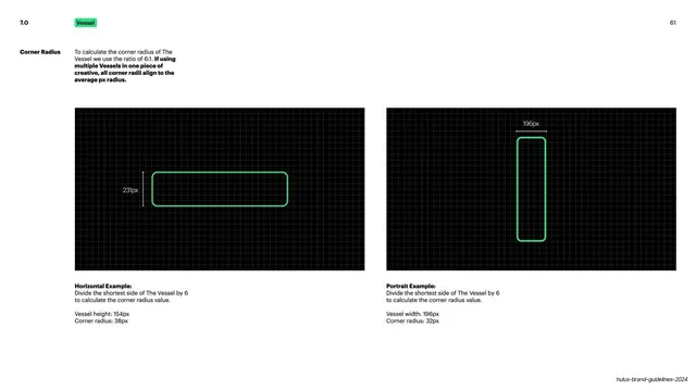
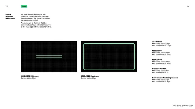
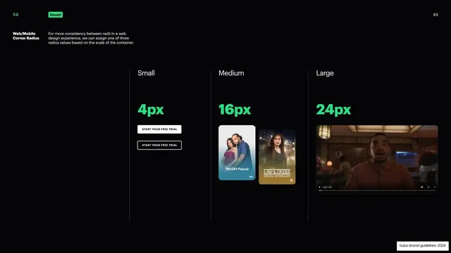
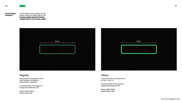
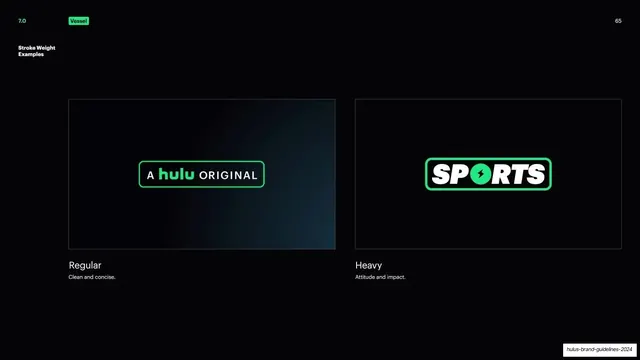
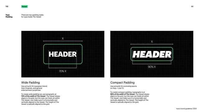
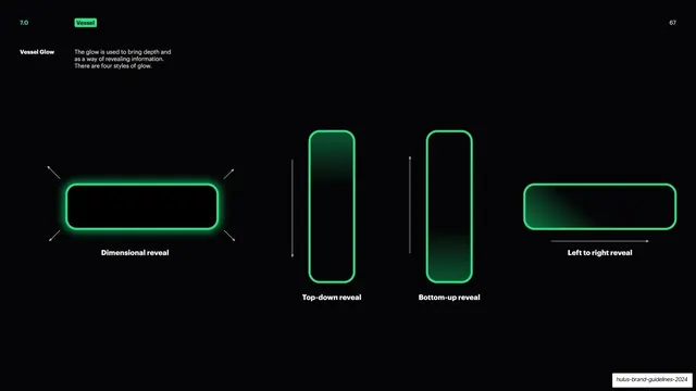
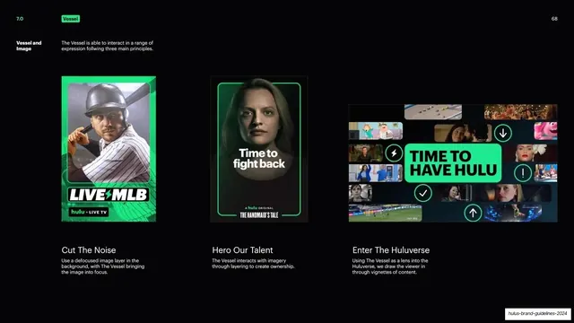
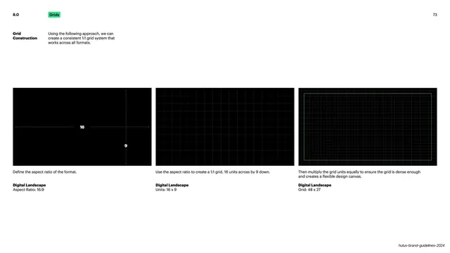
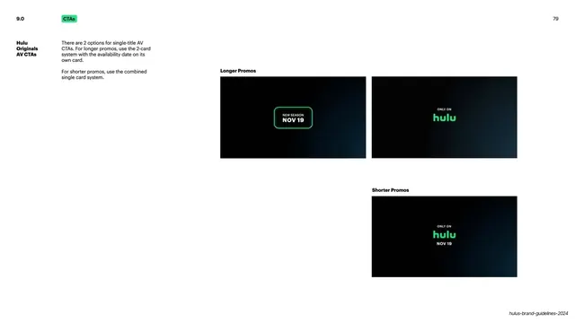
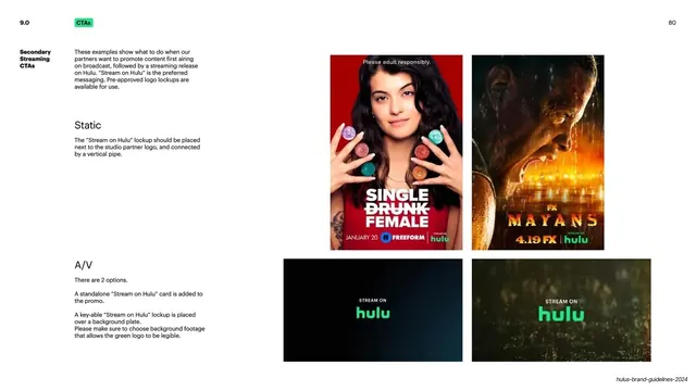
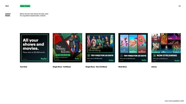
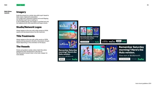
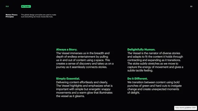
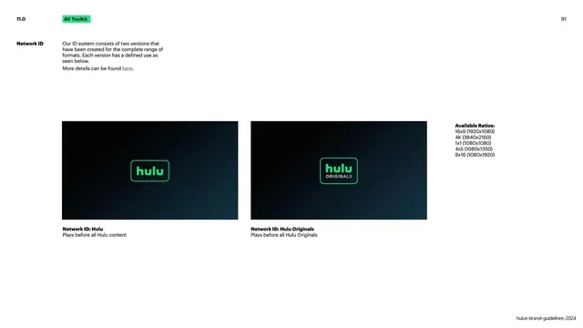
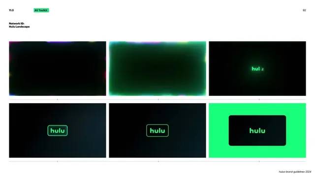
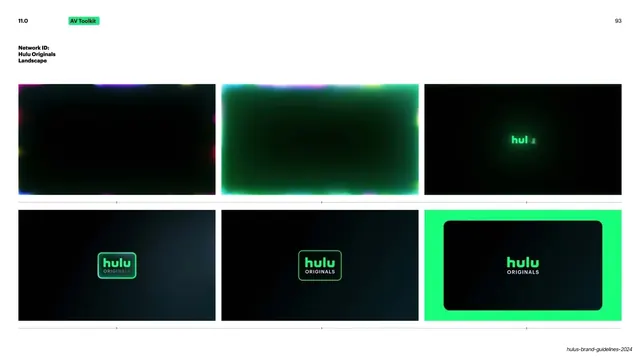
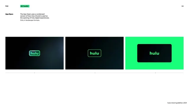
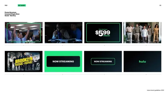
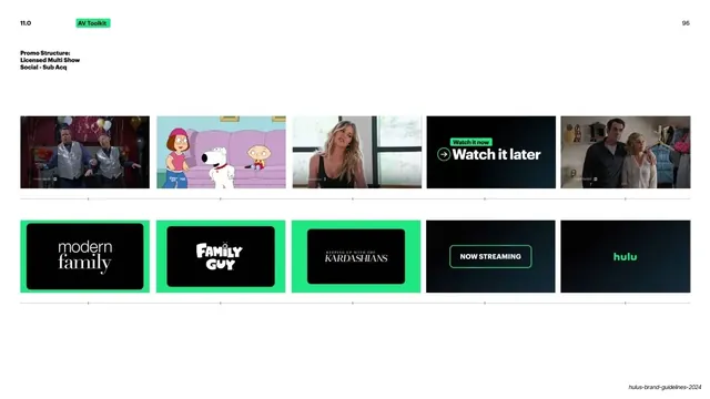
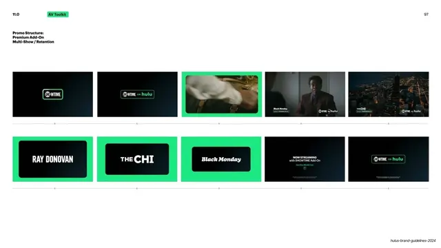
Slides are 16:9. The palette is almost entirely two colors: a saturated Hulu green (around #1ED981) and near-black (#0A0A0A), with white reserved for body copy on dark slides. The cover flips the system loud, setting "BIG GREEN GUIDE" in massive black bold sans across a full green field with a black hulu badge top-right. Section dividers repeat this inversion: a short all-caps headline ("GLOBAL DESIGN PRINCIPLES", "LOGO") in black, anchored low-left on a full green field, with a small section number top-left and page number top-right. Content slides sit on black: a thin top utility row carries a green section number left ("2.0"), a small green pill label naming the section ("Logo") beside it, and a page number top-right; left-rail bold white sub-labels ("Attributes", "Logo Safe Zone") sit against a narrow column of explanatory body copy. Headlines mix two type voices: an oversized black/bold grotesque for display ("BIG GREEN GUIDE", "GLOBAL DESIGN PRINCIPLES") and a lighter humanist sans for full-sentence statement slides ("We use our logo with pride and fill it with meaning") where the key word is colored green. Recurring content patterns include: a centered radial-glow logo reveal, a logo construction/safe-zone schematic, a four-cell colorway matrix table (Over Imagery / Over Gradient / Over Green / Over Black), multi-column logo-lockup specimen pages, a quadrant principles diagram with a green center circle, and full-bleed product, OOH, and device mockup montages. The Hulu green logo, its black "badge" (rounded-rectangle vessel) variant, and a recurring rounded-square "Vessel" device thread through almost every page.
Key takeaway
The discipline of a true two-color system: one brand green plus black carries 99 slides with zero decoration and never gets tired. The inversion trick, flipping black-on-green for dividers and green-on-black for content, gives the deck rhythm for free. And the navigation grammar, a numbered section plus a small green pill label plus a left-rail sub-label, makes a long technical document instantly scannable.
Reuse notes
A best-in-class reference for brand guideline and design-system decks, especially single-accent identities that need to feel bold without color variety. The section-divider and utility-header system is directly reusable for any long, navigable internal deck. The oversized-black-headline-on-brand-color cover is a strong, confident pattern for any brand with one hero color. Leans entirely on one excellent accent color and a strong grotesque; a weak green or a generic typeface would collapse it.
From this deck: Hulu Brand Guidelines 2024 (Big Green Guide)
View deck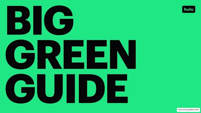


































More like this









Keep what you find
A free account saves references to boards and can send you a weekly email of picks based on what you save.
To see every result, go Pro.