
Preview image. Unlock full-res
A 31-page brand guidelines deck for KPR, a Web3 worldbuilding project, built on a strict black/white system, a futuristic squared display face, oversized section numerals, and purple as the only accent.
Summary
A 31-page brand book (Version 1.0) for KPR, a Web3 worldbuilding project around collective narrative and digital collectibles. Its identity rests on a disciplined black/white system, a custom squared/chamfered futuristic display face, oversized section numerals on black dividers, and a single purple accent.
Visual description
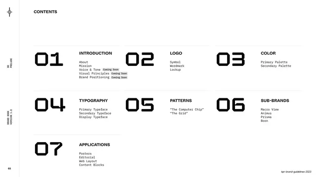
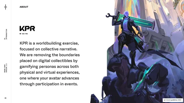
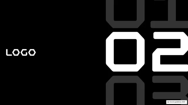
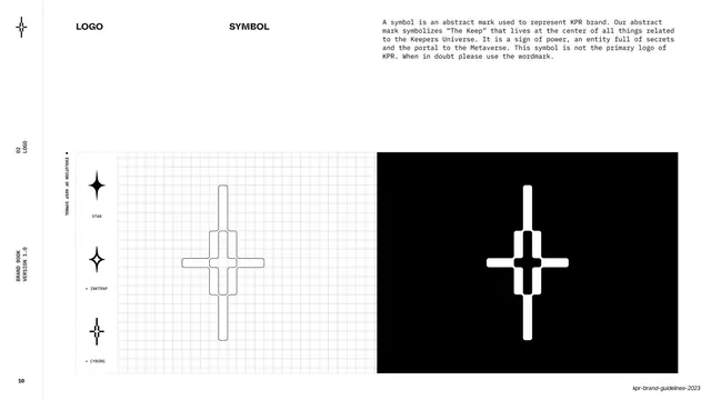
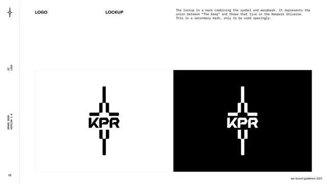
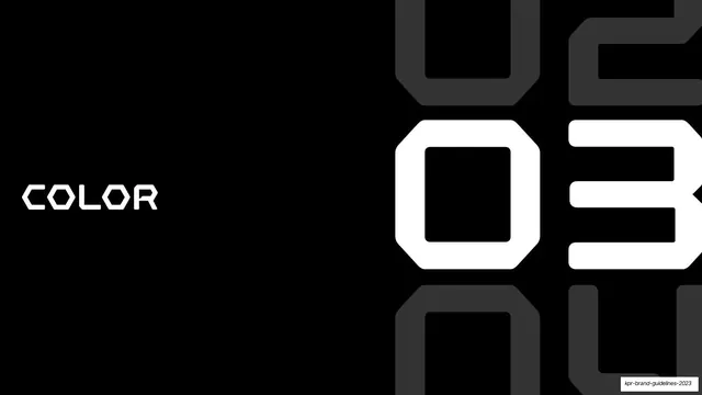
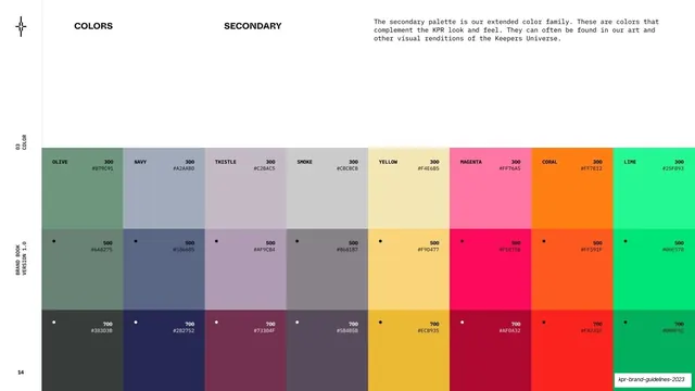
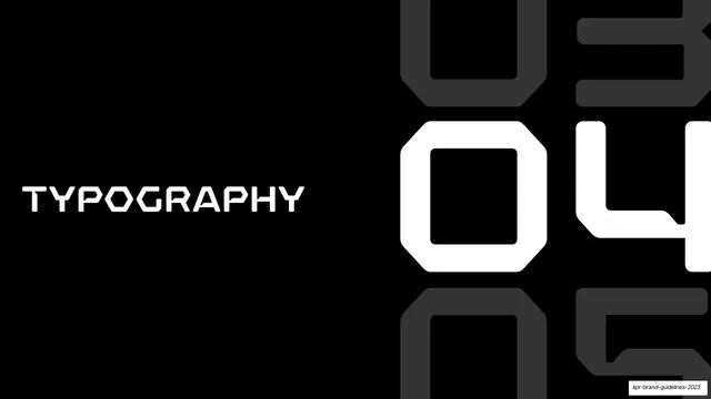
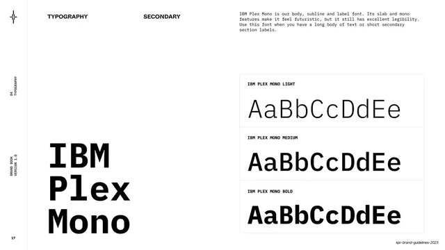
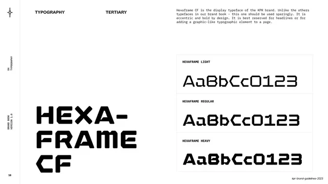
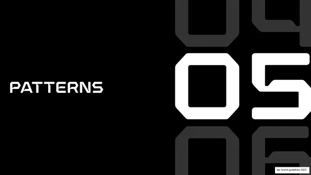
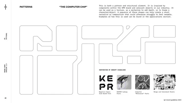
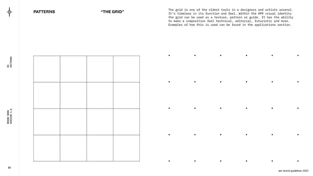
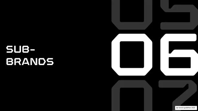
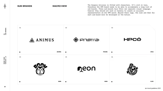
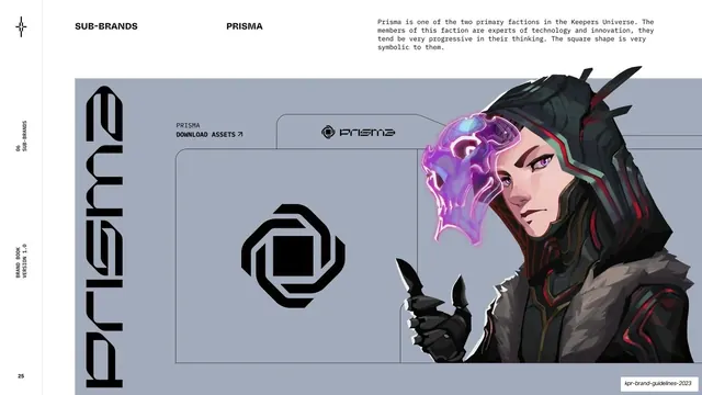
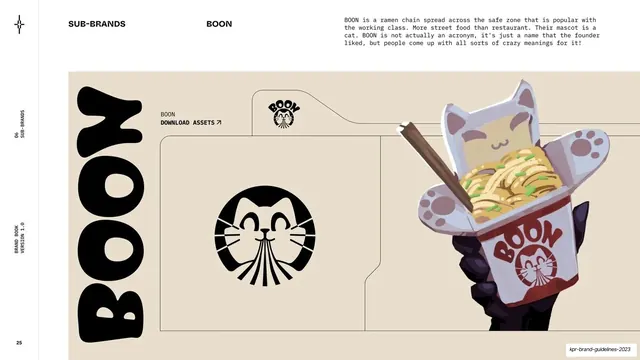
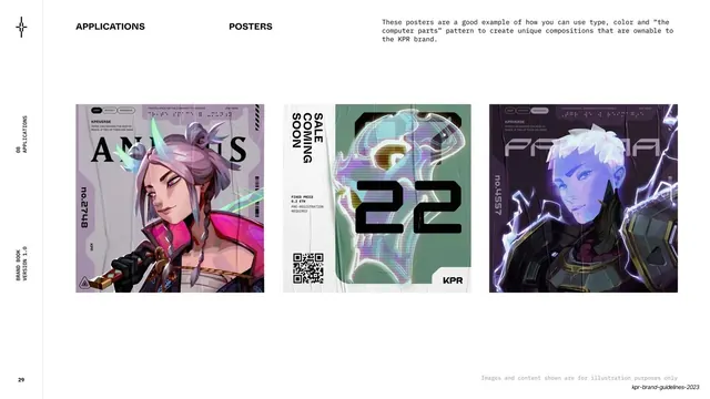
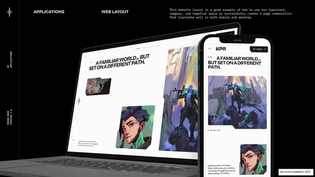
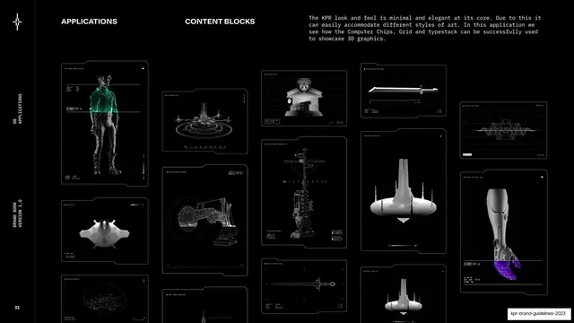
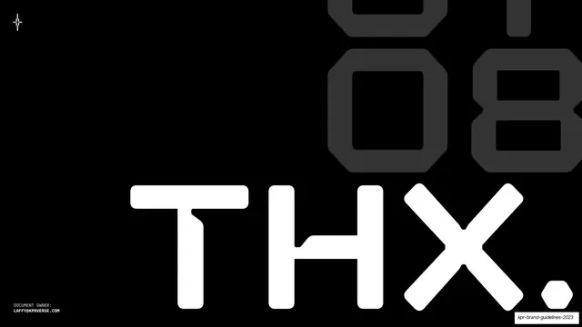
Slides run 16:9 and alternate two registers: full-bleed near-black section dividers (large white section word lower-left, a giant white seven-segment-style numeral pushed off the right edge with a faint dark "ghost" of the next number below it), and white content pages. Content pages share a fixed grammar: a thin vertical rule down the left margin with a small four-pointed-star brand mark at top and tiny rotated all-caps labels (section number, section name, "BRAND BOOK / VERSION 1.0", page number) running up it; a bold all-caps page title and sub-label across the top in a squared sans; and a monospace body column at upper right. Three type families carry the system: a clean grotesque (ABC Whyte Inktrap) for headlines, IBM Plex Mono for body and labels, and an eccentric squared display face (Hexaframe CF) for the big numerals and the KPR mark itself. Color is almost entirely black on white or white on black, with purple (#A79BED) reserved as the action/highlight color. Recurring devices: large color swatch bands (primary black/white/purple, plus an extended secondary grid with 300/500/700 tints and hex values), type specimen slides pairing an oversized family name on the left with a boxed regular/medium/bold AaBbCcDdEe table on the right, a rounded-rectangle "computer chip" pattern built from negative space of the brand letters, a faint dot grid, a sub-brand logo grid, and dark application mockups (posters, web layout, editorial, 3D content blocks). The cover is a black field filled by an oversized white "KPR" in the chamfered display cut; the closing page is a black "THX." with the same numeral treatment.
Key takeaway
The section-divider system: an oversized seven-segment numeral bleeding off the right edge with a ghosted next-number behind it gives a long technical document strong wayfinding with zero decoration. The restraint of a pure black/white base with one purple accept color. And the consistent left-margin rail (star mark plus rotated micro-labels) that timestamps every page as part of one book.
Reuse notes
A strong reference for Web3, gaming, crypto, or any "futuristic/technical" brand guideline or report that wants to feel engineered rather than decorative. The monospace-body plus squared-display-headline pairing is directly reusable. The character art and 3D renders are bespoke IP, so swap them; the system itself (numeral dividers, color bands, type specimens, chip pattern) carries without them. Best where a black/white-forward, high-contrast aesthetic is acceptable.
From this deck: KPR Brand Book Version 1.0
View deck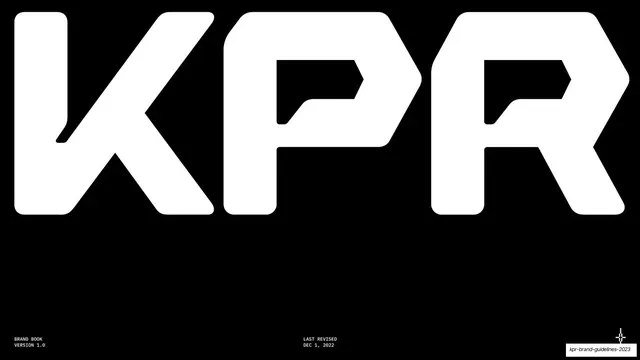








More like this









Keep what you find
A free account saves references to boards and can send you a weekly email of picks based on what you save.
To see every result, go Pro.