Preview image. Unlock full-res
A 38-page brand book for Malta's government IT agency built on a crimson-and-navy palette, a chevron "greater-than" symbol, and a geometric sans-serif type system.
Summary
The brand book for MITA, Malta's government information-technology agency, structured into seven numbered sections. Its defining move is a chevron "greater-than" mark drawn from code syntax, paired with a confident crimson-and-navy duotone and giant outlined section numbers.
Visual description
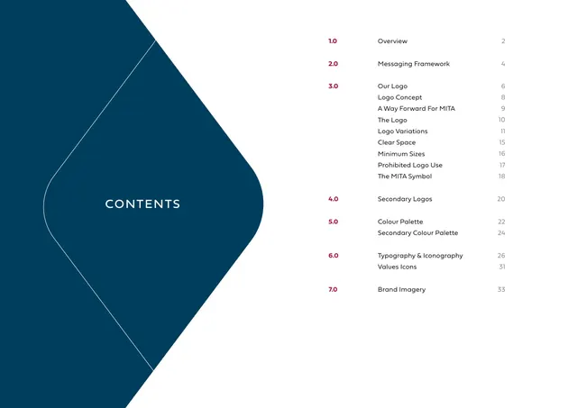
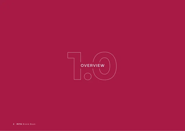
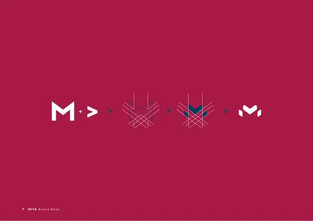
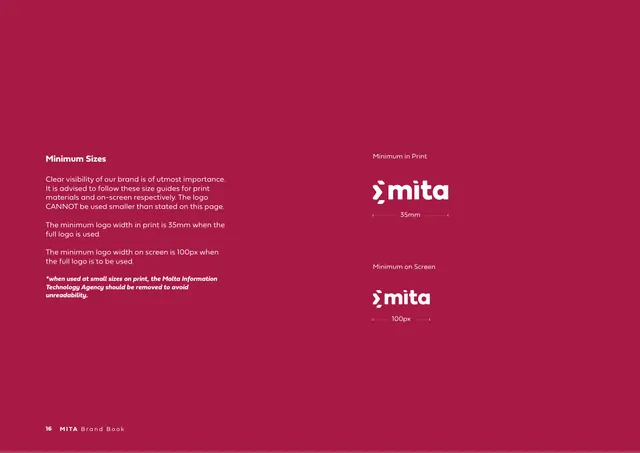
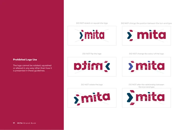
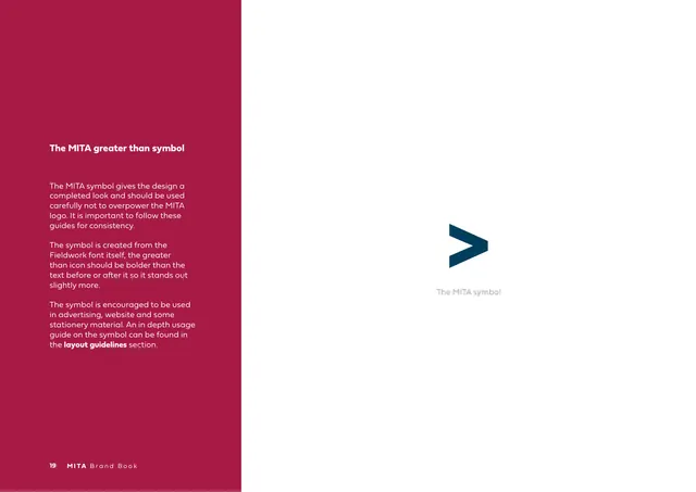
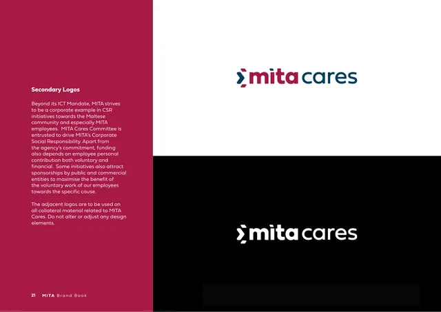
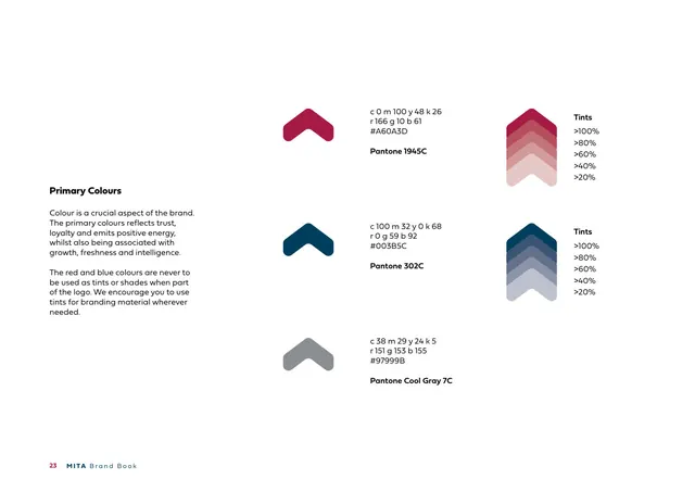
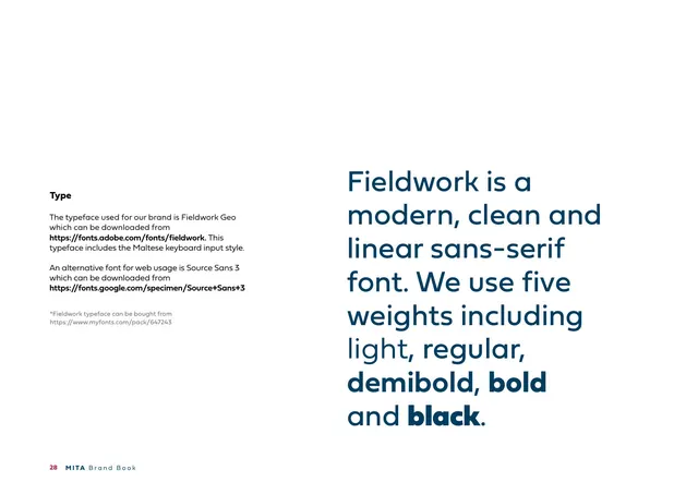
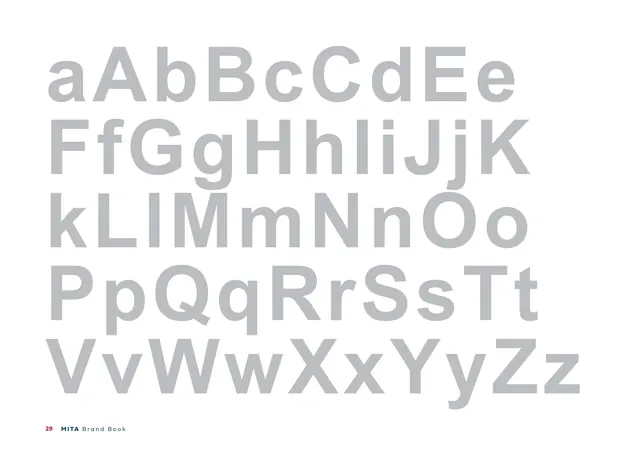
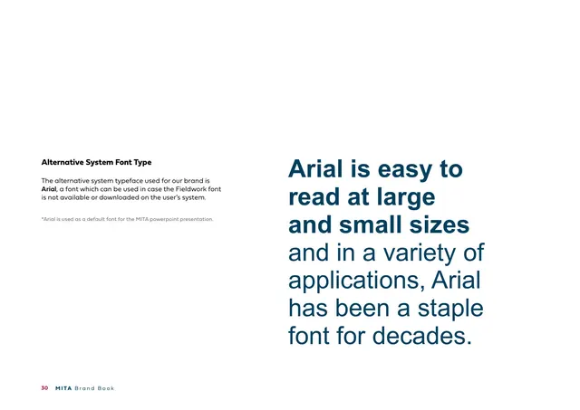
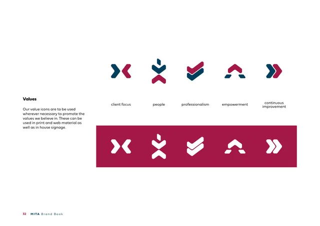
A landscape (roughly 3:2) guideline document running 38 pages. Two colours carry the whole system: a deep crimson (#A60A3D) and a dark teal-navy (#003B5C), supported by a cool gray. Section dividers are full-bleed crimson or navy fields with the section name set in spaced white capitals laid directly over an oversized, thin-outlined section number (1.0 through 7.0). Content pages flip to a white ground with a tight left-hand text column (bold heading, light body paragraphs) and the supporting artwork pushed far to the right, leaving large open margins. A persistent footer carries the page number, a bold "MITA" and a light "Brand Book". The logo is a lowercase "mita" wordmark in crimson preceded by a navy chevron/greater-than symbol built from two stacked arrowheads; it is shown on light, dark, grayscale, and dark-grayscale grounds. The book documents logo construction (M plus arrow), clear space (measured in arrow-height "x"), minimum sizes (35mm print, 100px screen), six prohibited-use crosses, the standalone chevron symbol, a "mita cares" secondary lockup, primary and secondary colour swatches with full CMYK/RGB/HEX/Pantone values and tint ramps, a two-tone alphabet specimen of the Fieldwork Geo typeface, an Arial fallback specimen, five chevron-derived value icons, and a stock-photography imagery page. Decorative pages use thin single-stroke line versions of the chevron motif repeated across a navy field.
Key takeaway
The chevron/greater-than symbol pulled straight from programming syntax doubles as a brand mark and a flexible graphic device (value icons, line patterns, clear-space unit) all derived from one shape. The divider system, oversized hairline-outlined numerals with the title knocked out in white over them, is a cheap, high-impact way to structure a long document. Colour swatches drawn as the brand's own chevron shape (rather than plain squares) make even the palette page on-brand.
Reuse notes
A strong reference for a technical, governmental, or B2B IT identity that needs to feel trustworthy and modern without going flashy. The disciplined two-colour duotone plus a single geometric symbol is easy to extend to sub-brands ("mita cares"). Reach for the divider-number treatment when laying out any multi-section guideline or report. Note the palette leans formal and slightly austere; the optional warm/teal/yellow secondary colours exist precisely to loosen it for editorial or campaign work.
From this deck: MITA Brand Book
View deck







More like this







Keep what you find
A free account saves references to boards and can send you a weekly email of picks based on what you save.
To see every result, go Pro.